Action for Children
Identity Print Strategy
Action for Children asked us to explore how their current visual identity could be expanded and built upon so that they had a more flexible kit of parts. The results of this project led to a visual language that could speak to different kinds of audiences in different types of situations.
Client
Action for Children have been working to help children and young families for over 150 years. They present a down-to-earth face to the world with a strong focus on transparency and honesty. In 2017 Action for Children worked with Johnson Banks to redefine their core values, agree a clear brand narrative and create a new brand identity based around the desire to ‘do what’s right, what’s needed and what works’, bringing ‘how’ they work to the fore.
Brief
Using the core identity elements as a starting point, Action for Children asked us to look at how the visual language could be built upon, so it could speak to different kinds of audiences in different types of situations. This ‘brand-stretch’ work was to be recorded in a guidelines document that the internal team could begin to use to continue their work engaging various audiences.
The Strategy
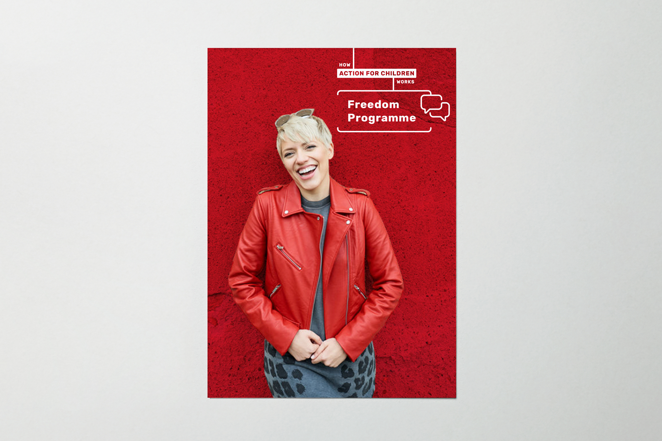
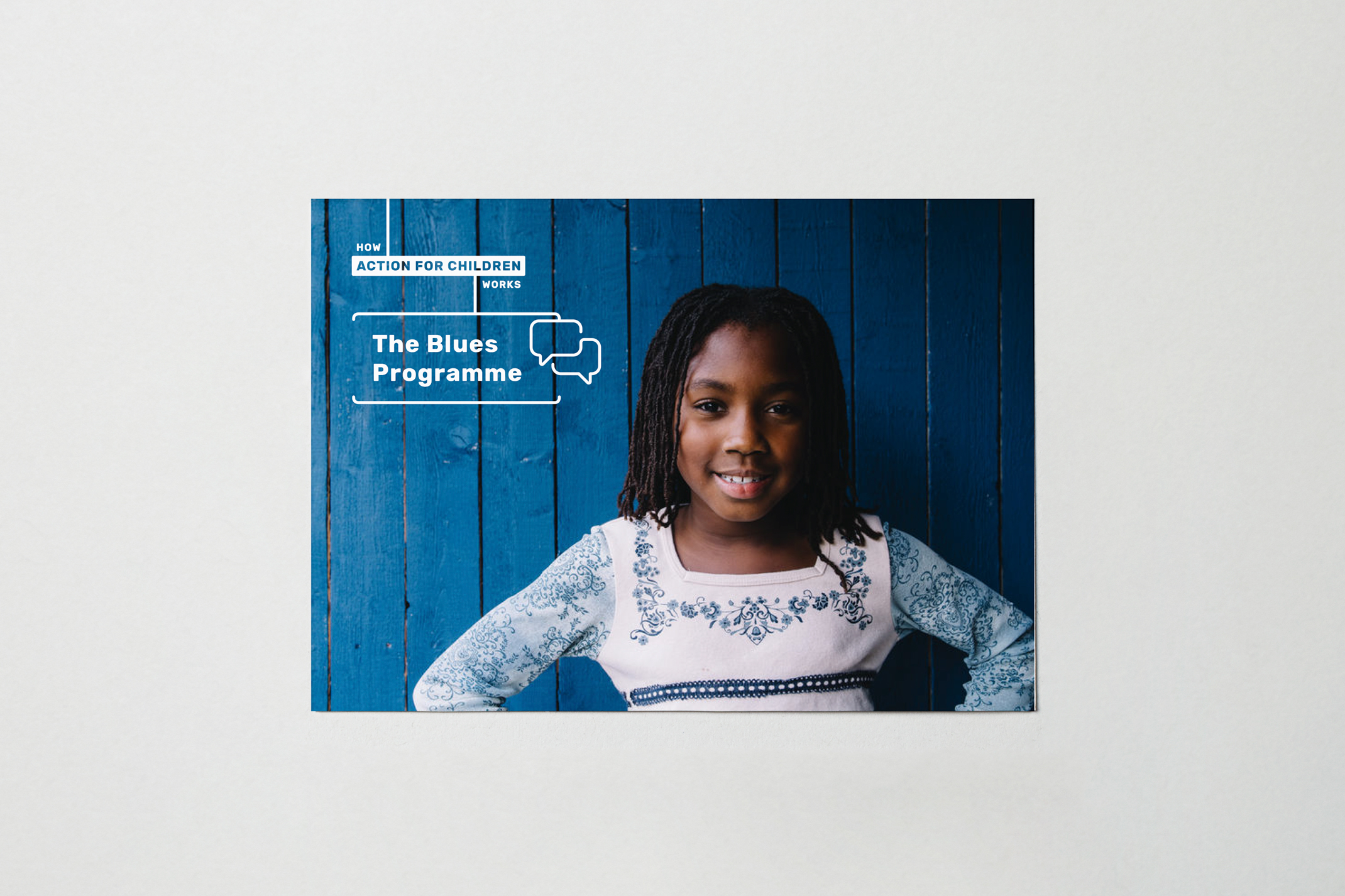
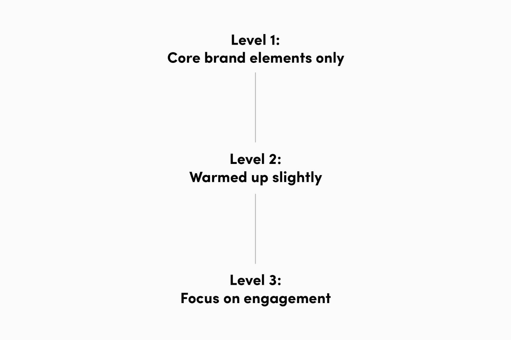
We worked with Deborah Taffler on the strategy behind the new brand-stretch. Together we looked at how the various types of communication should be grouped, along with the different audiences Action for Children communicate with. From this, we devised a spectrum from ‘Expert’ to ‘Inclusive’ to describe how the tone of voice should change. The original core brand created by Johnson Banks already worked very well communicating the most urgent of Action for Children’s messages, so our job was to look at how the brand spoke as it moved towards the ‘Inclusive’ end of the spectrum. To help Action for Children decide what tone of voice each piece of communication should use, we created three main levels of brand stretch. These then informed how we structured the development of a visual kit of parts.
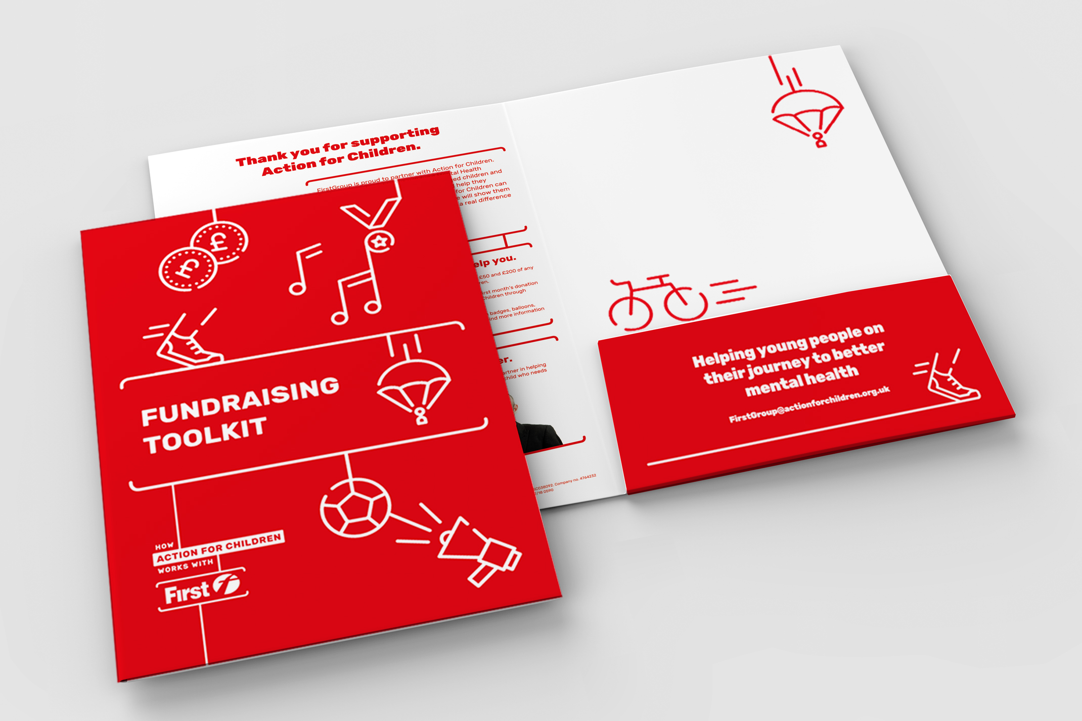
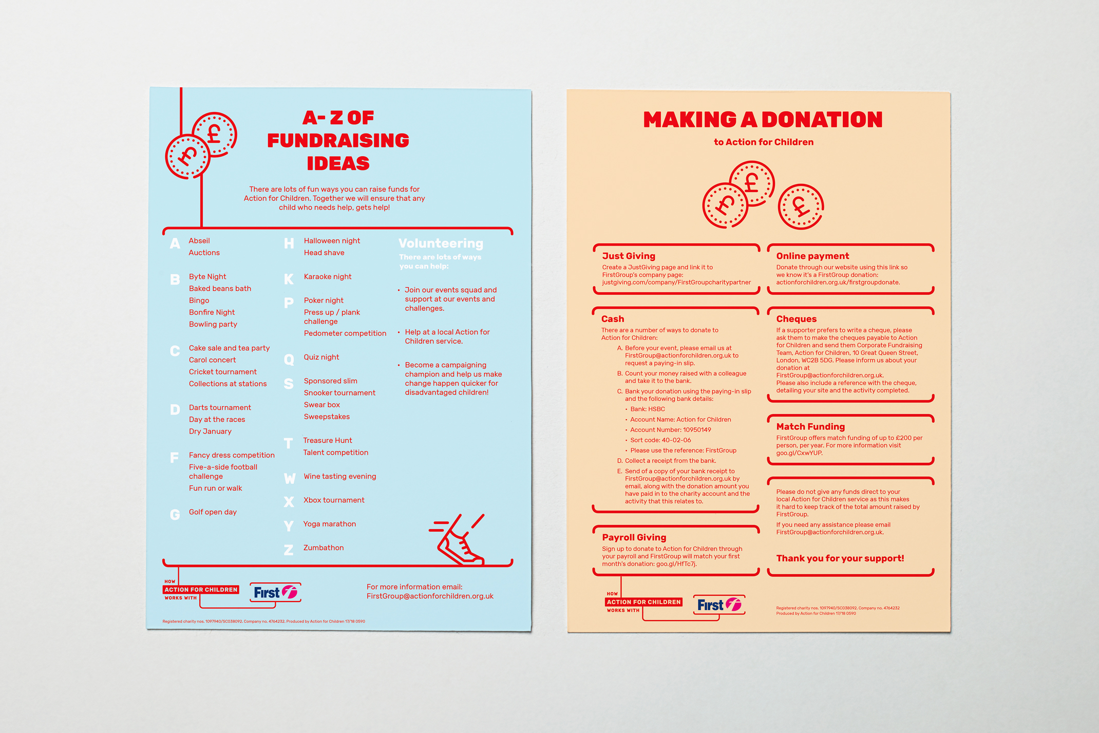
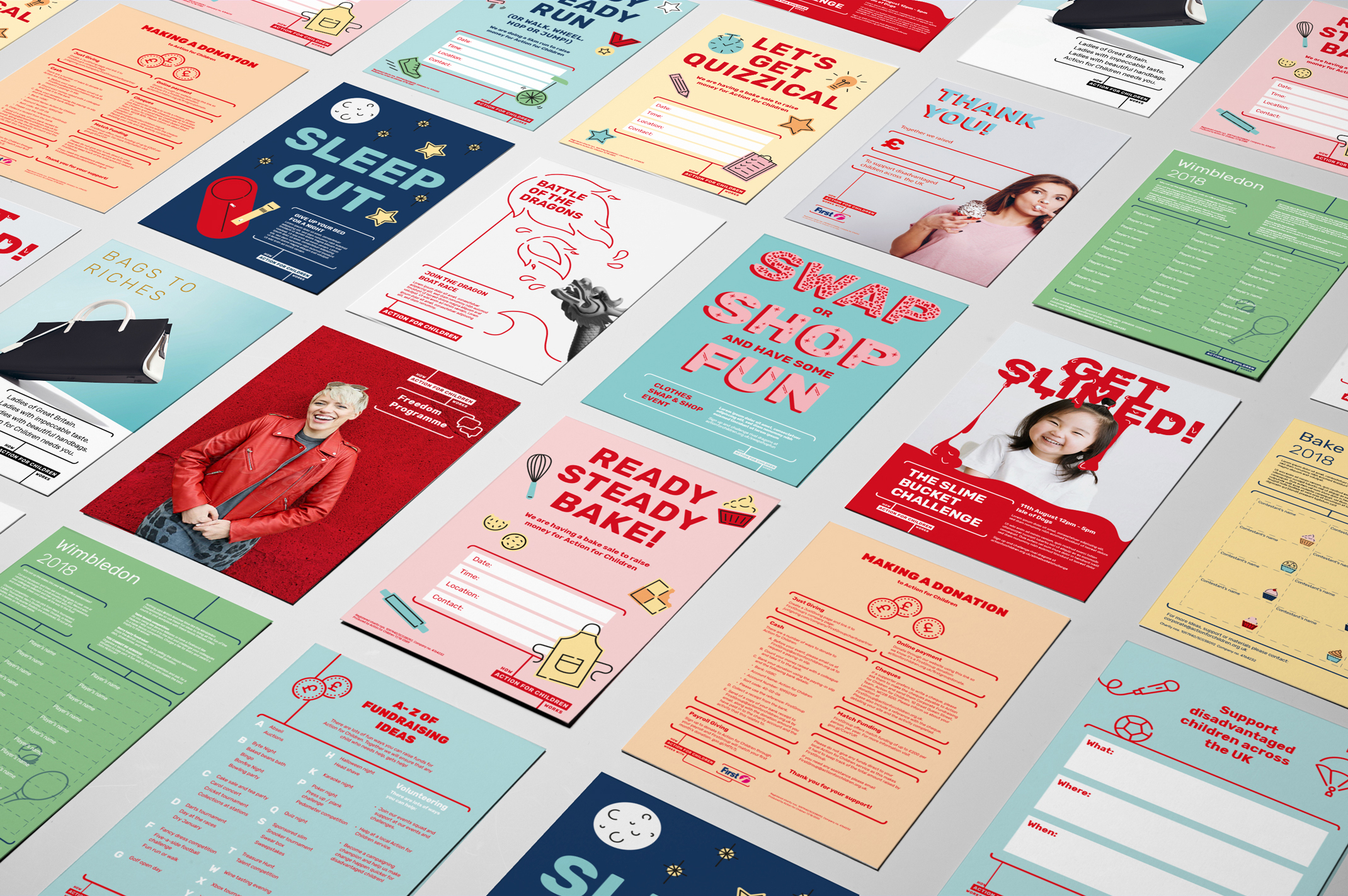
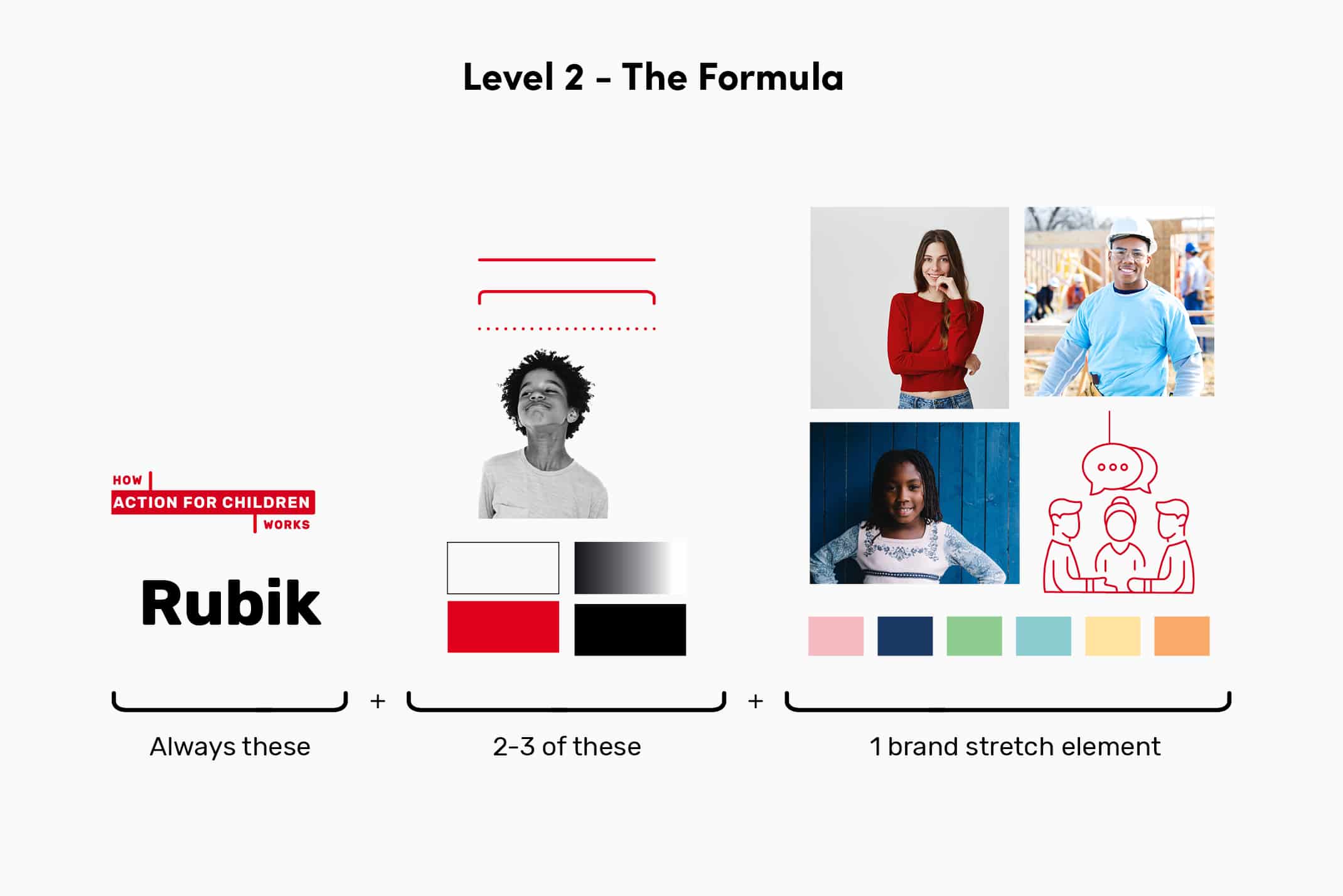
Kit of Parts
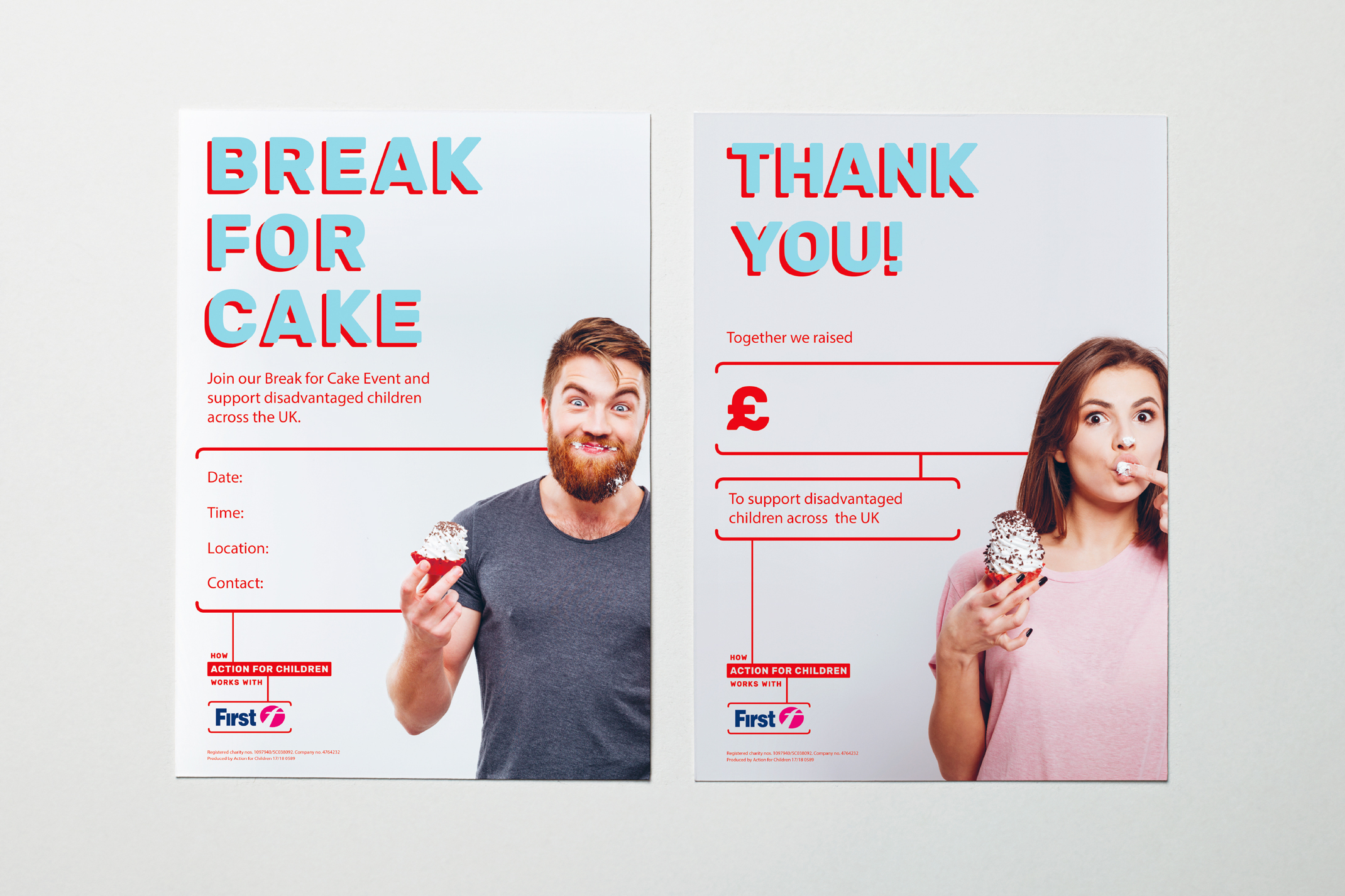
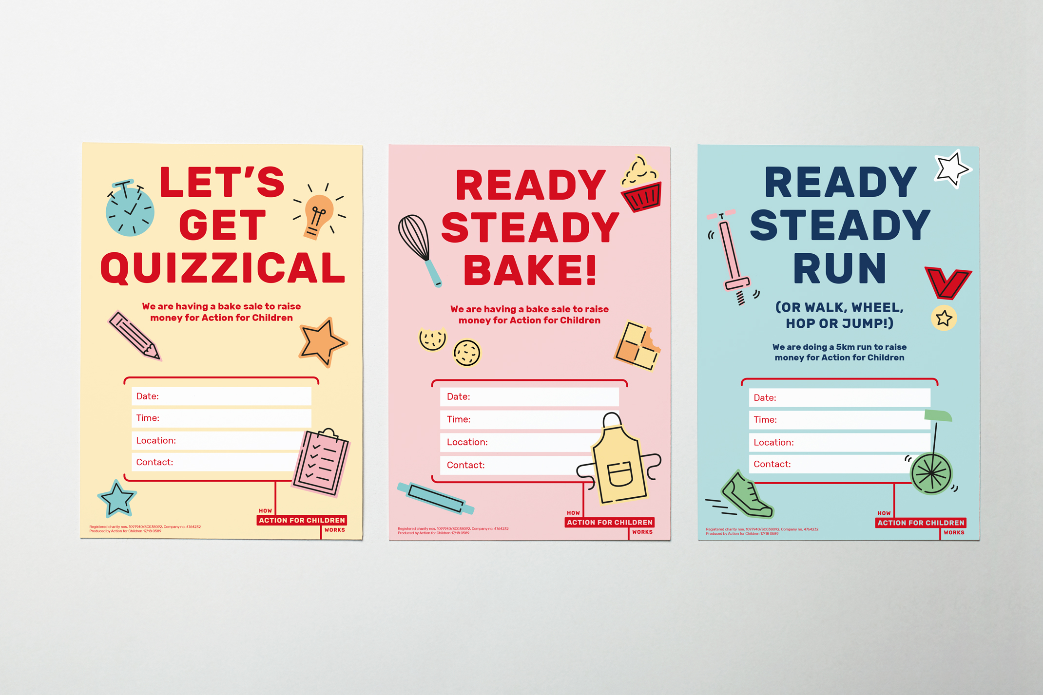
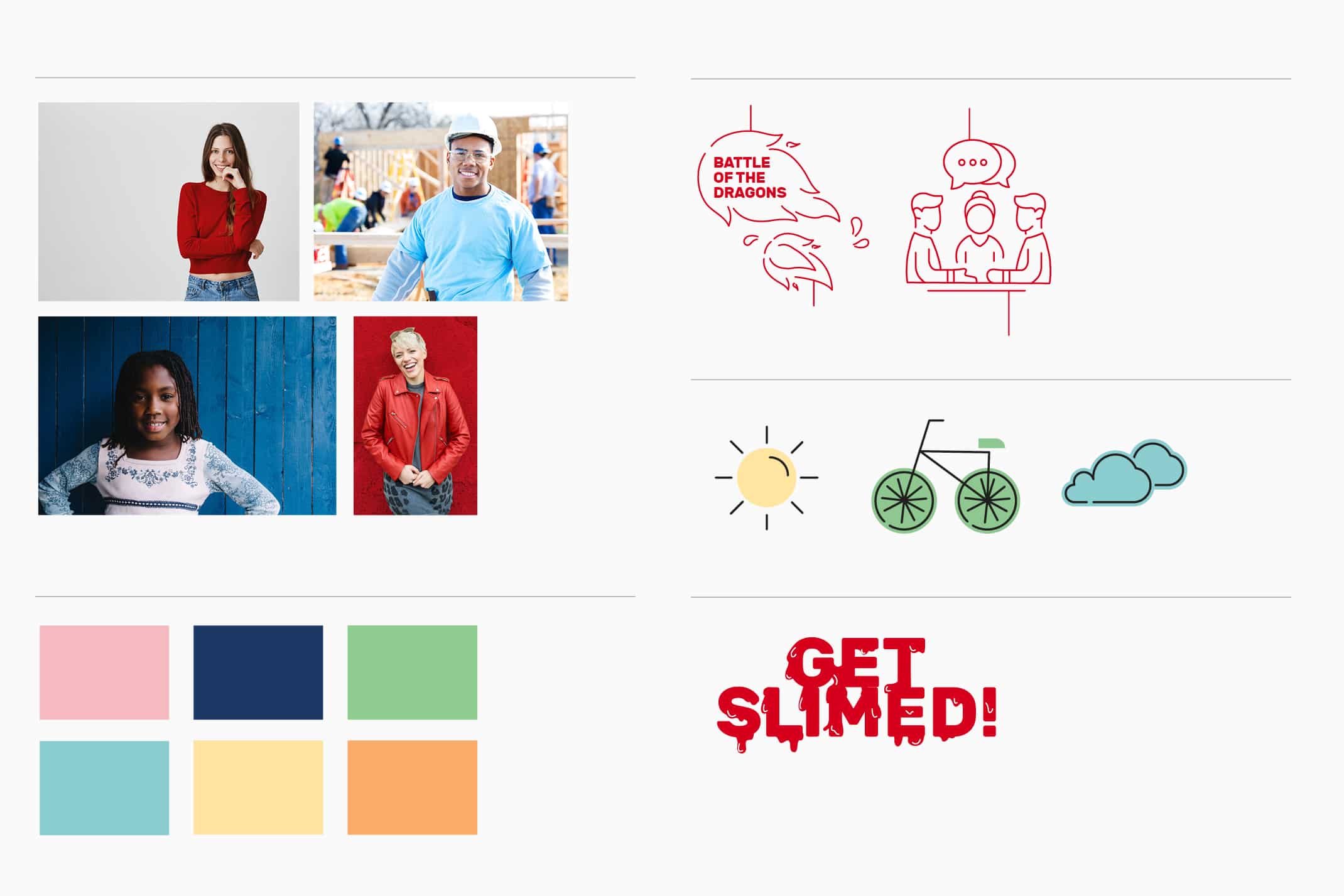
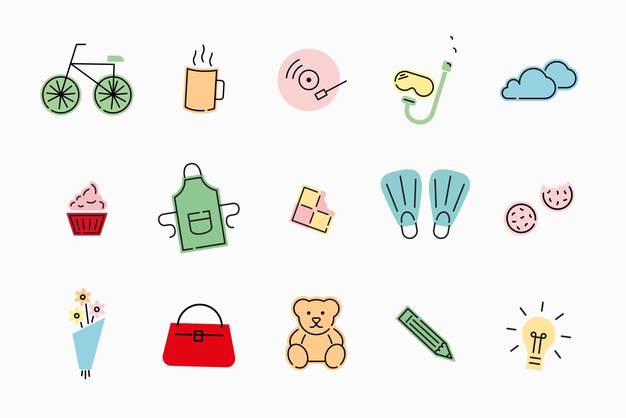
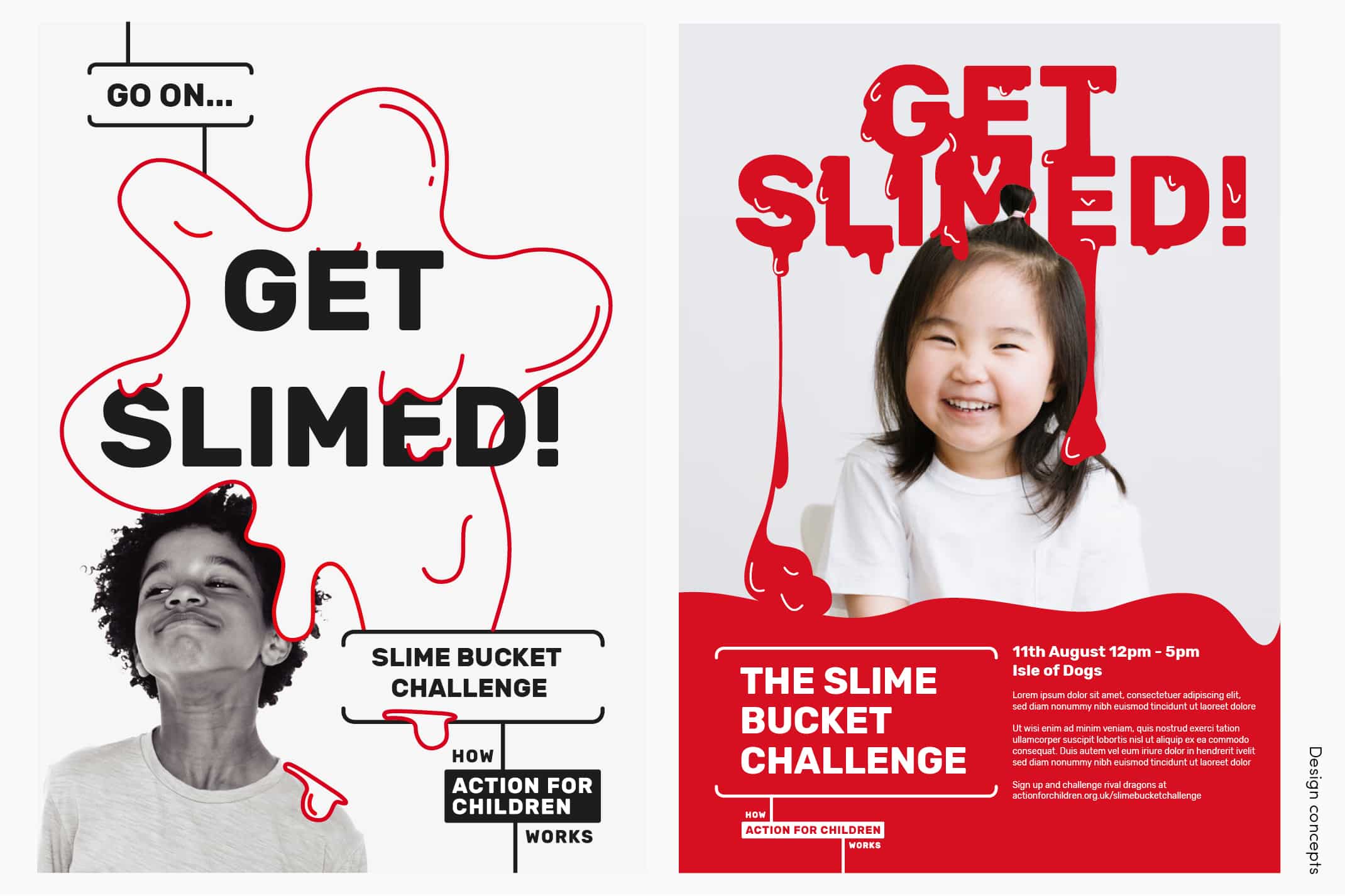
Each level of the brand stretch has it’s own kit of parts. The first level uses their core brand elements, keeping all communications feeling direct. The next level expands on their suite of icons, developing it into a more illustrative style. A secondary colour palette is also added at this stage, with colours that all sit with the Action for Children red. Lastly this level introduces two new styles of photography: a warmed up version of their ‘core’ photography which always include a small element of red but feels more relaxed, and a bold style of photography that brings the colour into the models clothes and surroundings. The third level pushes the illustration style further by creating full colour illustrations. Typography can also be pushed further at this level, and sees the core typeface edited to create a more illustrative and playful feel.
Creating a System
To aid understanding for anyone needing to use the new elements we created easy to follow formulas for each level. These helped to make sure that even with a broader kit of parts, the core identity is always apparent. It was important Action for Children remained consistent despite needing a brand that was flexible. These formulas ensured that there was always enough ‘core brand elements’ within each design for it remain recognisably Action for Children.
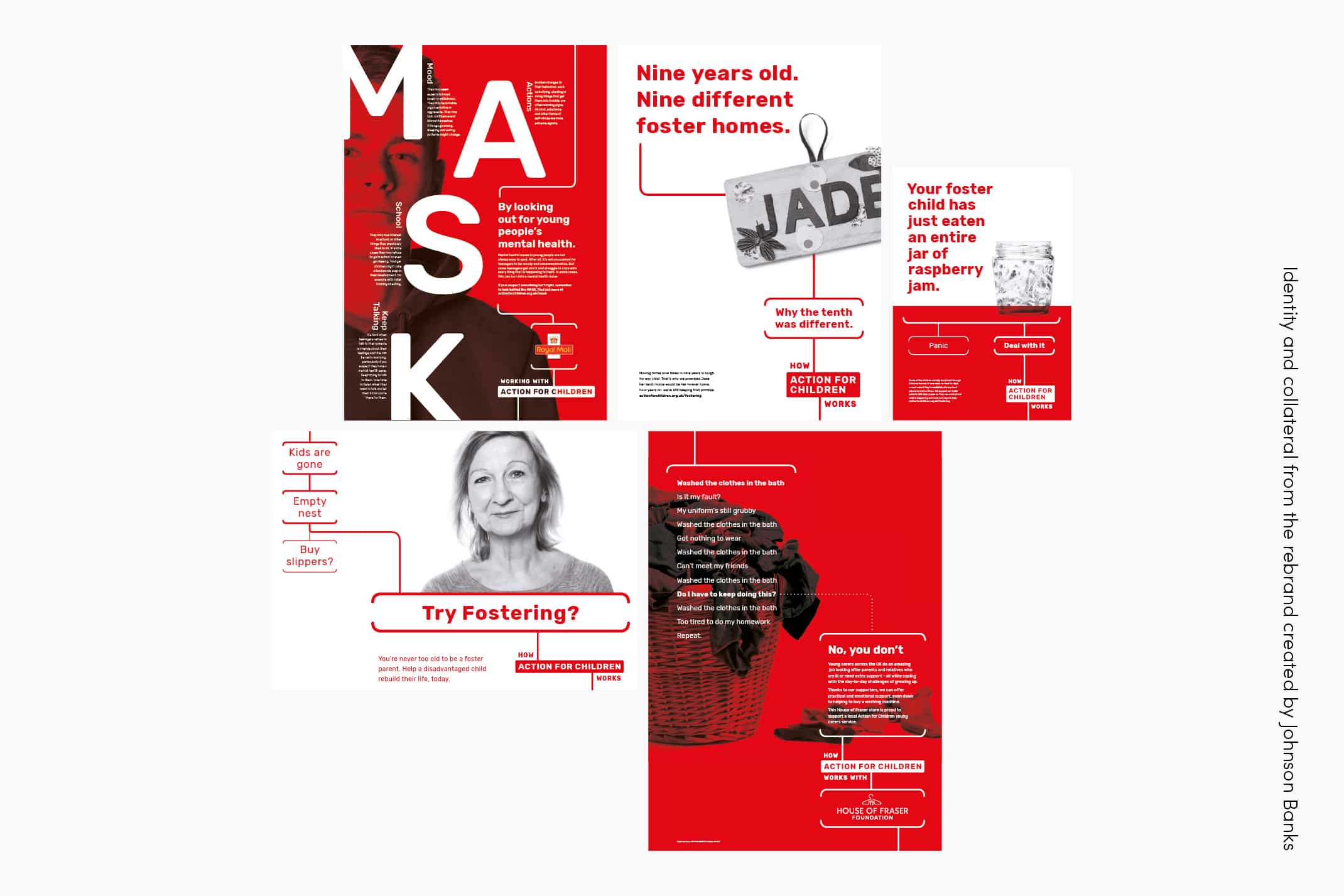
Guidelines and Leading Examples
Once the system was finalise we created a short guideline document. Example designs were used to exemplify how the brand stretch elements could be used to achieve various tones of voice, ranging from the core ‘expert’ level to the most inclusive third level of stretch.
Implementation
We have worked with Action for Children to begin the implementation of their new kit of parts by working on campaigns that use various levels of brand stretch.