
Piccadilly Vaults
Identity Packaging Print
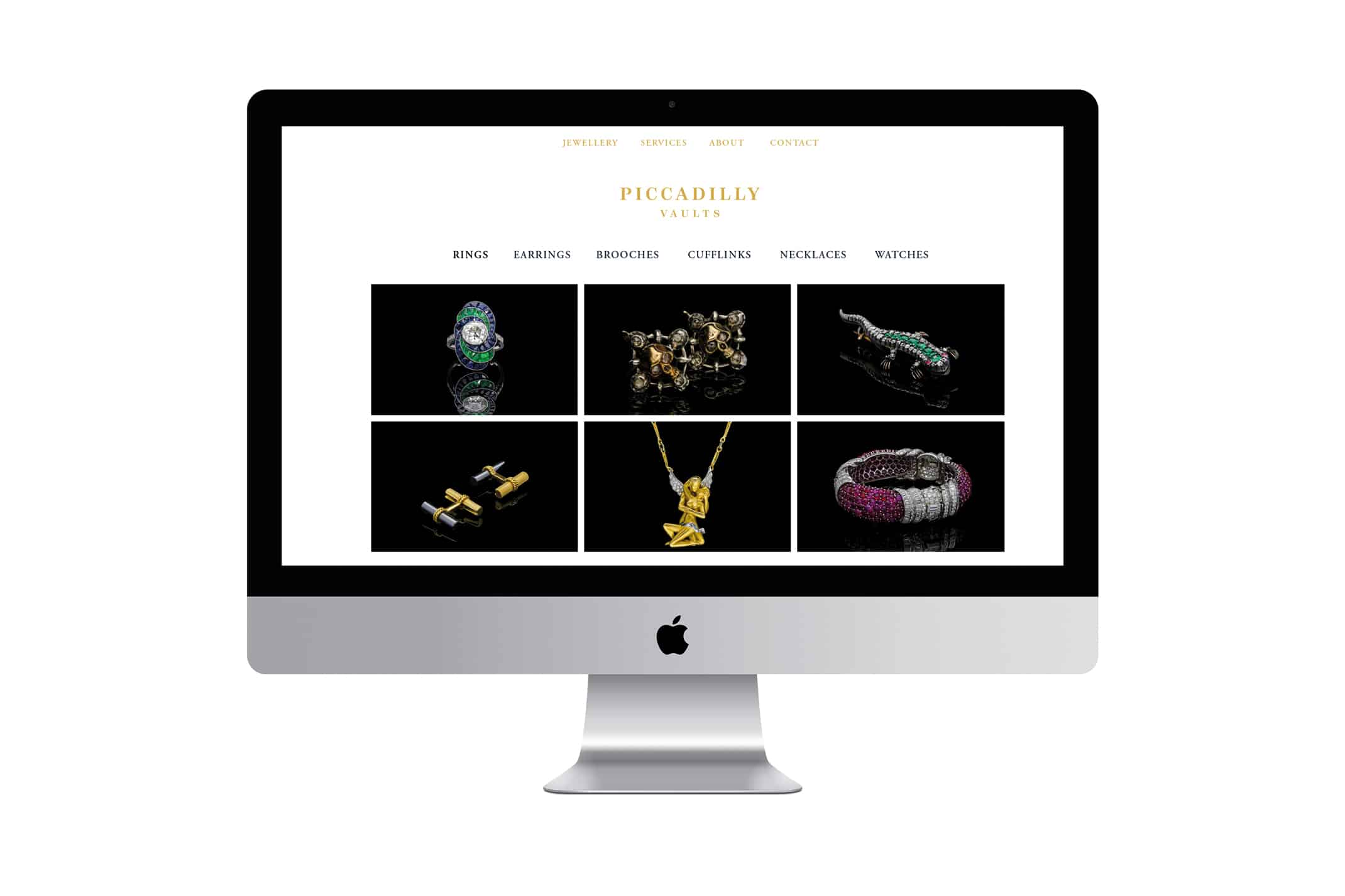
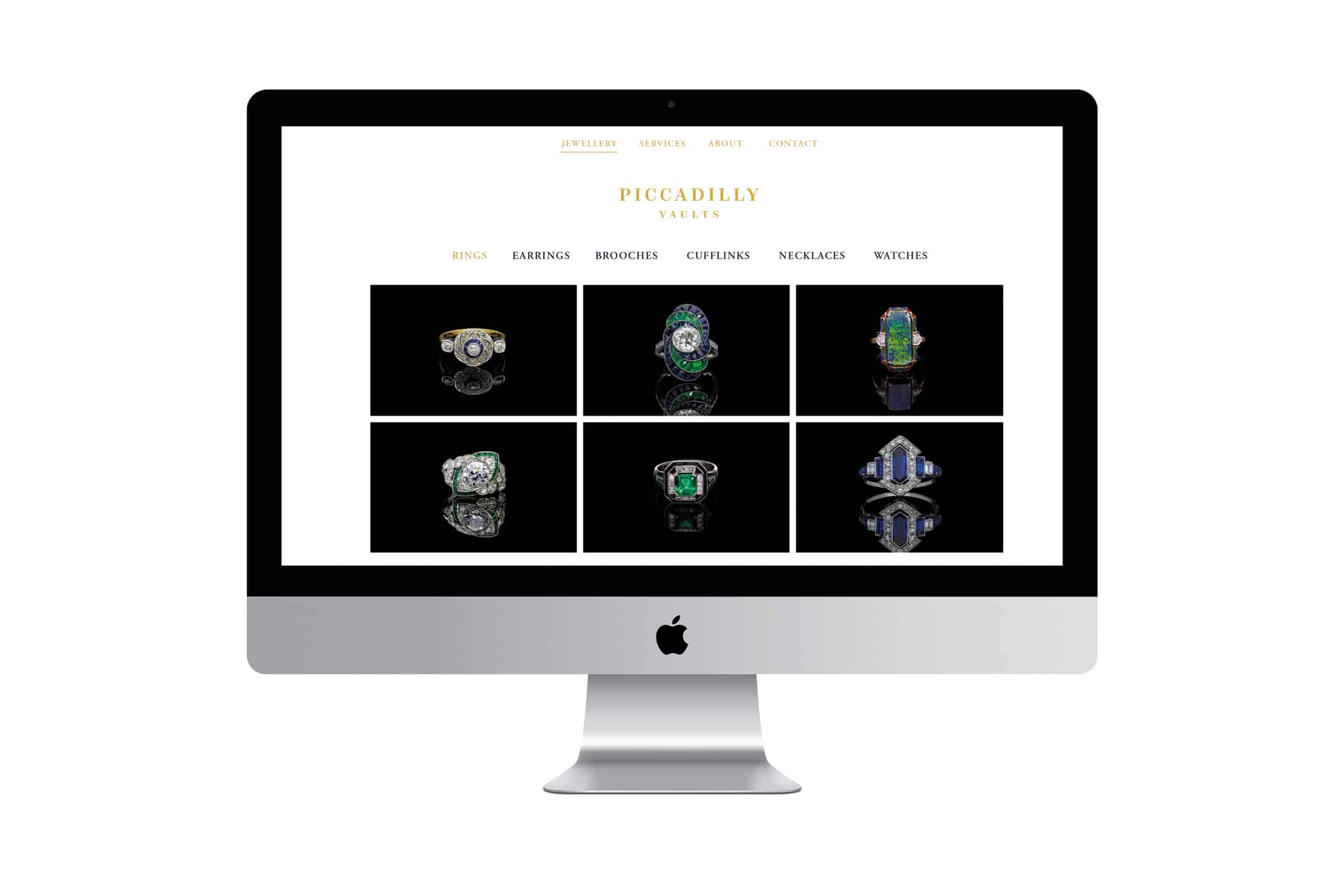
Piccadilly Vaults were looking to open their first emporium of fine antique jewellery in the heart of Piccadilly Arcade, London. They approached Charlie Smith Design to develop the stores visual identity, packaging and supporting collateral in time for their opening.
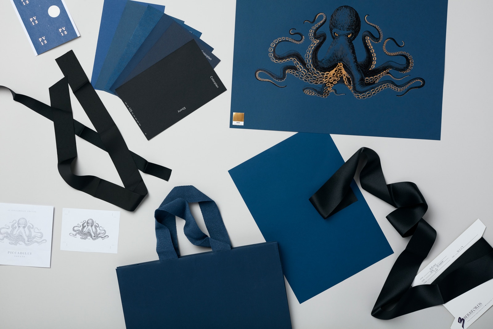
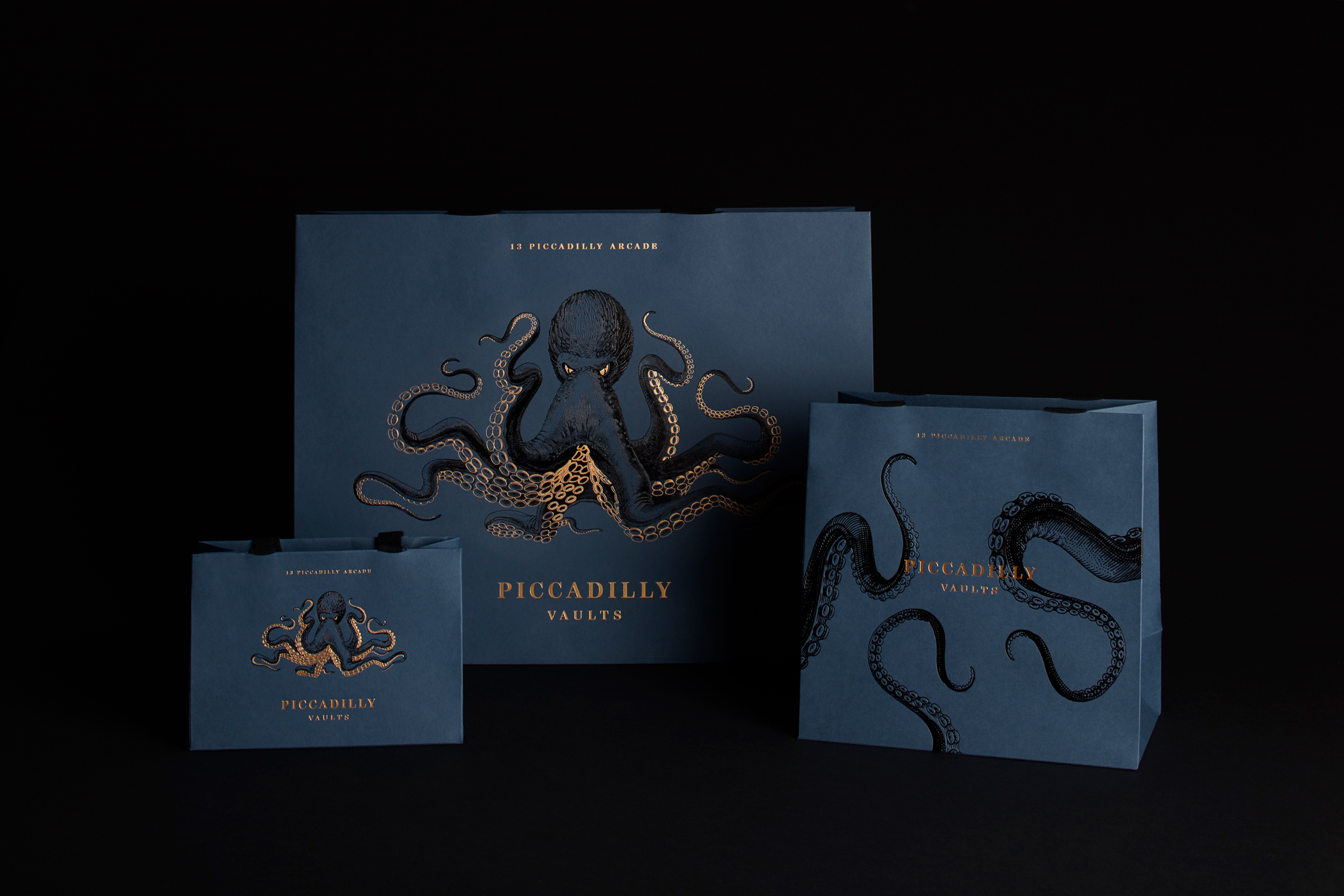
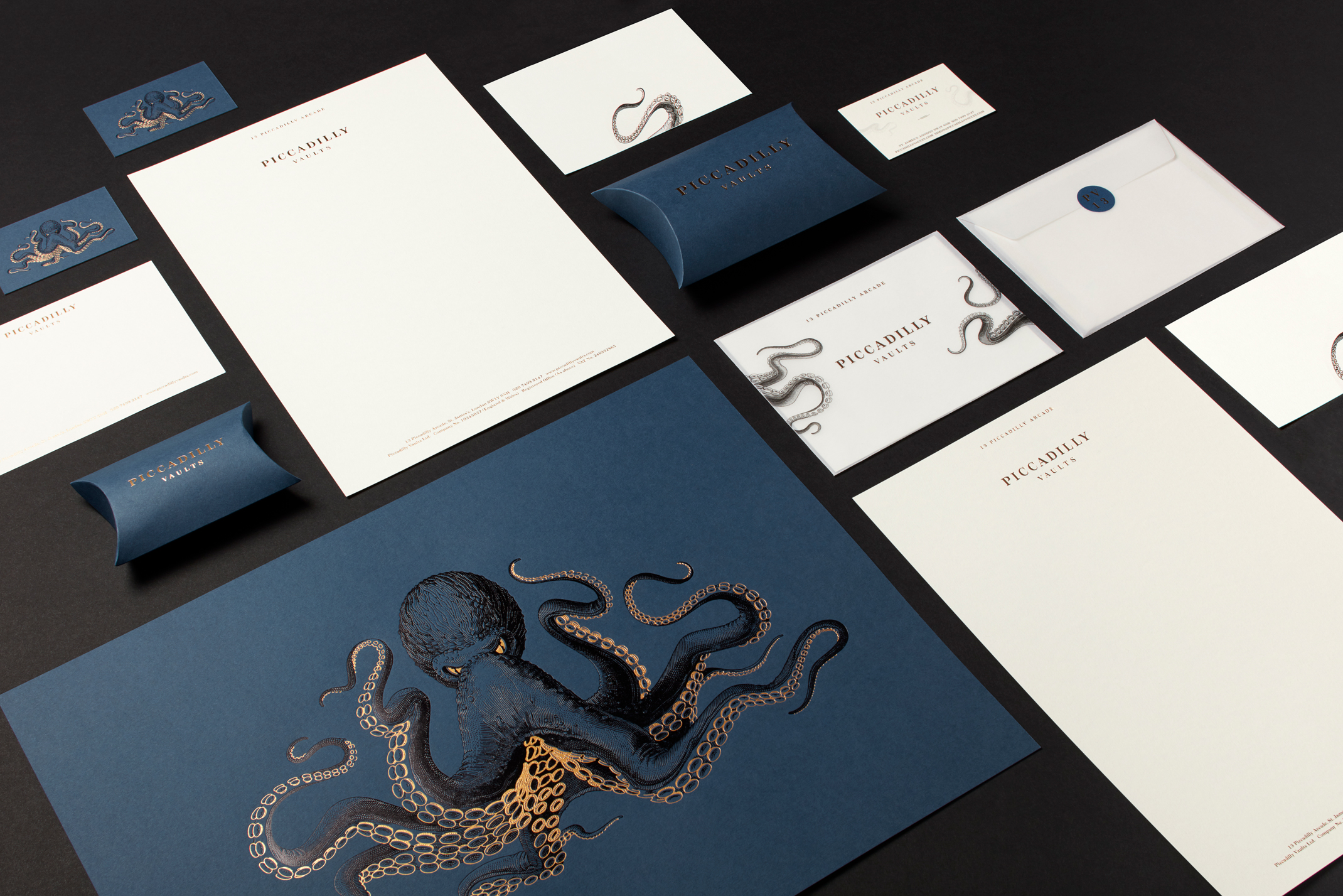
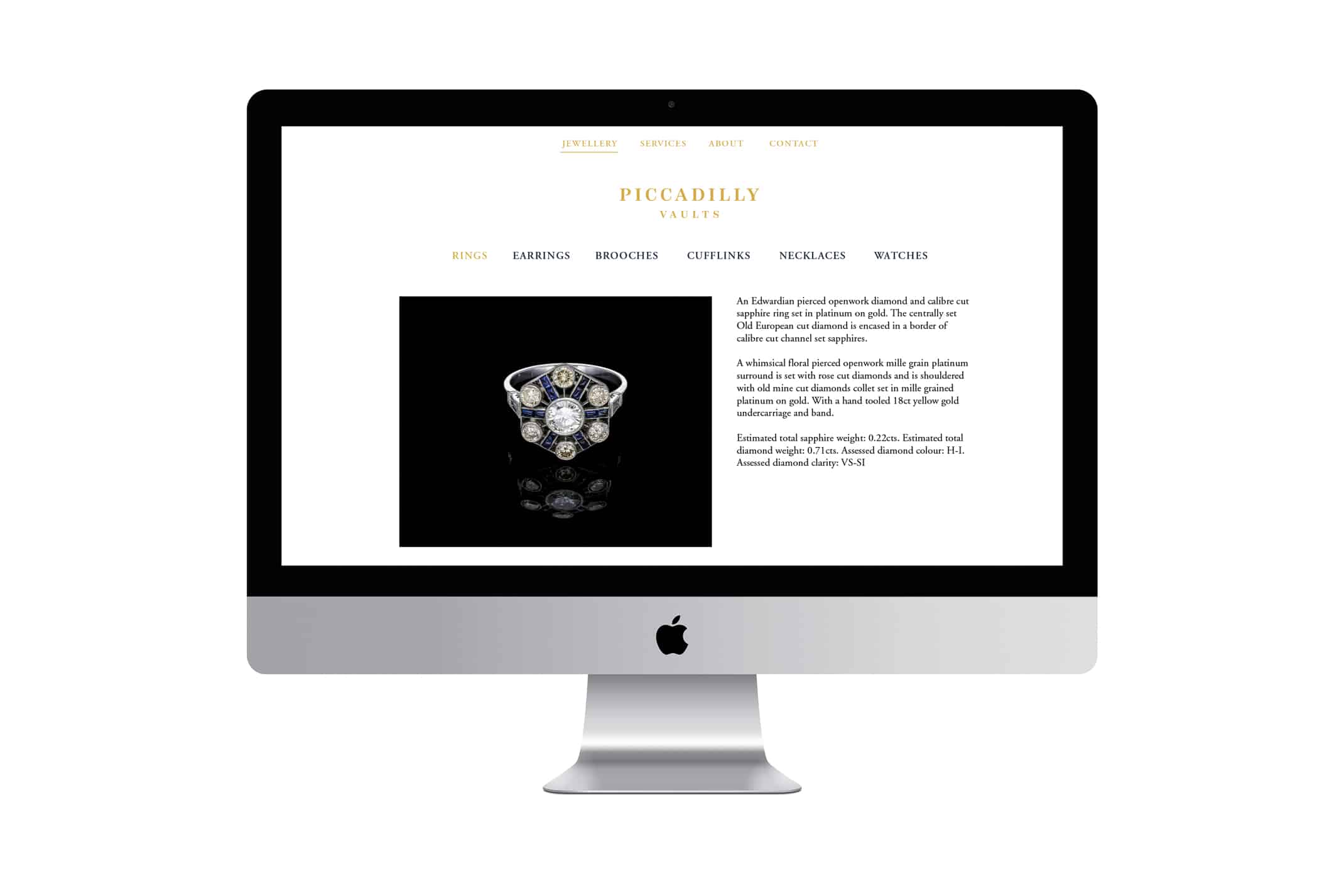
The visual identity needed to reflect the unique style of the jewellery, positioning the brand as a place to go for unusual treasures. From the outset, we discussed the idea of a Kraken, a mythological sea creature becoming the central part of the visual identity. The illustration was teamed with a more classic logotype, the combination of the design and finishes aimed to be timeless, premium and luxurious, reflecting the intricate and unique jewellery pieces.
Client
The founders of Piccadilly Vaults had a fascination and expertise in jewellery history and craftsmanship. Having amassed a collection of fine antique jewellery, they wanted to bring their unique collection to the market and open their first emporium of fine antique jewellery in the heart of the Piccadilly Arcade, London.
Brief
The visual identity for Piccadilly Vaults needed to reflect the unique style of the jewellery, positioning the brand as a place to go for unusual treasures. From the outset, we discussed the idea of a kraken, a mythological deep-sea dwelling creature becoming the central part of the visual identity.
Typography and Logo Type
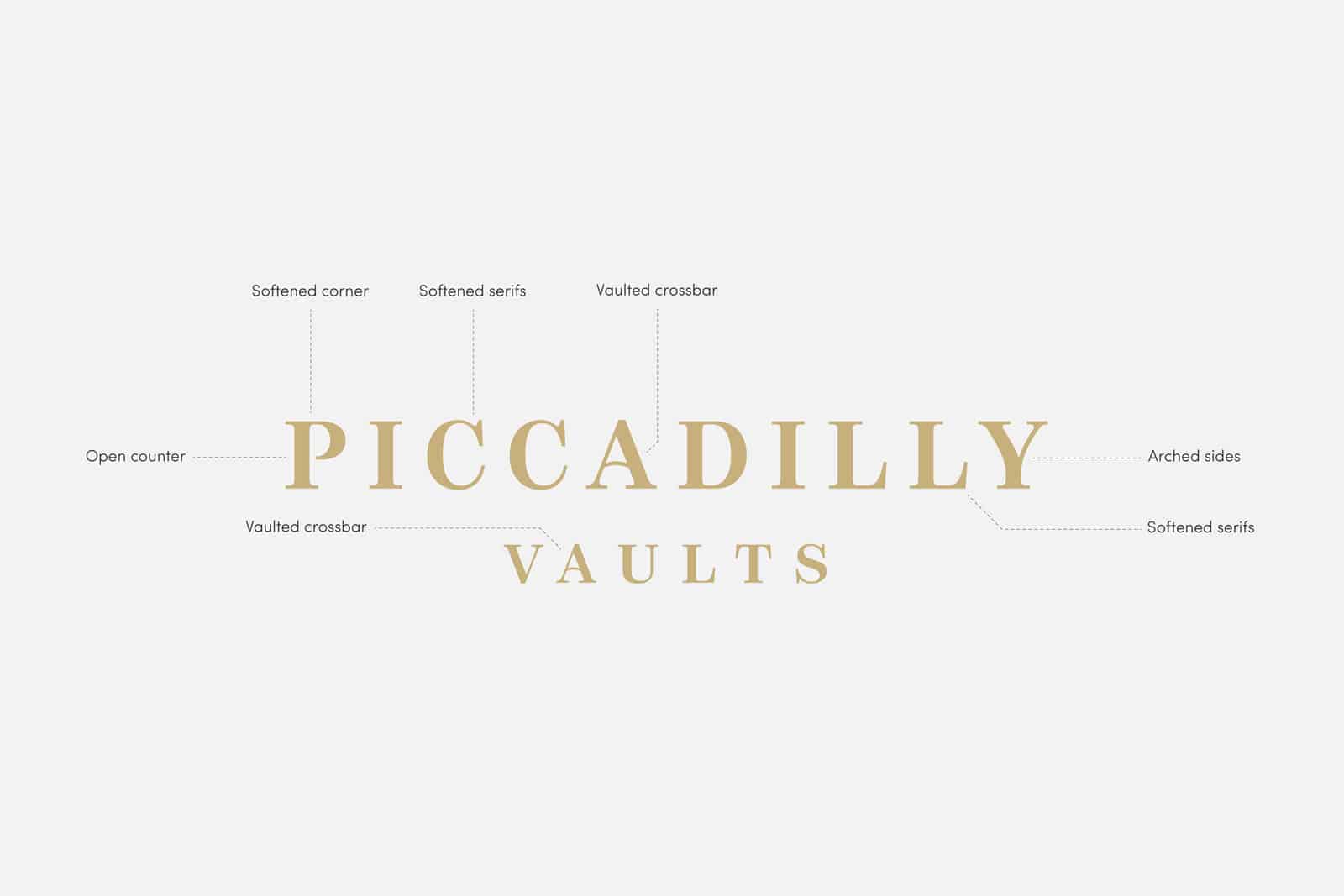
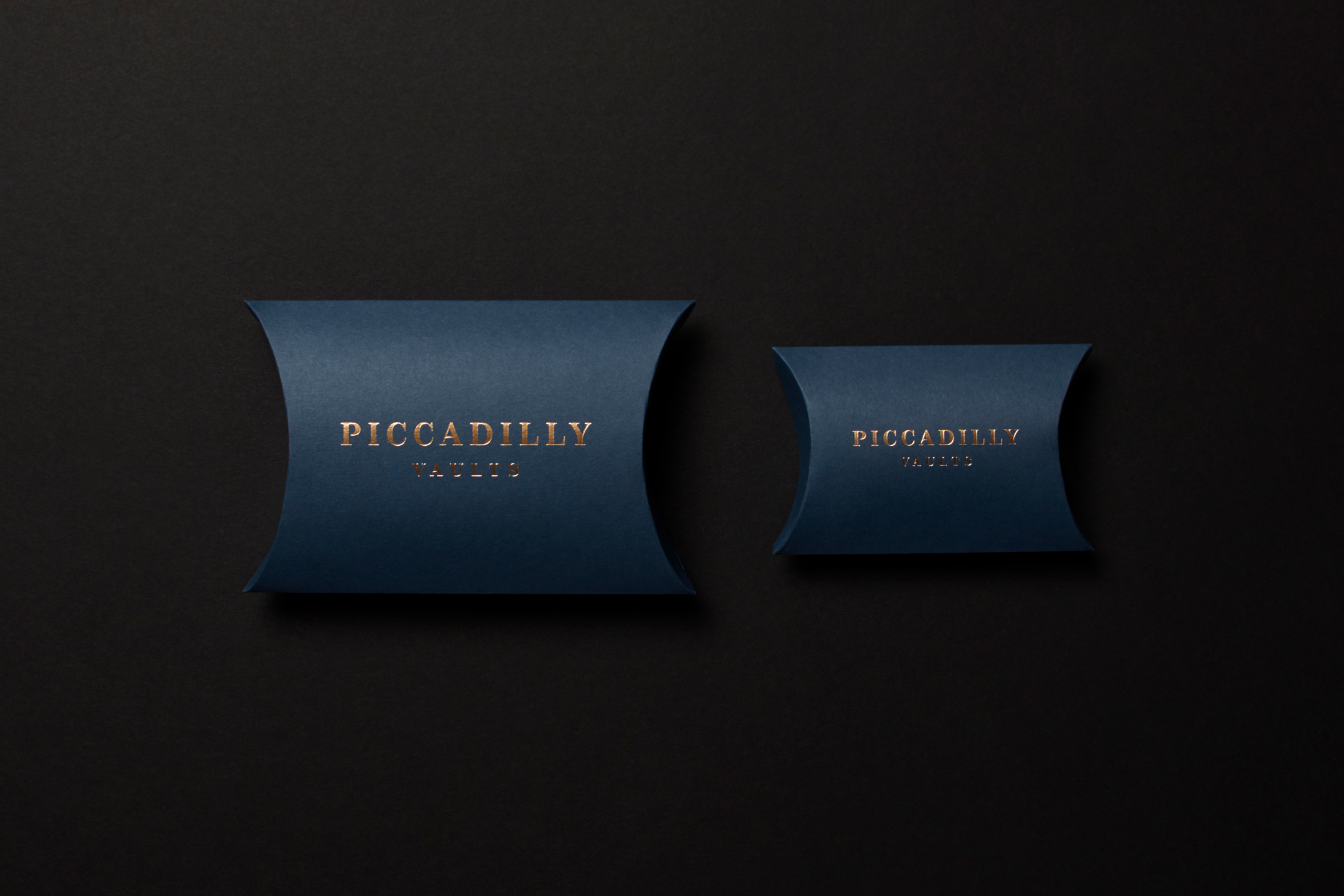
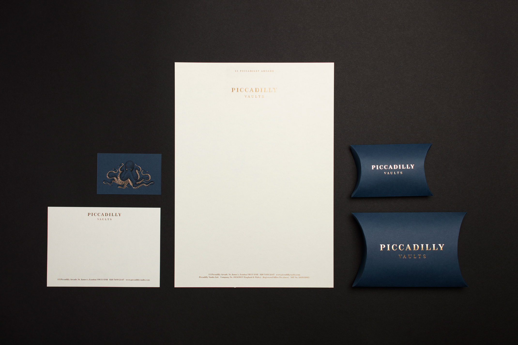
We used a serif typeface for the logo type and typographic treatment throughout the identity. This felt appropriate both as a historical nod to the antique jewellery but also to communicate the premium quality of the brand. In order to create a unique logotype we edited a number of the letterforms to add more character.
Our Approach
We settled on a colour palette of dark inky blue, black and gold quite early on, as it felt both premium and entirely appropriate for the brand. The kraken lent itself to quite a detailed illustrative style, and could be paired with a more classic, but ownable logotype. The combination of the design and print finishes aims to be timeless, premium and luxurious, reflecting the intricate and unique nature of the jewellery pieces.
Illustration
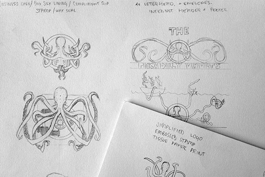
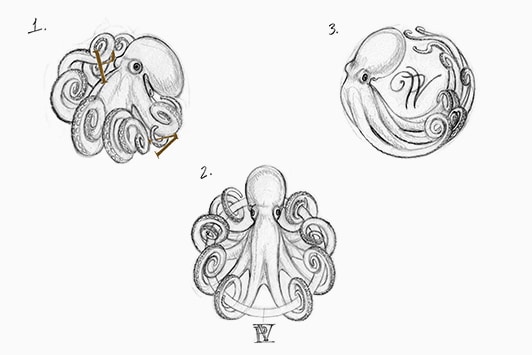
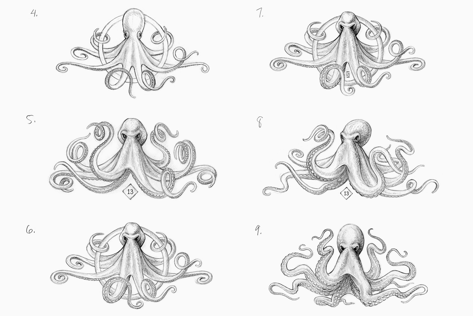
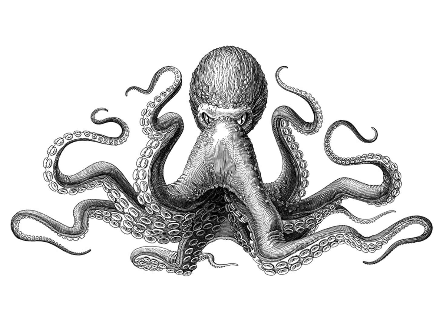
We set about researching illustrators who’s approach and style would be a good fit for the project. We came across Olivia Knapp, an American based illustrator who has a very intricate, cross-hatching style that we loved, and so commissioned her to produce a detailed illustration of the kraken. The process involved many rounds of sketches and refinements to develop the krakens character. The desired illustration would have both menace and beauty about it, whilst appearing to be a centuries old creature lurking in the depths of the ocean.
We hoped to foil the kraken in two colours; black for the body, with gold being used as a highlight for the eyes and the suckers on its underside.
“Thank you so much for the incredible print and foil work you did for us. I’ve produced a lot of things over the years and never to this quality; it really is stunning. It’s so rare that something is even better than hoped for, which this certainly was.”
Simon MacLachian, Owner and Founder – Piccadilly Vaults