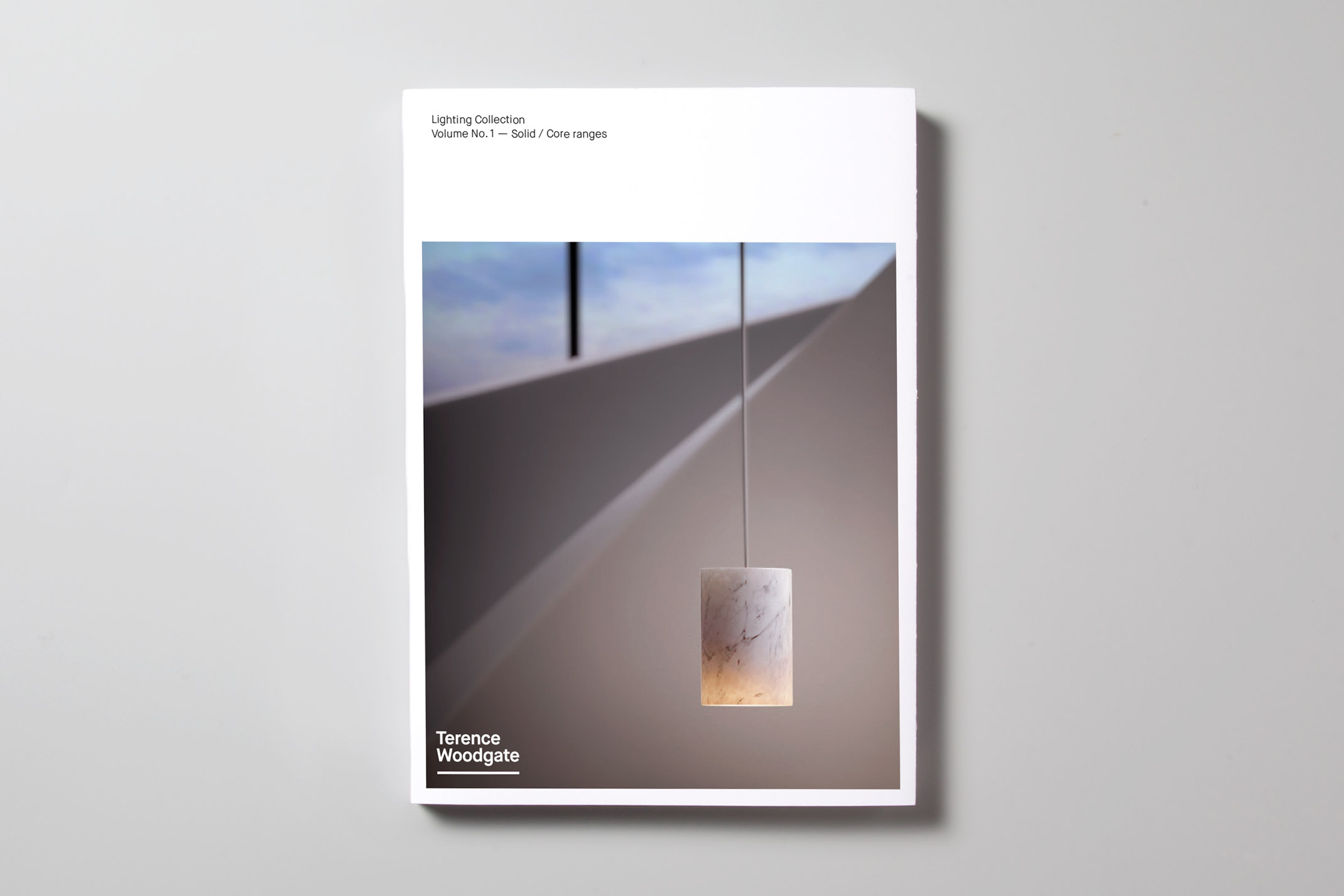
Terence Woodgate — Identity
Digital Identity Packaging Print
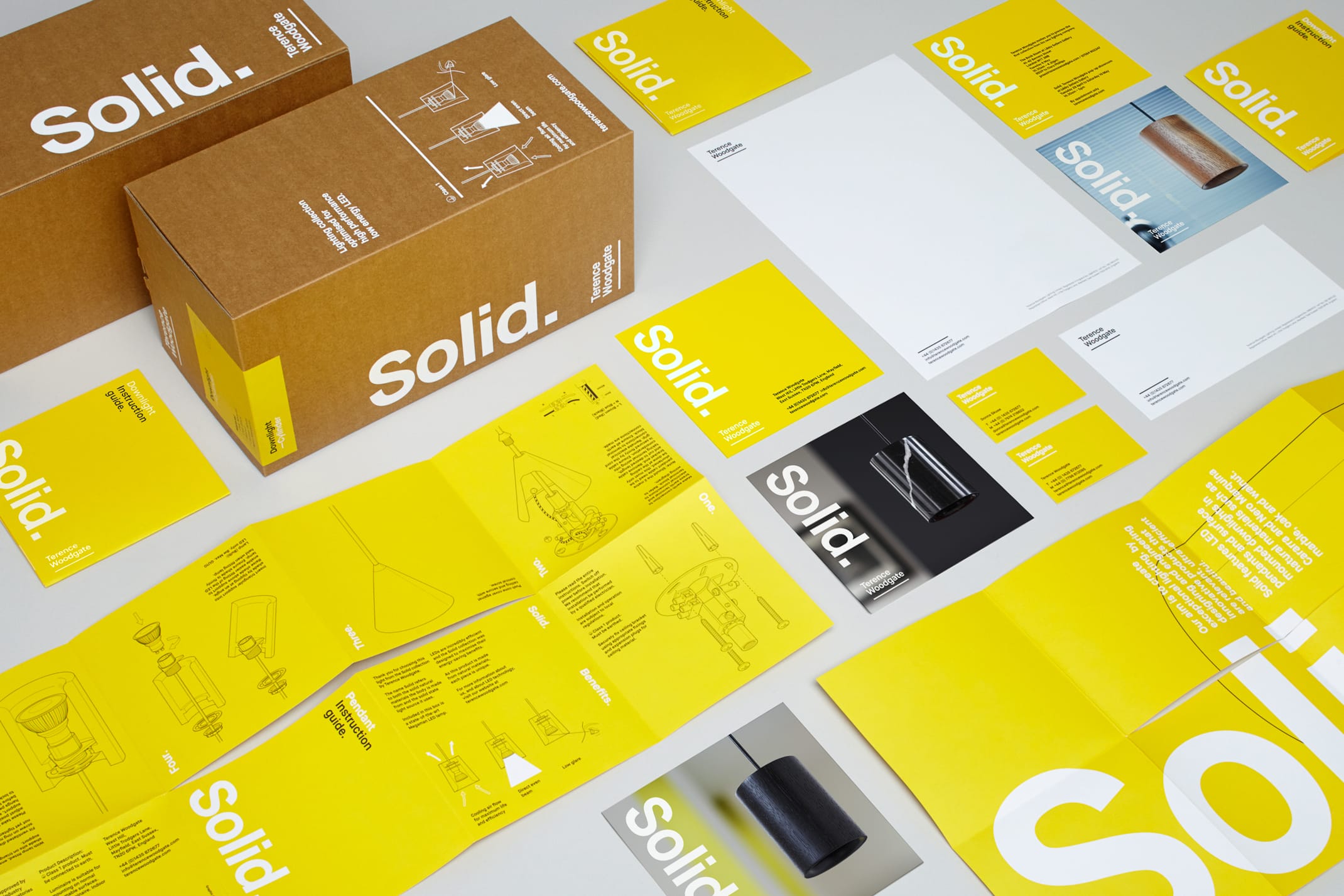
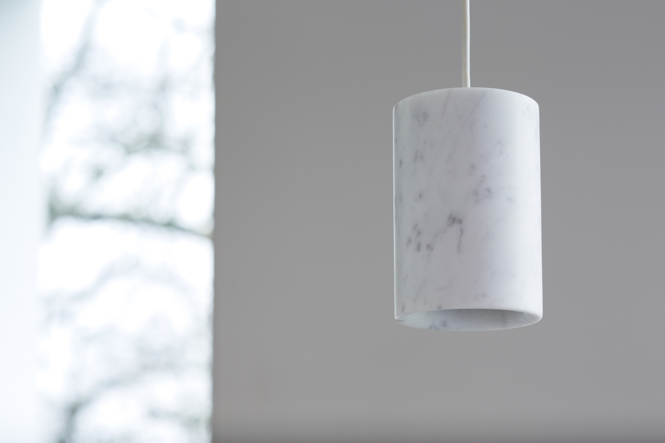
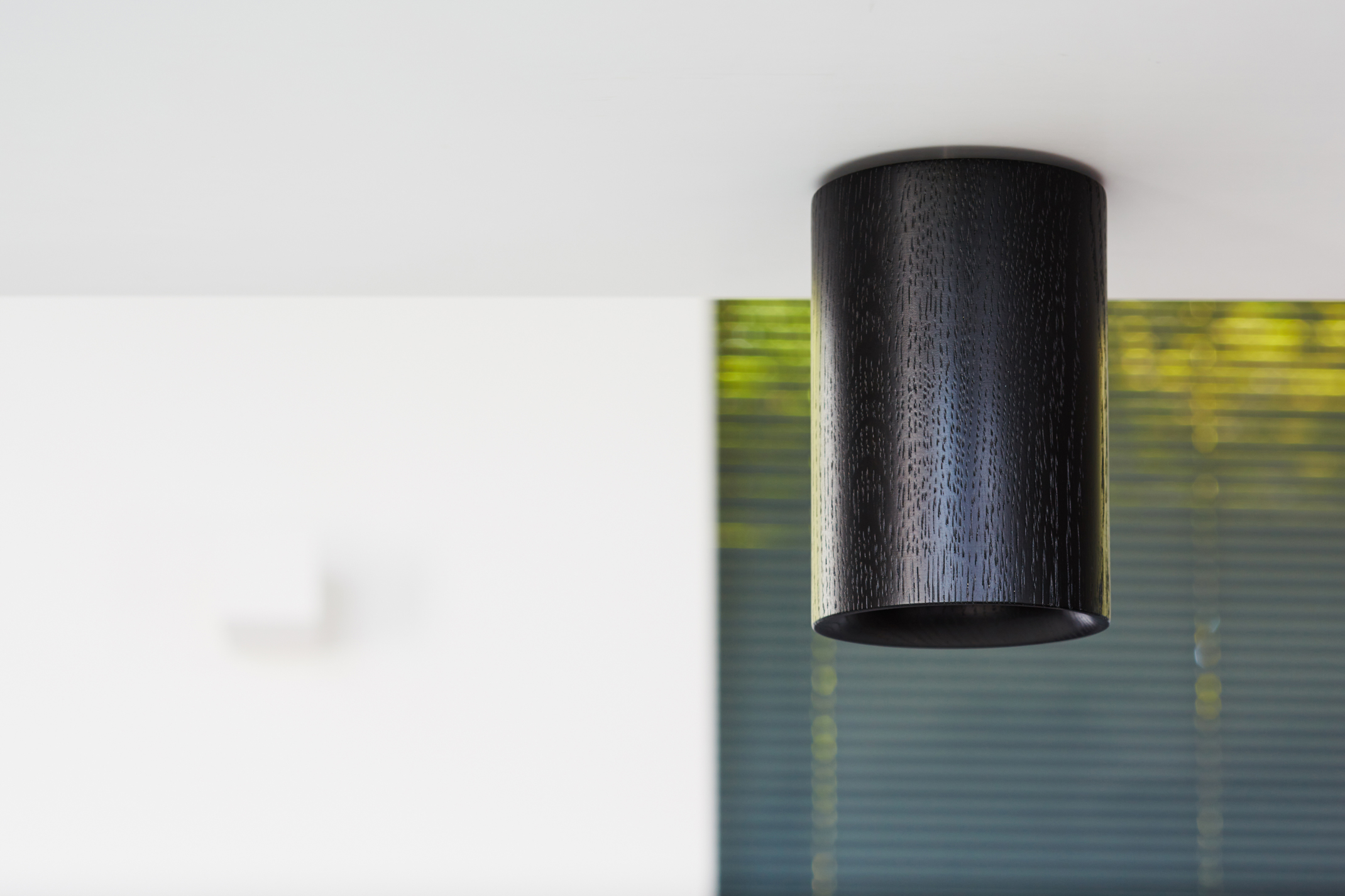
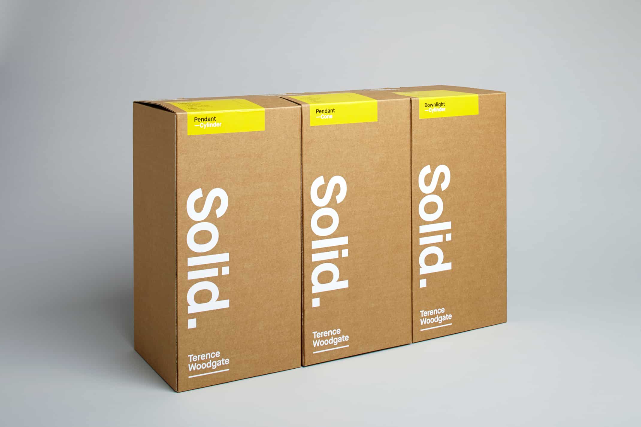
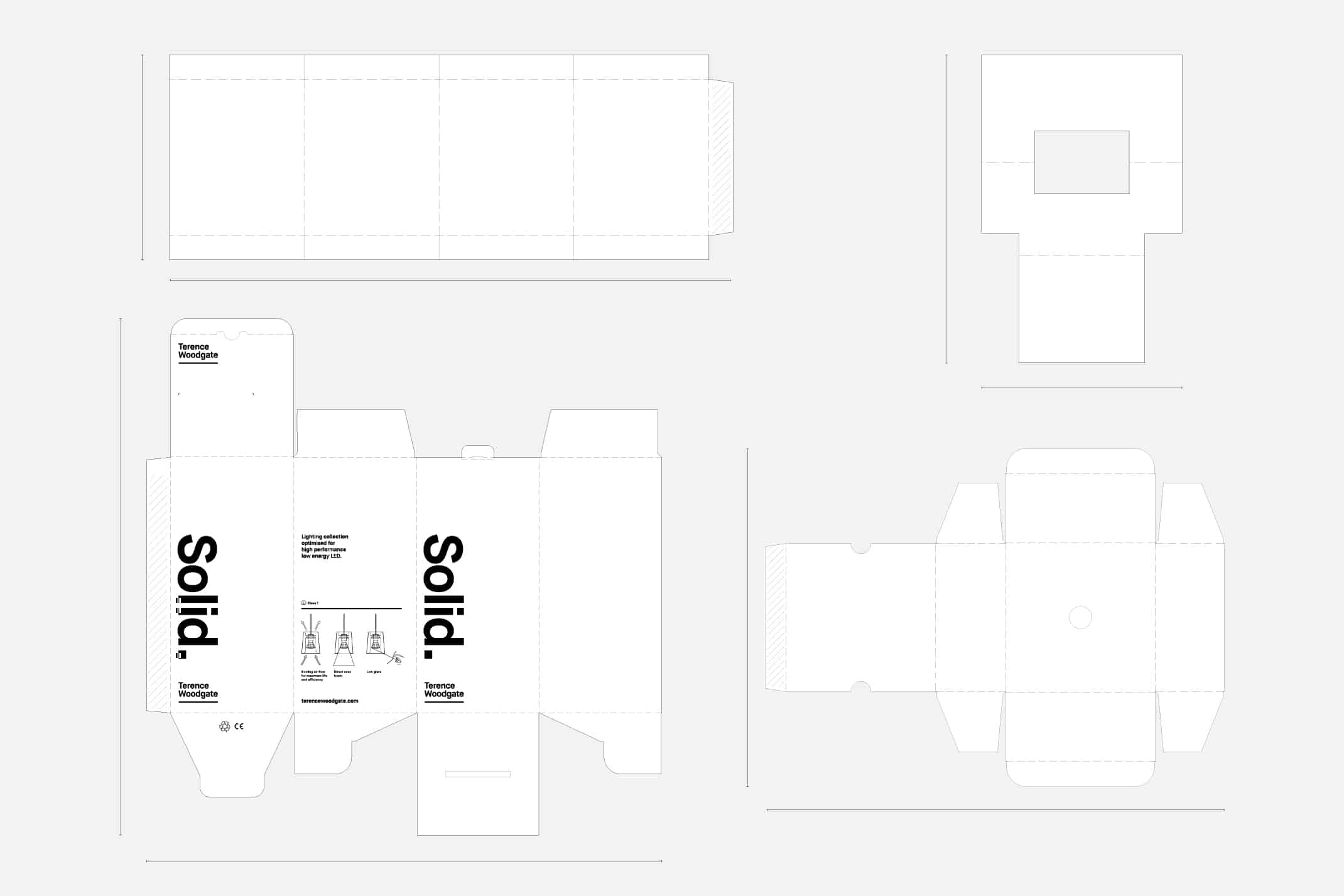
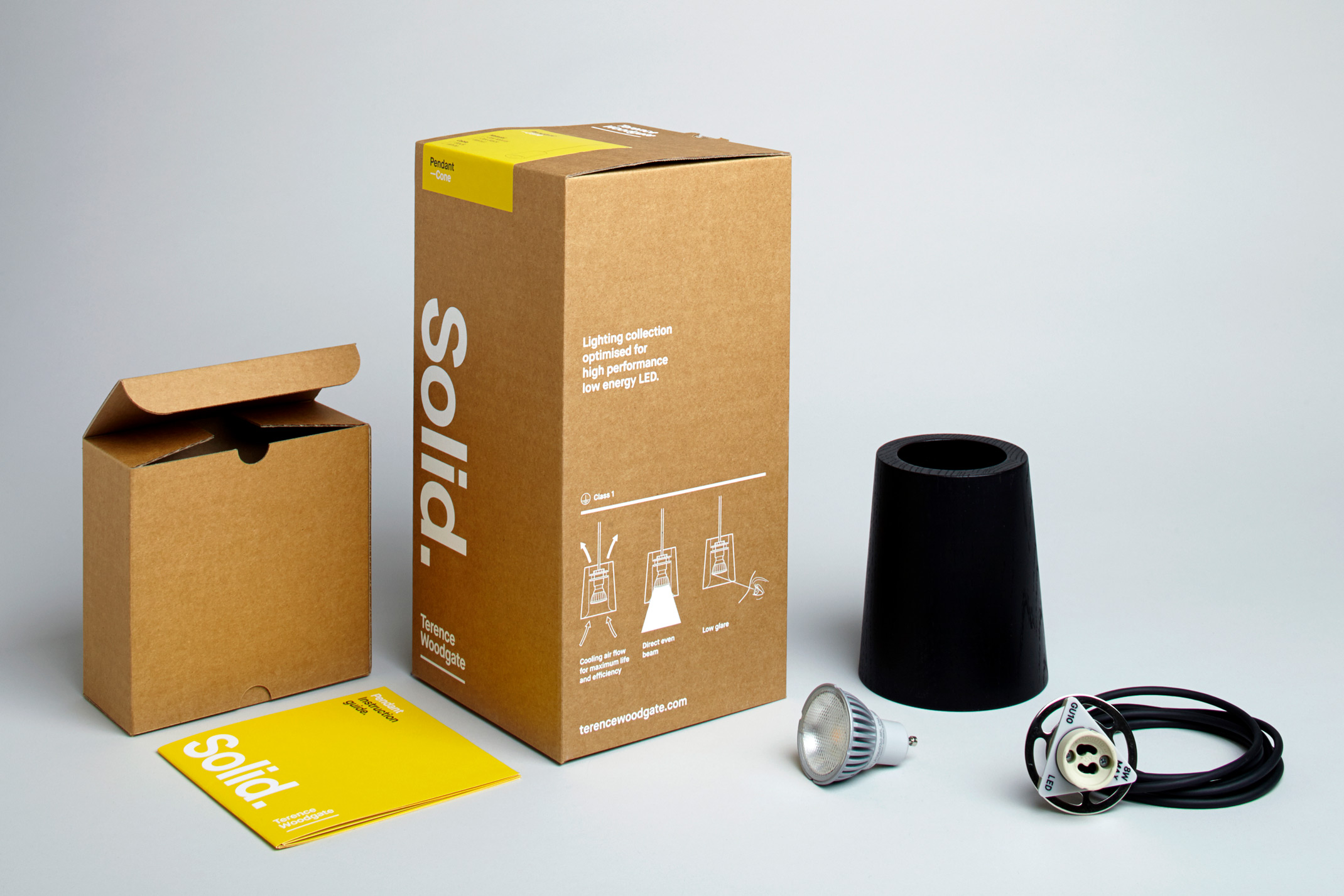
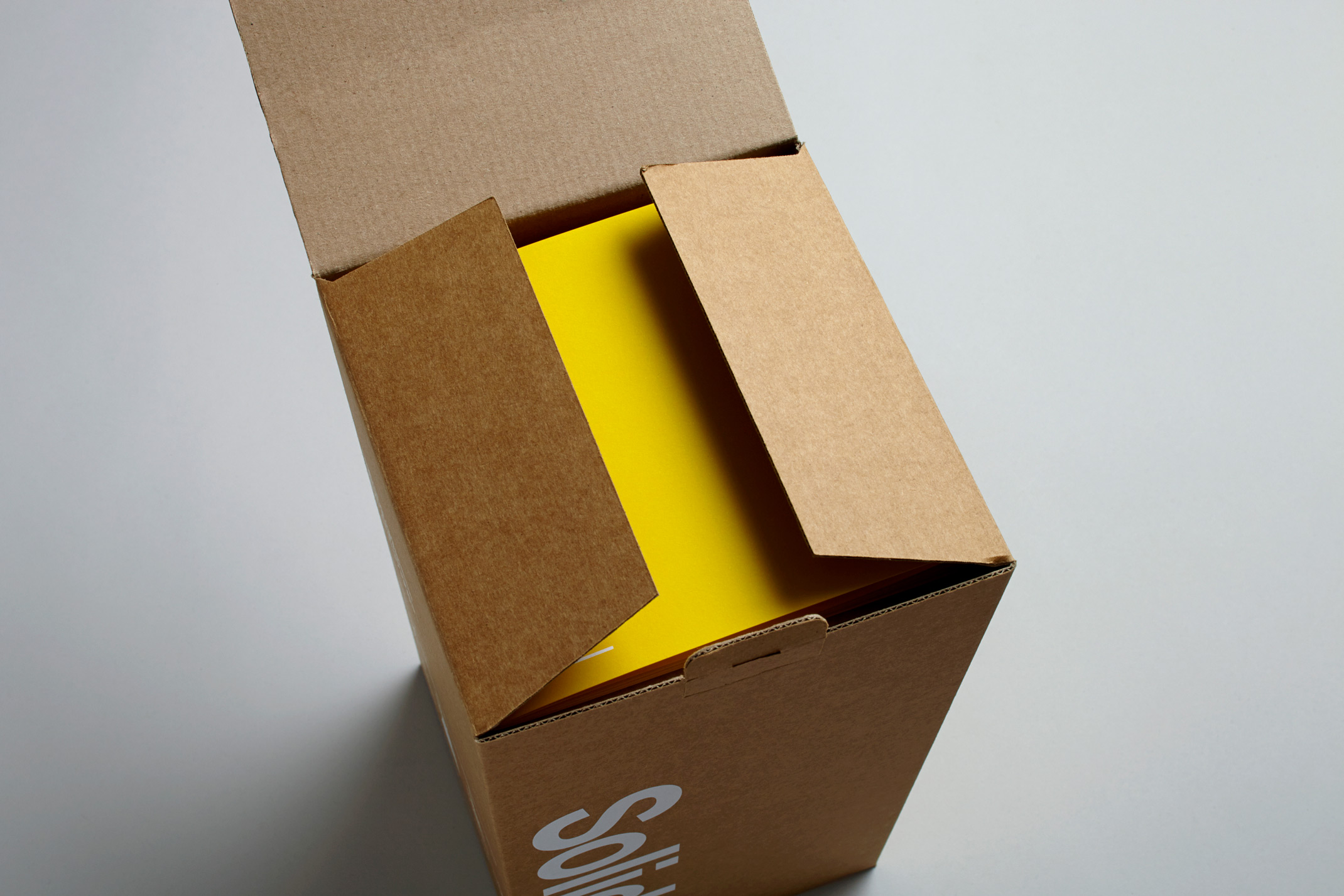
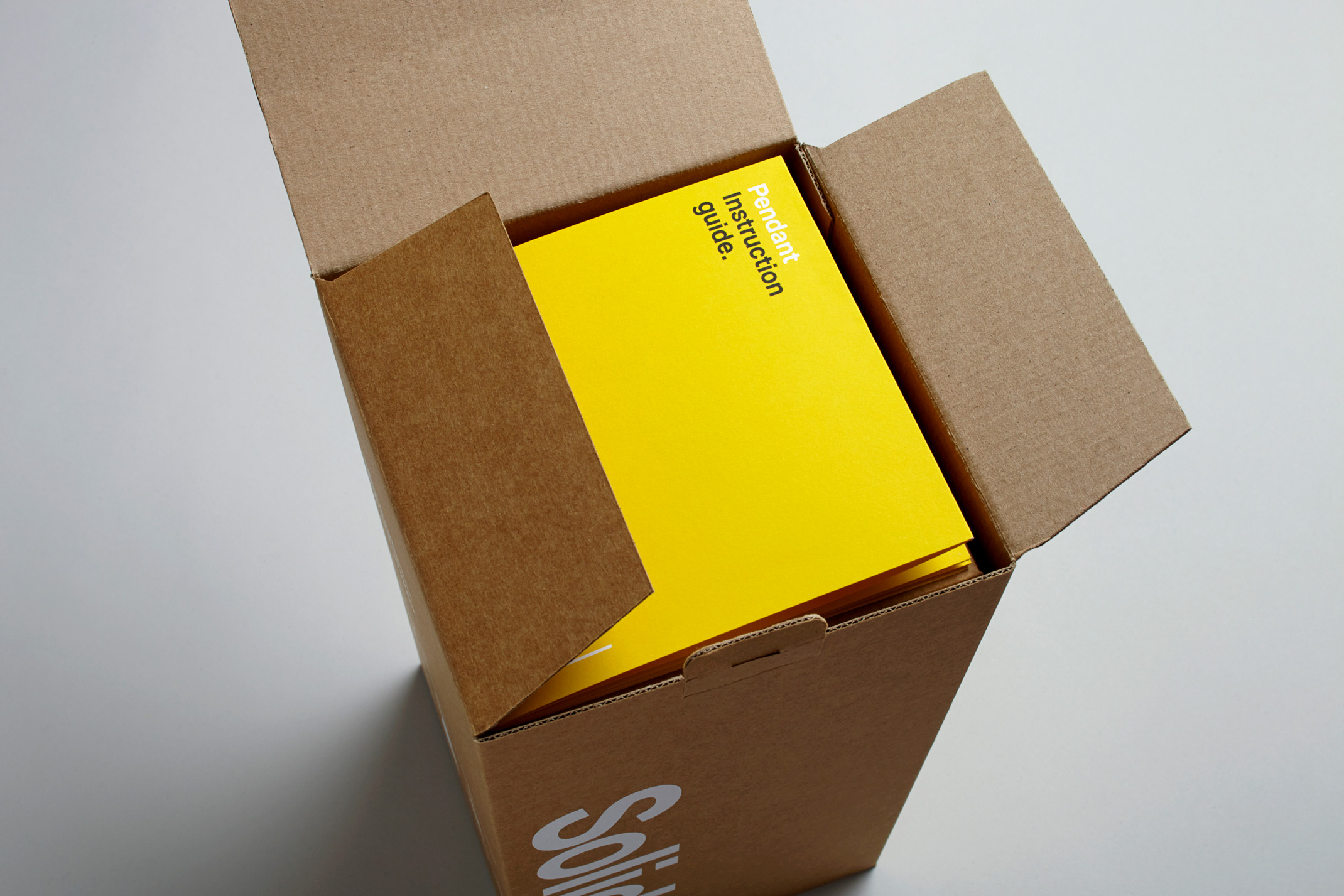
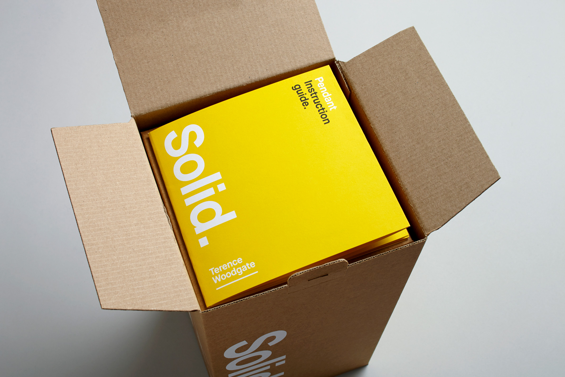
Founded by industrial designer Terence Woodgate in 2014, the lighting company designs and manufactures lighting collections that fully optimise the benefits of LED technology. As part of the overall identity we designed many printed items including the manuals and fitting instructions for their first range. We developed a packaging system, where the same outer box could be used with differing internal fittings to accommodate the different lights. A sticker system was then used to highlight the particular light within.
The Client
Founded by industrial designer Terence Woodgate in 2014, the lighting company designs and manufactures lighting collections that fully optimise the benefits of LED technology.
The Brief
This design-led company challenged us to create a flexible identity and apply it to packaging, instruction manuals, printed material and a website. As a fledgling start-up the identity needed to be contemporary and high-end with room to grow in line with future product launches.
Creating an Identity
With future product ranges in mind, we took a typographic approach to the identity, using the recently designed typeface Maison Neue. This ensured the resulting look was contemporary, flexible and easily applied in new contexts. Subtle references to the lighting were made with the use of colour and vertically positioned typography. We also used Kraft for the packaging, referencing the beautiful and raw materials which run through the lighting products.


Structural design
Much time and testing was spent on developing a packaging system where the same outer box could be used with differing internal fittings to accommodate the different lights. As a singular box design was used for the various lights, we used a sticker system which encompassed four different stickers. Each sticker could be marked to signify the different finishes as well as being used as a device to seal the box. The sticker also showed the information on two faces, depending how the box was displayed on the shelf.
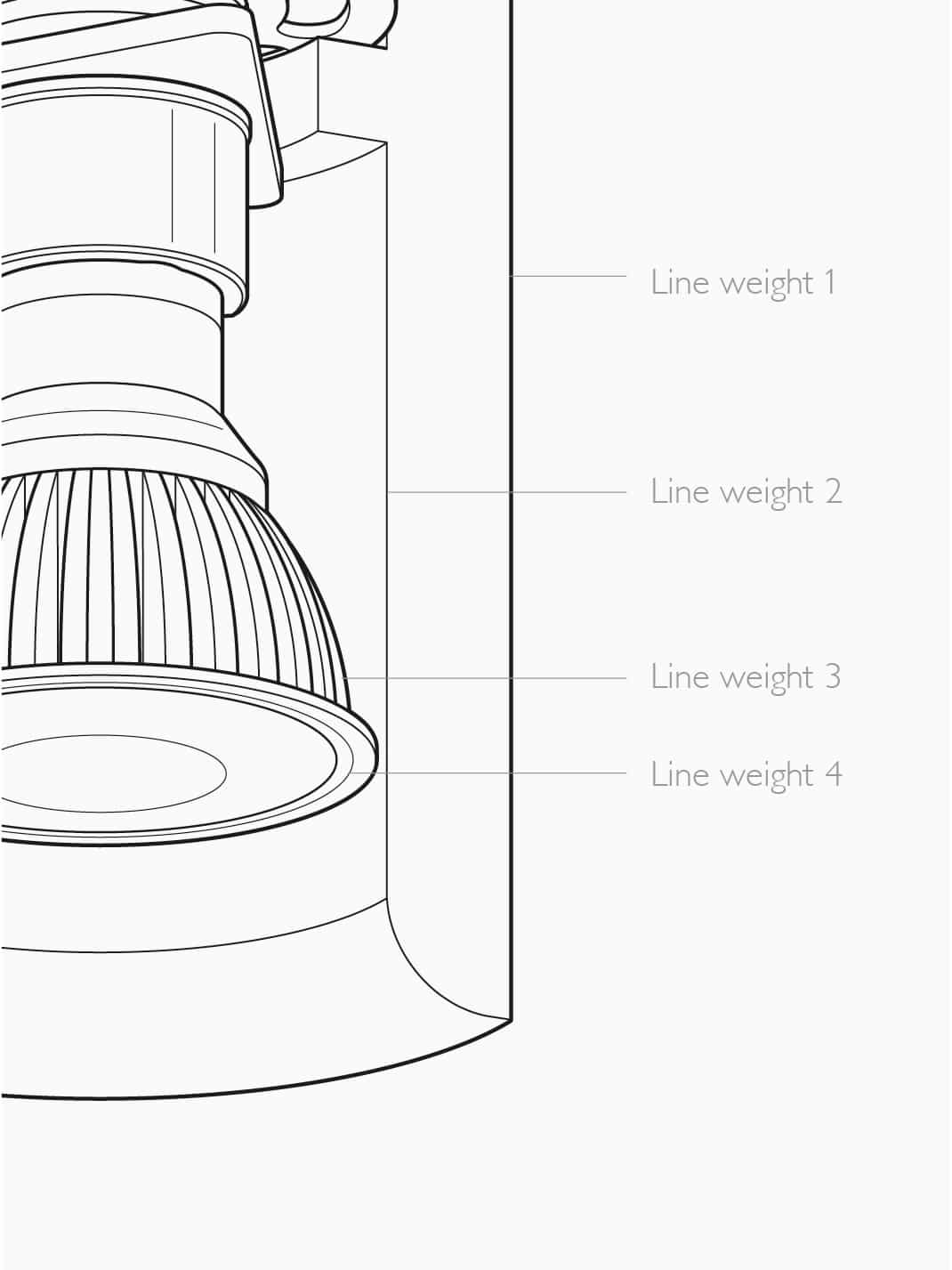
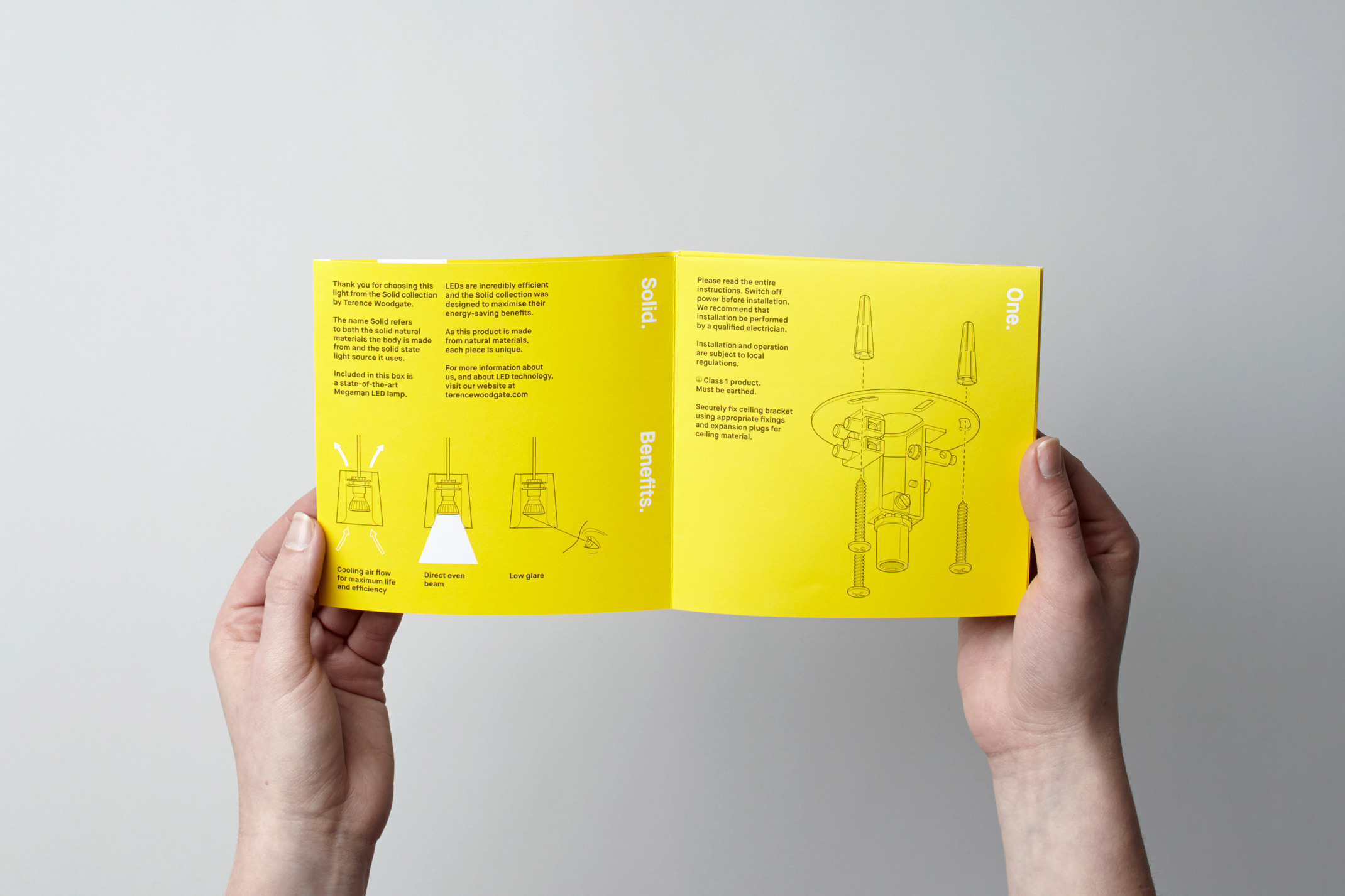
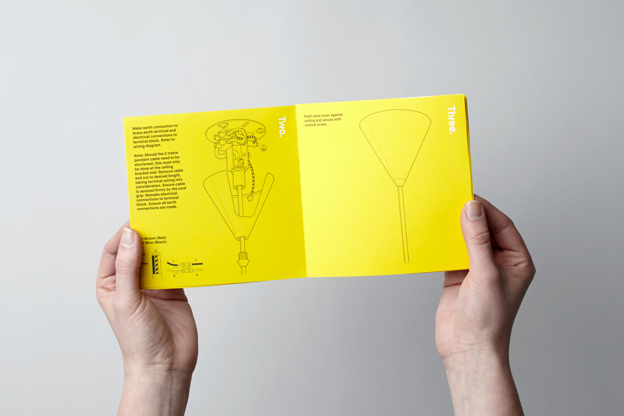
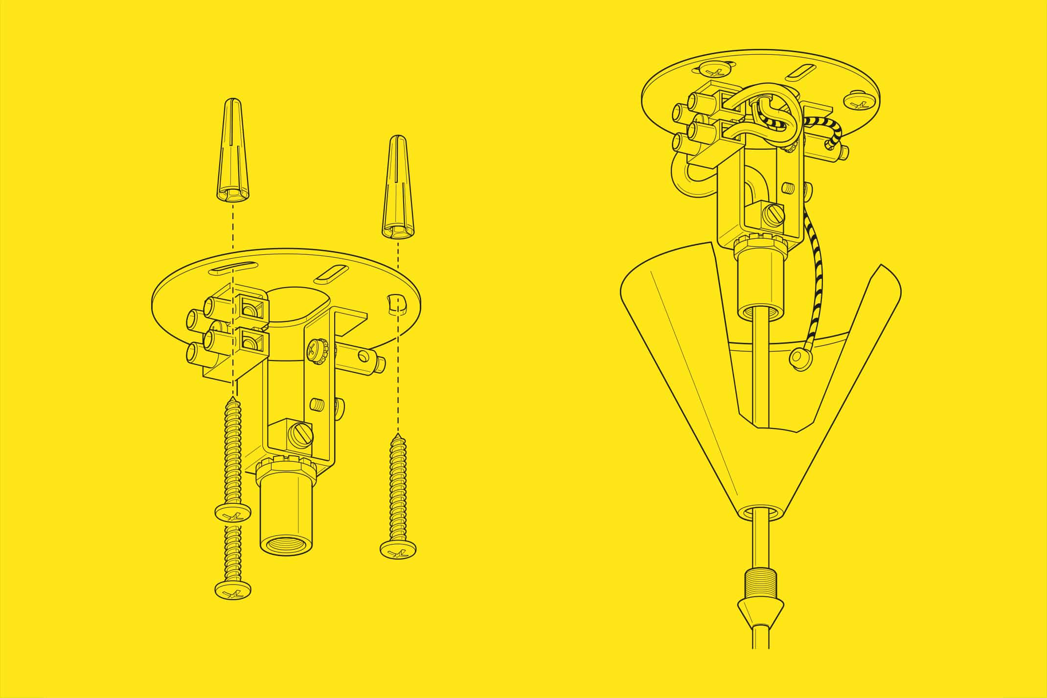
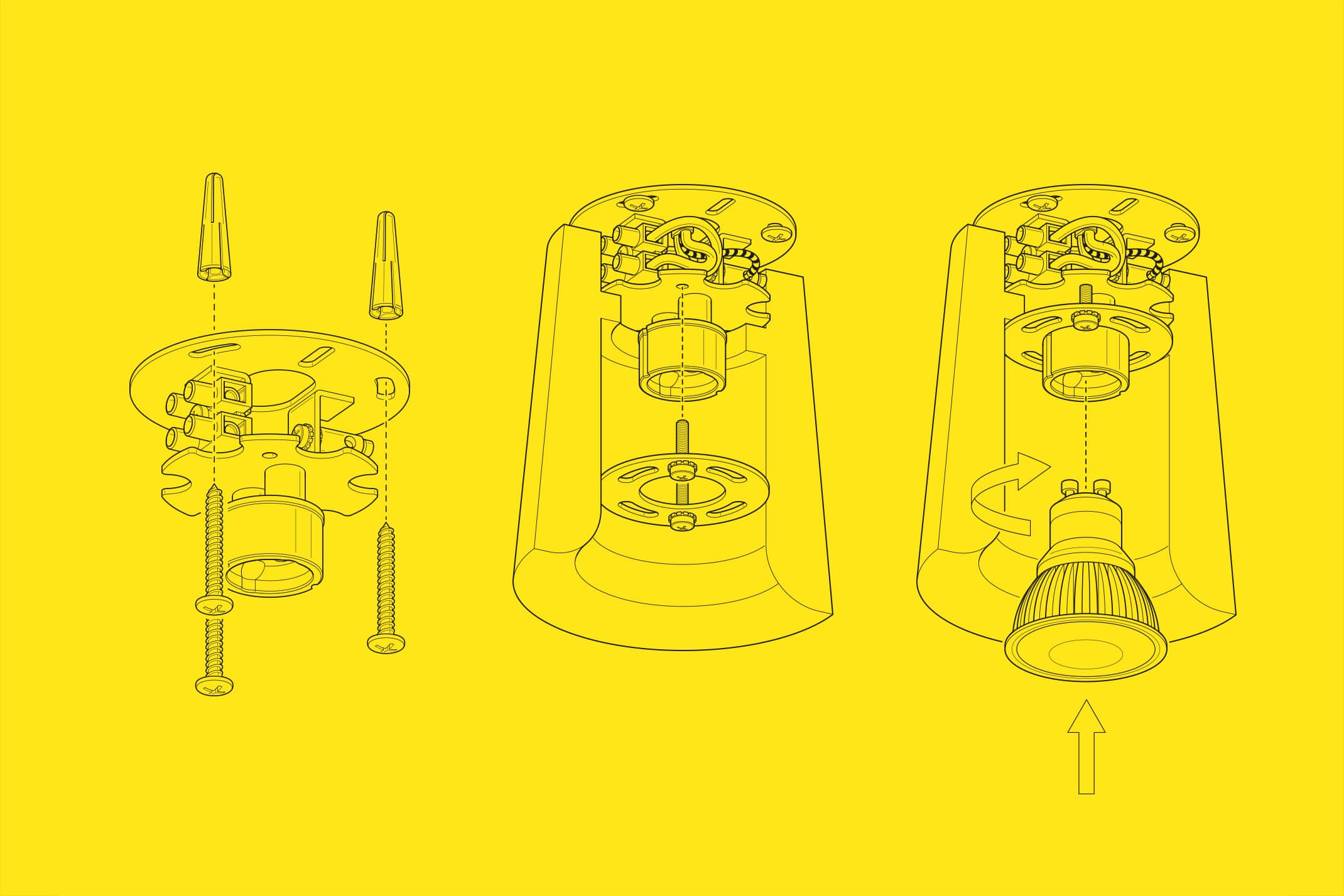
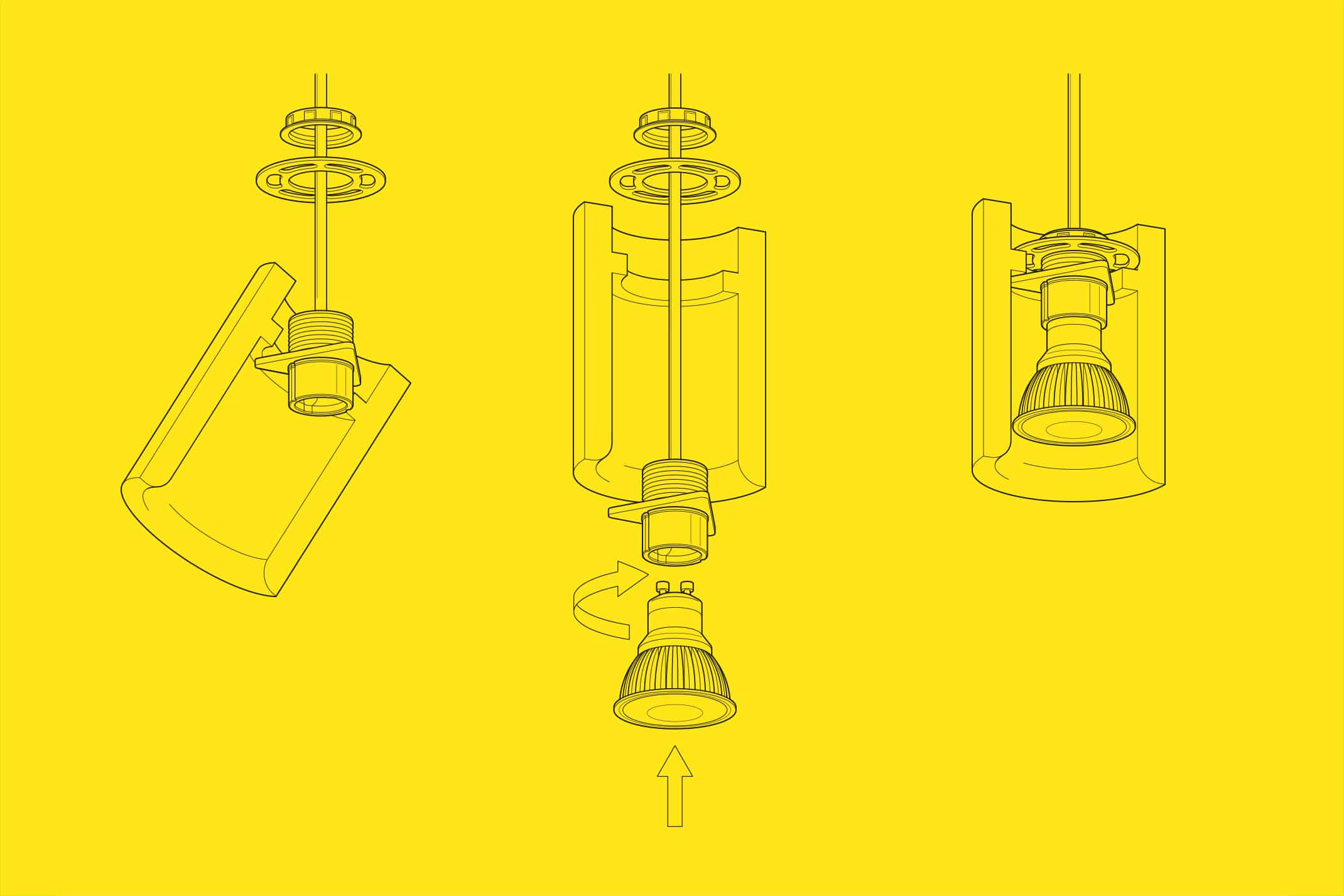
Technical illustrations
Working closely with the illustrator John See we commissioned illustrations which would form the majority of imagery within the identity. The illustration needed to be highly informative as well as decorative so that they could be used within the lighting instruction manuals. A system of different line weights were applied to the illustrations to unify them at different sizes and across multiple applications.
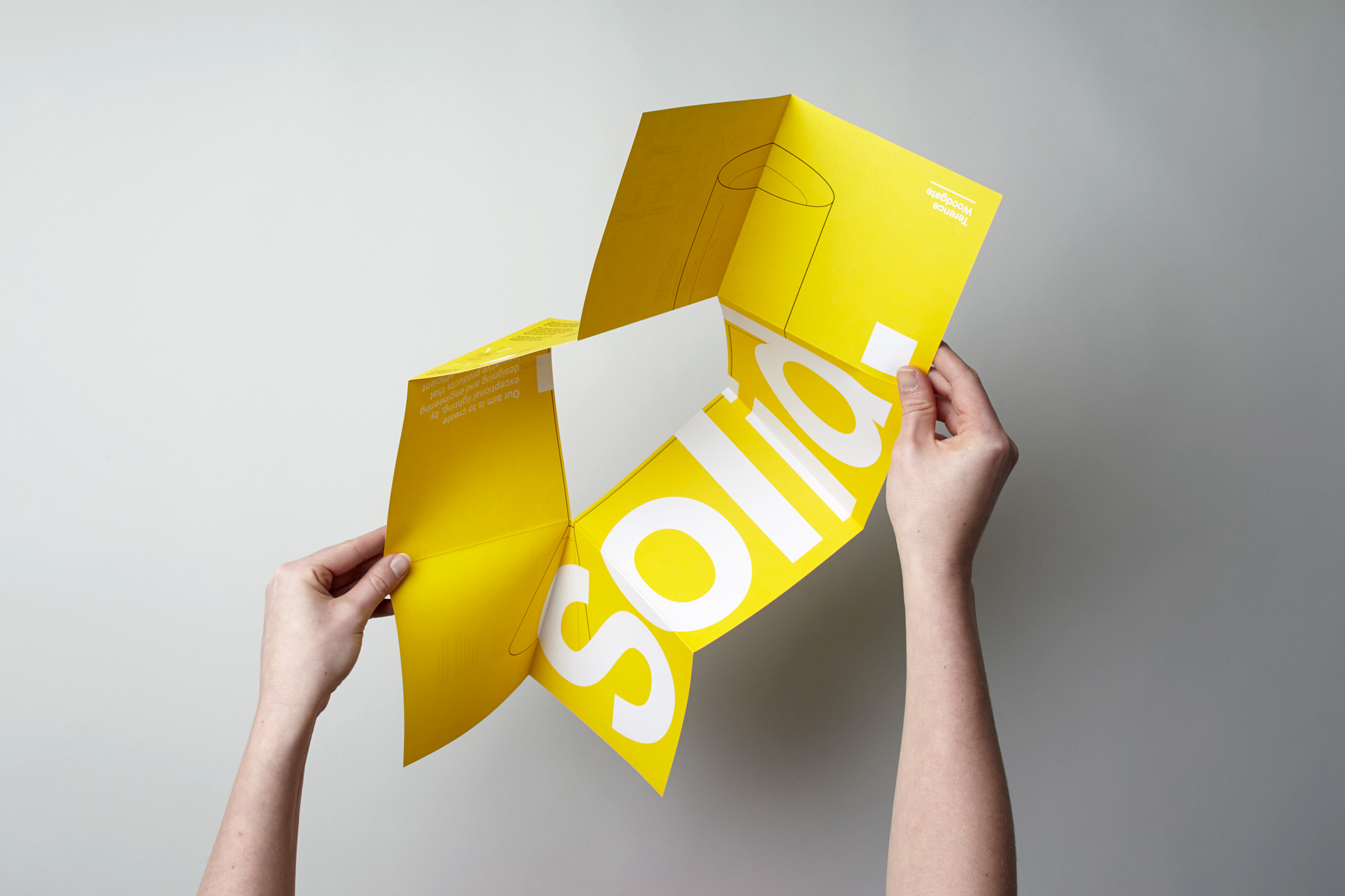
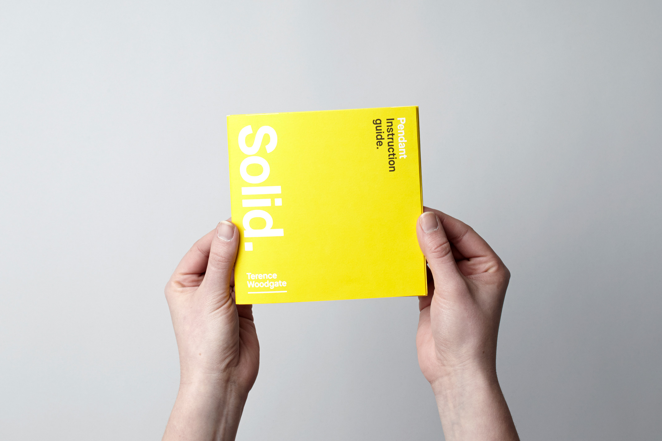
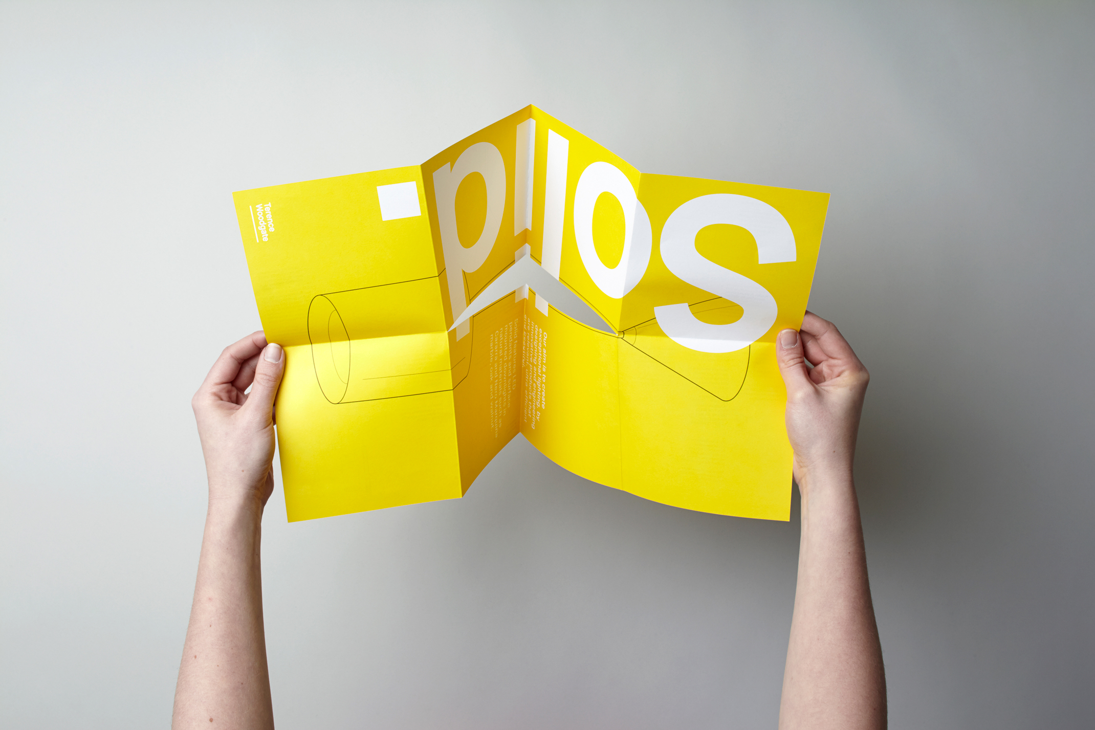
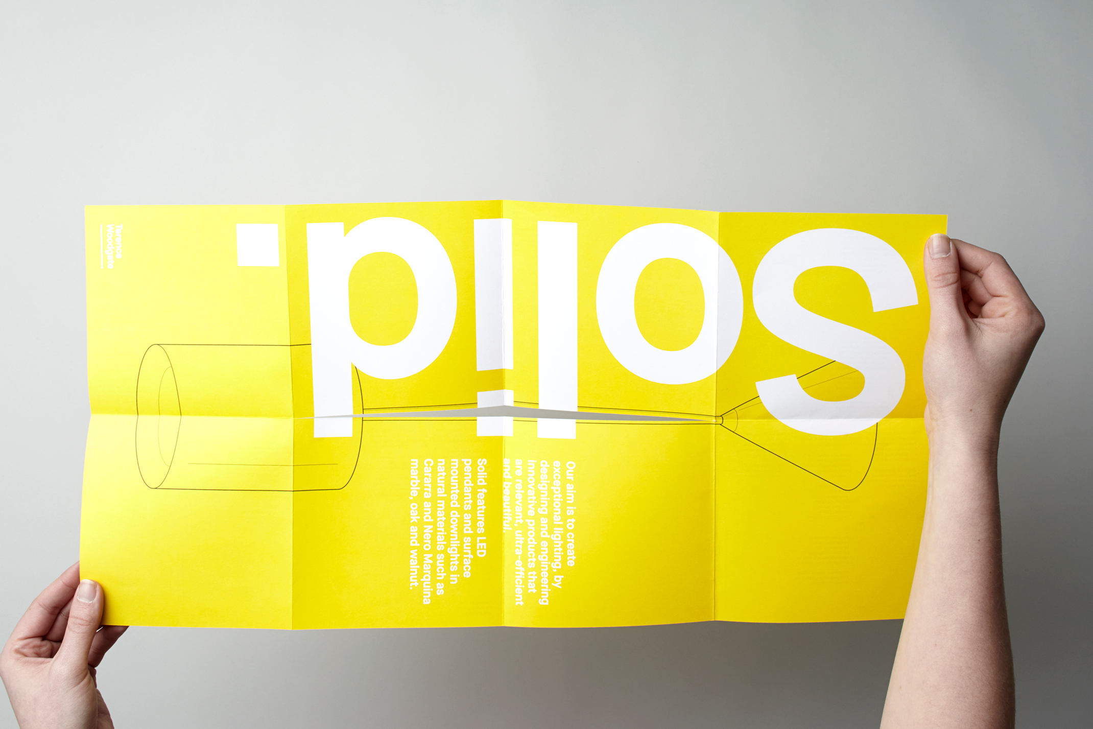
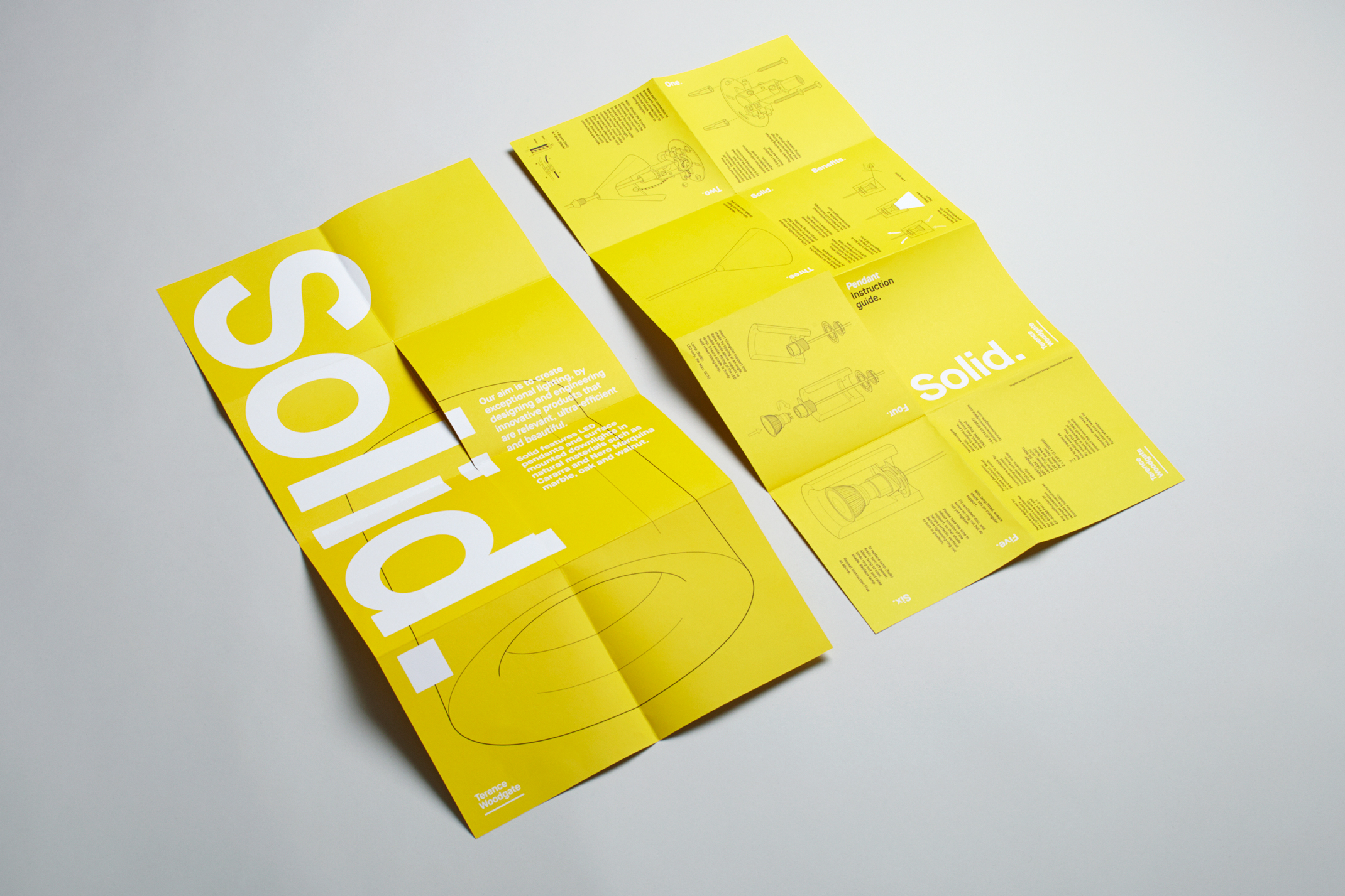
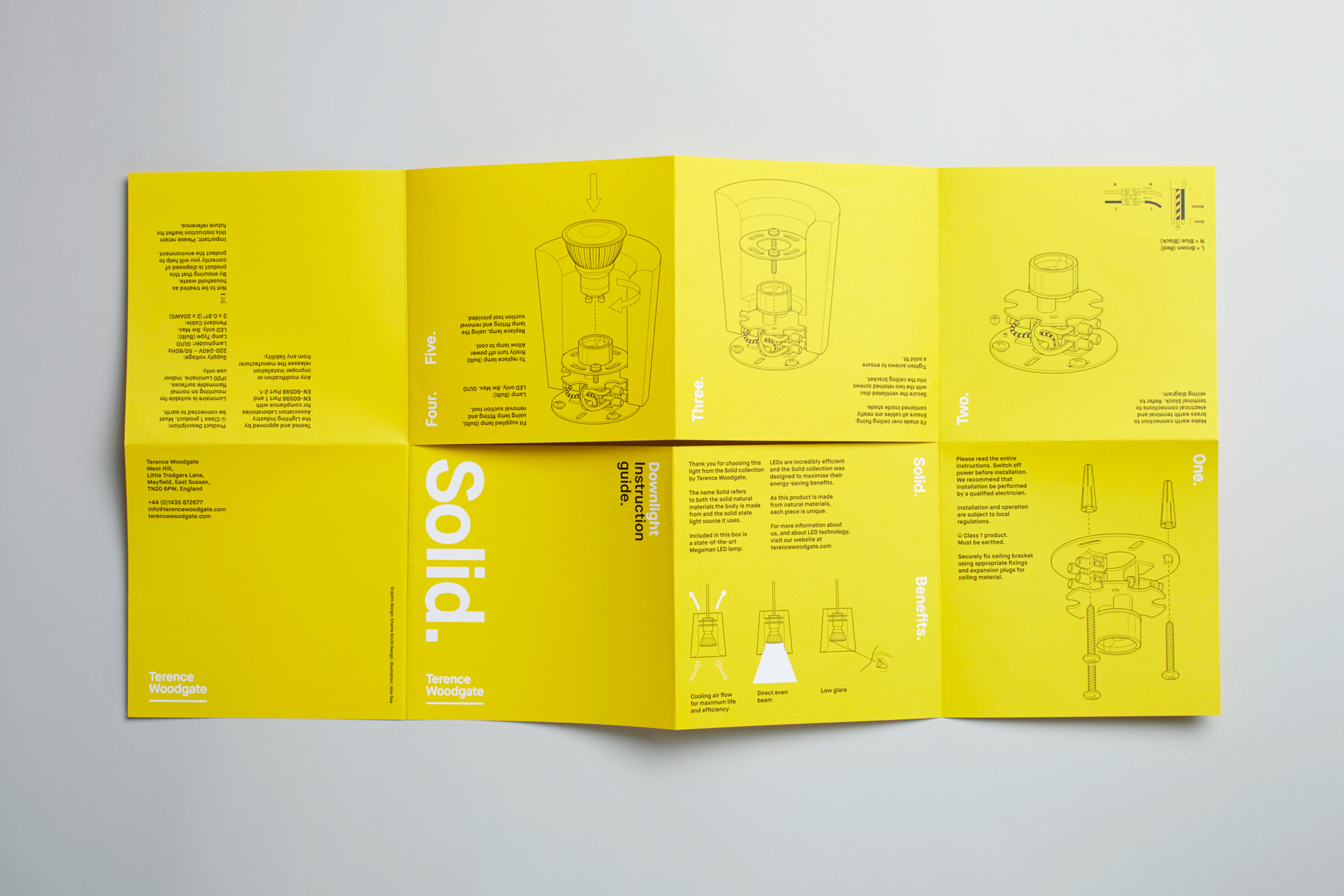
Instruction manuals
All elements of the identity culminated in a clean and contemporary aesthetic which we applied to all touch points including the instruction manual which accompanied each product. Rather than being a purely-practical afterthought, this is a considered and well-executed piece which is positioned as the first thing you see when you open each box. A uni folding technique meant the instructions become more of a ‘poster’ making full use of the illustrations. Using the illustrations at this scale allowed us to emphasise the incredible work and attention to detail that goes into the products.

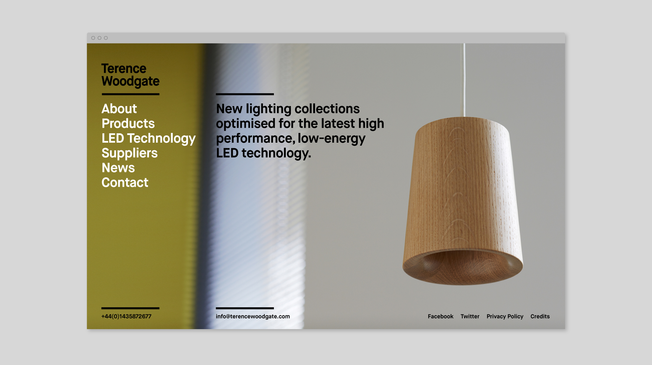
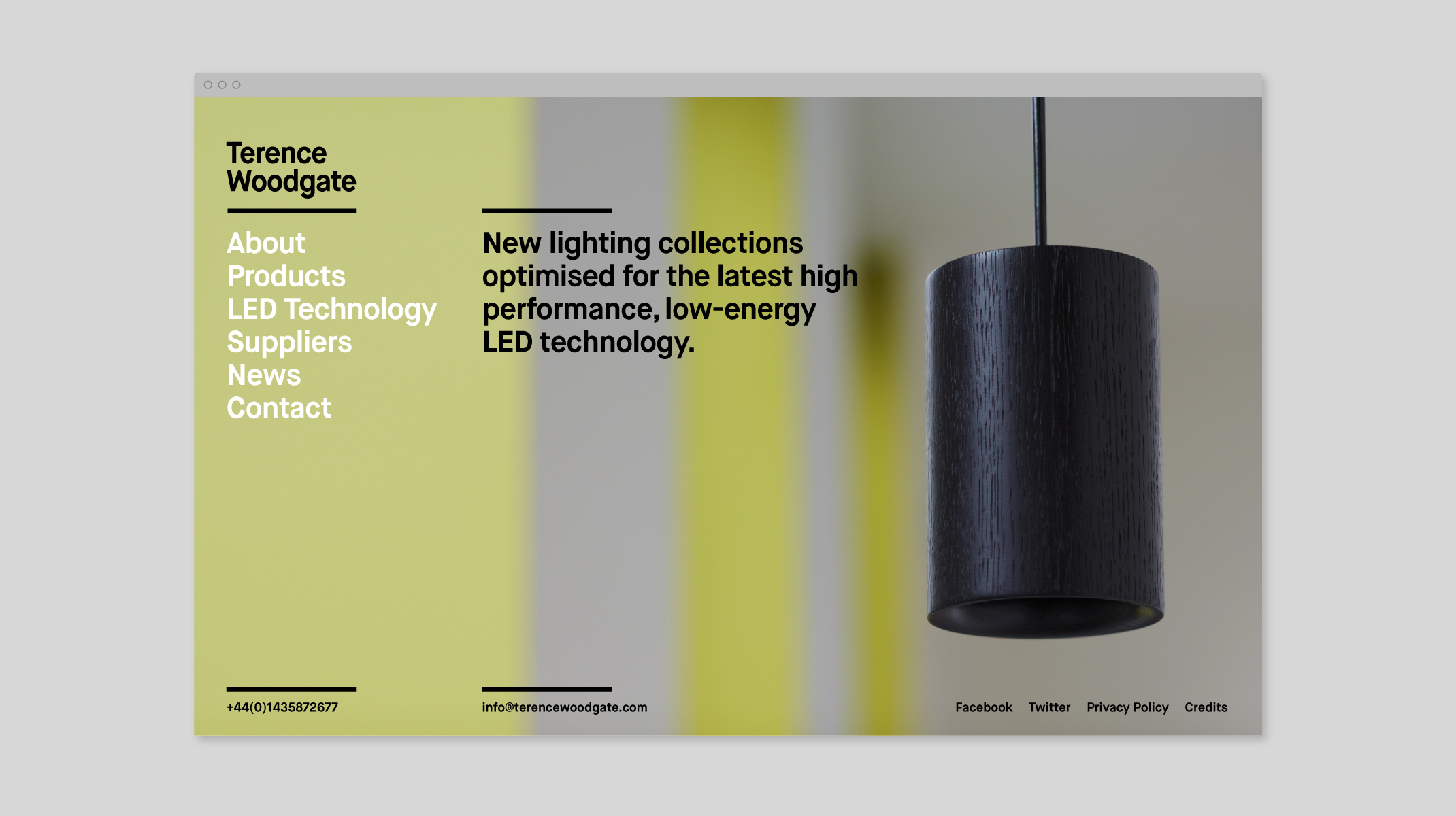
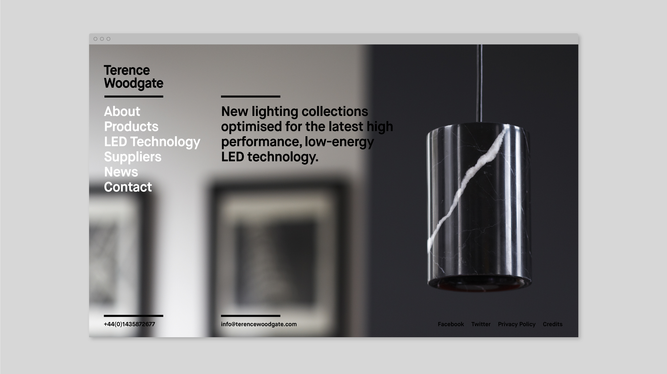
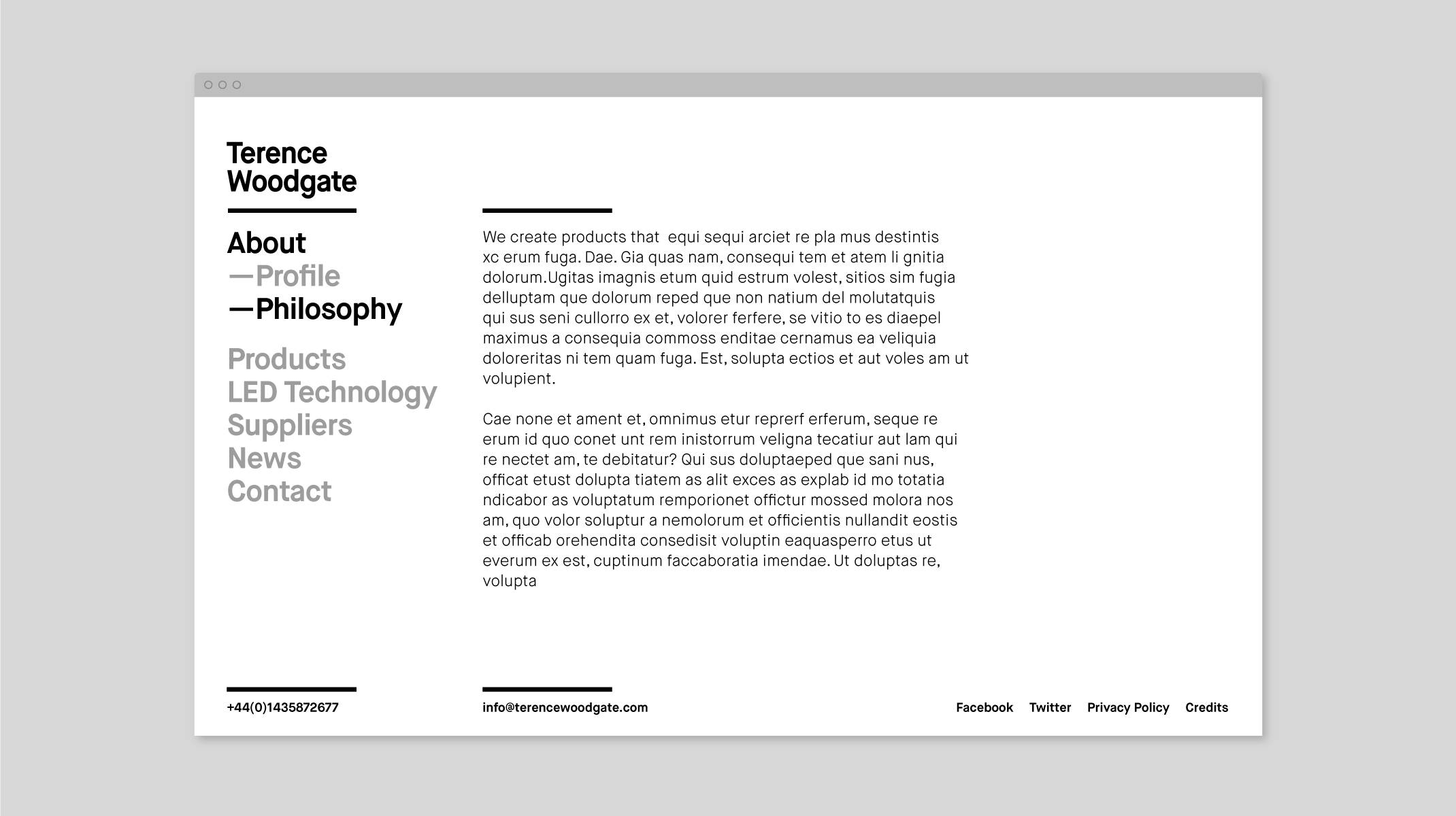
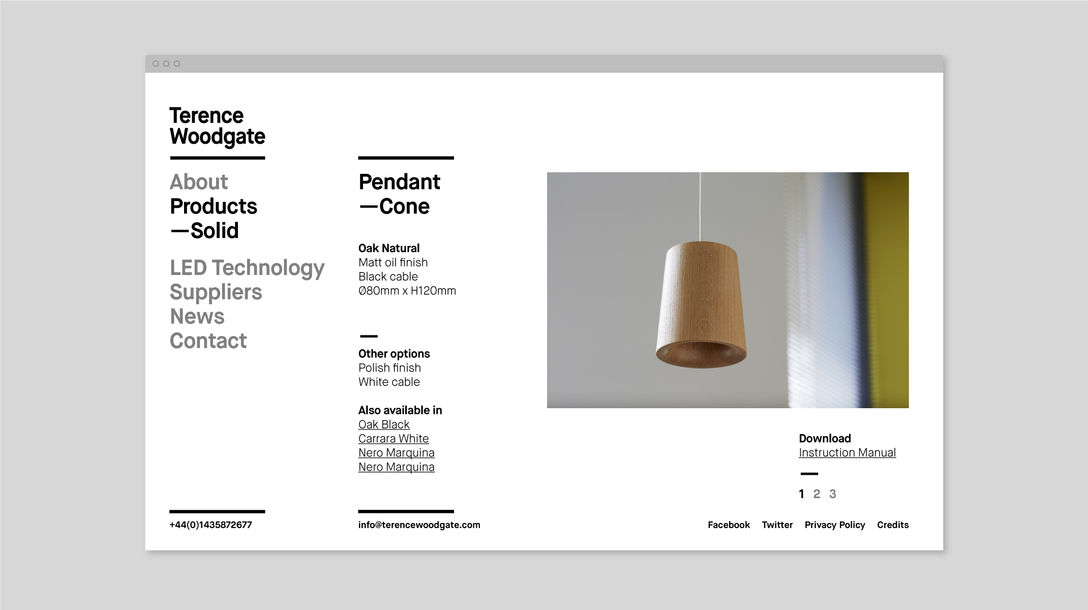
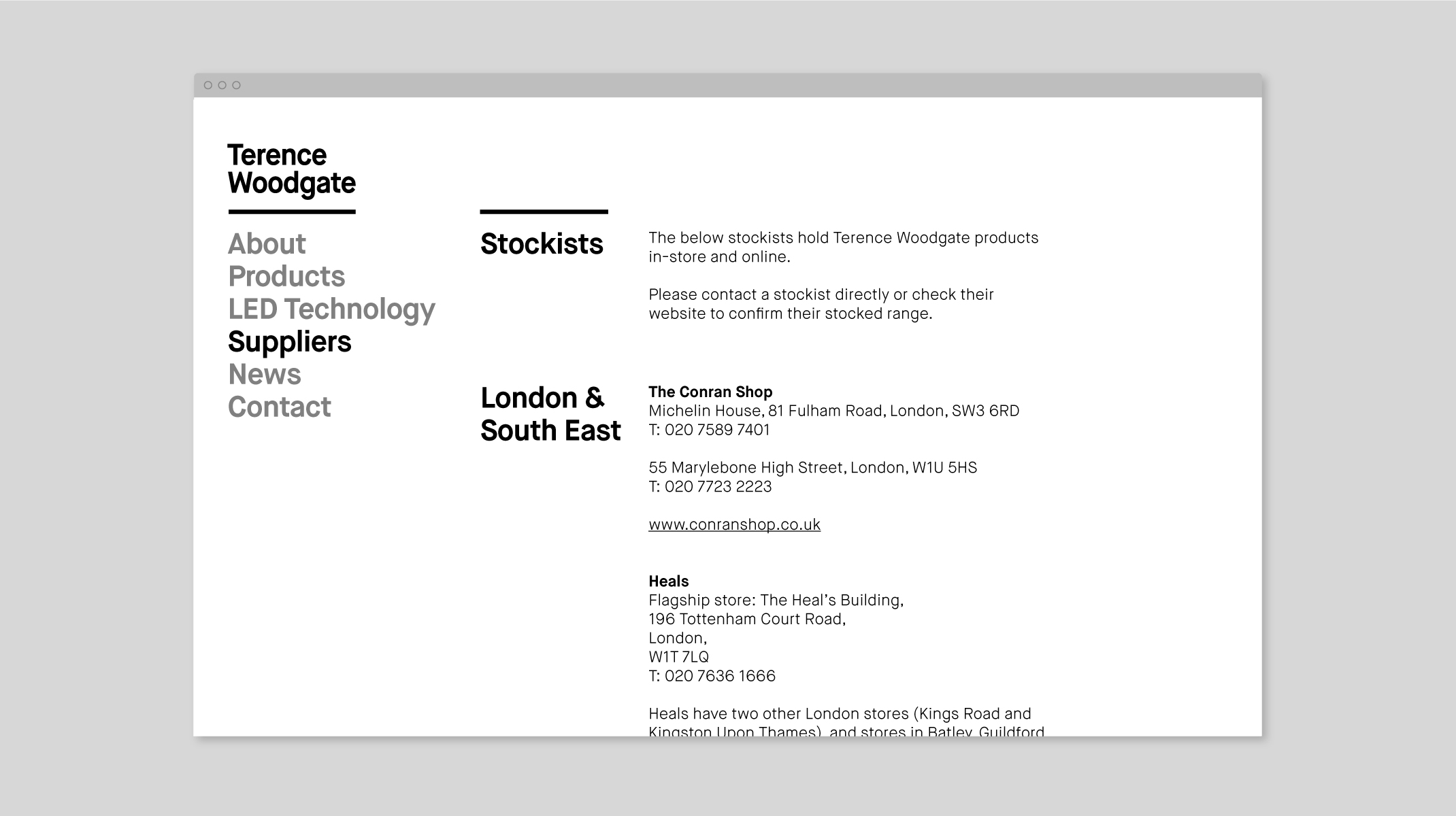
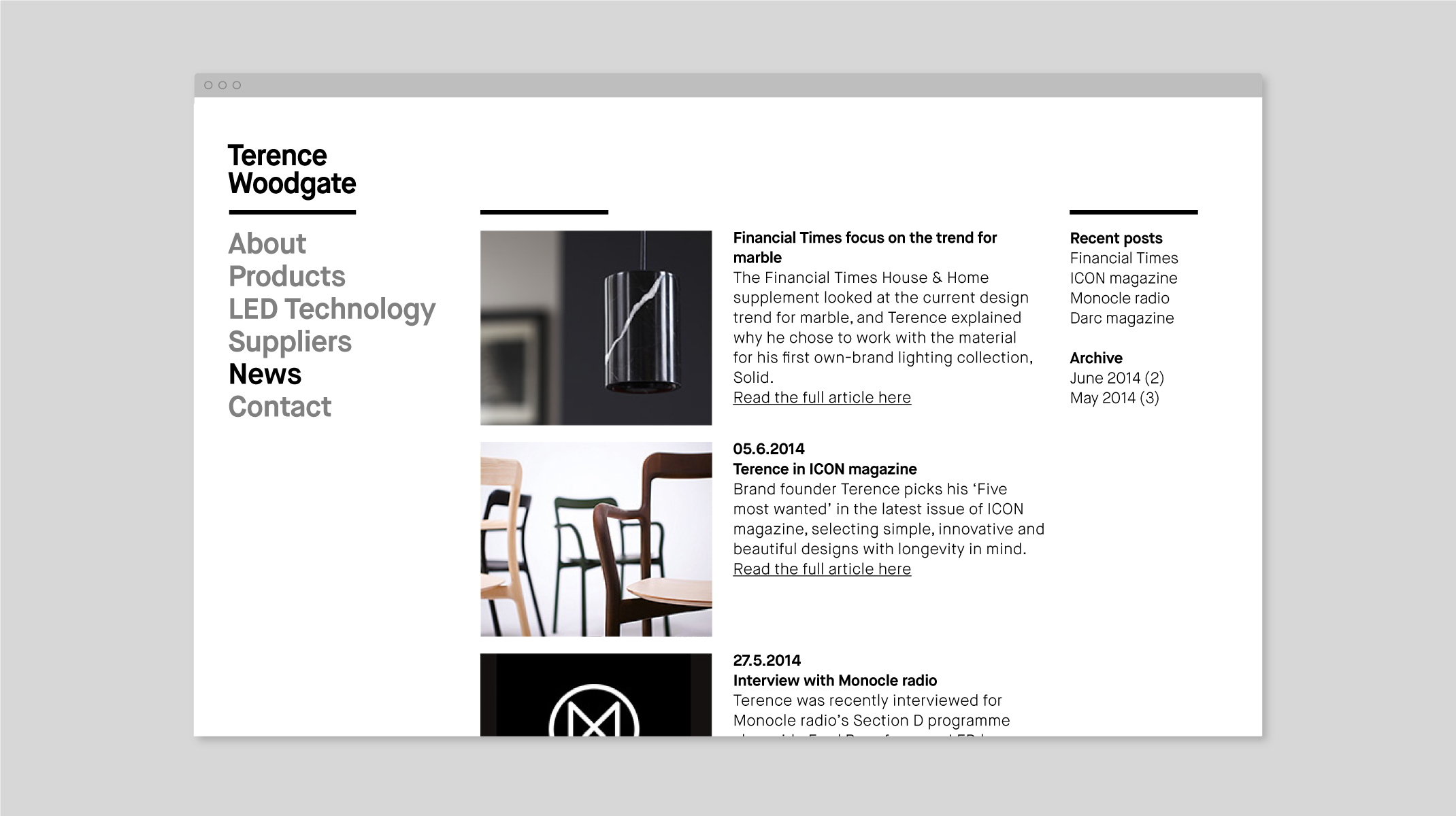
Digital design
The identity was also applied to the initial website design which followed the same simplicity as the rest of the identity, hanging menus from the logo at the top of the page and showcasing large scale imagery of the products.
Photography: St.John Asprey, Illustration: John See