
Insight
Exploring the Art and Functionality of Maps: How We Bring Locations to Life
Recently in the studio we’ve had a lot of requests for map designs, prompting us to reflect on the diverse forms and functions they can take. Over the years, we’ve crafted a wide variety of maps, each tailored to different needs—some leaning more into creativity, while others prioritising clarity and usability.
The Art of Decorative Mapping
Maps can sometimes serve a purely decorative role, capturing the essence of a place without getting bogged down in specifics. A great example of this is the illustrated map we commissioned from David Sparshott for the Rebecca Hossack Art Gallery and Gail’s Bakery collaboration. David’s beautiful drawings brought London’s greatest landmarks to life while placing the bakery locations at the heart of the city.

Balancing Creativity with Functionality
An illustrated map doesn’t have to sacrifice usability. We’ve collaborated with Stuart Hill over the past few years to create detailed maps for the Imperial War Museum’s Duxford Air Shows. These maps are rich with character, using illustration to highlight the various stands and attractions while still providing visitors with a clear way to navigate the event.

Maps for Navigating Information
In our recent book design for Laurence King Publishing’s Atlas of Dark Destinations, we used simplified maps as chapter openers to visually guide readers through the information in the following pages. Acting as navigational tools, these maps brought cohesion to the book’s diverse destinations while enhancing its accessibility. By leveraging the universal familiarity of maps, we created chapter openers that were not only visually striking but also intuitive and easy to use.
 Clarity in Complexity
When a map needs to convey more complex information, simplicity becomes key. For instance, recently we worked with Cadogan to map out their estate for the property team. This project involved tracing multiple Goad maps and splitting the area into layers based on different property uses. The result was a digital file that could be easily updated in-house with layers that could be toggled on and off depending on what needed to be viewed. Alongside this a large-format printed version of the map was created for use in meetings. Designing this map required careful consideration of colour, typography, and detail, ensuring that even complex data could be easily understood by the end user.

Seamlessly Blending Function and Design
As part of Lucy Harrison’s Carnaby Echoes project, celebrating Carnaby Street’s rich musical history, we designed both a printed map and an app for an interactive tour of the area. While usability was the top priority, we ensured the maps seamlessly reflected the project’s branding and overall identity. Drawing from the project’s colour palette, we incorporated layered semi-transparent boxes to echo the design of the main logo, creating maps that were both functional and visually compelling.

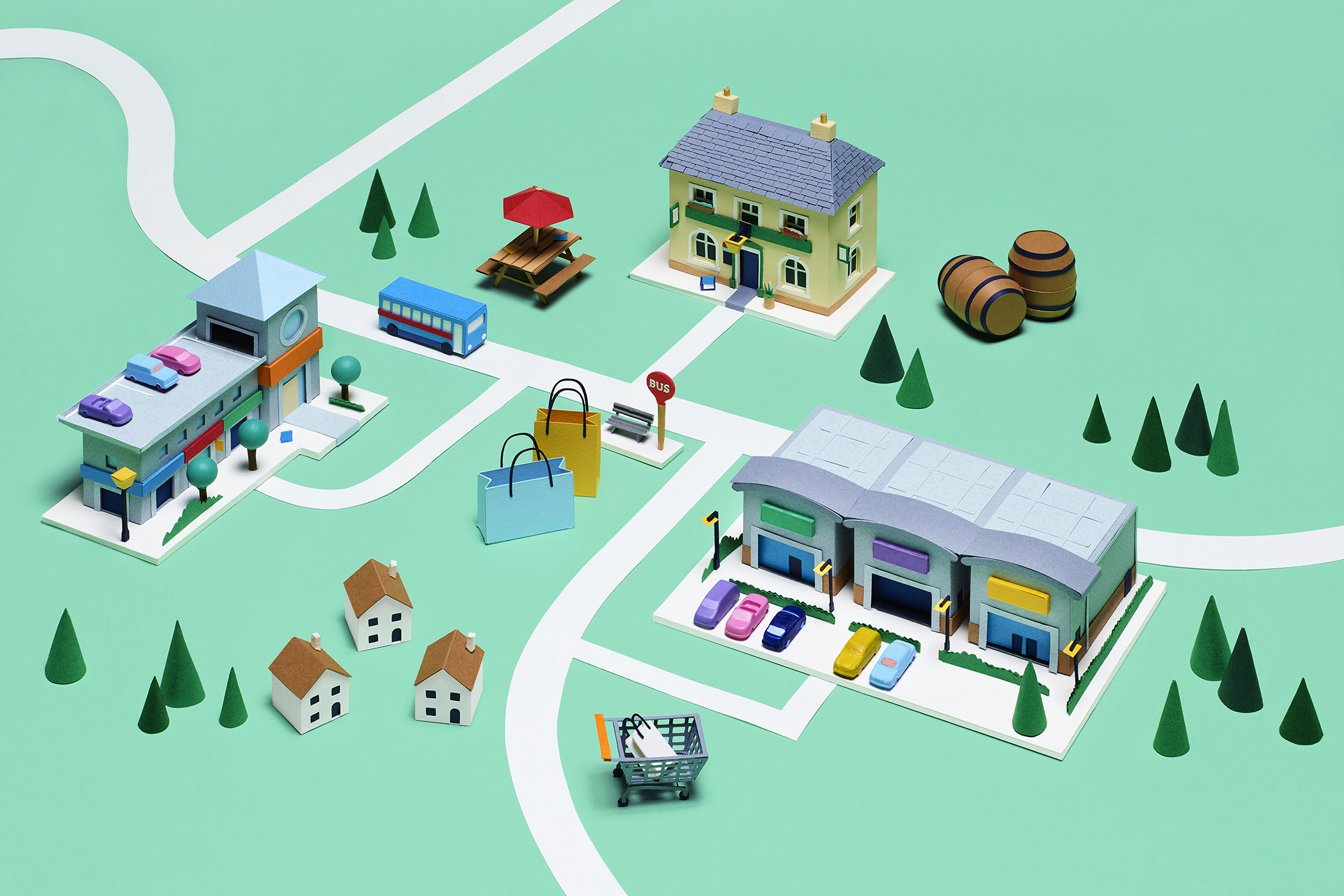
Bringing Map to Life
Lastly, we ventured beyond traditional two dimensions of a map by commissioning Hattie Newman to create a 3D model of the UK for NewRiver’s brand evolution. This model showcases NewRiver’s diverse portfolio of shopping centres, retail parks, and community pubs which span the entire British Isle. With multiple set-ups, the model allows for flexibility in format and the ability to grow as NewRiver’s portfolio expands.
Through these projects, we’ve seen how maps can be more than just tools—they can become storytelling devices that connect people to places. Whether a map serves as a functional guide or a piece of visual art, each one presents a unique opportunity to blend creativity with clarity. How could a map enhance your brand’s story or customer experience? We’re eager to hear your ideas!