Working in partnership with supermarket chain Morrisons to create a brand identity for their new Market Kitchen concept: a hot food counter that serves ready made dishes to go.
The Client
Morrisons are a large supermarket chain that sell food and drink as well as clothing, books, magazines, CDs, DVDs and home accessories. They currently have 491 stores across the UK.
The Brief
Morrisons were opening a new store in Canning Town which included a new hot food counter called Market Kitchen; an extension to their current Market Street offering. Using the core Morrisons brand identity as a starting point, we were asked to develop an identity for Market Kitchen. The end result of the project would be a brand guideline document for the internal design team to use.
Tone of voice
We ran a workshop with Morrisons and copywriter Tom Lynham to discuss the tone of voice and suitable language to use. Out of this came an importance of emphasising Morrisons heritage as well as their relationships with their food producers.
Creating an identity
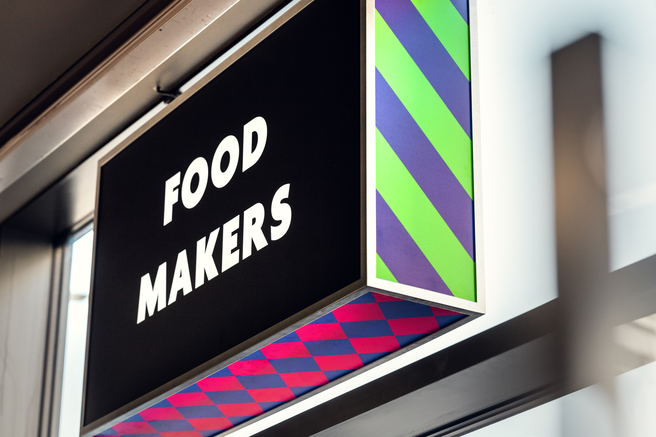
After developing the tone of voice, it was clear that the identity needed to provide a fresh and contemporary take on the heritage of a market, with an emphasis on the food makers. We used elements from the core Morrisons brand to bring our identity to life.
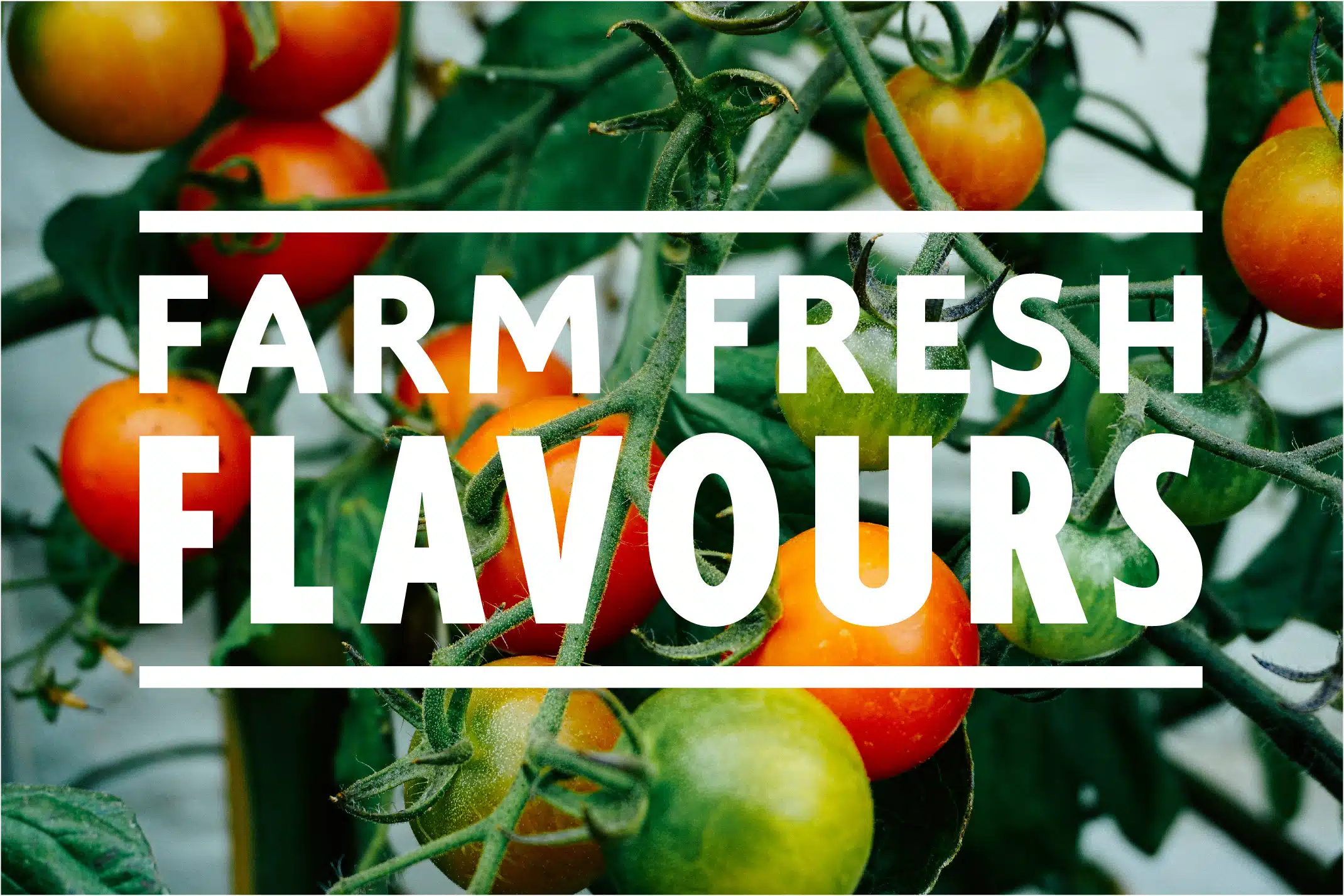
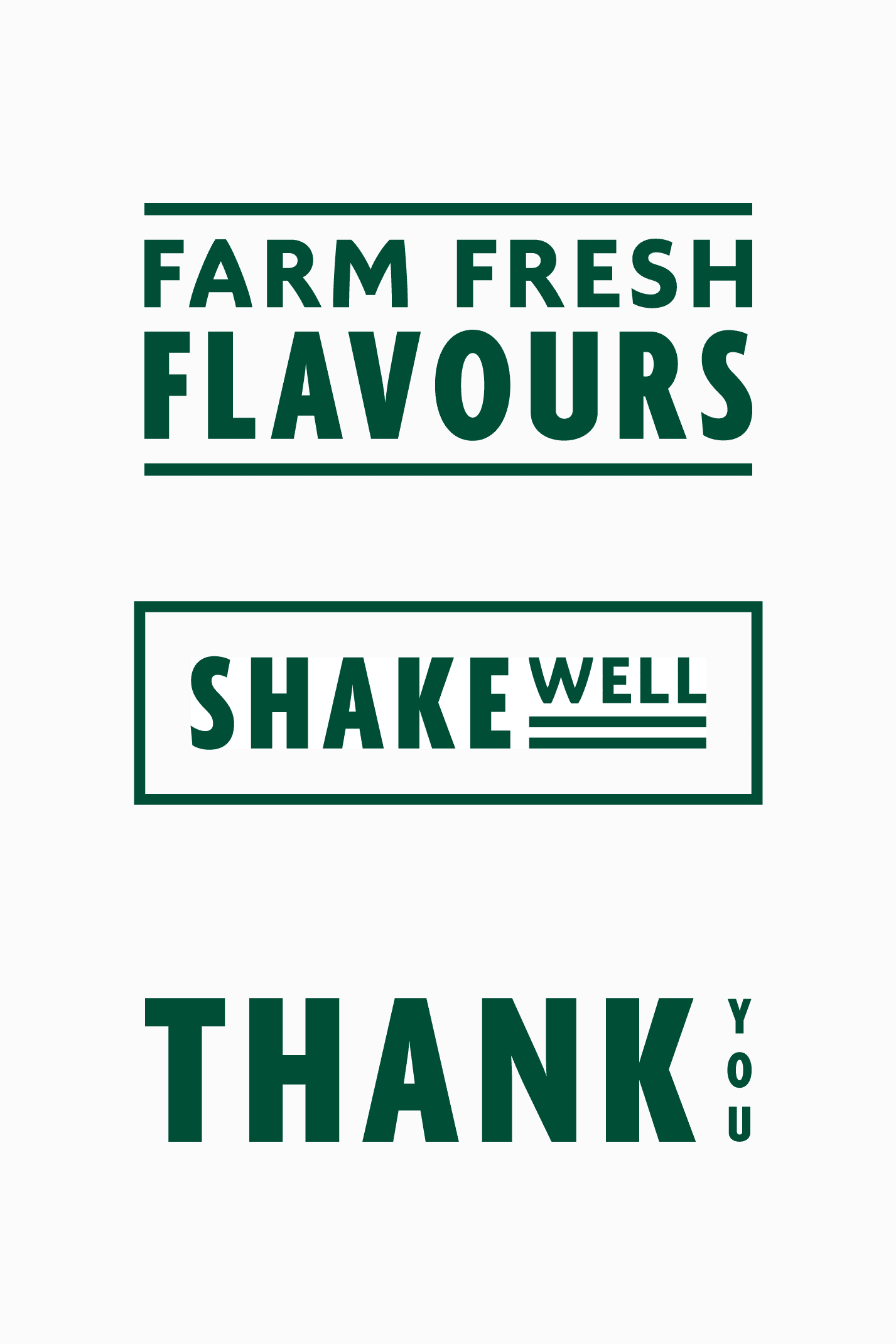
Typographic play is an important part of our identity as it captures the essence of markets. Type is used horizontally and vertically, and alongside rules to emphasise messaging.
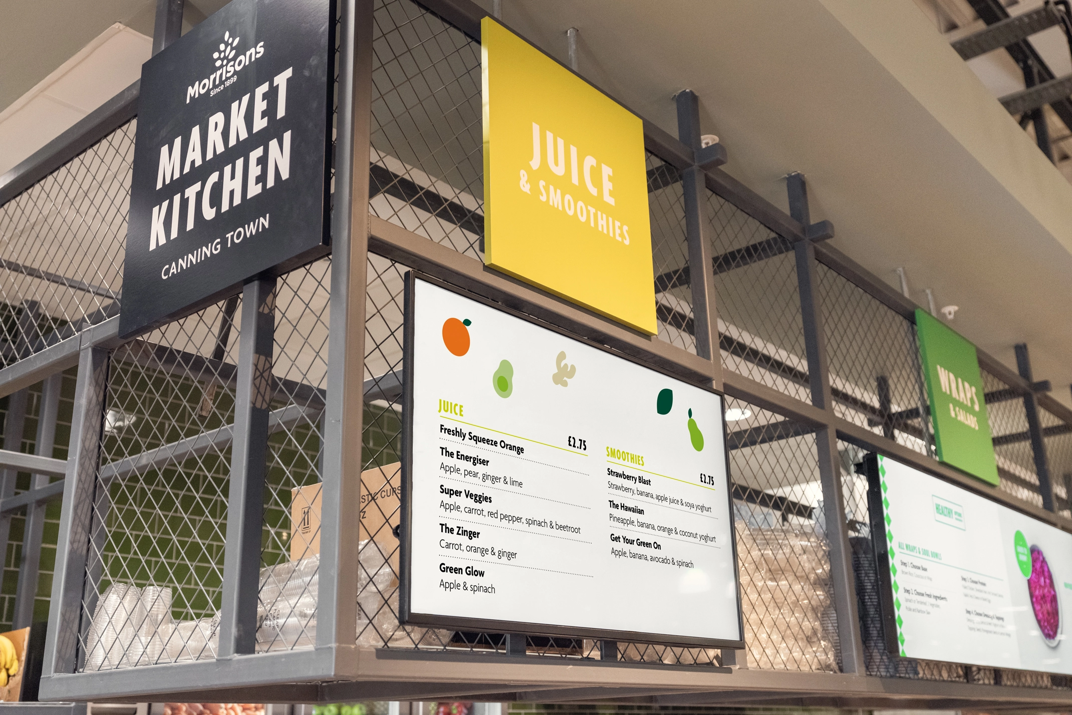
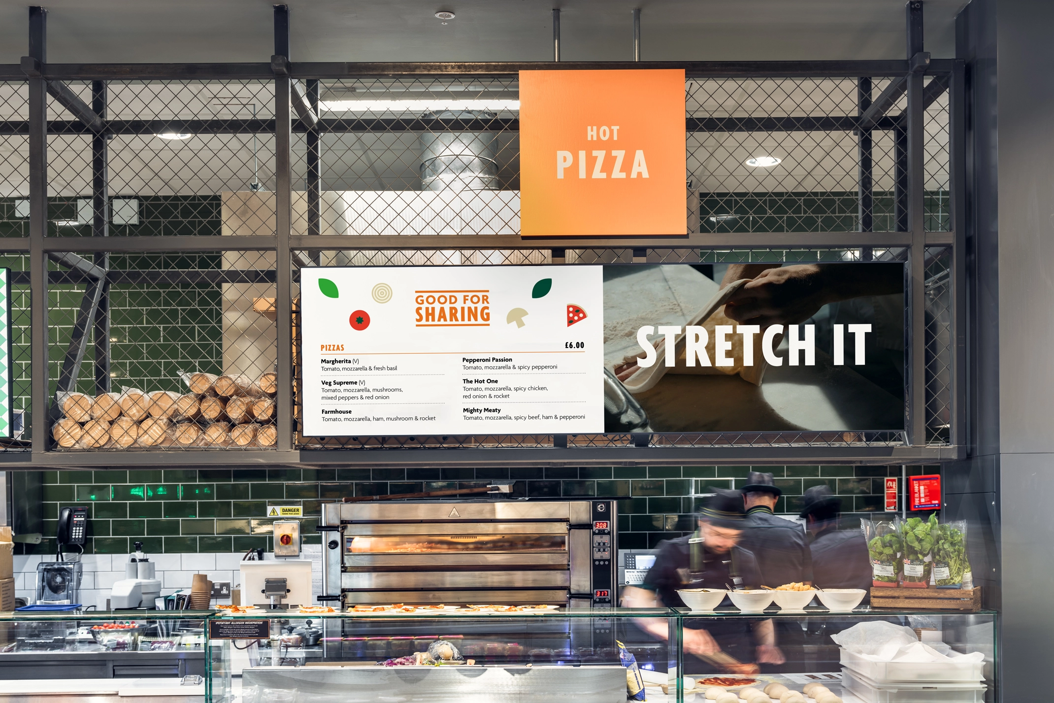
The colour palette was created using eight colours from the Morrisons primary and secondary colour palette. We selected tones that were bright and lively to ensure they would stand out amongst other Morrisons signage in store. Each of the eight colours was then assigned to the eight Market Kitchen stations: juice & smoothies, wraps & salads, hot pizza, wok station, hot food to go, order point, bakery and barista.
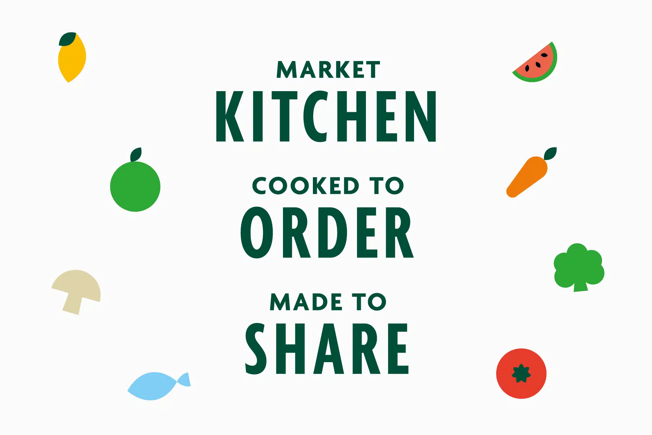
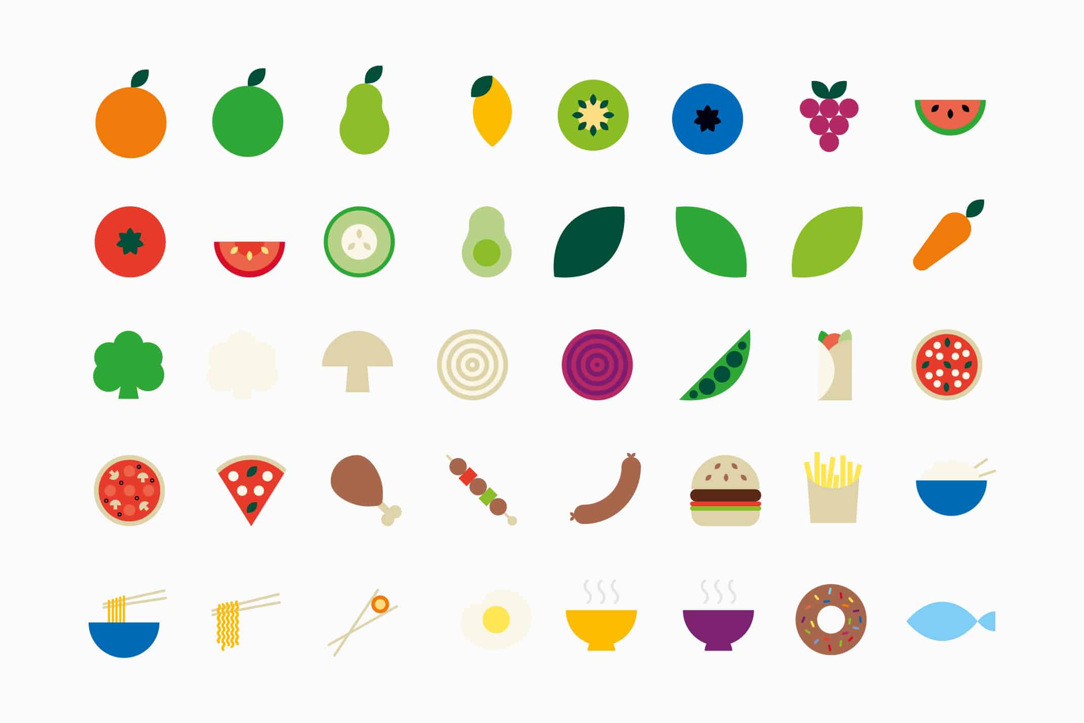
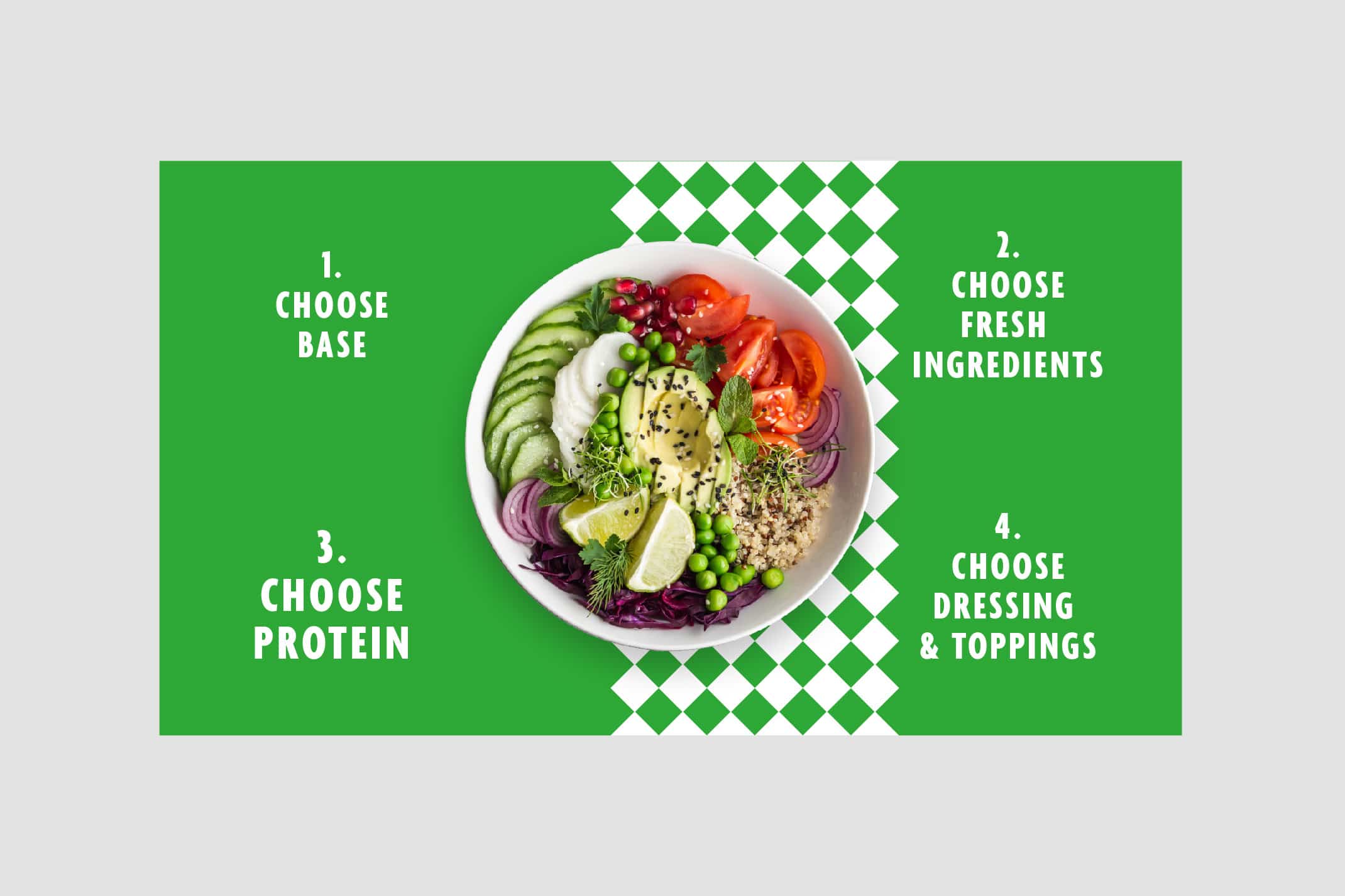
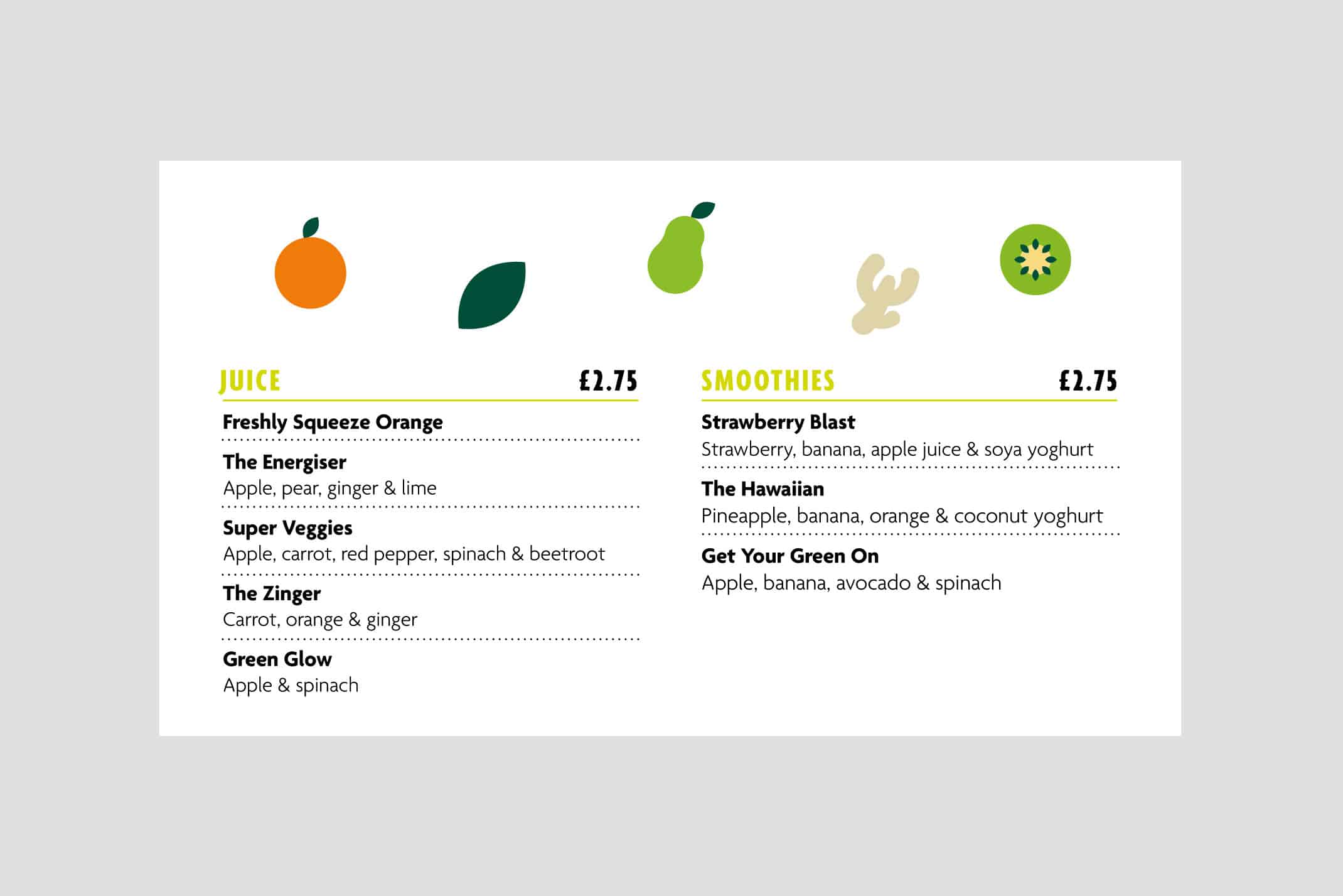
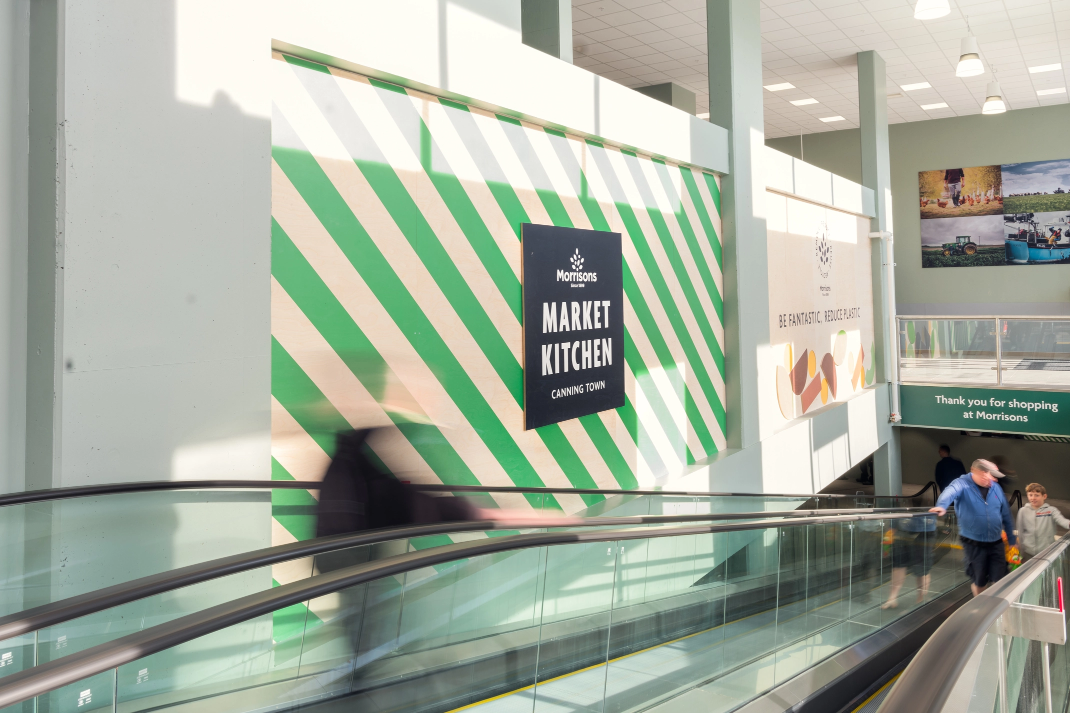
To add a warmth to our identity, we created simple illustrations of food and ingredients. Primarily these simple illustrations are created using just the circle and leaf shapes from the Morrisons logo, however when needed other elements can be used. We also developed two patterns inspired by the market place: a striped pattern and a chequered pattern, used for decorative purposes to add interest or texture.
Guidelining
Once the identity was finalised we created a detailed guideline document. Example designs were used to demonstrate how the elements worked. The guidelines covered the brand personality (tone of voice and how to talk to customers) as well as how to apply the visual identity in store.
Implementation
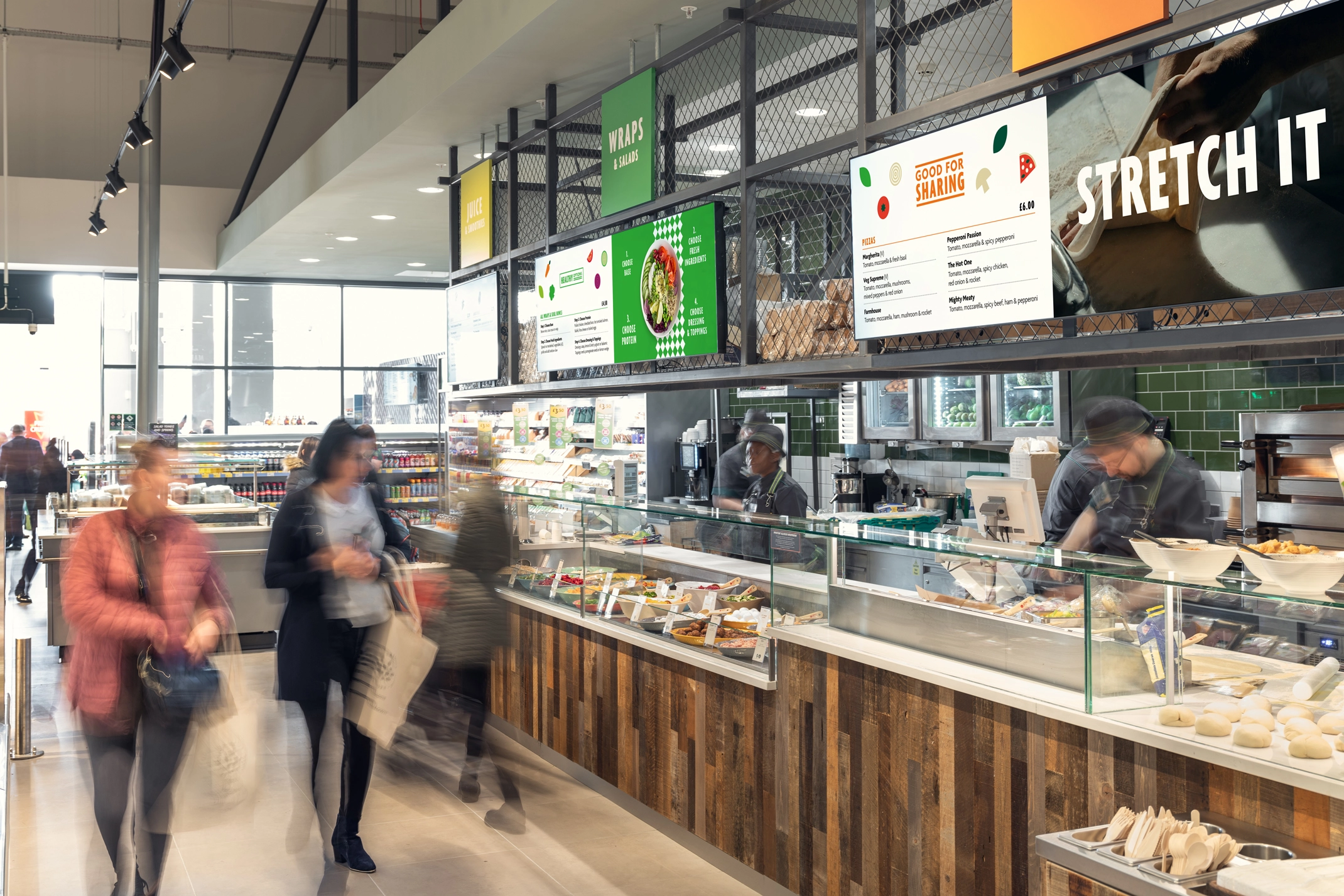
We worked with Morrisons on the roll out and implementation of the identity in the Canning Town store, in particular how the digital screens would sit above the food counter stalls.
