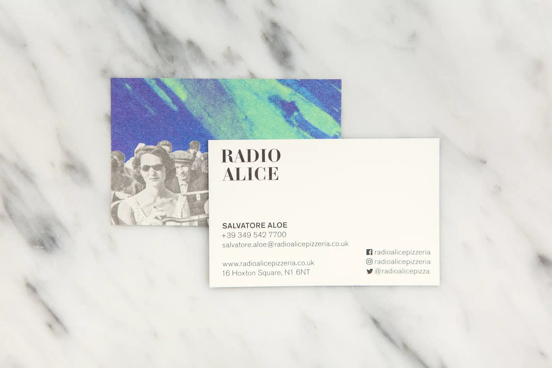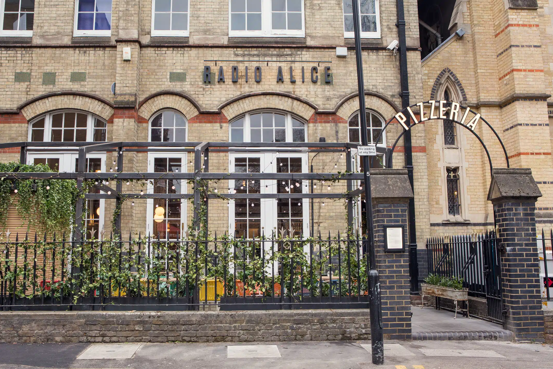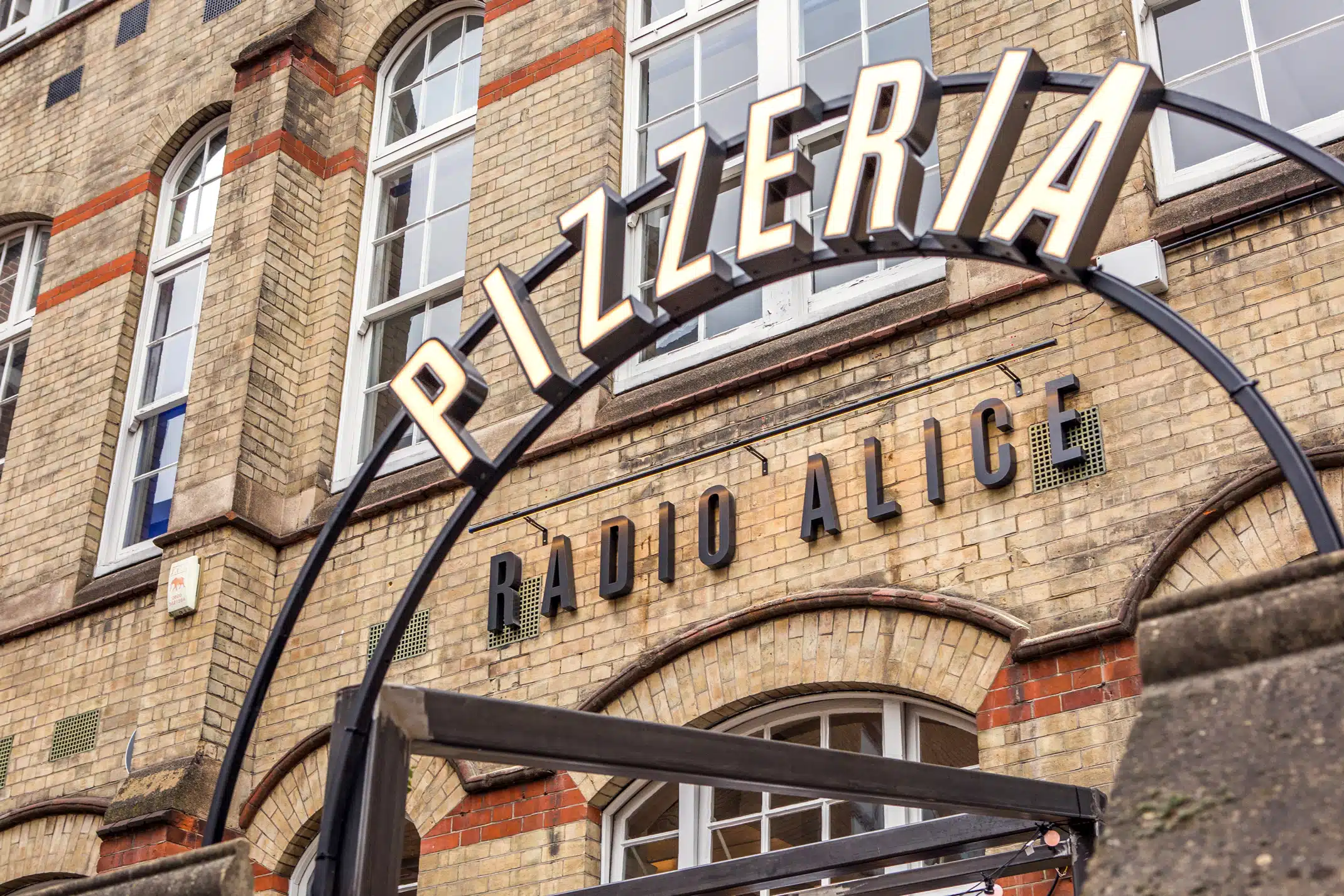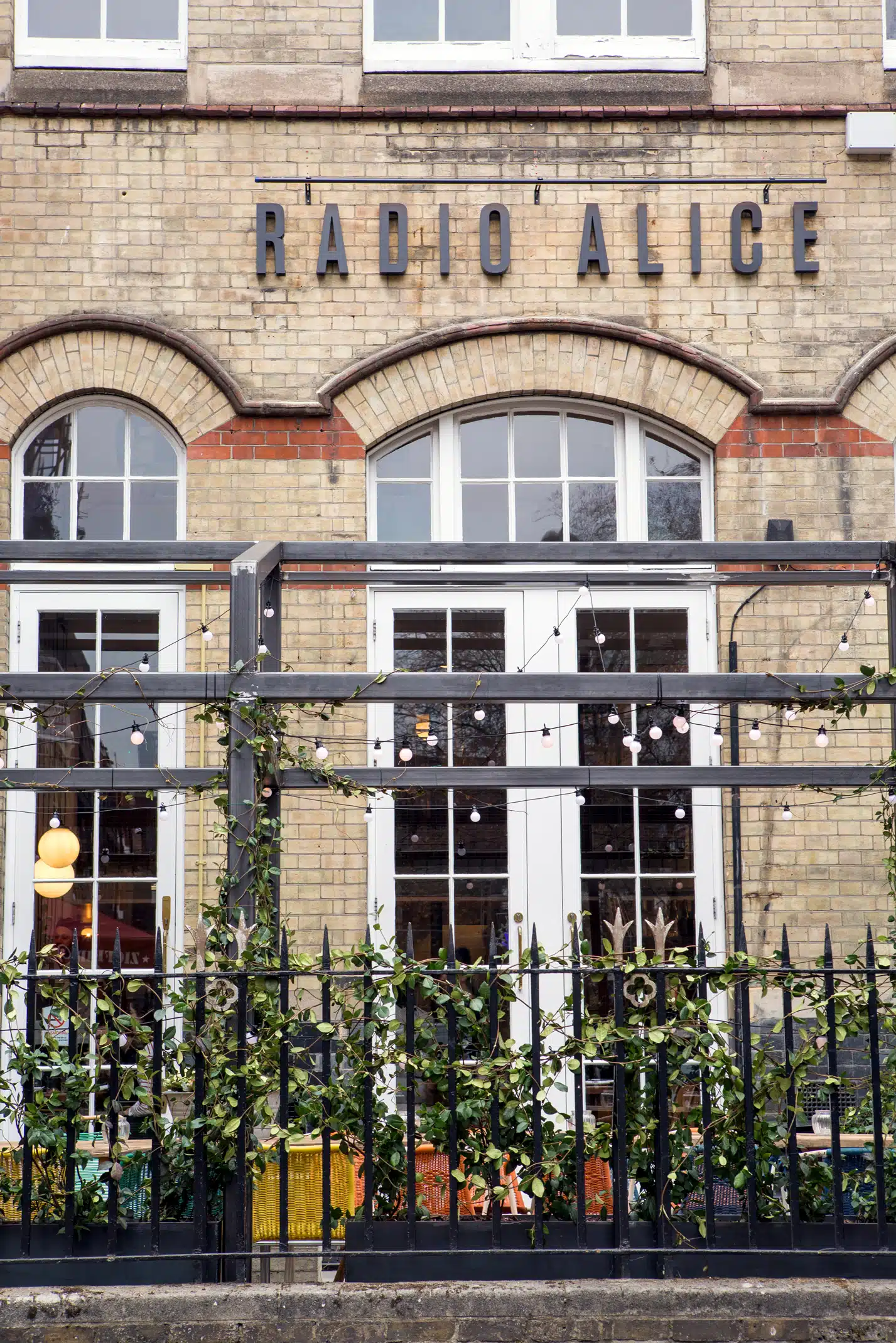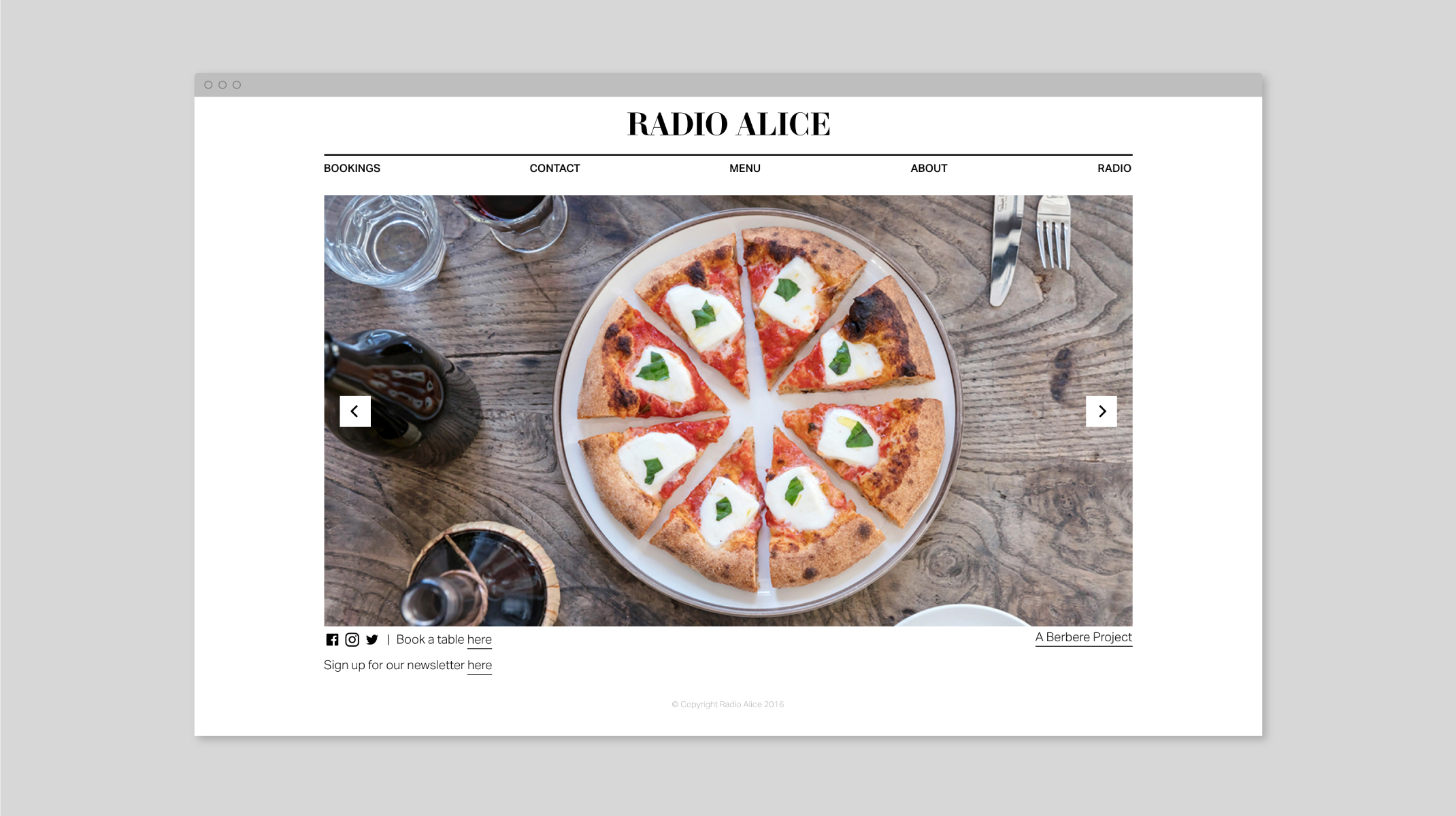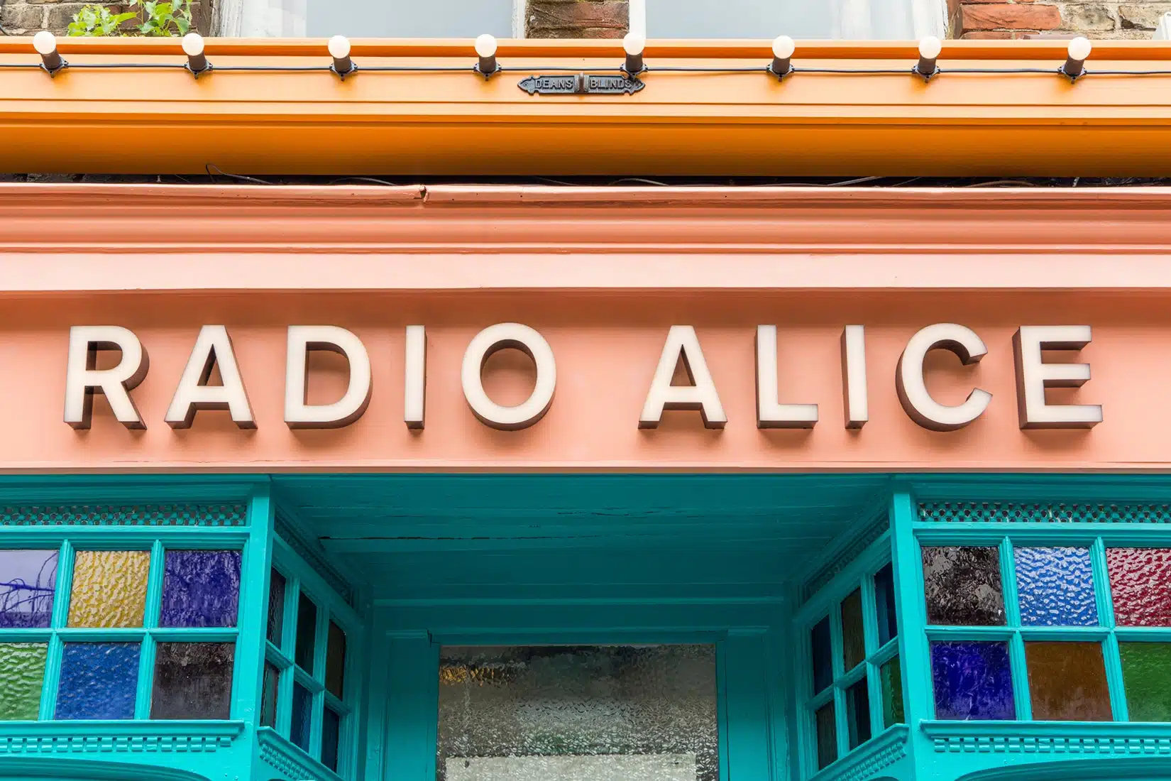
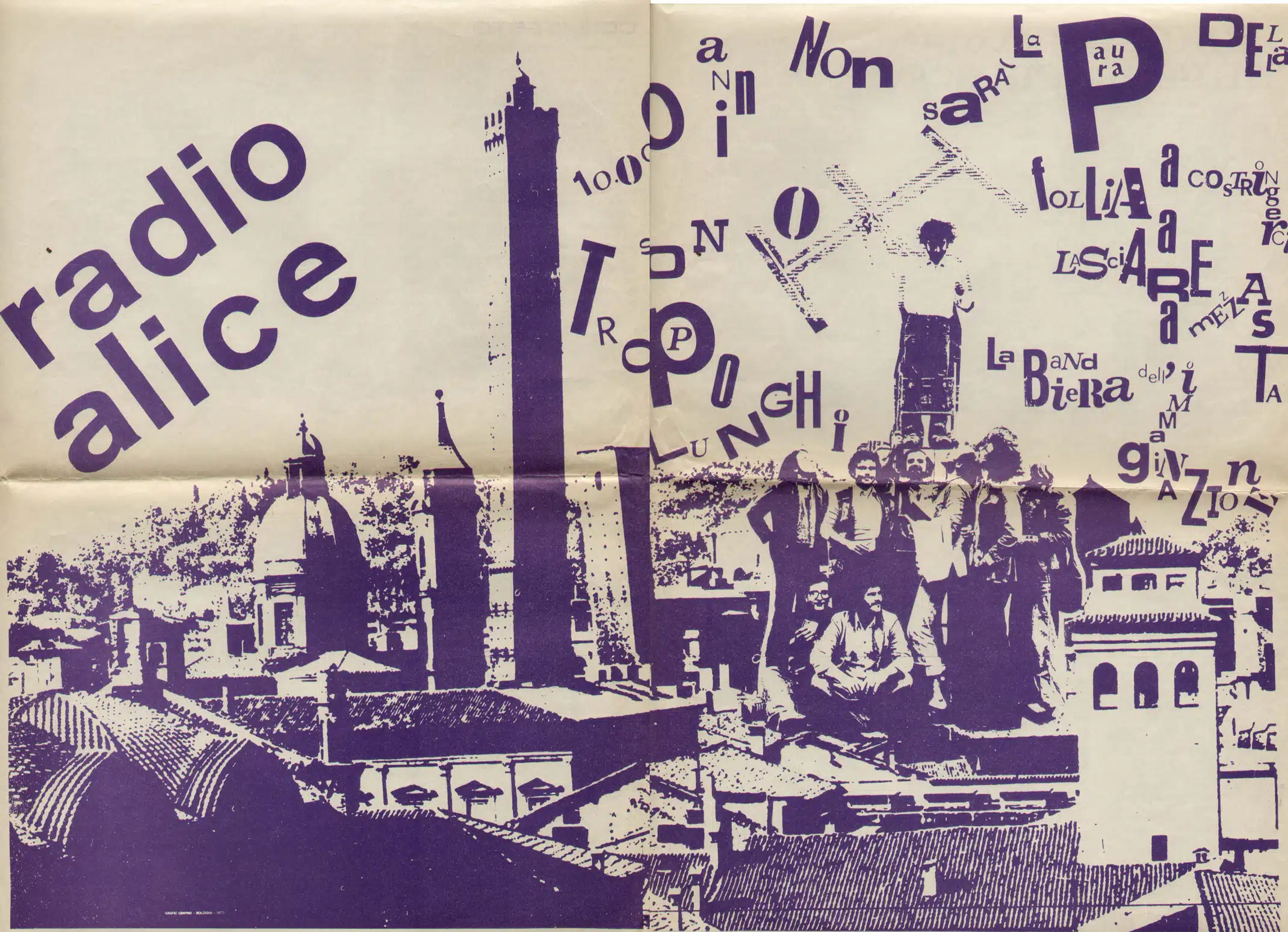
Radio Alice
Digital Identity Print Strategy
Bringing a very Italian brand to a London audience we worked alongside designer maker Alex Green to create an identity that conveys bold ideas with a joyful attitude.
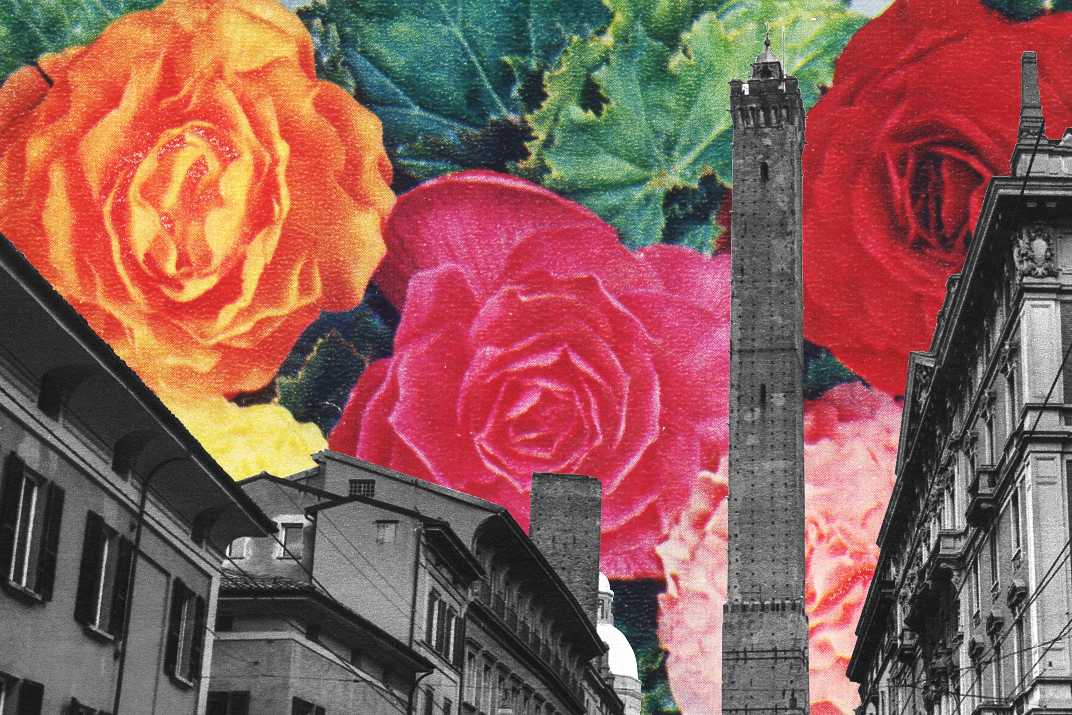
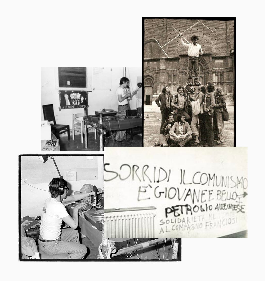
Radio Alice was originally a pirate radio station, born out of the student protests happening in Bologna during the 1970’s. It gave a voice to the people, and worked under the mantra ‘Respect and Joy’ something which felt like a natural fit for today’s Radio Alice brand. Following this mantra we created the visual identity for the restaurant.
Client
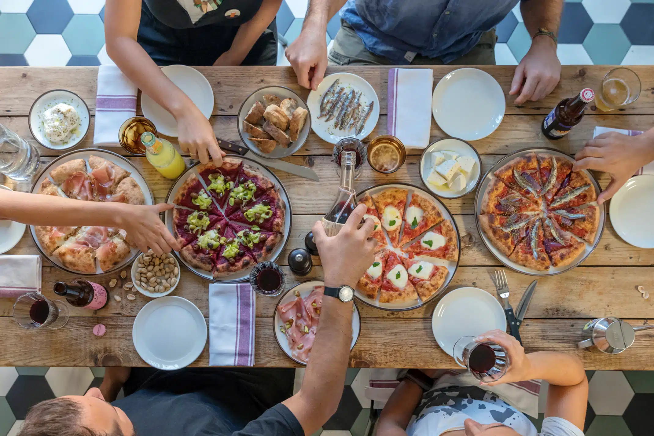
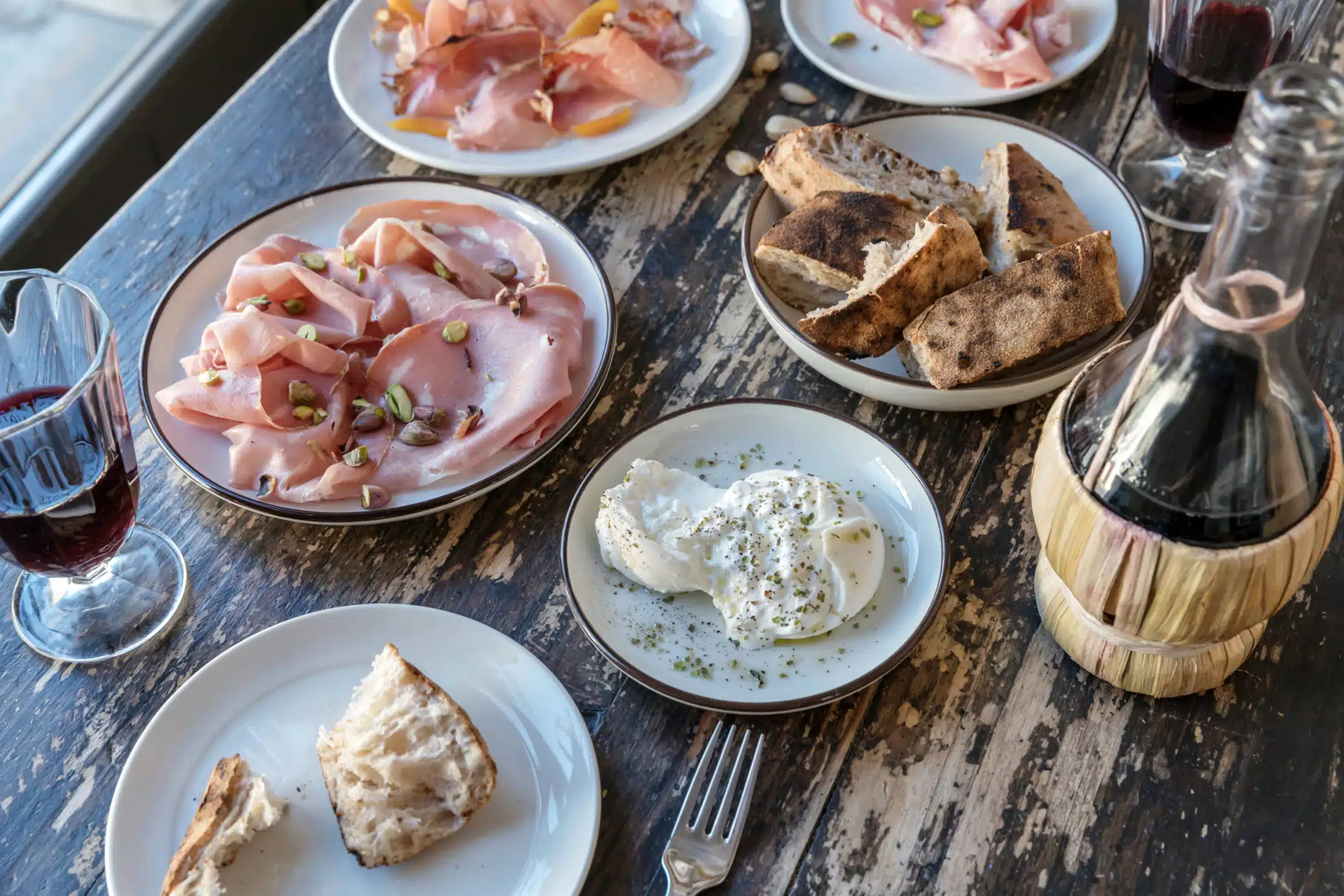
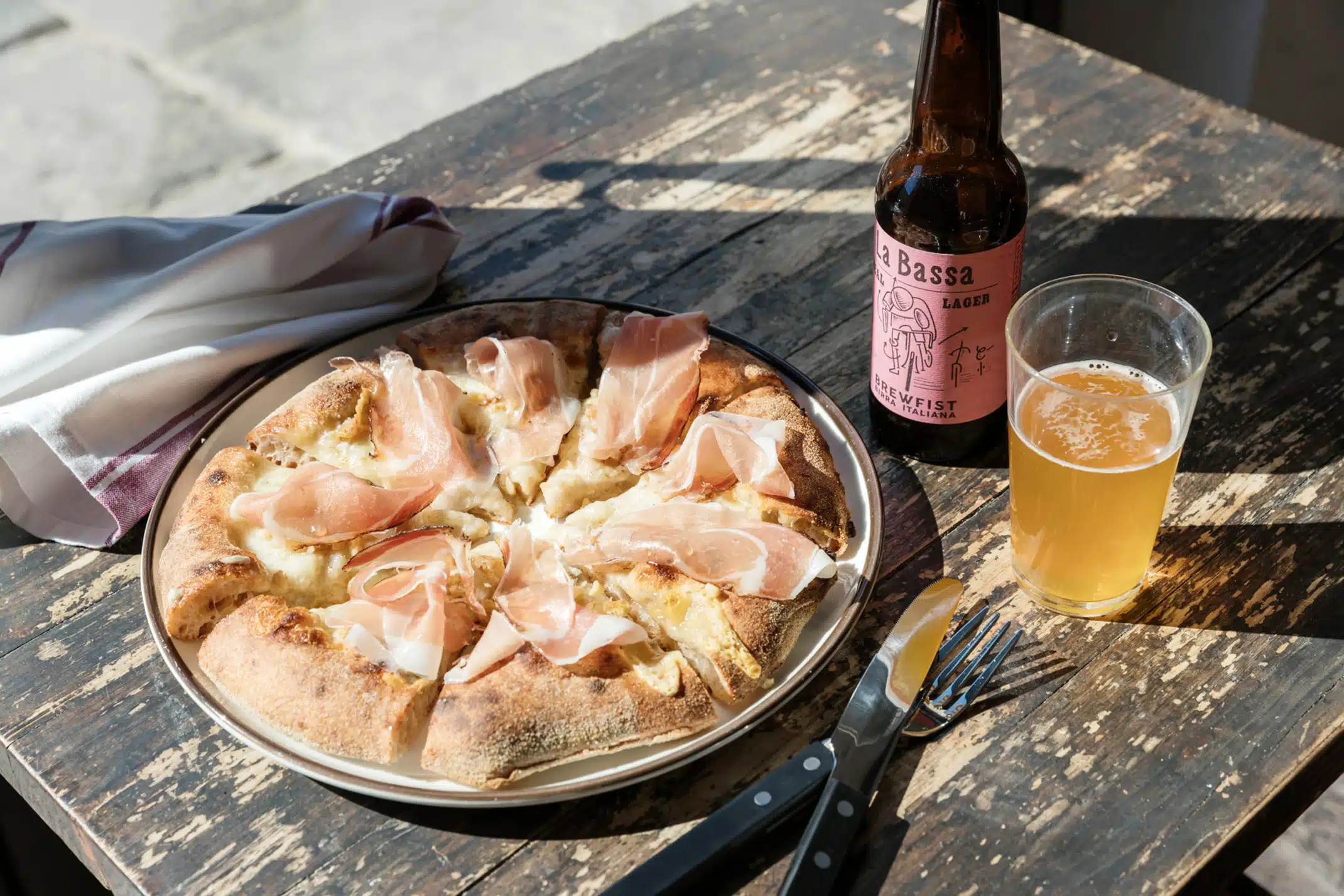
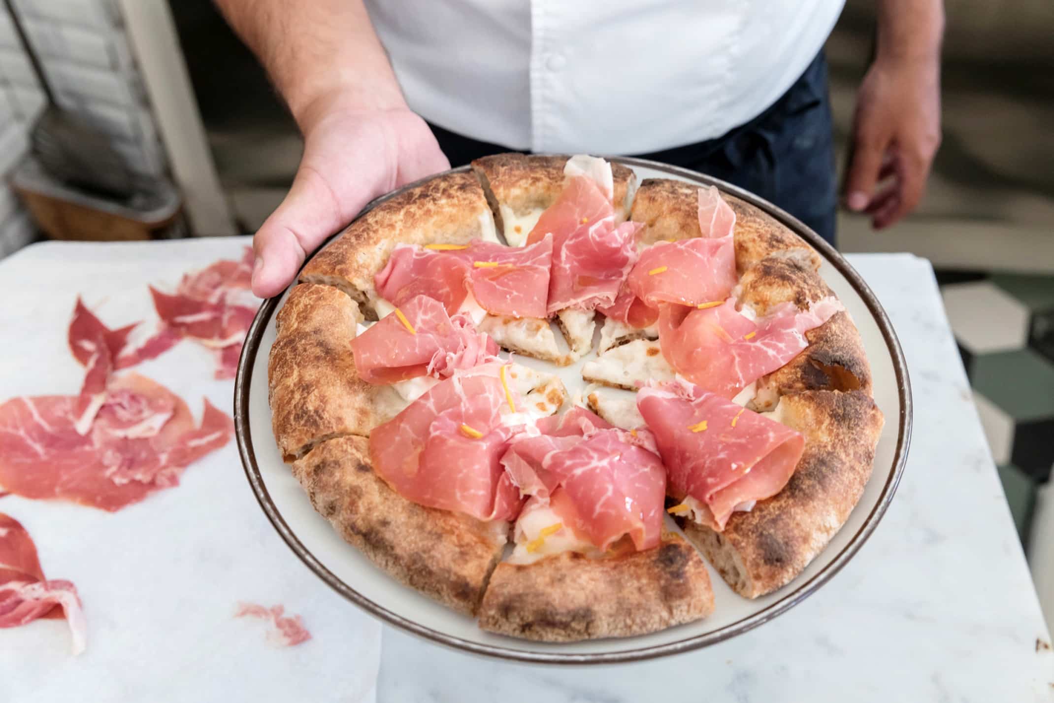
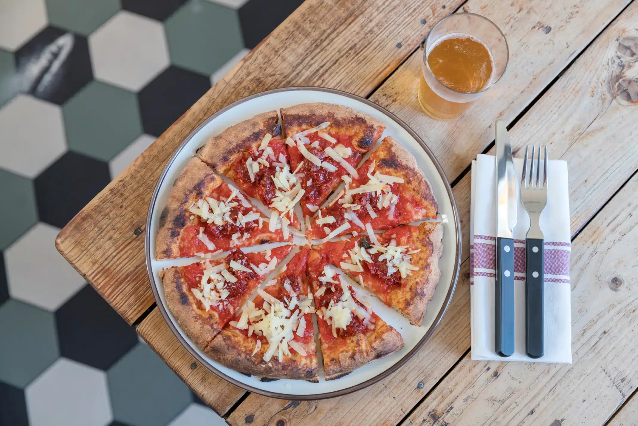
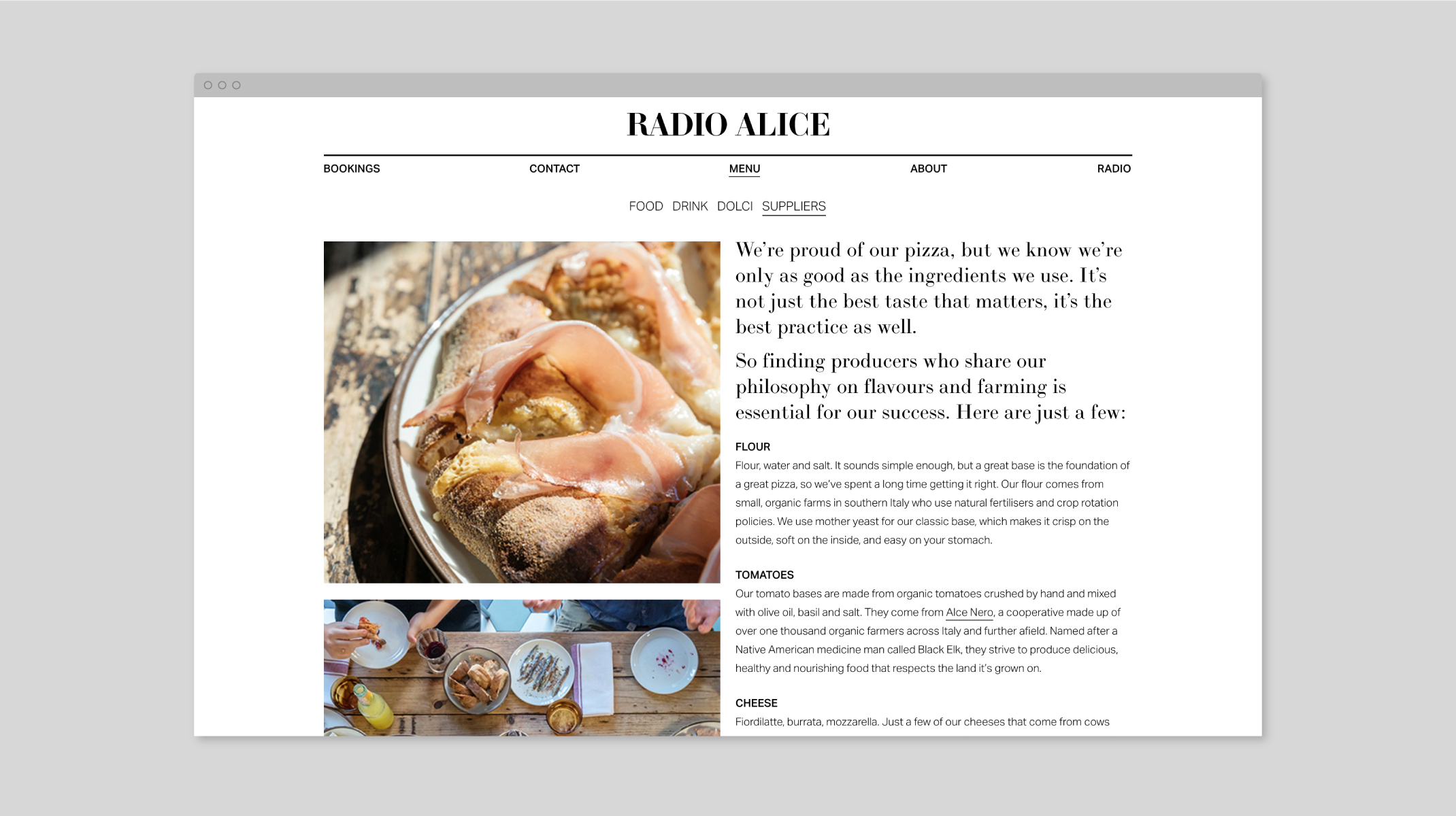
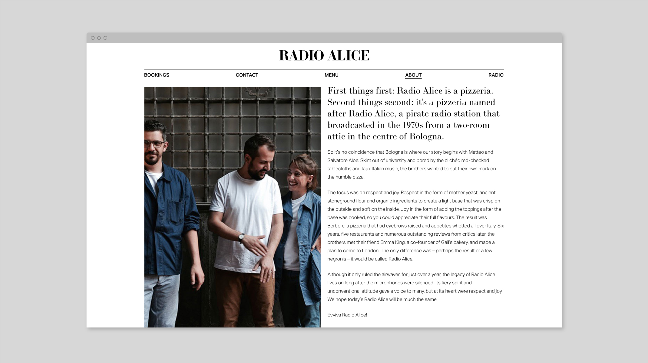
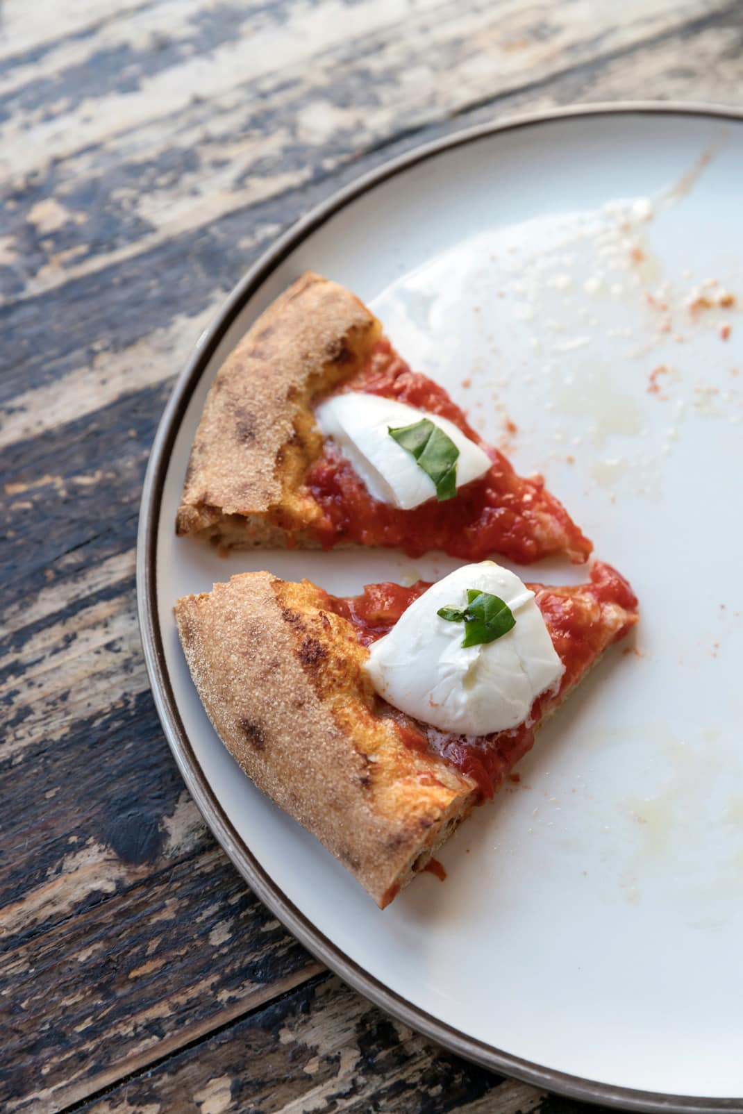
Berberè is a pizzeria, which was founded by brothers, Matteo and Salvatore Aloe in Bologna, they now have 9 restaurants all over Italy. Their focus is on high quality ingredients, seasonally and ethically sourced from small scale suppliers around Italy, and a new kind of sourdough base that is lighter and easier to digest due to the particular method of fermentation developed by Salvatore and Matteo. Emma King worked with the brothers on their new venture to bring Berberè to London.
Brief
The challenge was, how do we bring the Berberè brand to the UK in a way that feels relevant to a London audience? The differences for pizza between the Italian market and London market are vast, and right from the start it was clear that this new venture, needed to feel new.
In Italy pizza can often be viewed as a simple food, the quality isn’t often great, and so when Berberè began, bringing with it a whole new way of looking at pizza in a more refined and thoughtful way, it was a big deal. Whereas in London we see pizza in Italy, to be the best of the best, so part of our challenge became how to present this new version of pizza as something new in the already crowded market.
Research trip
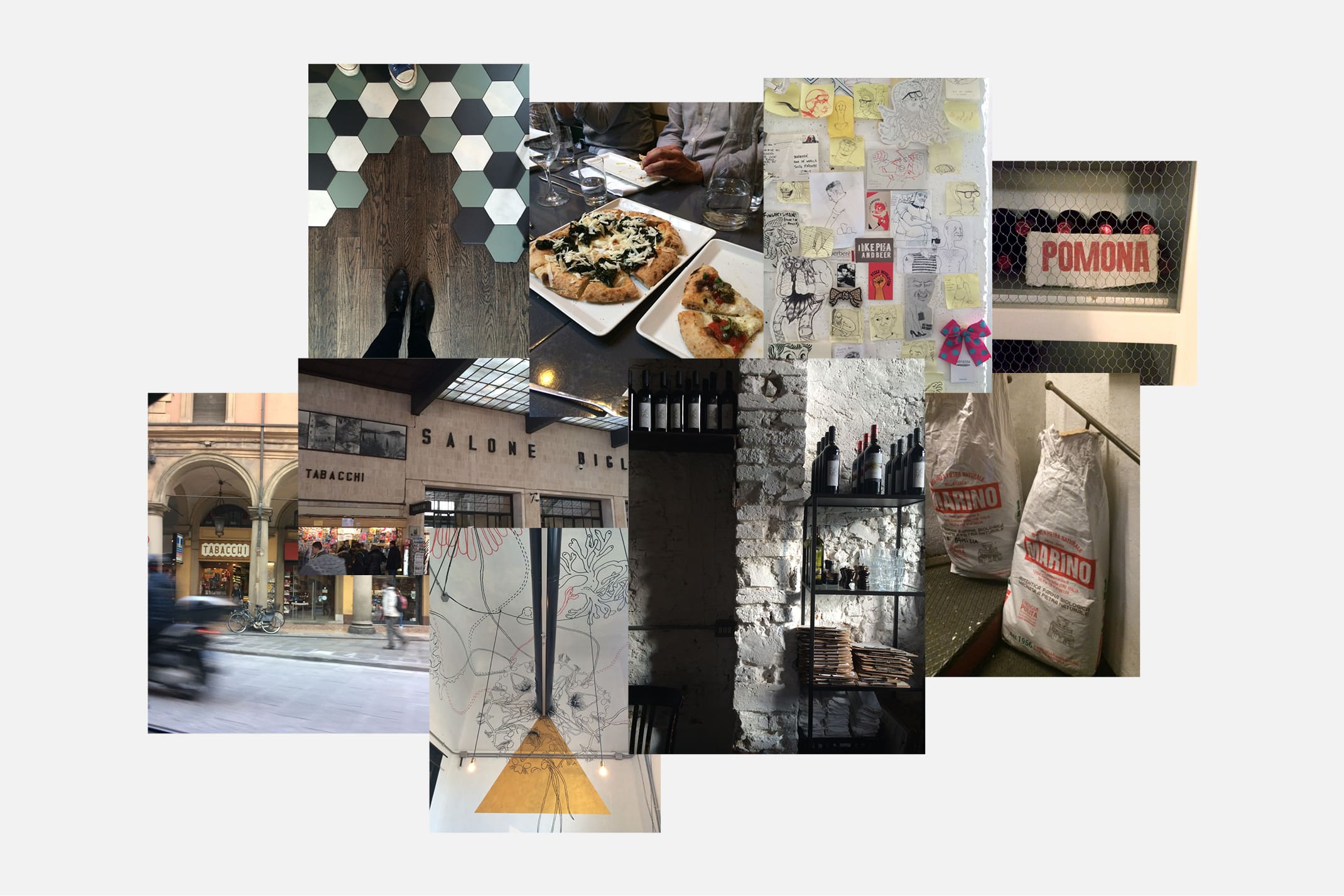
Right from the start we began detailed research, really immersing ourselves into our clients world. This way we can create designs that are meaningful and true to our client as well as standing the test of time, not being led by fads or fashions but by strong ideas and concepts built on research.
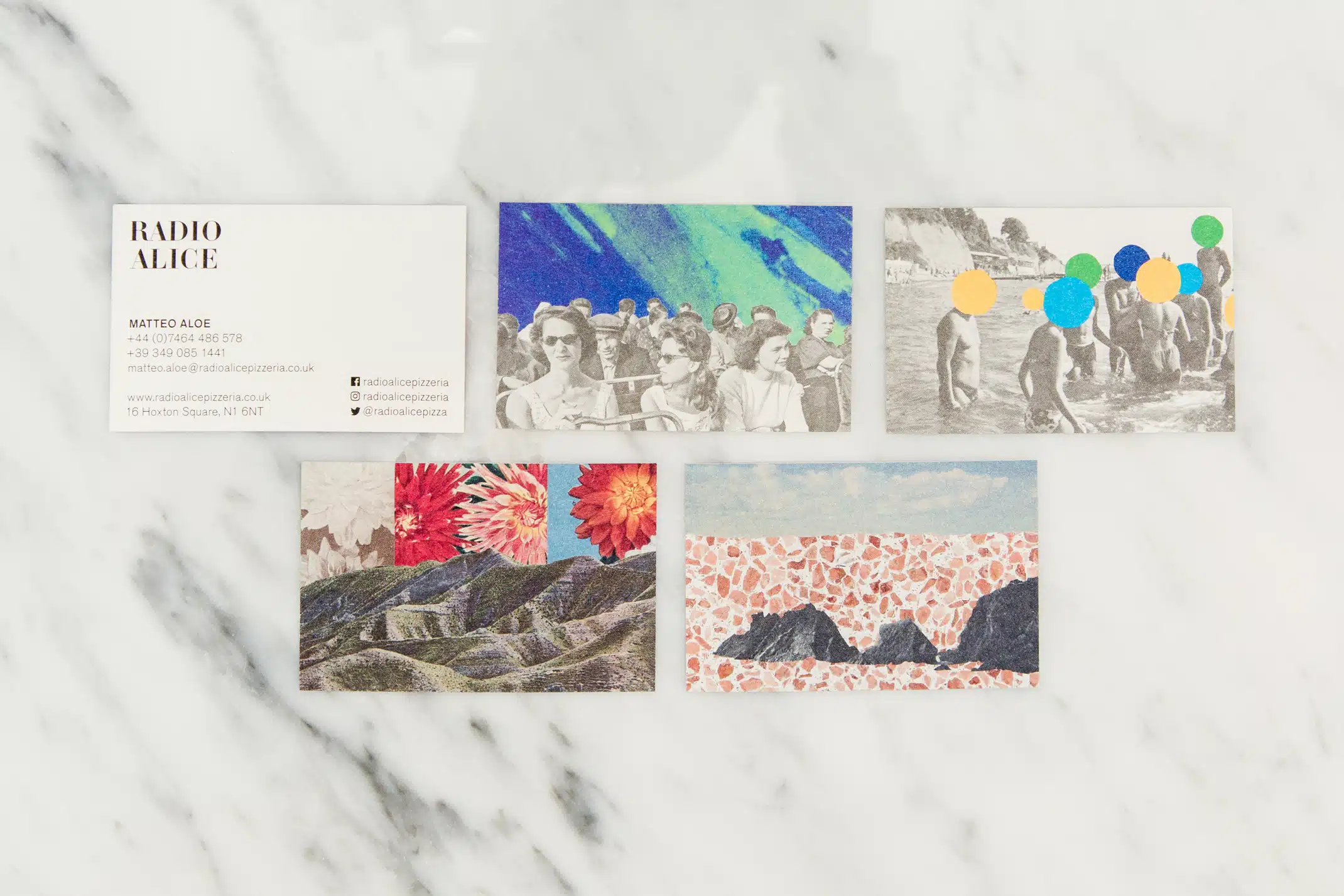
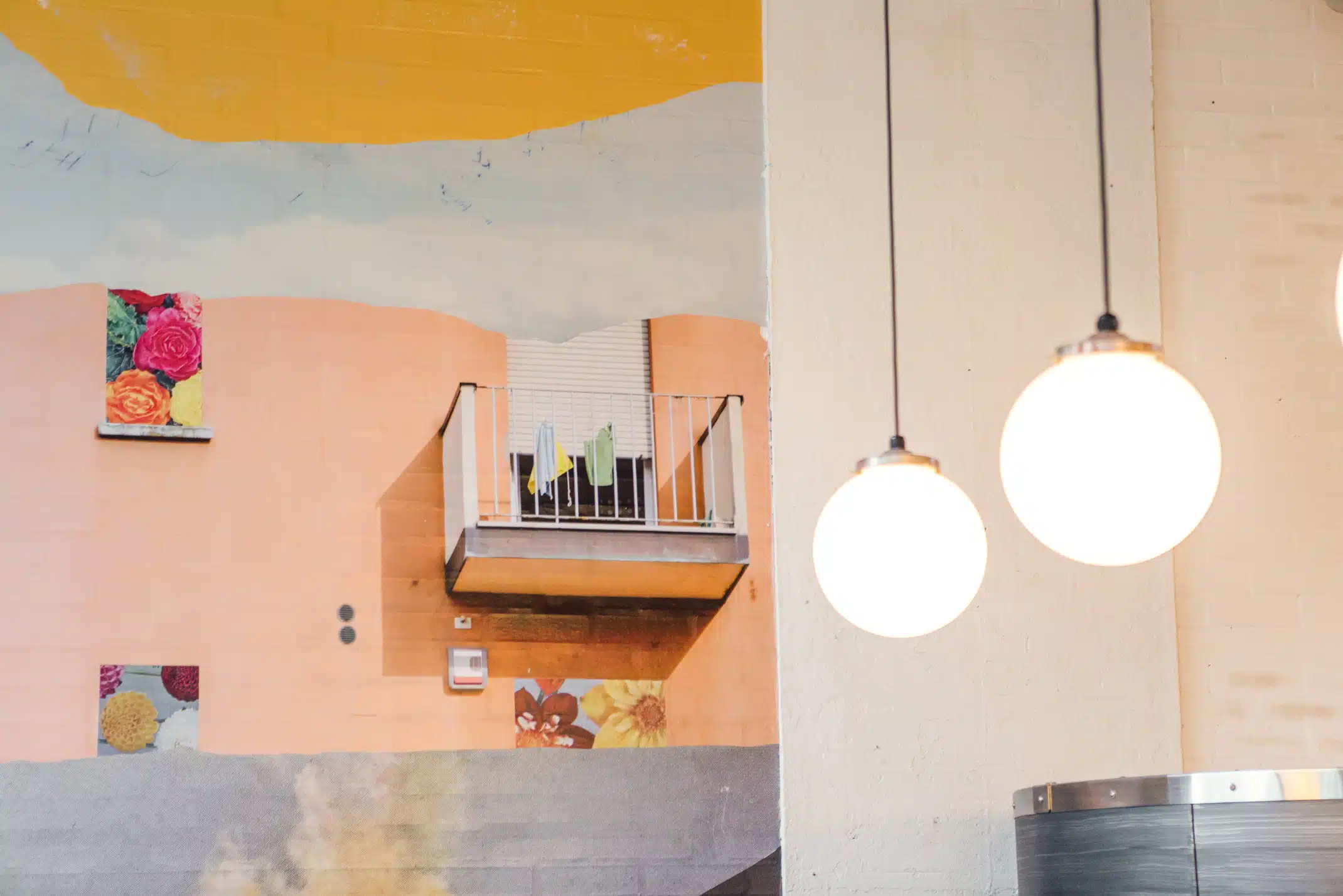
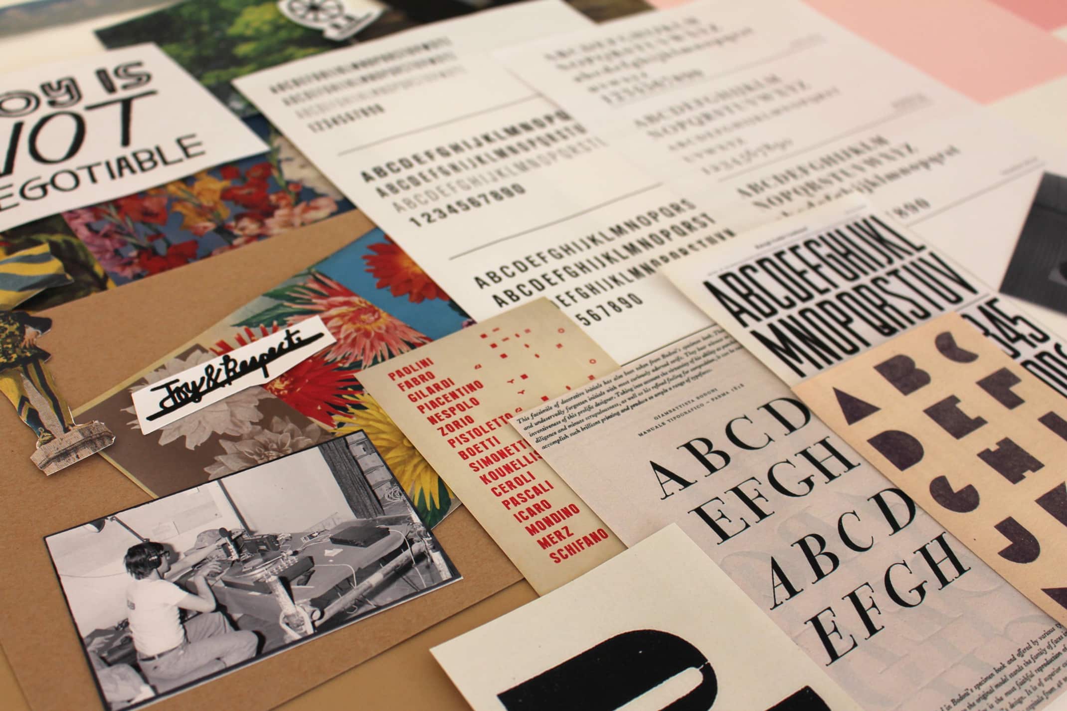
Luckily for us this meant a trip to Italy, to visit all of the Berberè restaurants, getting to know what they were really all about, and how they could bring this over to London. The trip also became an invaluable source of inspiration when it came to the visual identity. Having banks of found typography and signage from around Bologna meant we could delve into this resource to help convey the truly Italian heritage of the brand without seeming cliché.
Strategy and Naming
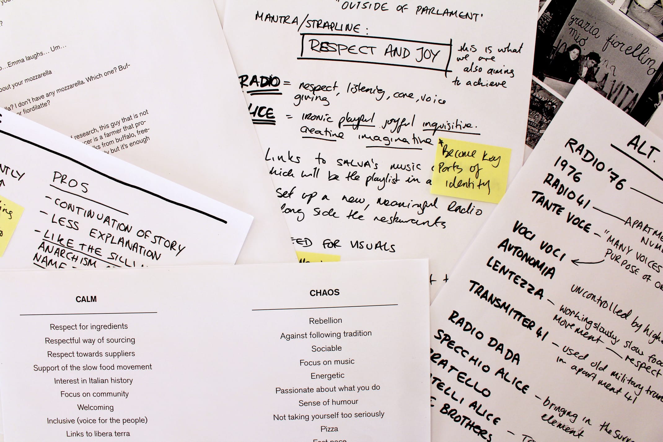
Once we had a good grip on who Berberè were in Italy, it was time to flesh out who they would be in London. This was kick started by a workshop over in Italy, with everyone who was going to be involved in the initial creation of the brand. Through previous experience, we have come to find that this is essential to the process, having everyone around to work through all the ideas in the room, and hopefully discuss many more.
It was crucial to decide and finalise the name before any branding work could begin. For various reasons, the name Berberè didn’t feel right for a London audience. After working through the story behind the brother’s pizzeria, and what spurred them to create this new kind of pizza. We stumbled across a particular part of Bologna’s history that Salvatore and Matteo had a great interest in. Radio Alice, a 1970’s pirate radio station that acted as a voice for the people, and the protesting students who were unhappy with the government at the time. This radio station embodied a lot of the character traits that we had identified for our new Pizzeria. It was both passionate about a cause, but joyful in the way they approached it. ‘Respect and Joy’ had been the mantra for the original Radio Alice, and this also became key to our Radio Alice today.
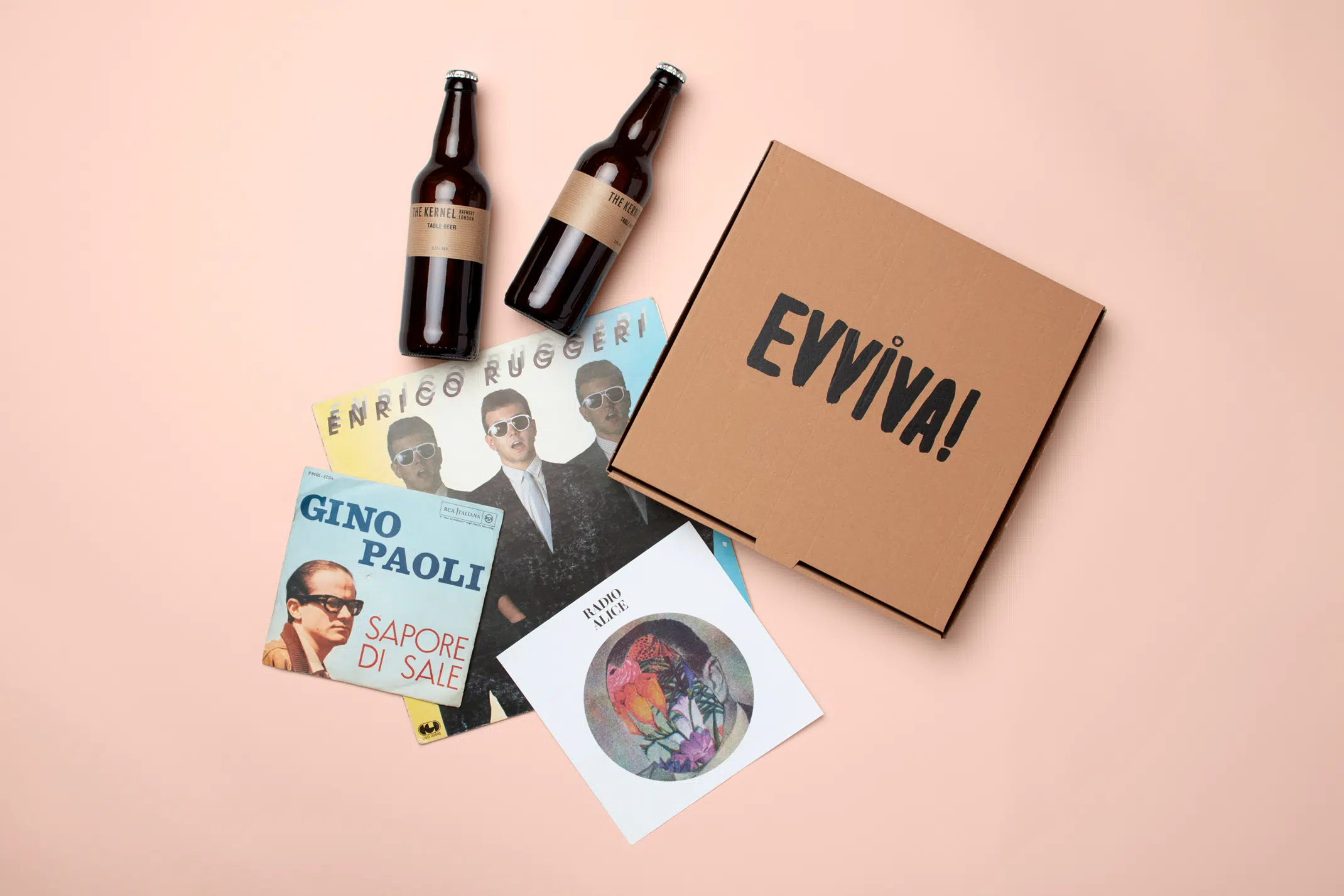
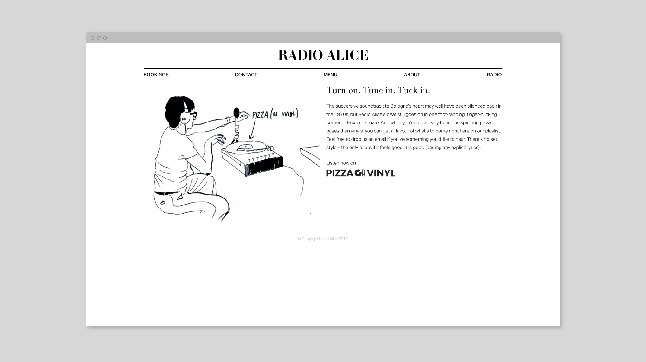
Having a strong link to a radio station also felt appropriate due to Salvatore’s huge interest in music. Having a great record collection that would become both the playlist for the new restaurants, as well as a base for a radio station that they were already beginning to run from their Turin site.
Once the the name Radio Alice had been settled upon, yet more research began. But this time into more specific ways in which we could visually bring this very vibrant brand identity to life.
Collaboration
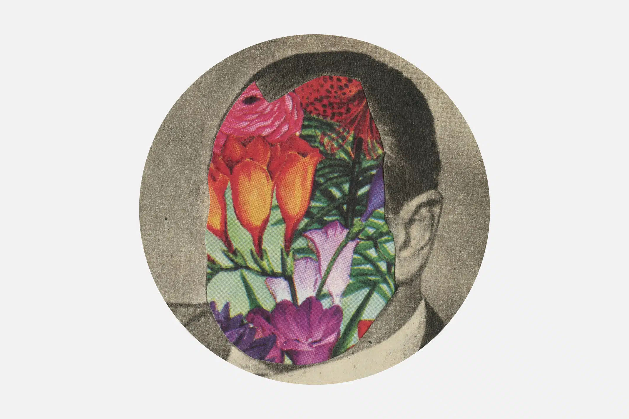
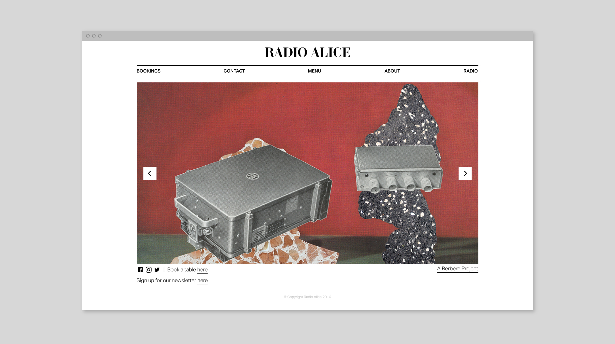
This whole process was worked on in collaboration with Alex Green a designer maker, who’s illustration work and approach felt appropriate from the outset.
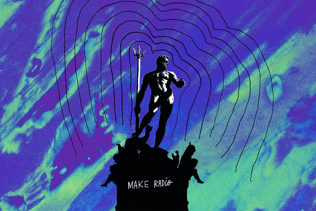
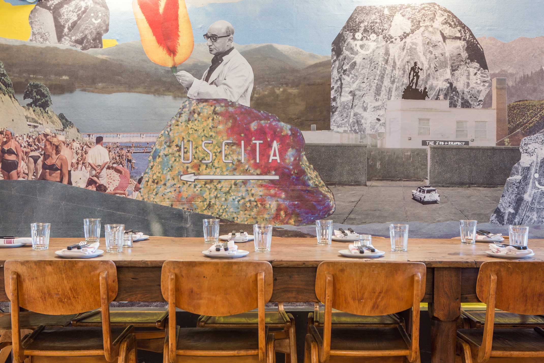
We often commission illustrators when working on projects, however this more collaborative way of working brought out a whole different tone to the work. Instead of the illustration being an addition to the identity it became a key component; adding contrast to the straighter more refined typography. The chaotic collage and hand lettering allowed us the flexibility and tools to demonstrate the two sides of the brand.
Research
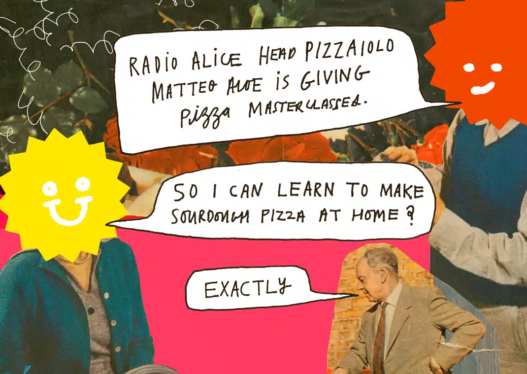
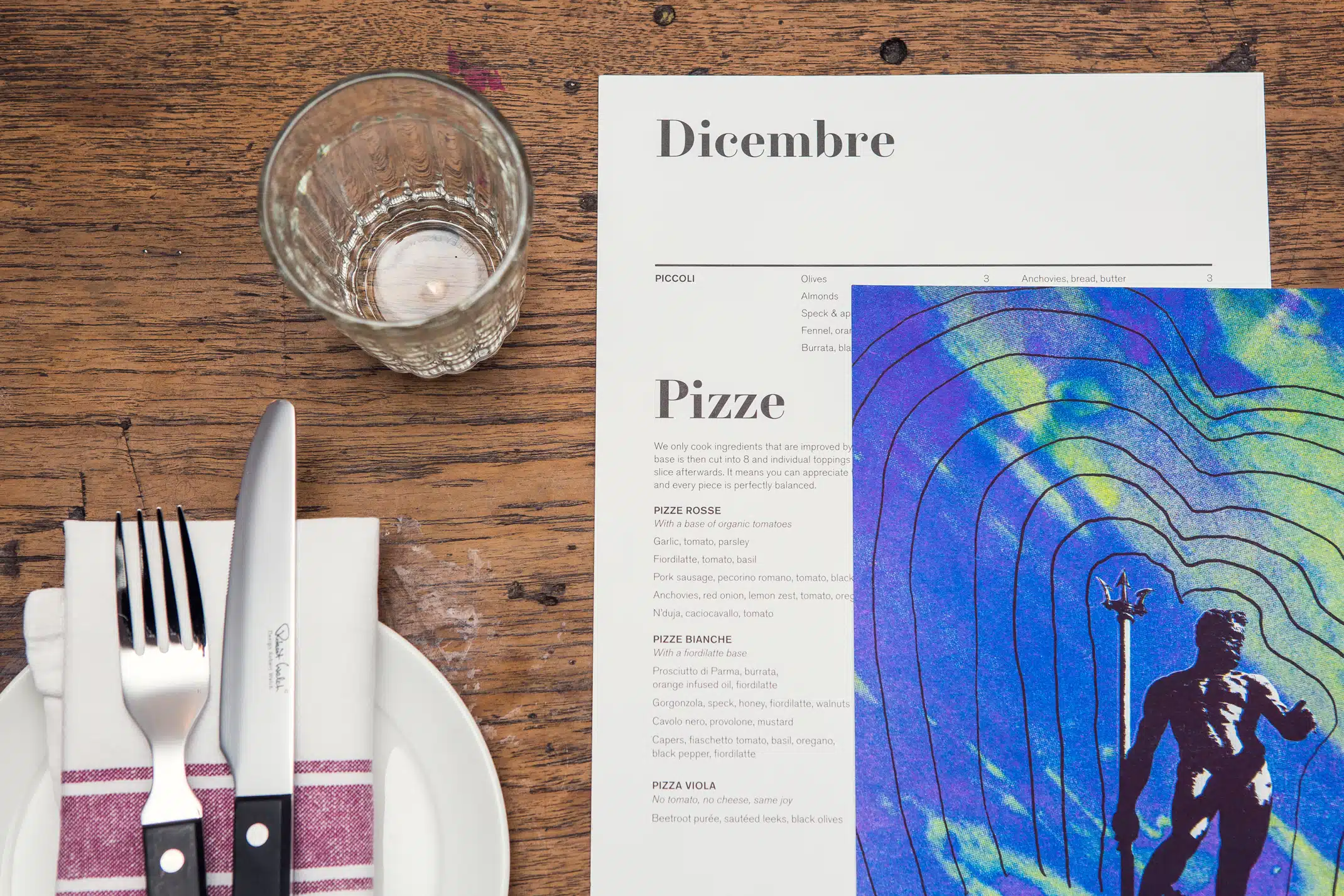
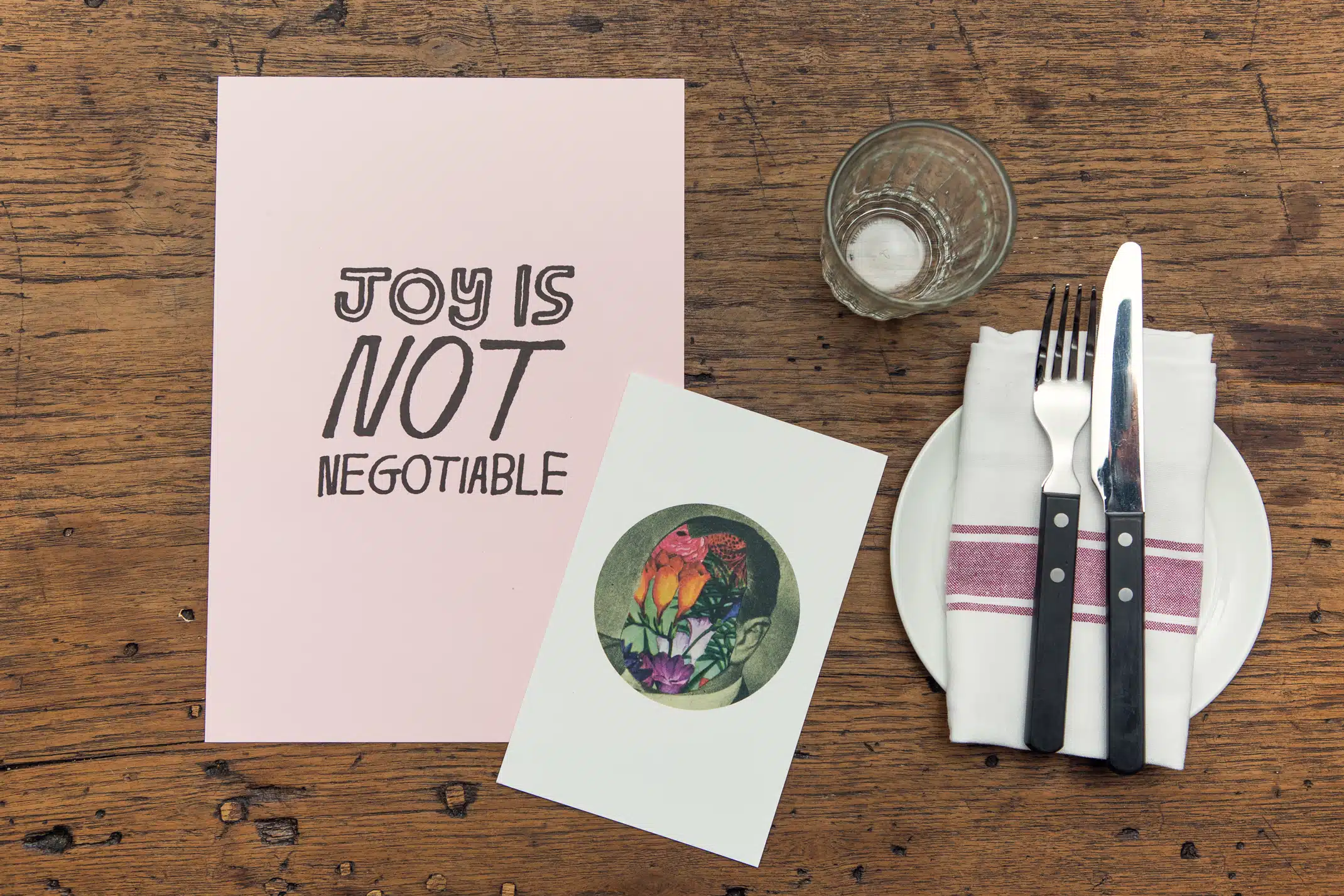
There were many aspects of the original Radio Alice that we could draw from in order to build the visual identity for the new Radio Alice pizzeria. One key element was the cut and paste graphics that were used to promote the radio and events happening around it. This came to inform the use of collage within the identity. Not only being relevant to the history of the original Radio Alice, it also worked perfectly with the sense of humour and joy that we wanted Radio Alice to have today. Copy and tone of voice was also informed though our research, bringing in odd phrases picked out from graffiti around the apartment Radio Alice was broadcast from,as well as 1970’s Bologna. Phrases like ‘Joy is not negotiable’, once translated roughly into English added to the slightly surreal sense of humour, whilst still retaining this core sense of warmth and respect.
Print Process
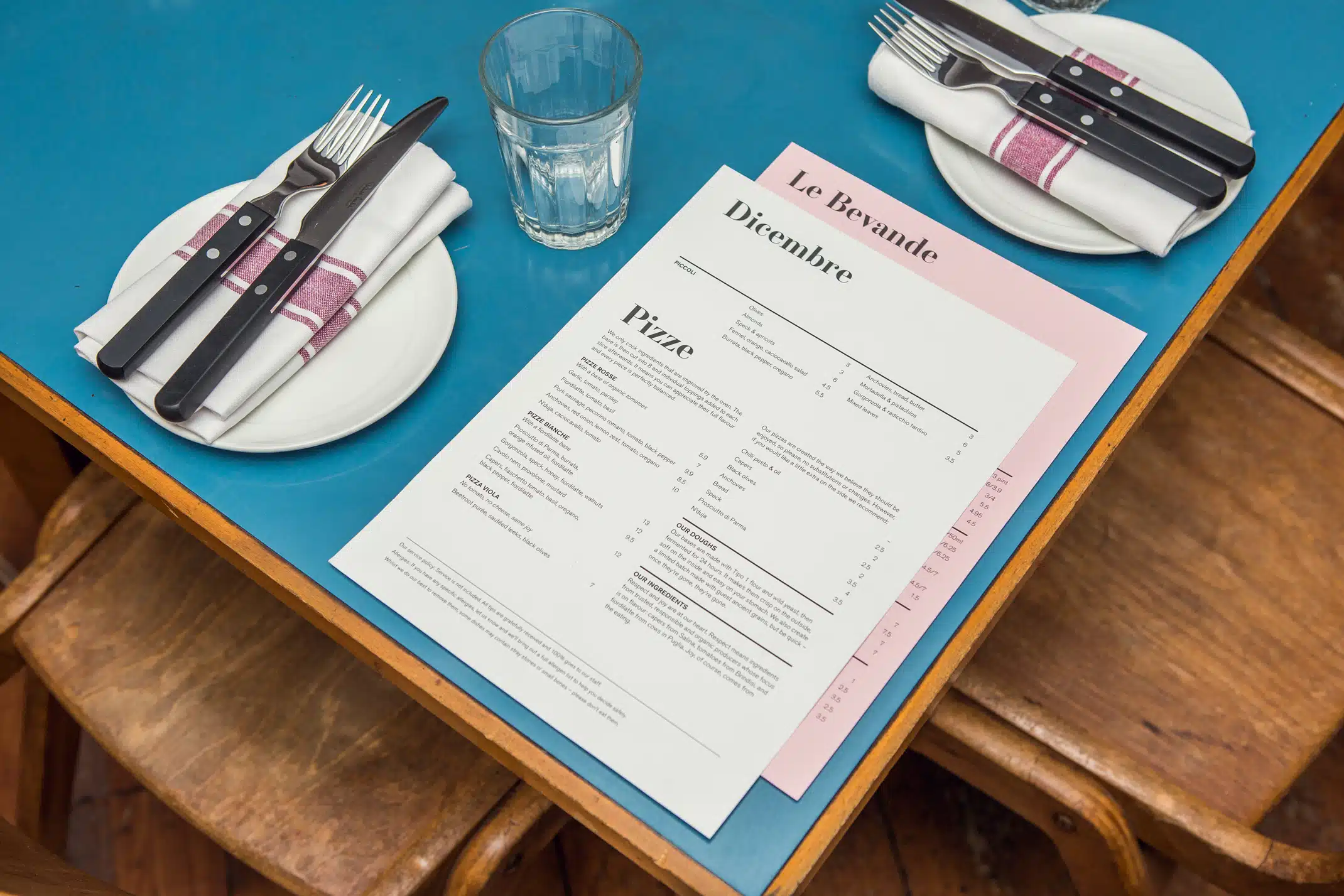
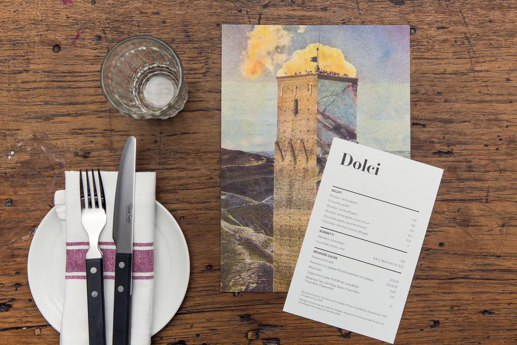
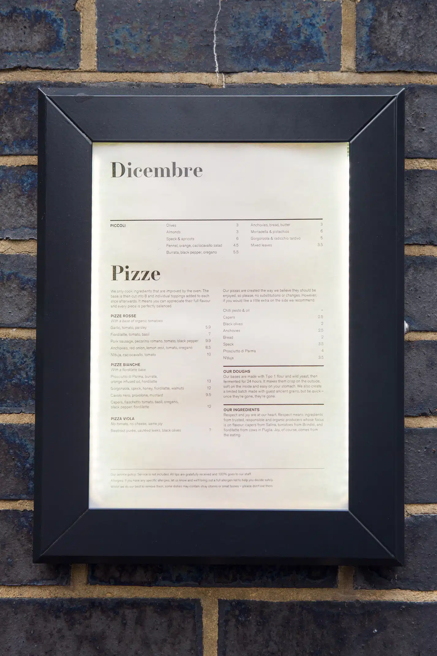
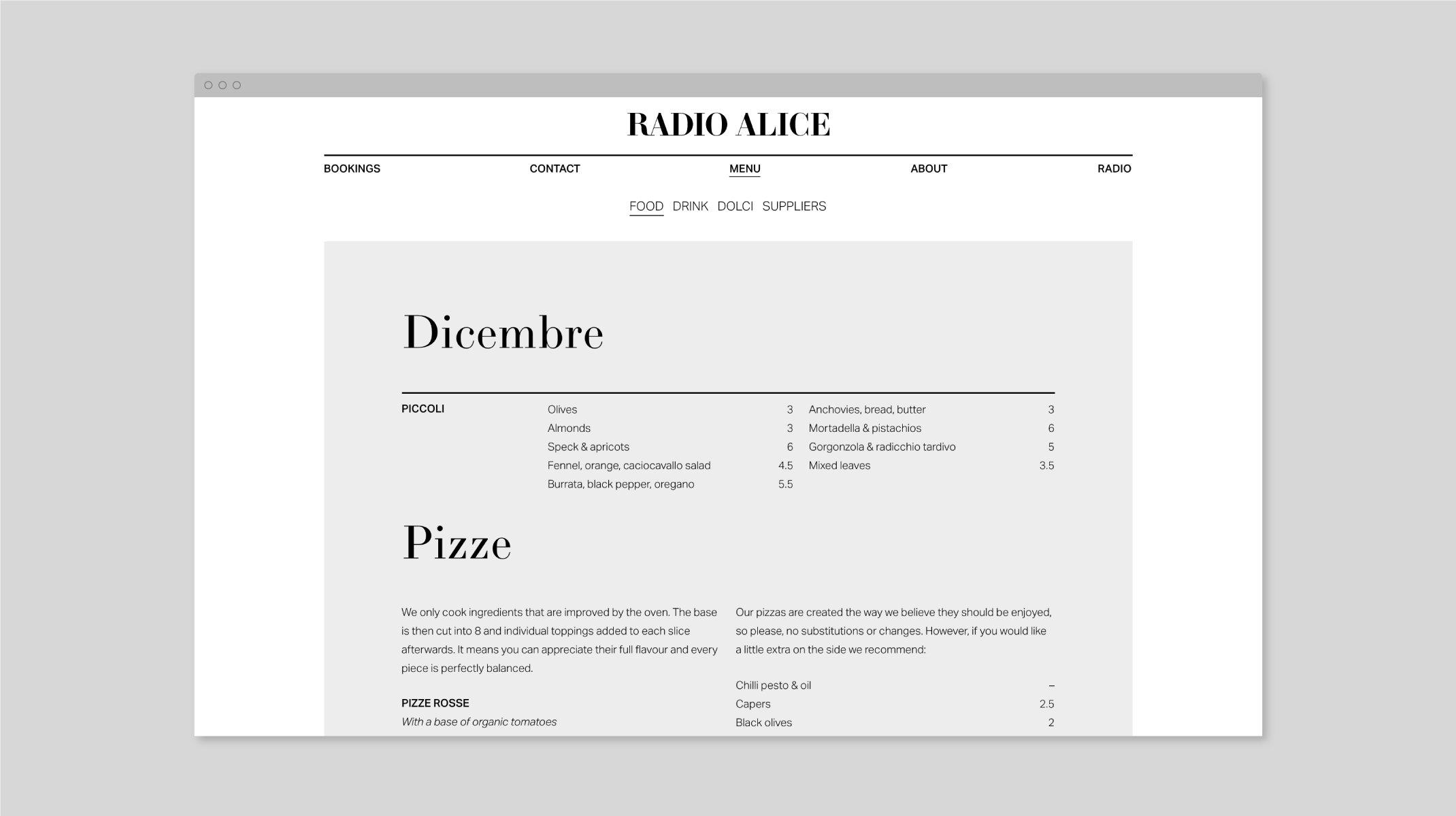
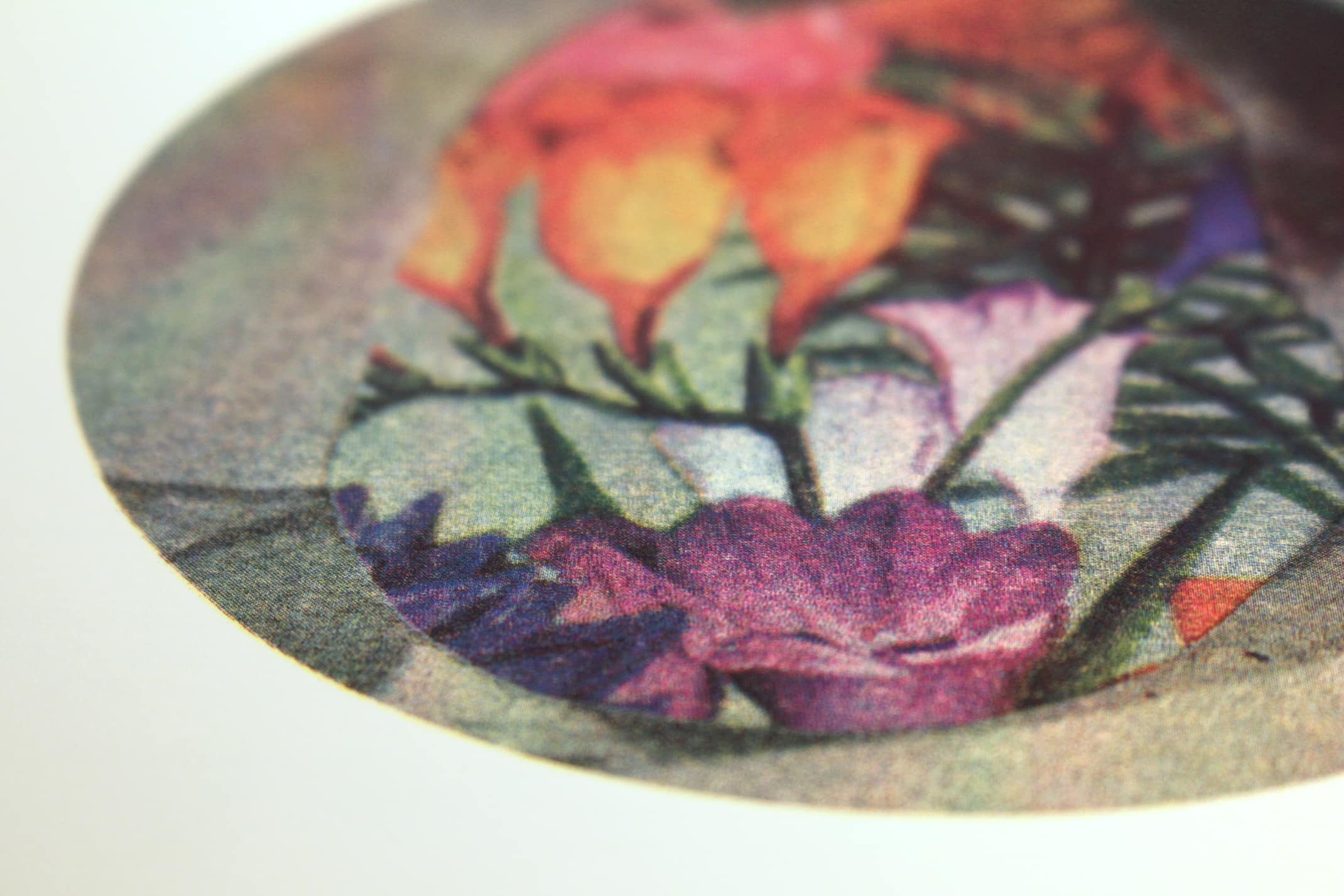
One aspect of the old Radio Alice that we were keen to bring forward, and perhaps one that is less obvious is the way they printed and distributed their messages. Printed material would have been produced on an old mimeograph machine, a wonderfully immediate and low-fi printing technique. The closest that we could get to this today was risograph printing, which we experimented with and fell in love with. The wonderful colours that it brought to the illustrations added another level of playfulness and joy. Unfortunately there were restrictions when using this process in larger quantities. So, experimenting within the more standard litho printing, we chose to replicate the risograph ink colours with fluro pantones. Swapping out the standard CMYK for super bright pantones instead. This had an amazing effect, and really added to the contrast between the ‘respect’ and the ‘joy’.
Considering how everything from the choice of typeface to the way we printed the menus sits with the core idea behind the brand ensured that we had both a unique and coherent tone of voice.