Artnote
Digital — Identity — Print
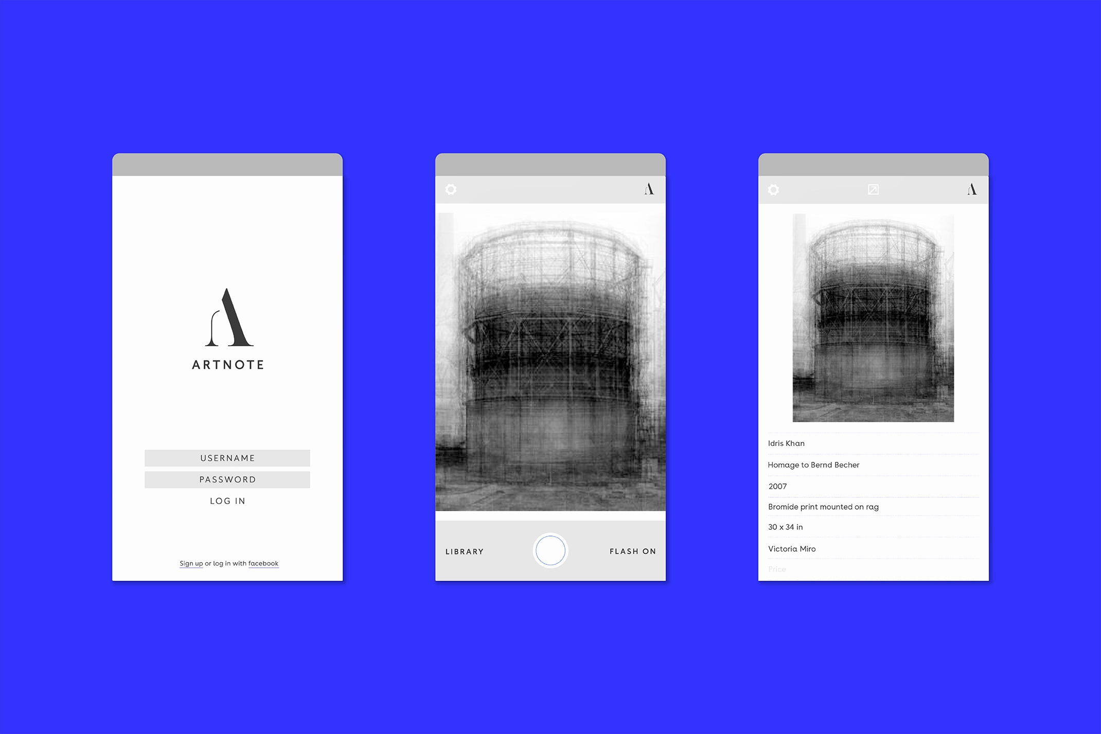
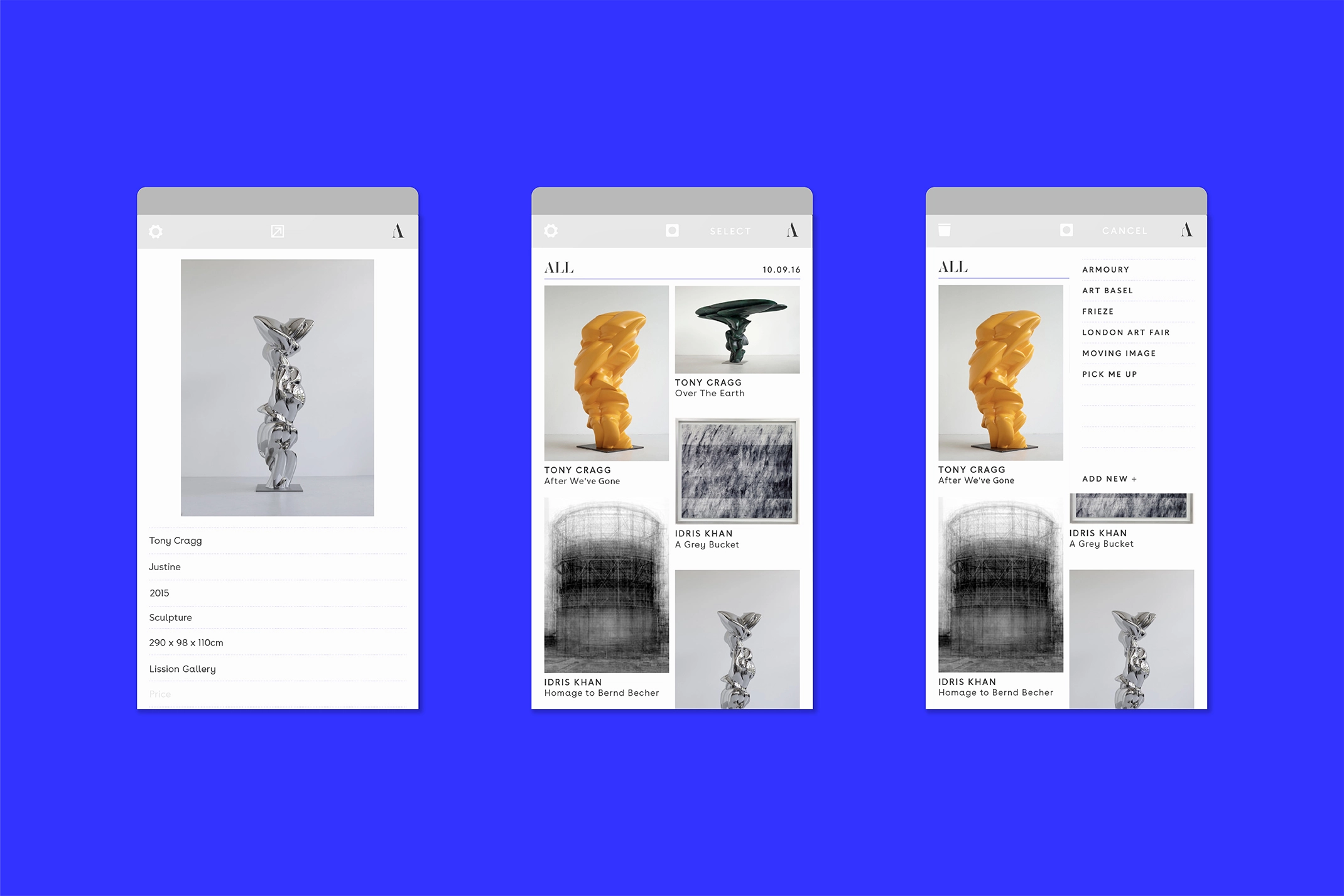
Artnote is an app which acts as a tool for collectors, curators and art world professionals to capture, store and share images of their finds and record key information in a simple and elegant way.
The team behind Artnote approached us to create the identity and look and feel for the app ready for it’s launch at Frieze London.
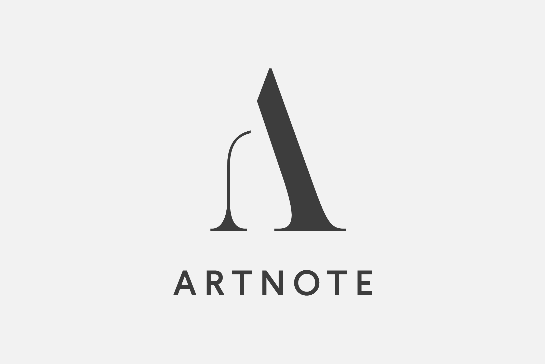
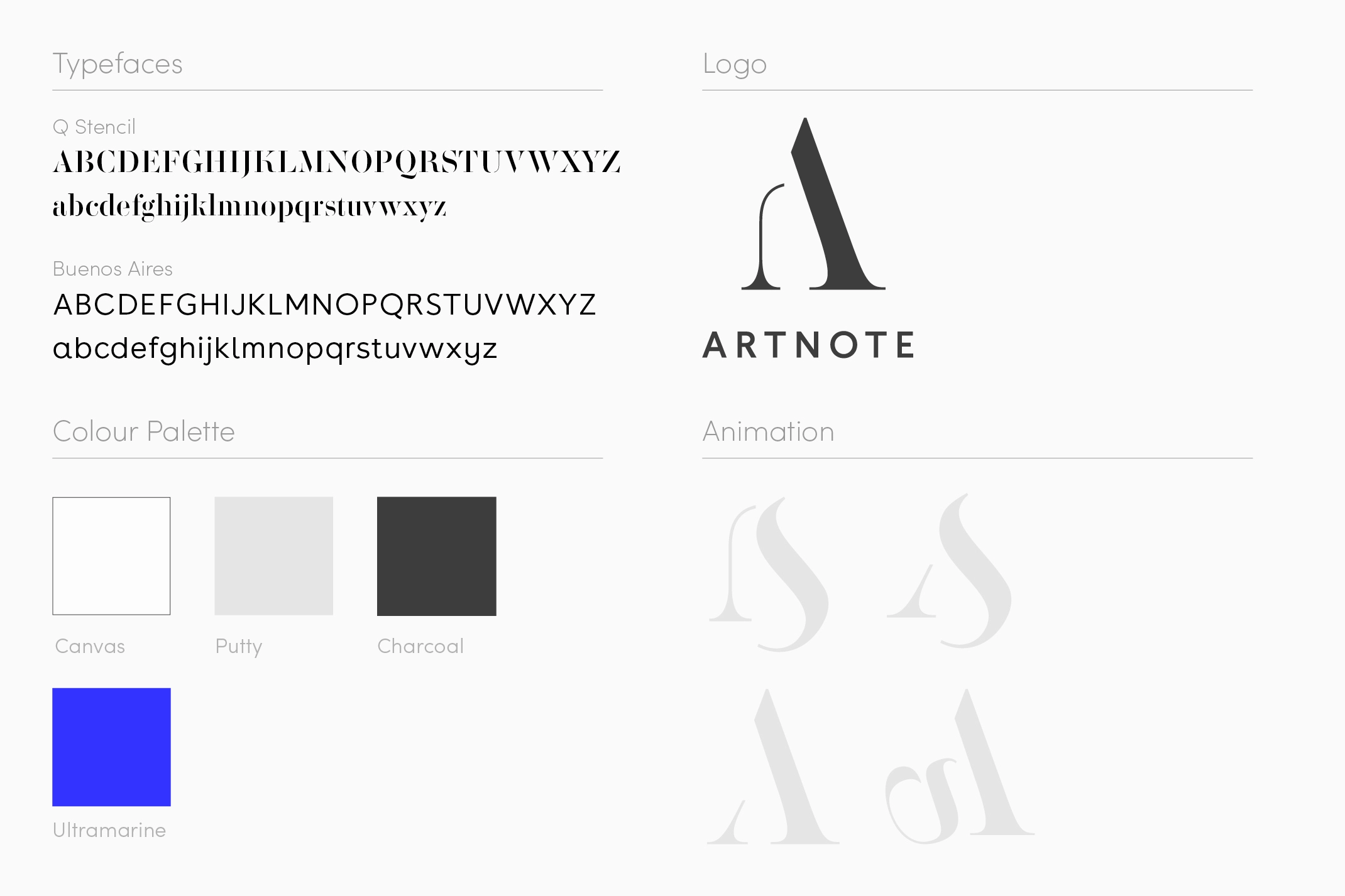
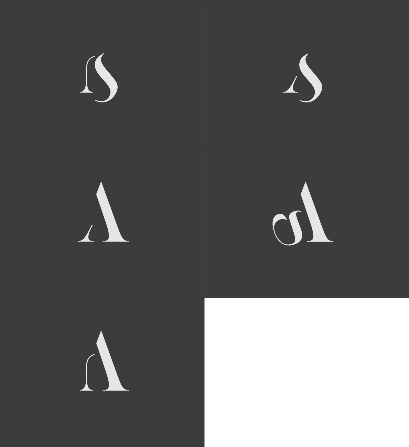
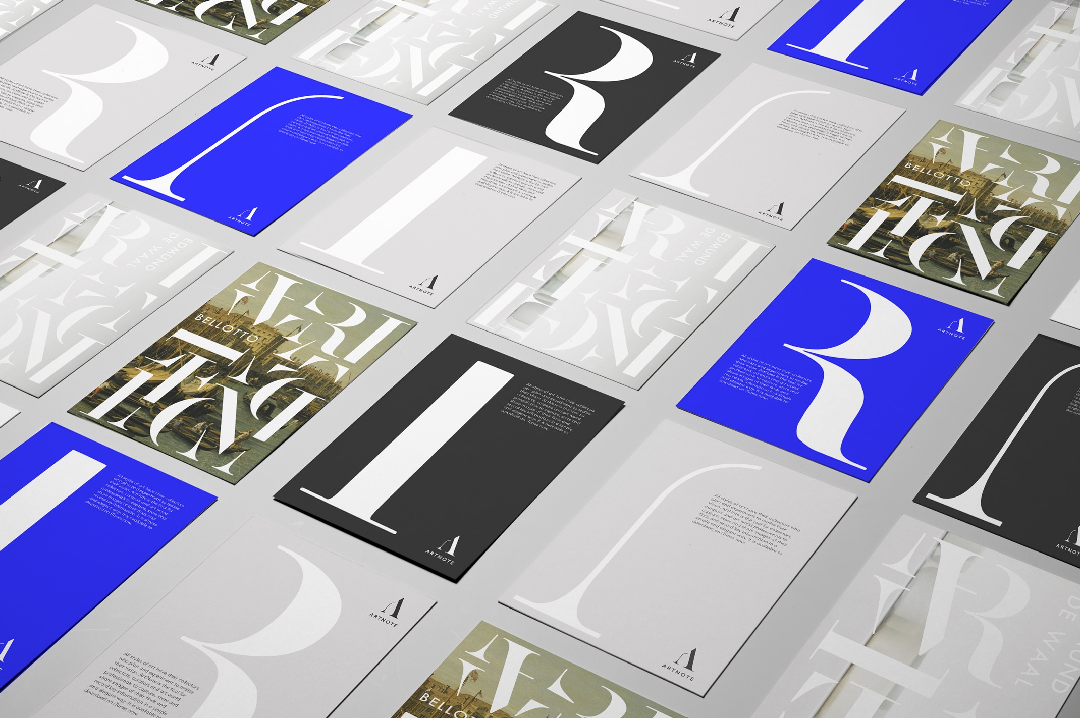
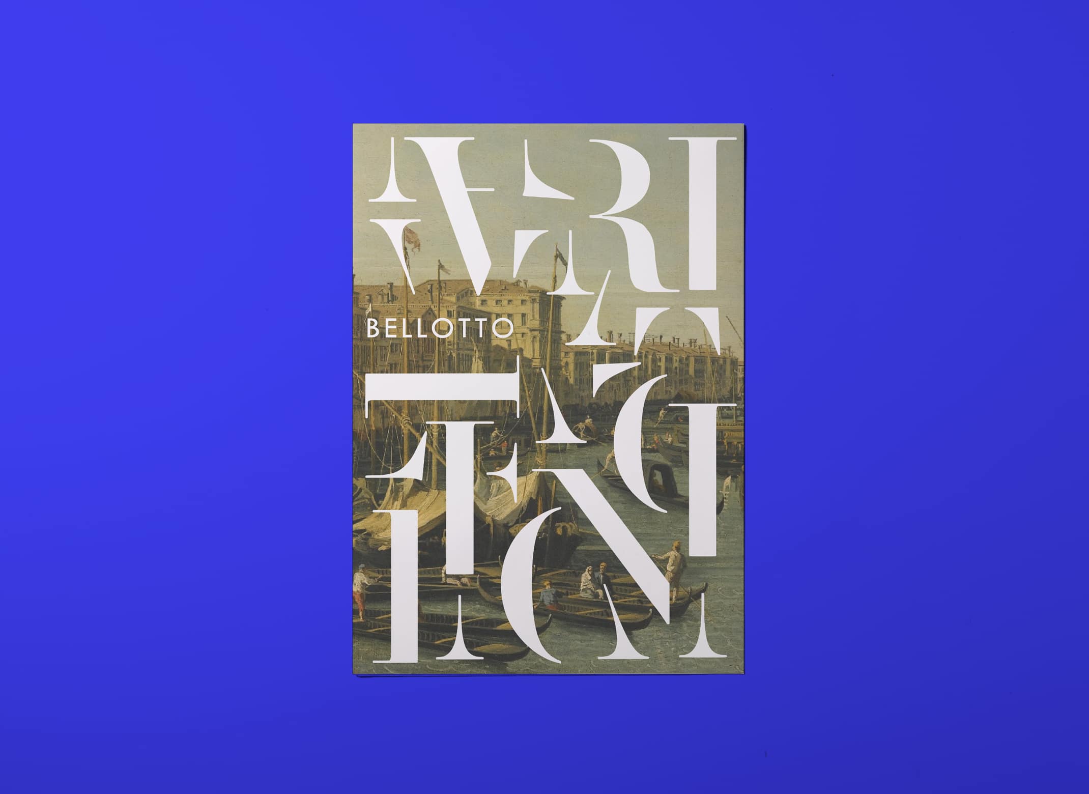
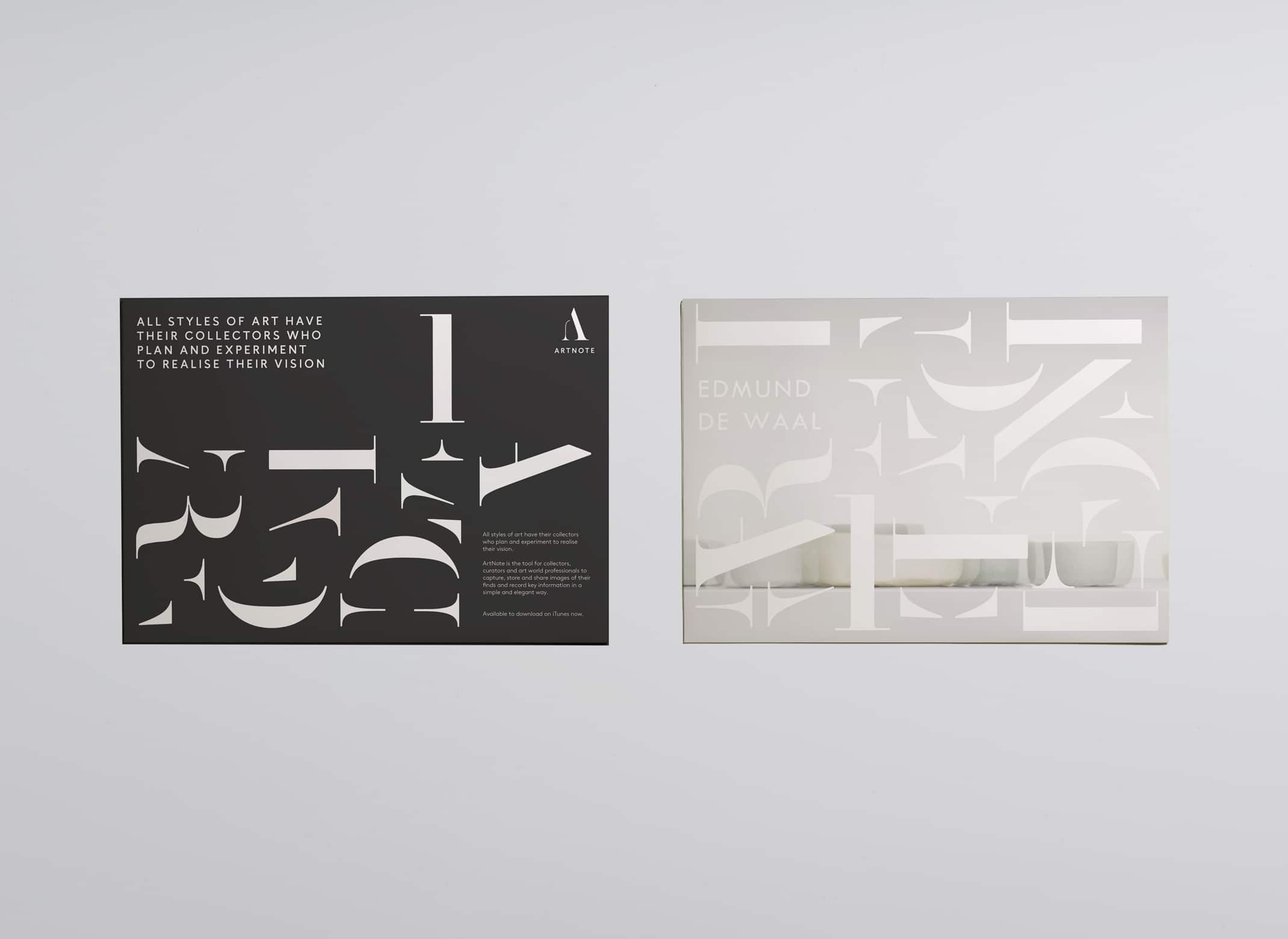
Building on the idea of the wunderkammer, which literally translates as a cabinet of wonders, we created a logo which celebrates the eclectic nature of the artworks the app users may bring together. The letterforms are broken apart and displayed almost as sculptural forms in themselves. This is used for the loading animation as well as printed pieces, becoming a motif that can be used and played with throughout the identity. This idea reinforces the idea that Artnote is a place for experimentation, and the dynamic logo reflects this in its constant changing form. Swapping one shape for another, but always being the A.
As the app had a very functional reason for being, the design needed to be clear and not distract from the art which was being recorded. We used a neutral colour palette to keep things simple but paired it with a bold electric blue to represent the energy and passion behind collecting.
