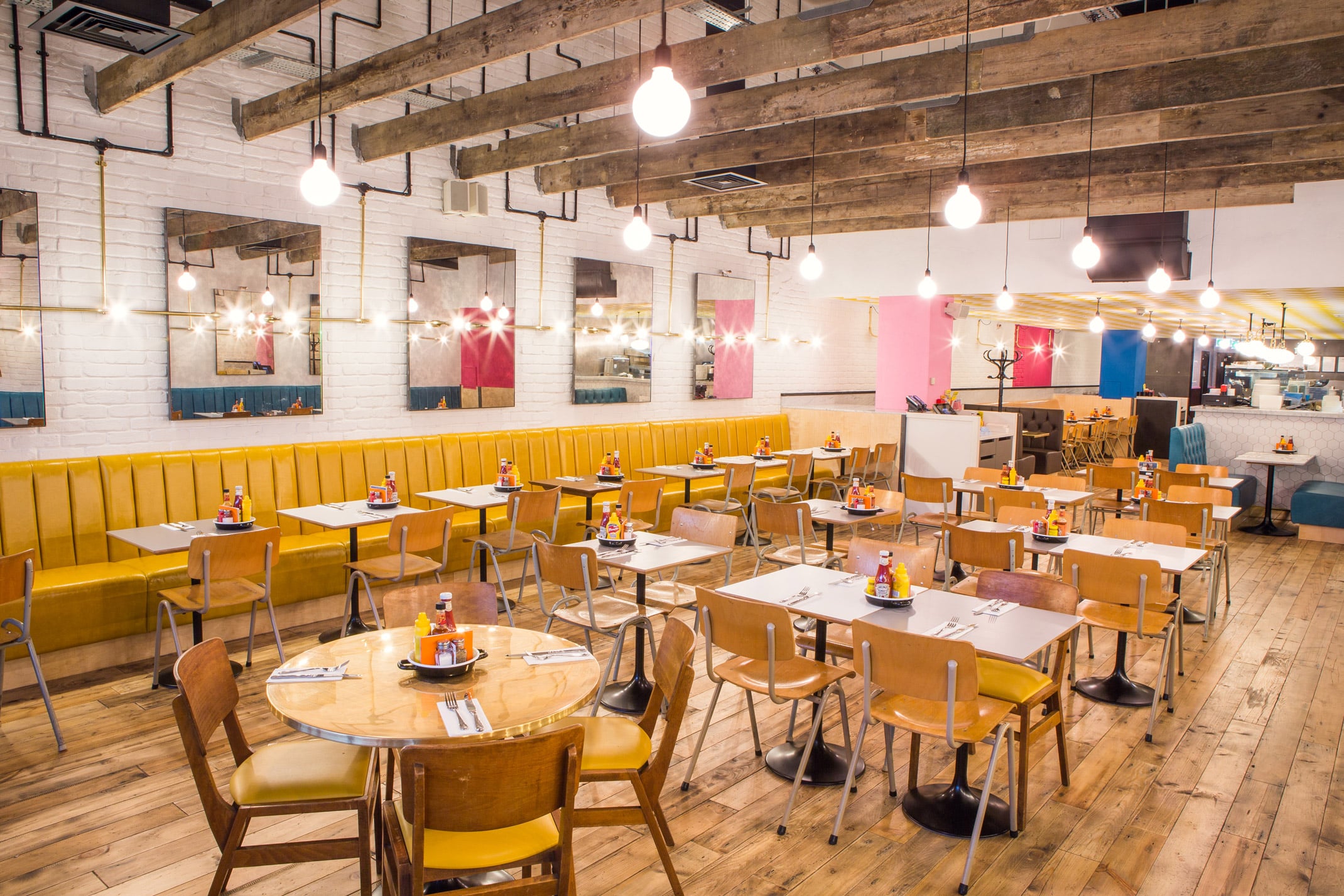
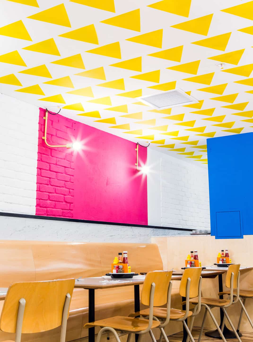
Like a lot of restaurants in shopping centres, when Byron took over the site in a Camberley it felt gloomy and uninviting. Working alongside the brand team, interior designer and architects we were asked to make this space feel bold, bright and most importantly welcoming.
The Client
For over five years we worked with Byron on the internal and external signage for all new restaurant openings as well as a number of restaurant refurbishments. As Byron are well known for not having a singular logo or easily described ‘house style’ each restaurant is individually designed. There are no custom typefaces or brand colours, instead we worked closely with the architecture and interior design team to develop each restaurant’s unique look and feel.
The Brief
Interior designer Clare Nash briefed us on the sites theme ‘A Lichtenstein take on a restaurant’ and shared that the site would feature bright colours, unusual shapes, white painted brickwork and an overall mid century feeling which, Byron are well known for. Our task was to create bold signage which reflected the interior scheme and felt big, bright and light.
Neon
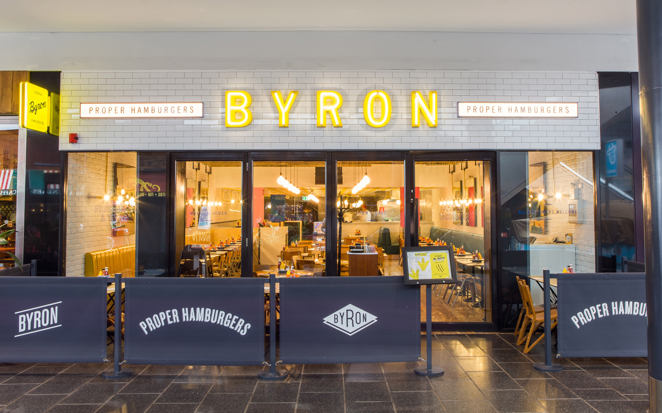
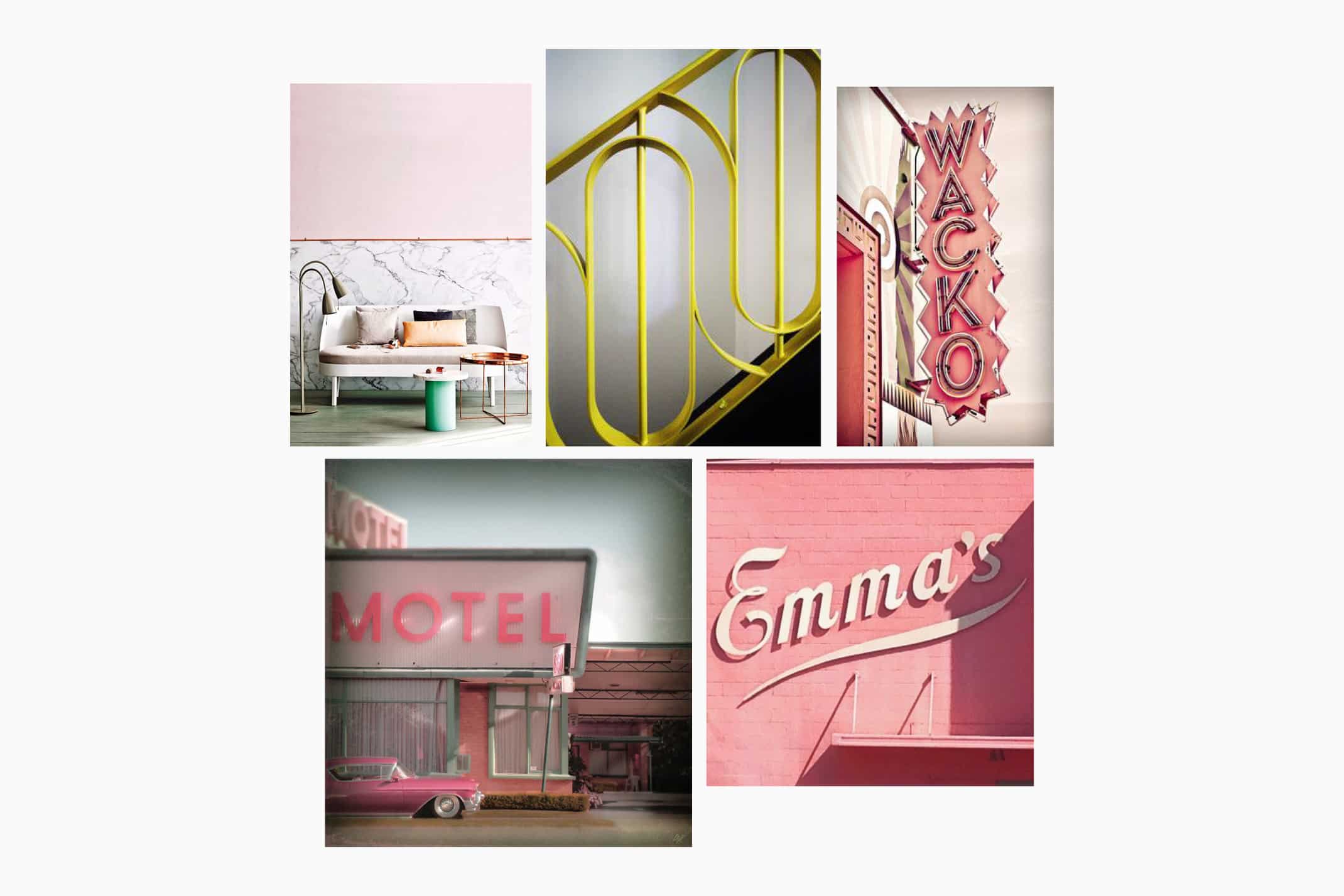
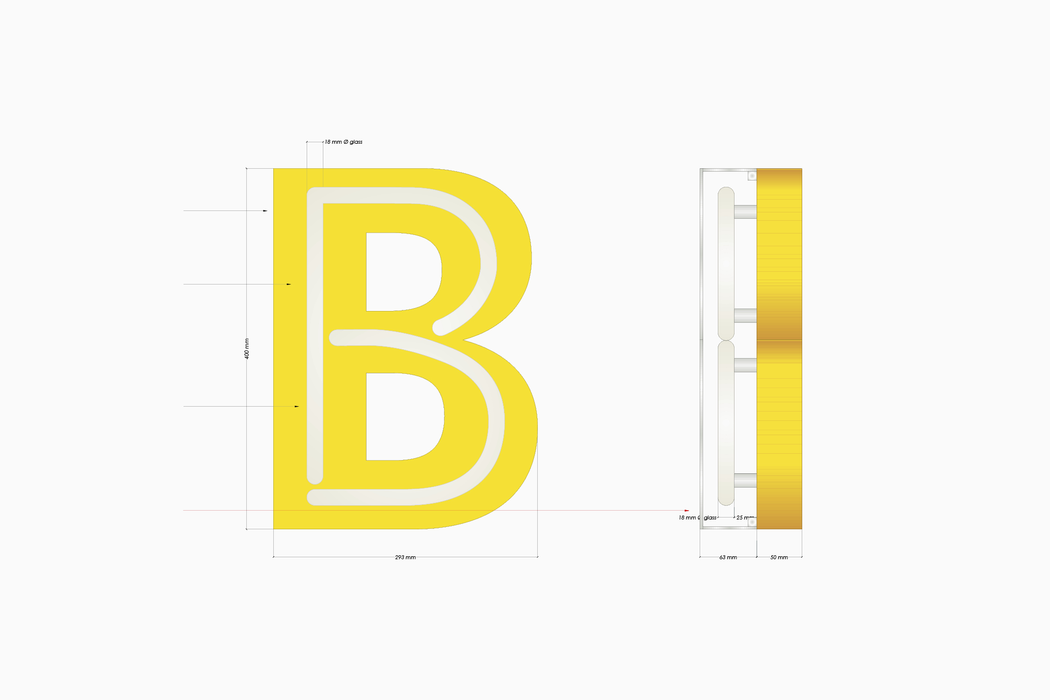
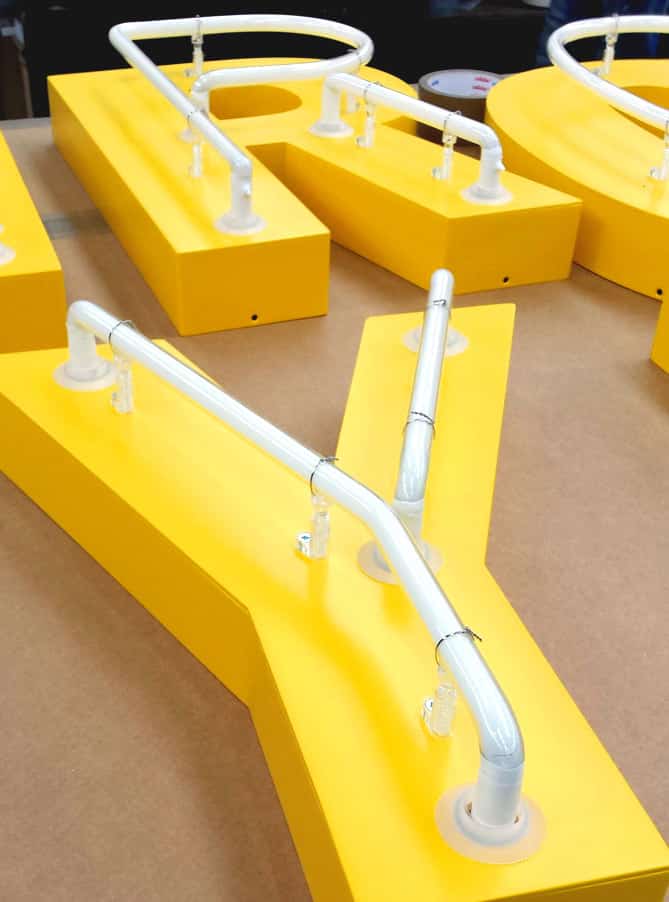
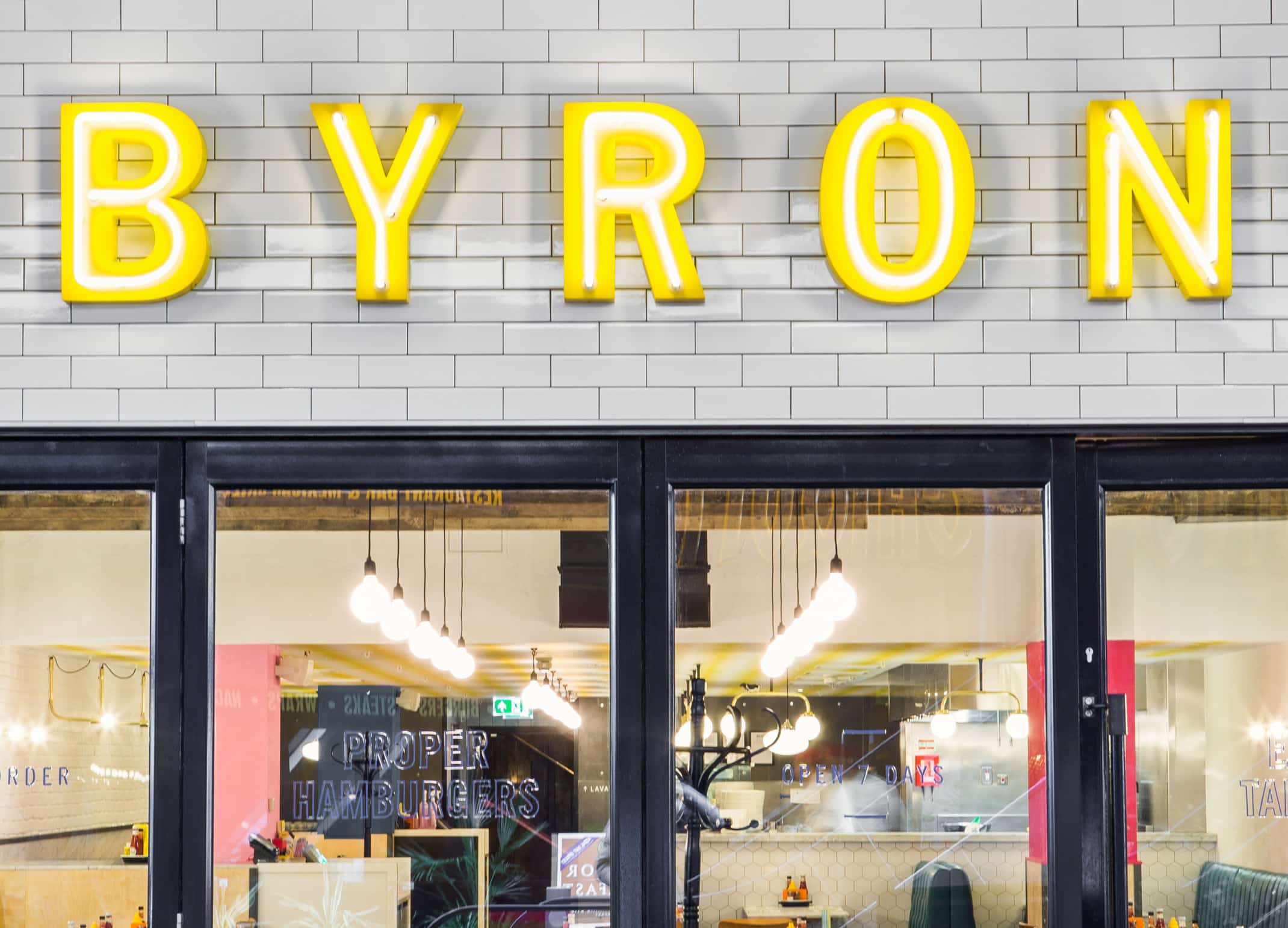
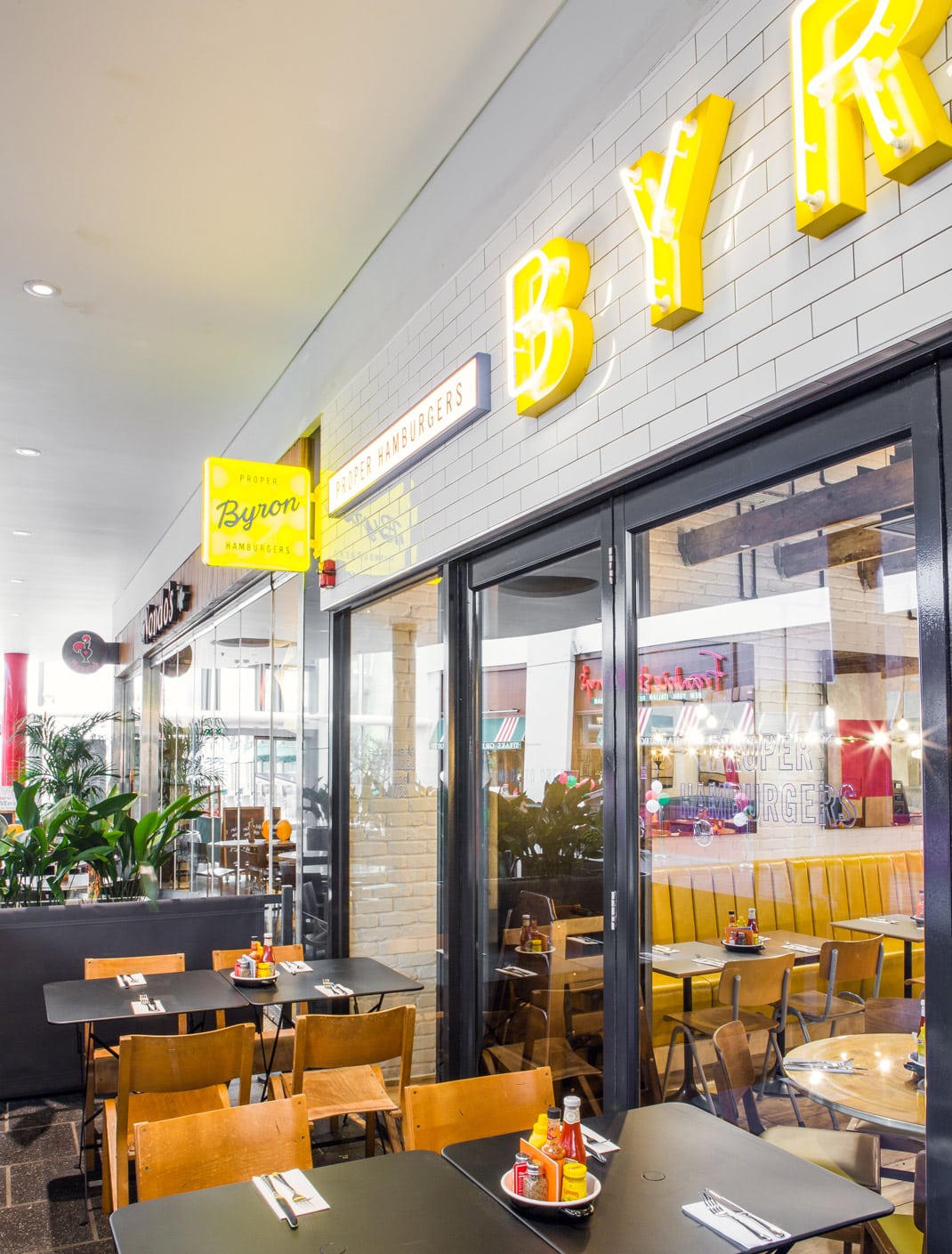
Working from our research into 60’s American motel signage and a palette of pink, bright yellow and white we looked to create bold neons for the fascia of the restaurant. Using bold, solid yellow letters made up from a contemporary typeface and then overlaying a bright white neon to light the sign helped to give a nod towards our historical research whilst keeping the overall look modern and very Byron.
Throughout the design process we worked closely with the technical signage company to ensure that the neon fitted the typeface centrally and reflected the chosen font. It was also important to get the breaks in the neon to sit in a way which reflected the research we’d carried out.
Projecting Sign
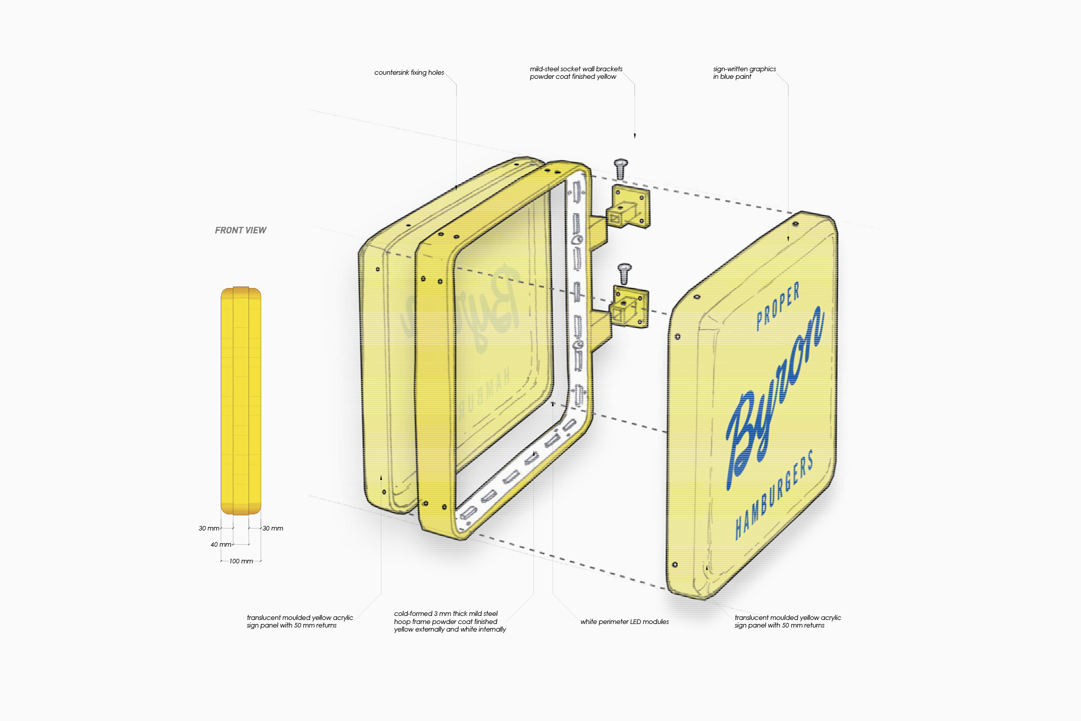
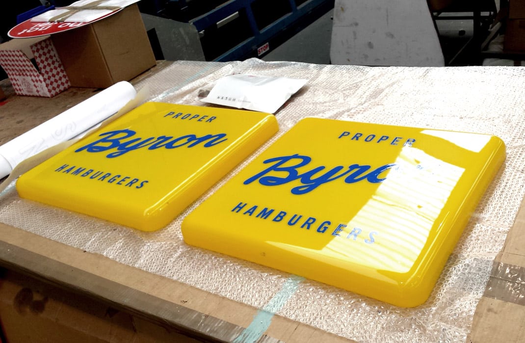
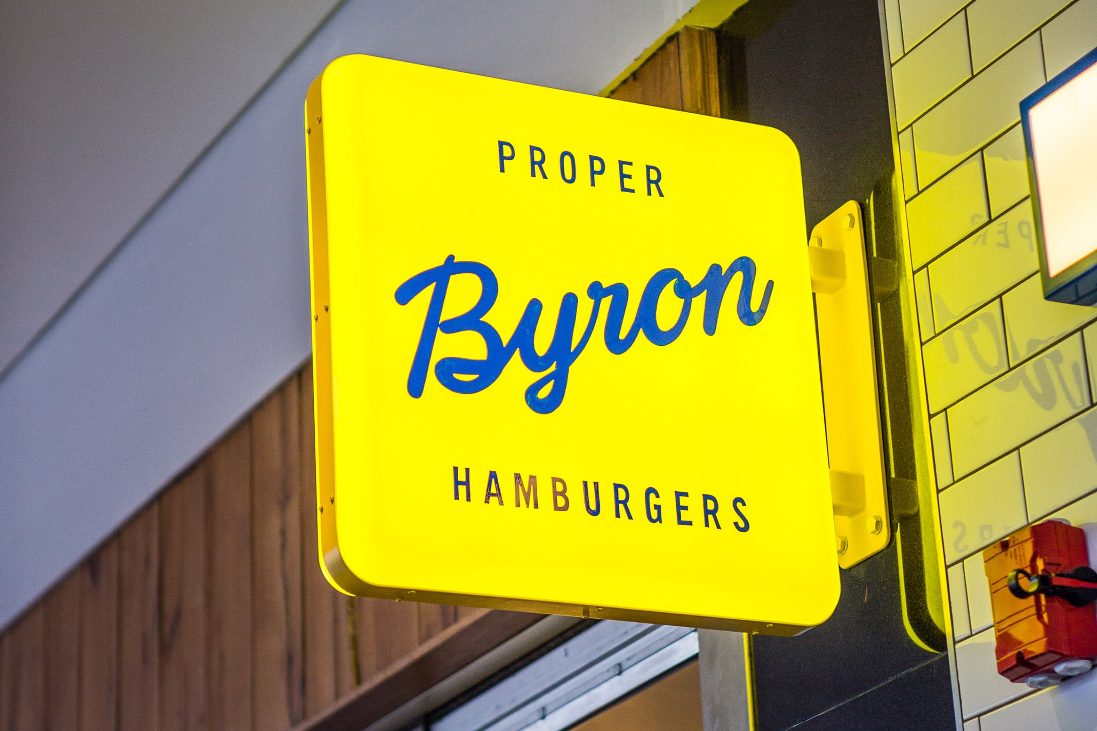
After using such bold typography for the main Byron neon we wanted to use a softer more scripted text which we’d found in our research as a contrast. The projecting sign provided a suitable opportunity for this. As well as the script we also wanted to use this space as an area to reference the blue which had been introduced into the interior design scheme. The large yellow lozenge was created with the blue text providing the ideal amount of contrast when the sign was internally lit.
Window Graphics
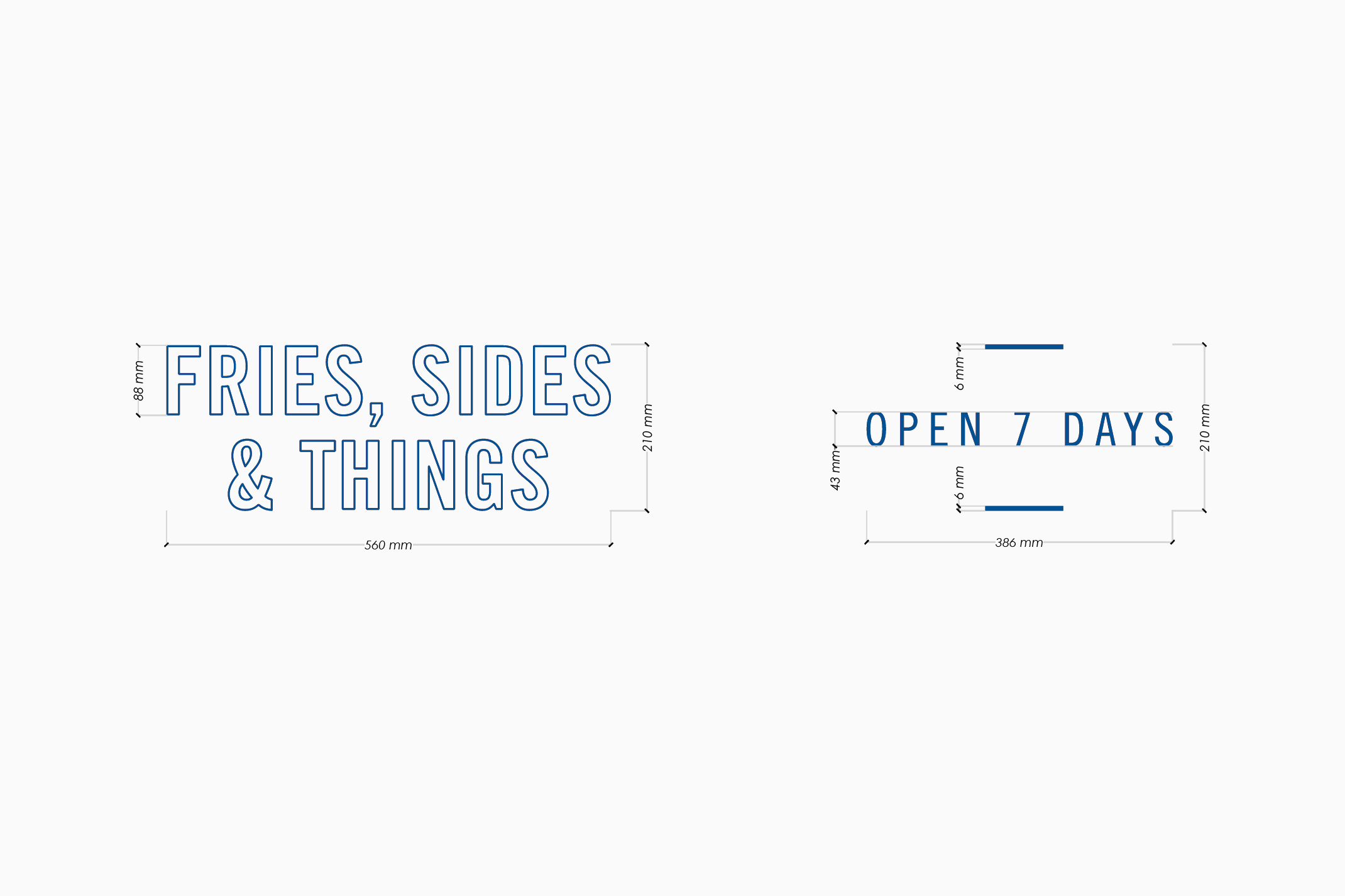
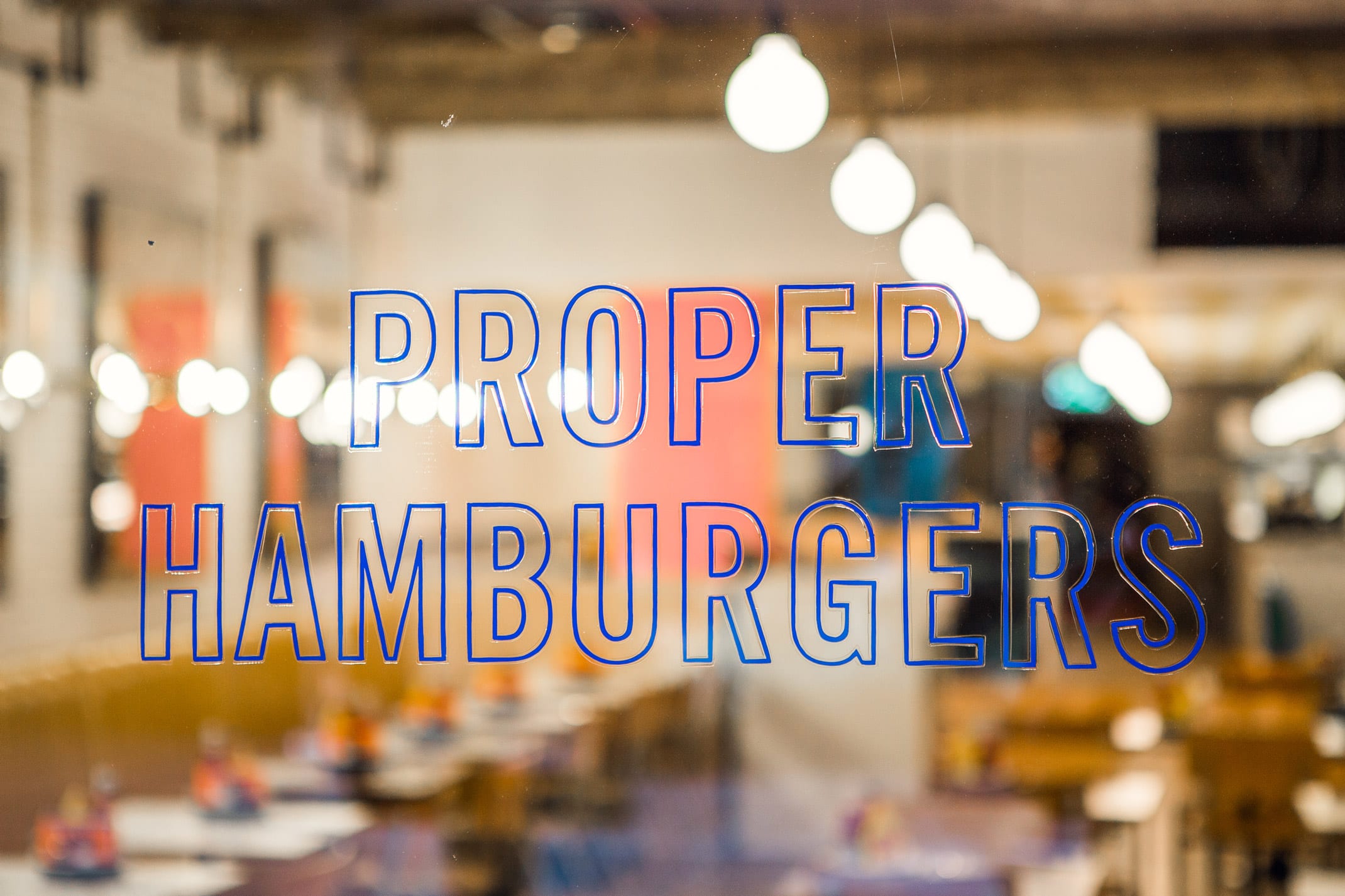
The site featured large bi-folding doors which provided the ideal opportunity to include key messaging from Byron. For this we contrasted large outlined text with smaller solid typography.
The Result
When the Camberley site opened it appeared bright, light and bold. The exterior signage was clearly visible and contrasted the surrounding restaurants well. Along with the neon, projecting sign and window graphics we created breeze screens and light boxes which supported Byron’s visibility in the area.
