Coco di Mama — Identity
Digital Identity Packaging Strategy
As Coco di Mama grew, its original visual identity was becoming restrictive and no longer reflected their Italian to go offering. We were tasked with rebranding the company, so it felt more contemporary and had greater flexibility.
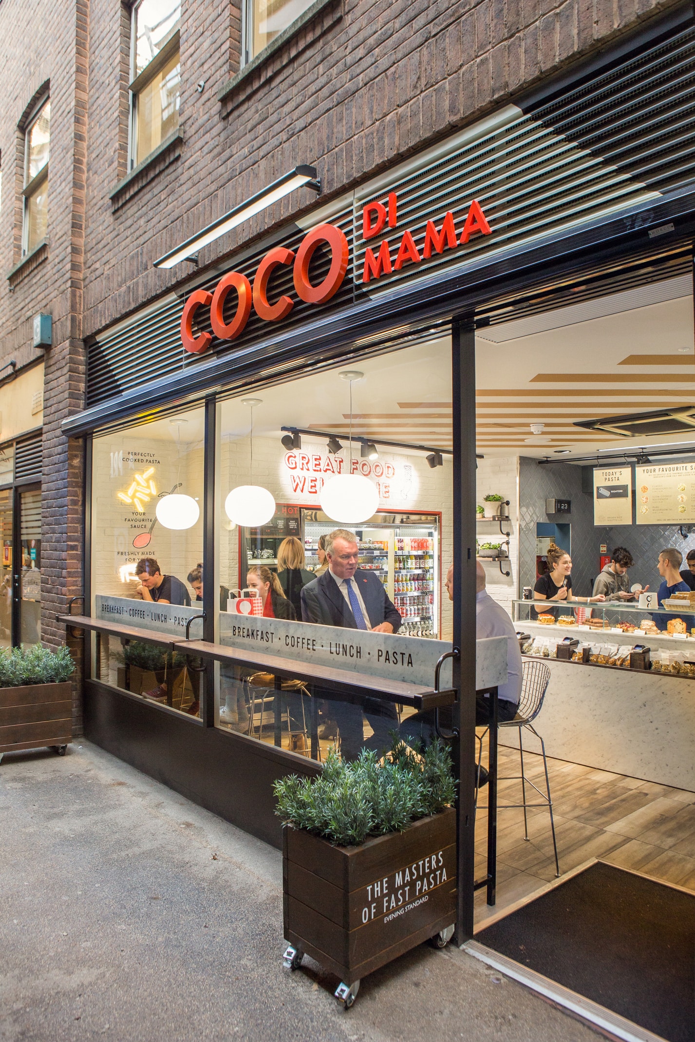
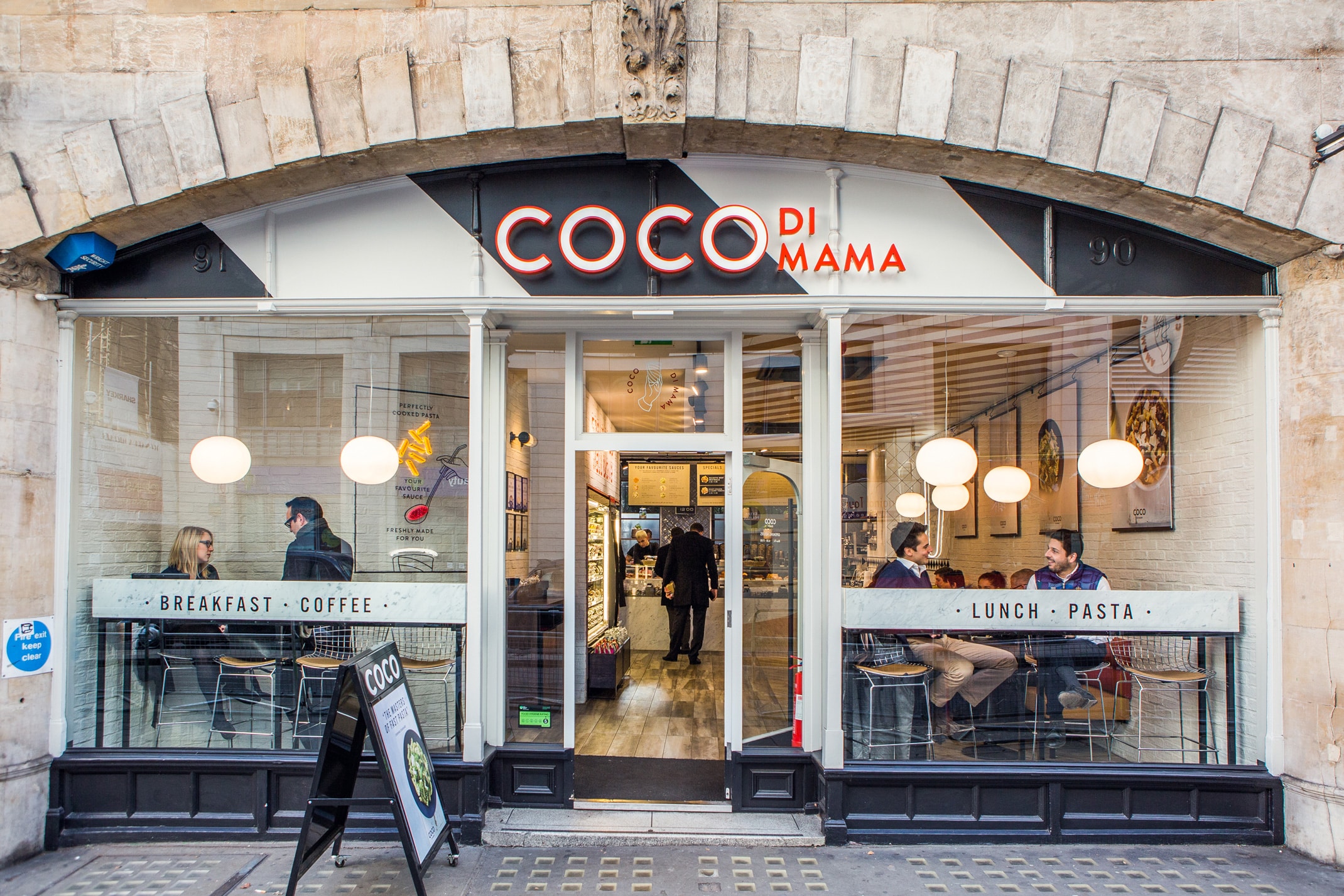
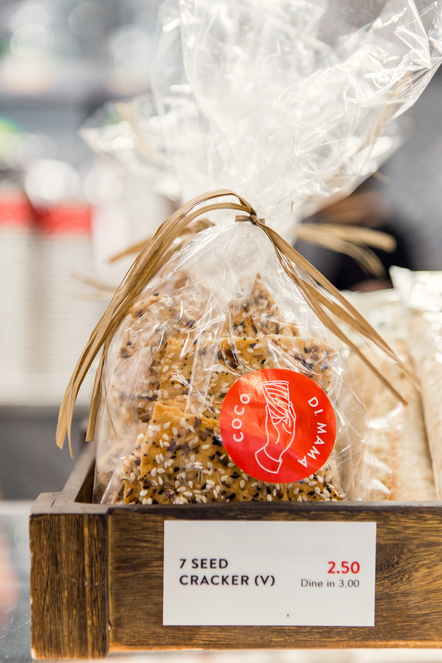
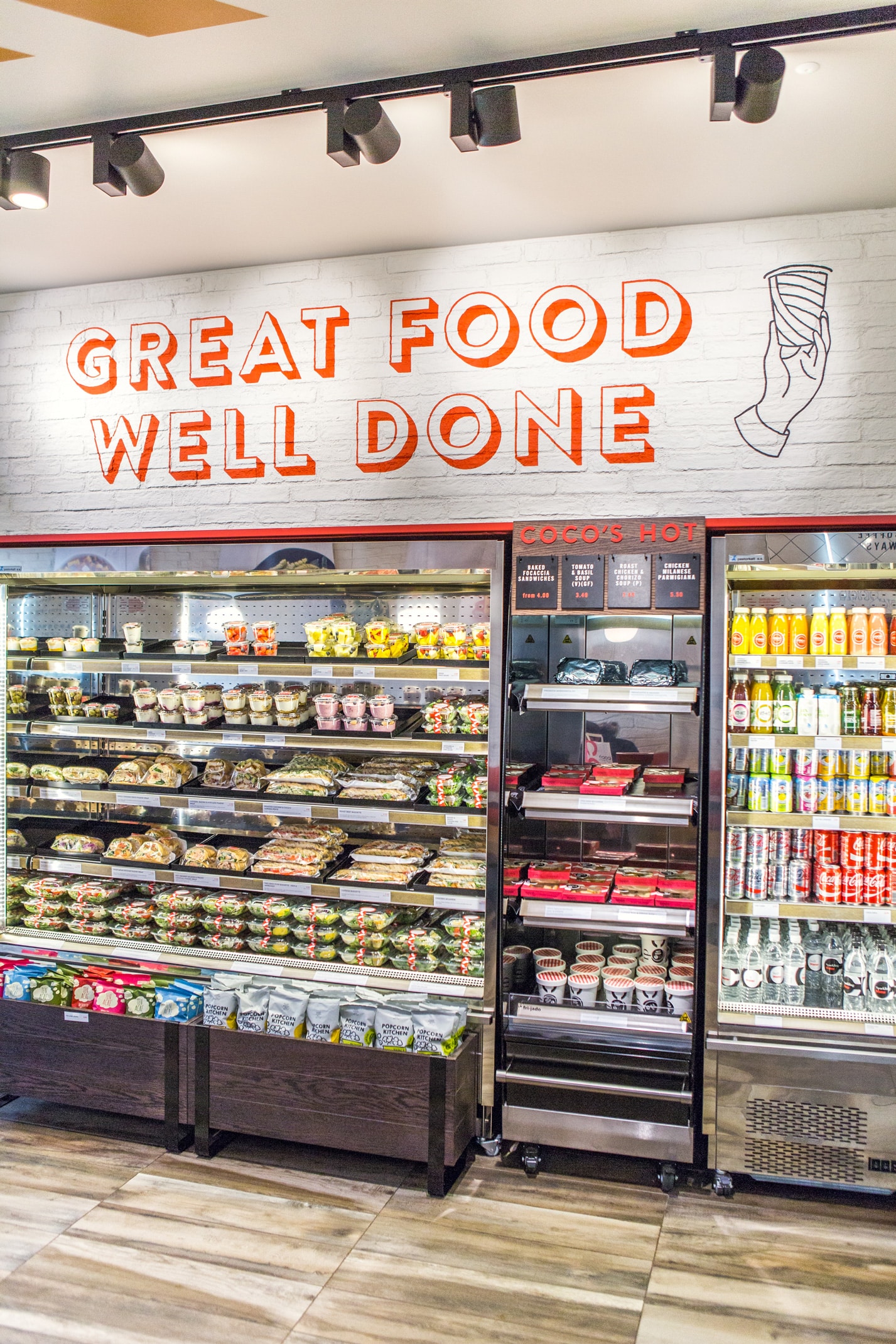
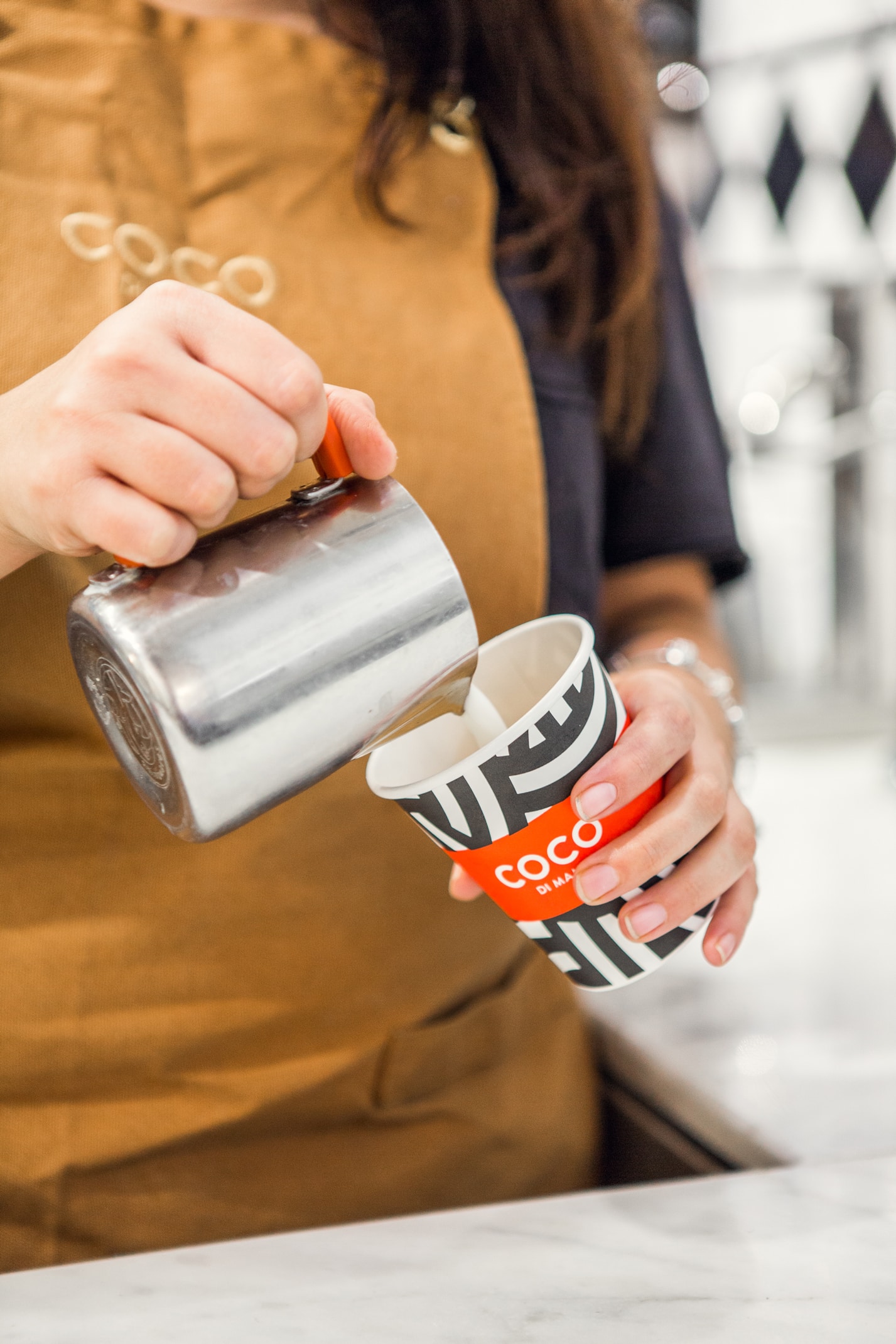
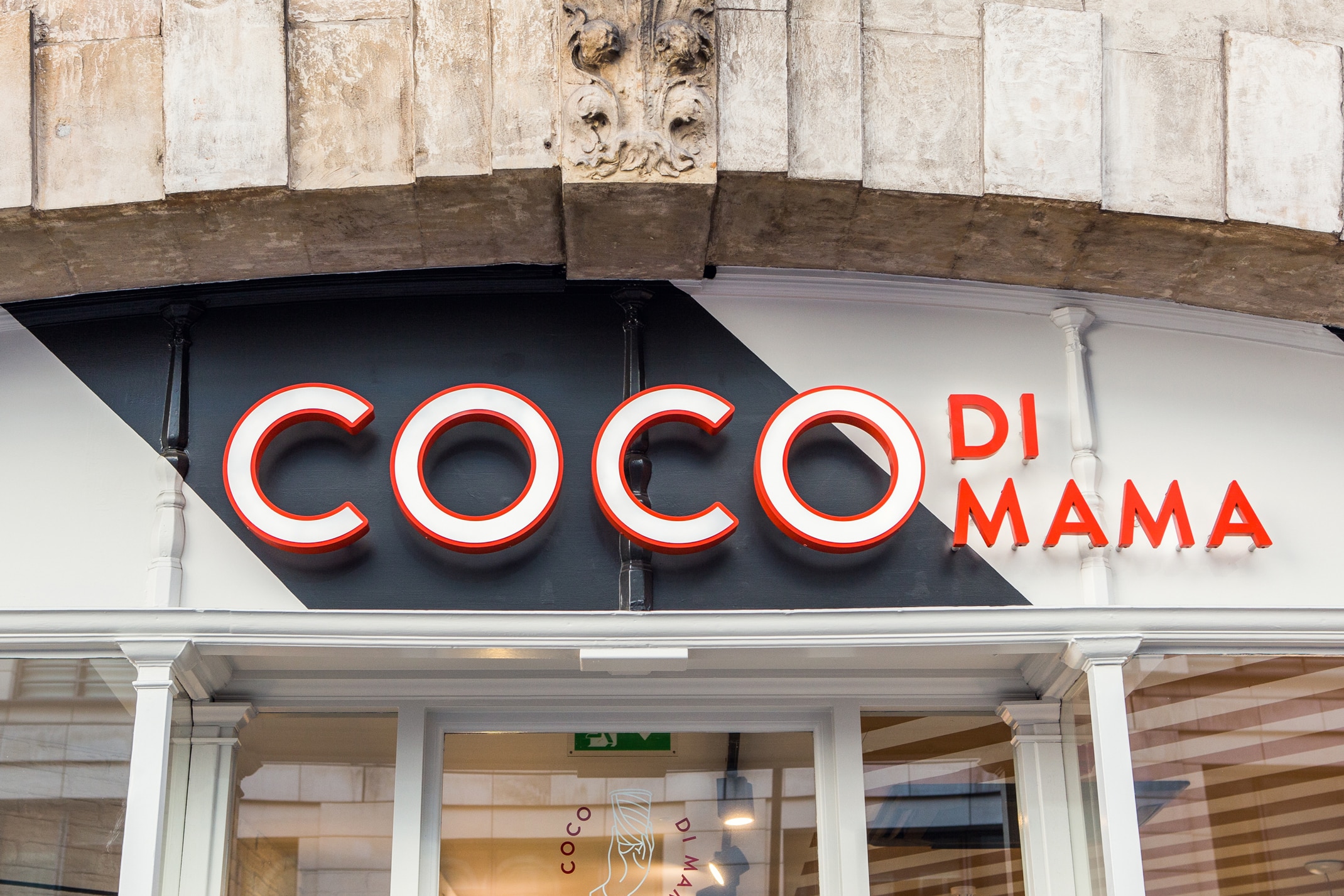
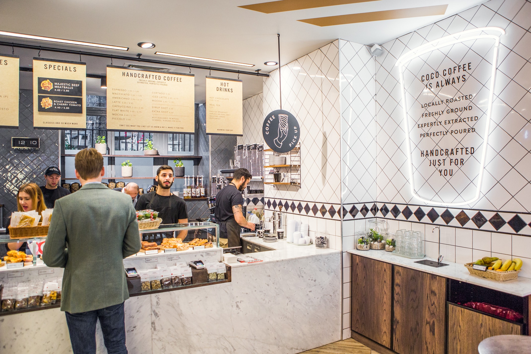
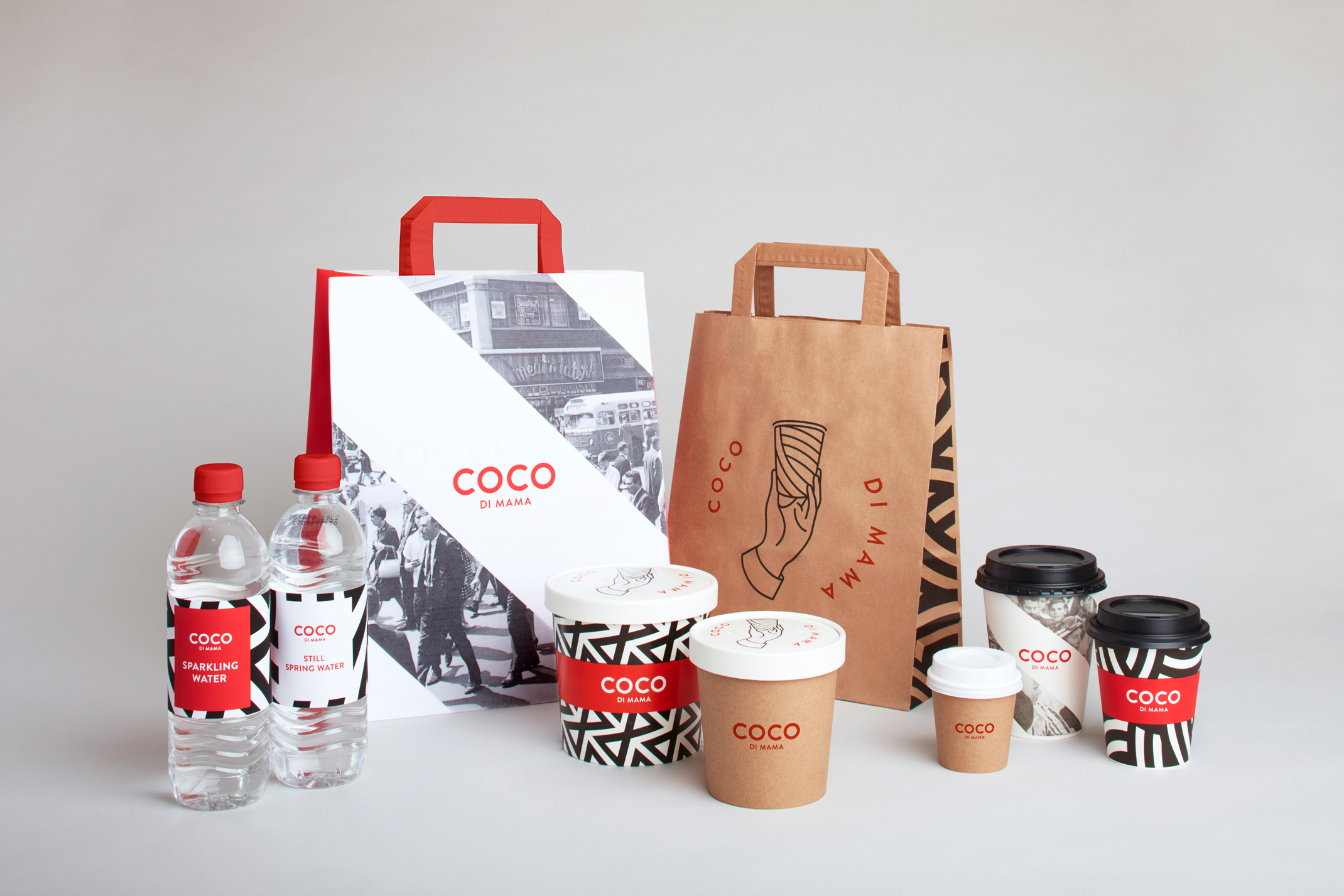
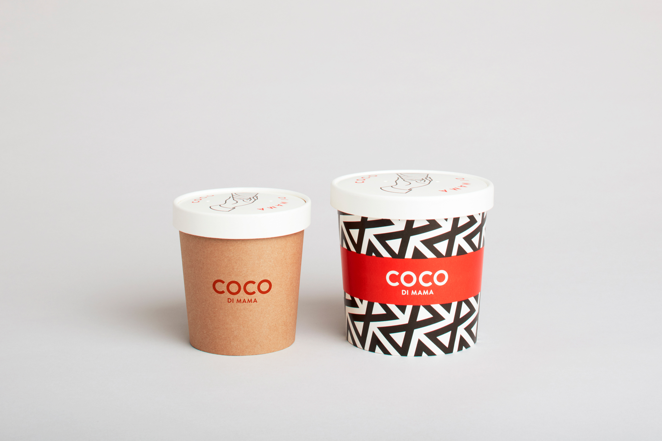
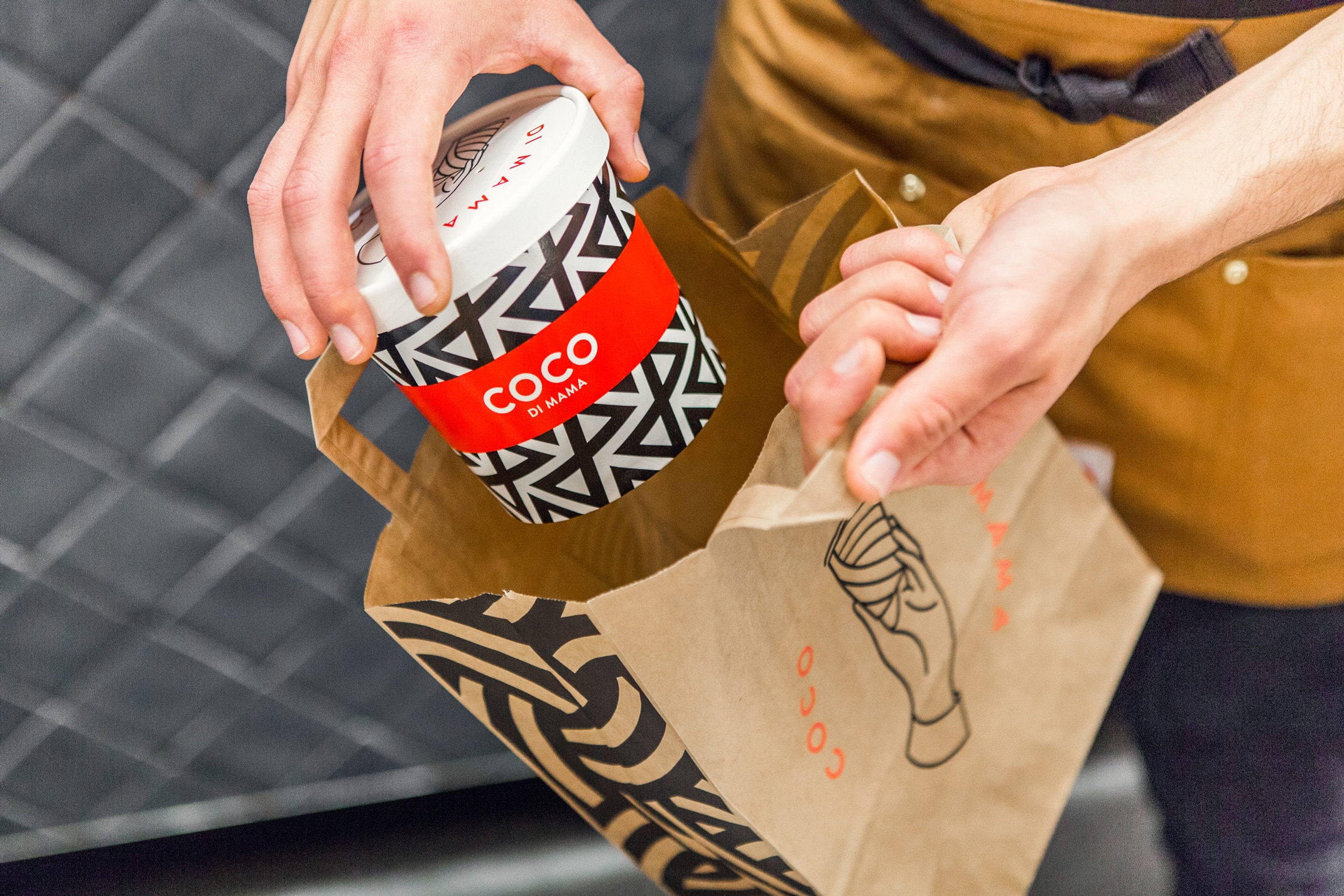
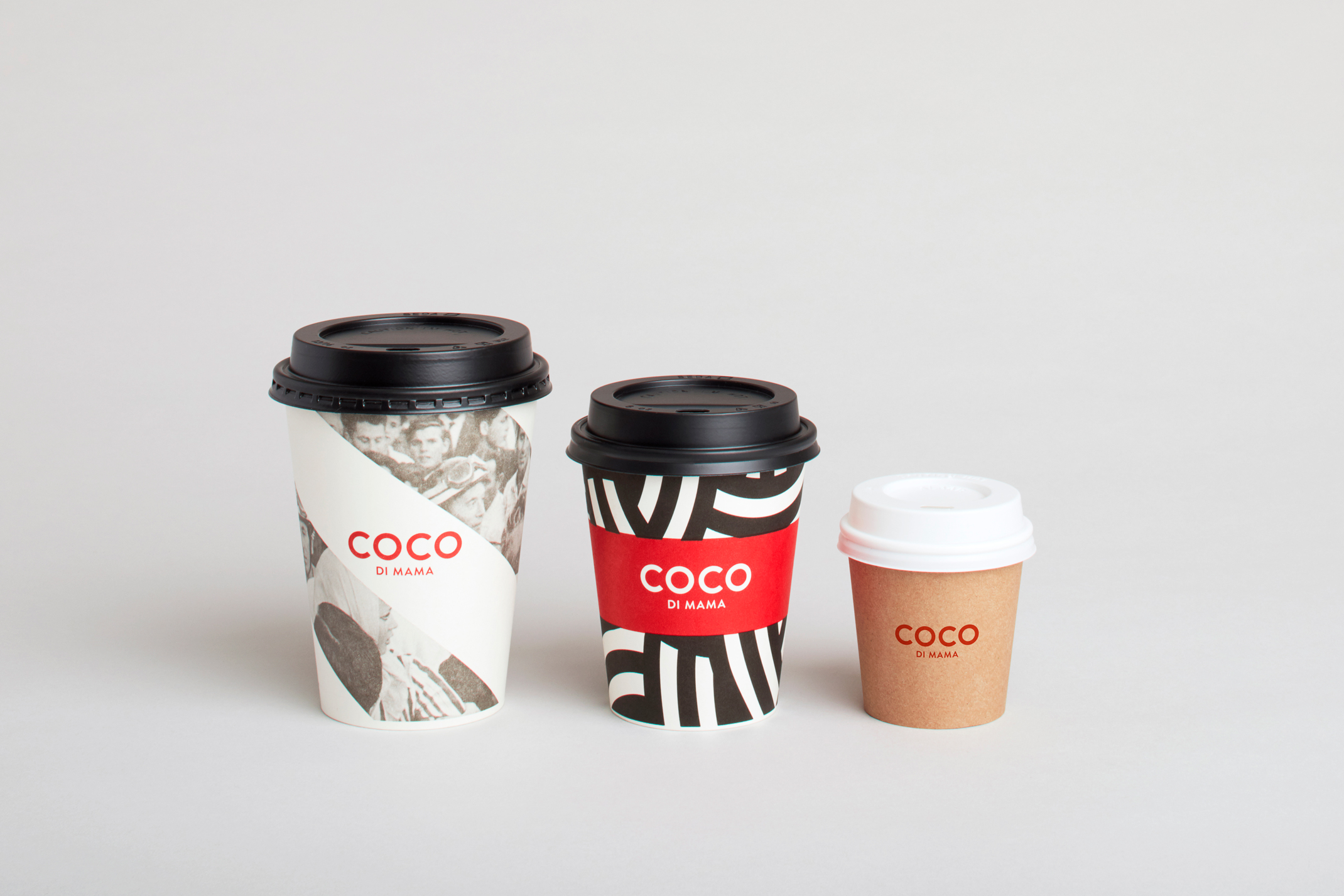
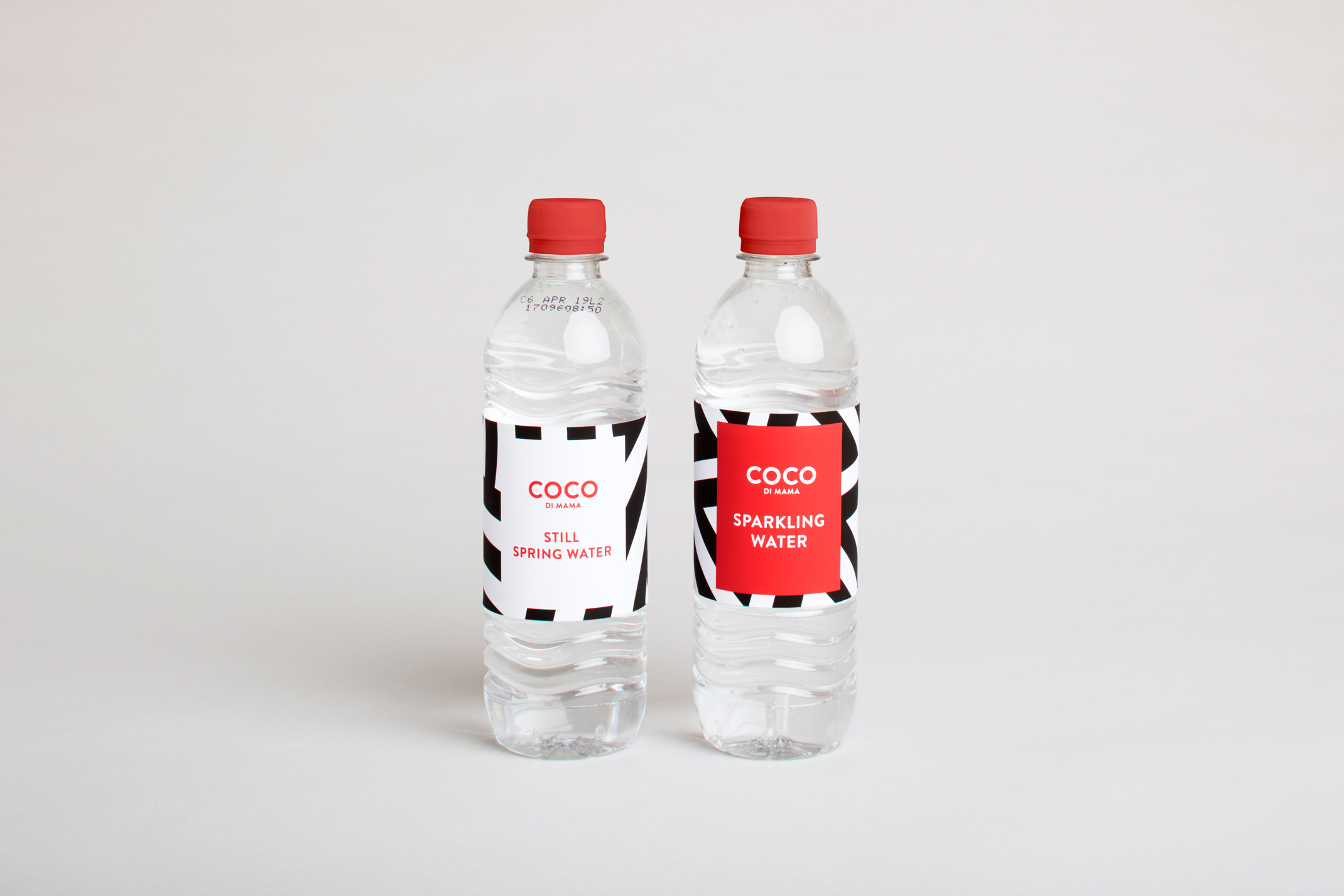
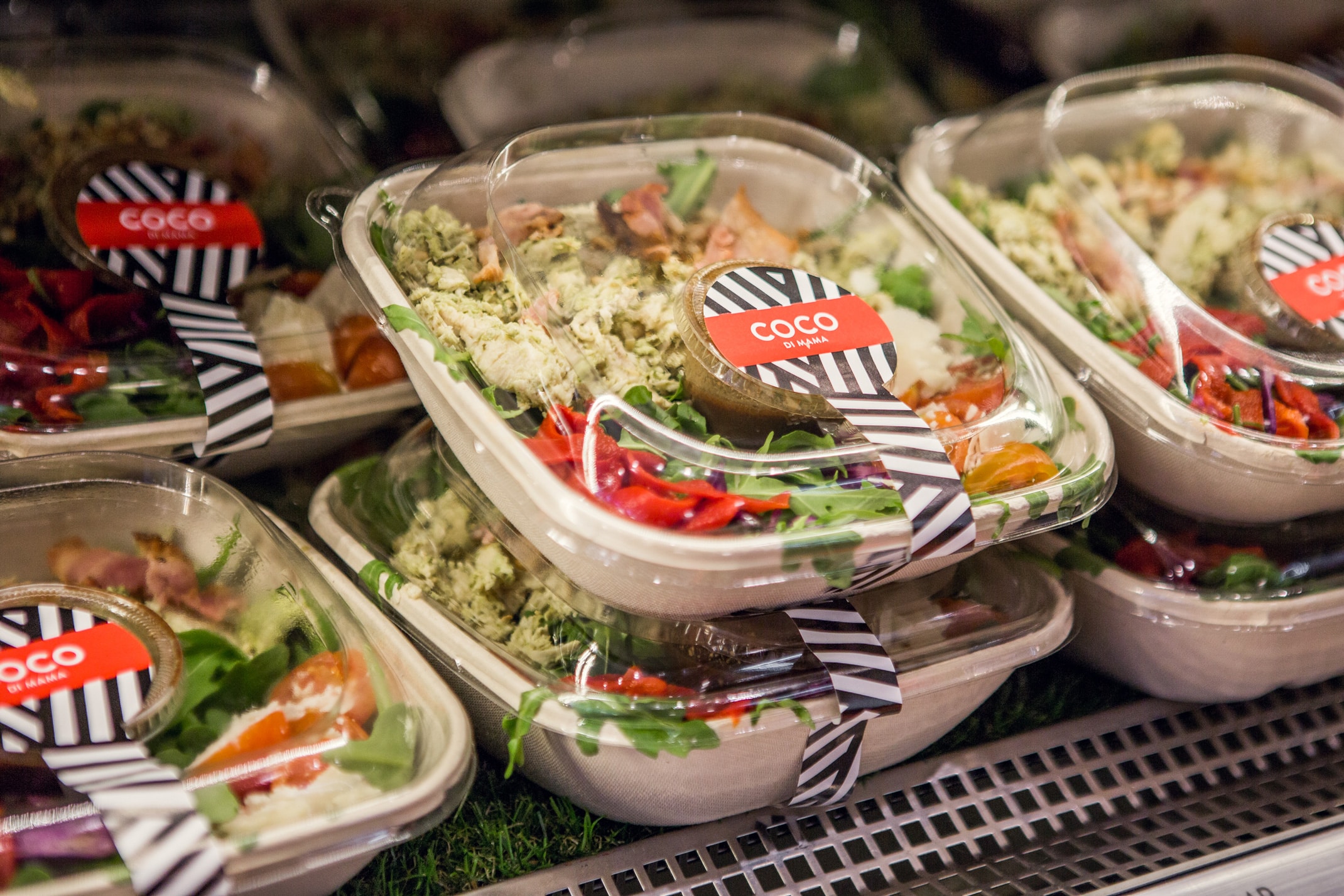
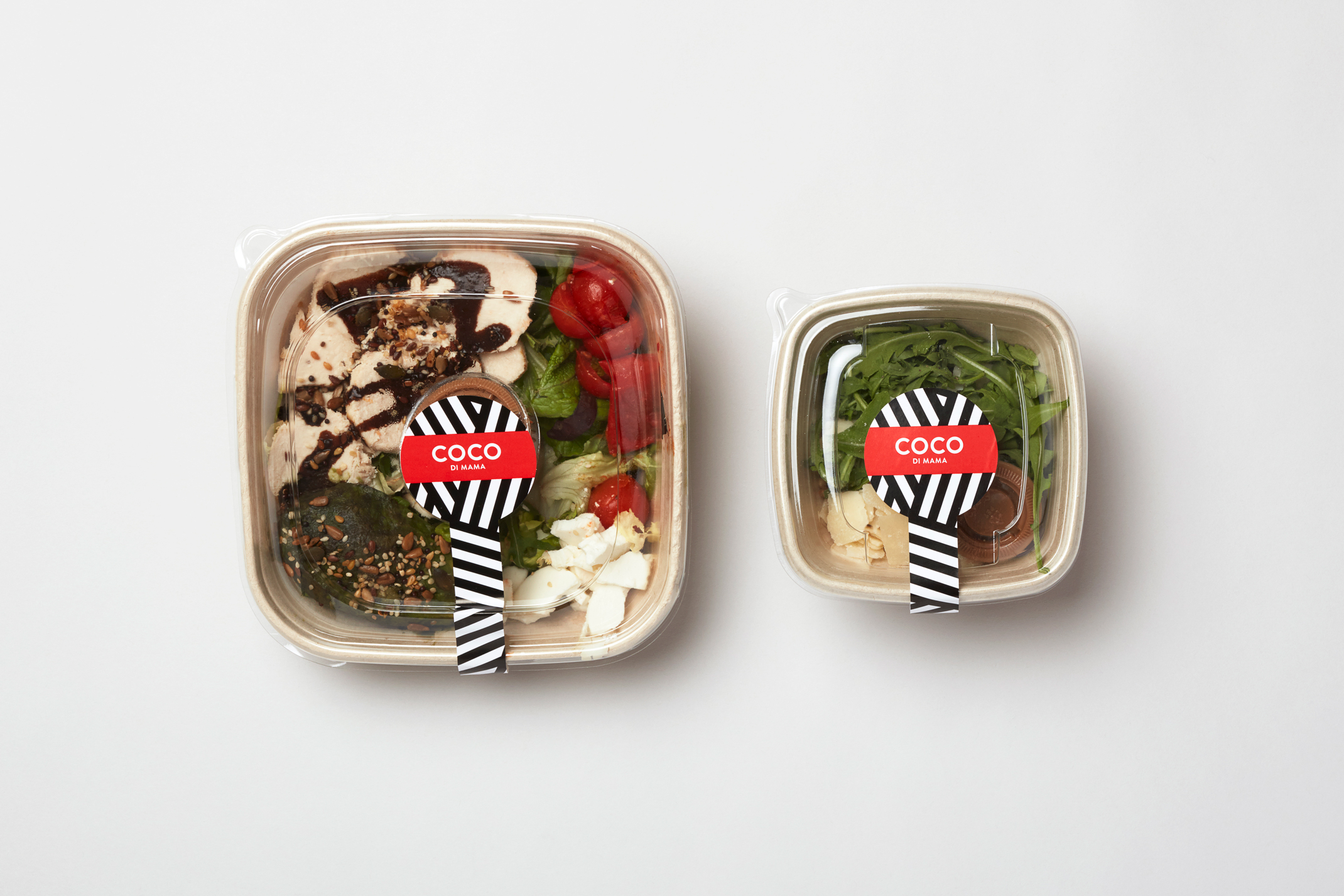
We began the process with a series of creative mood boards. These served as the focus for a brand workshop, with key members of the company to discuss the direction the brand should be moved in. It was felt the company’s use of red, black and white had become very recognisable and so we moved forward with this colour palette, refreshing the red and introducing materials like craft for the packaging and wood for the interiors to add depth and warmth.
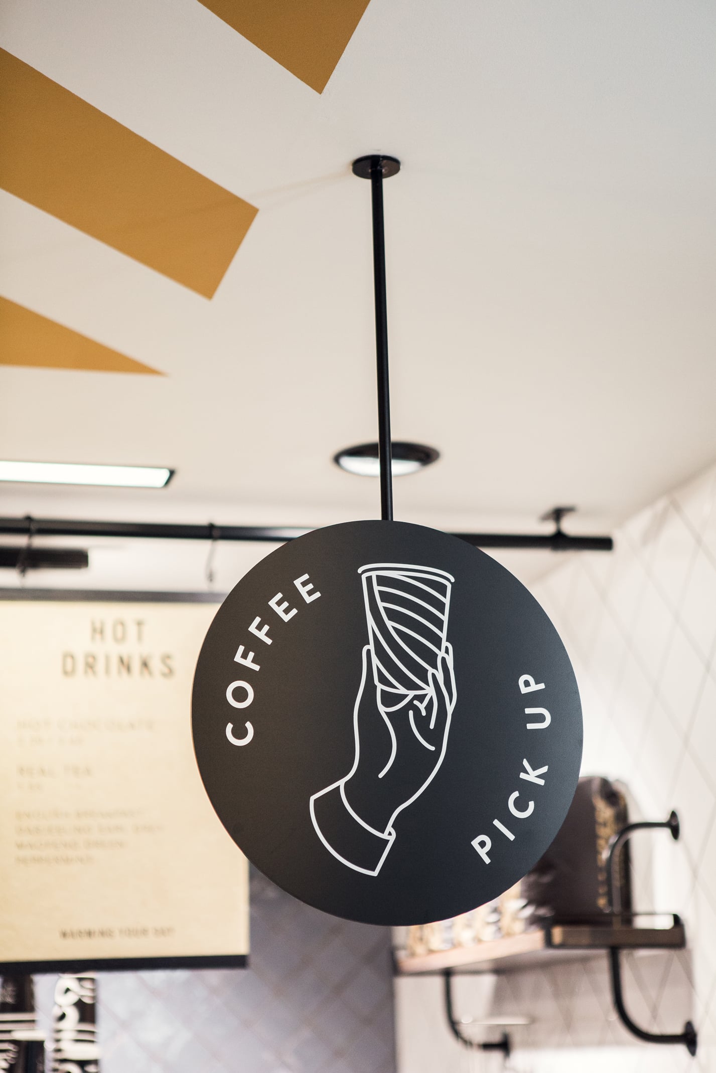
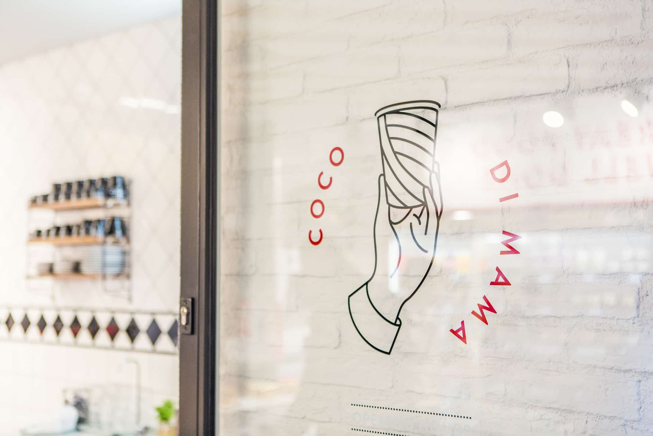
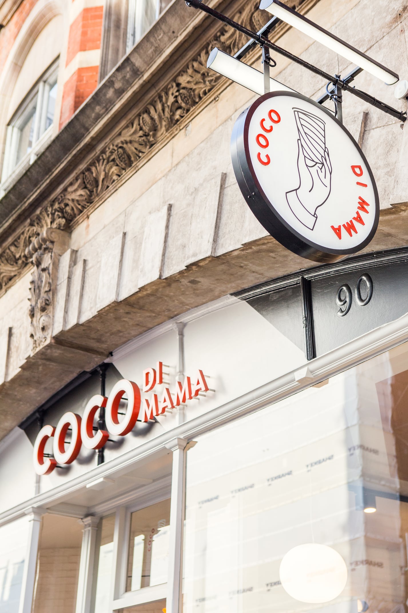
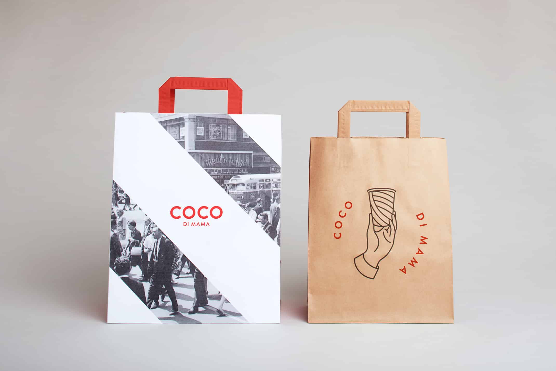
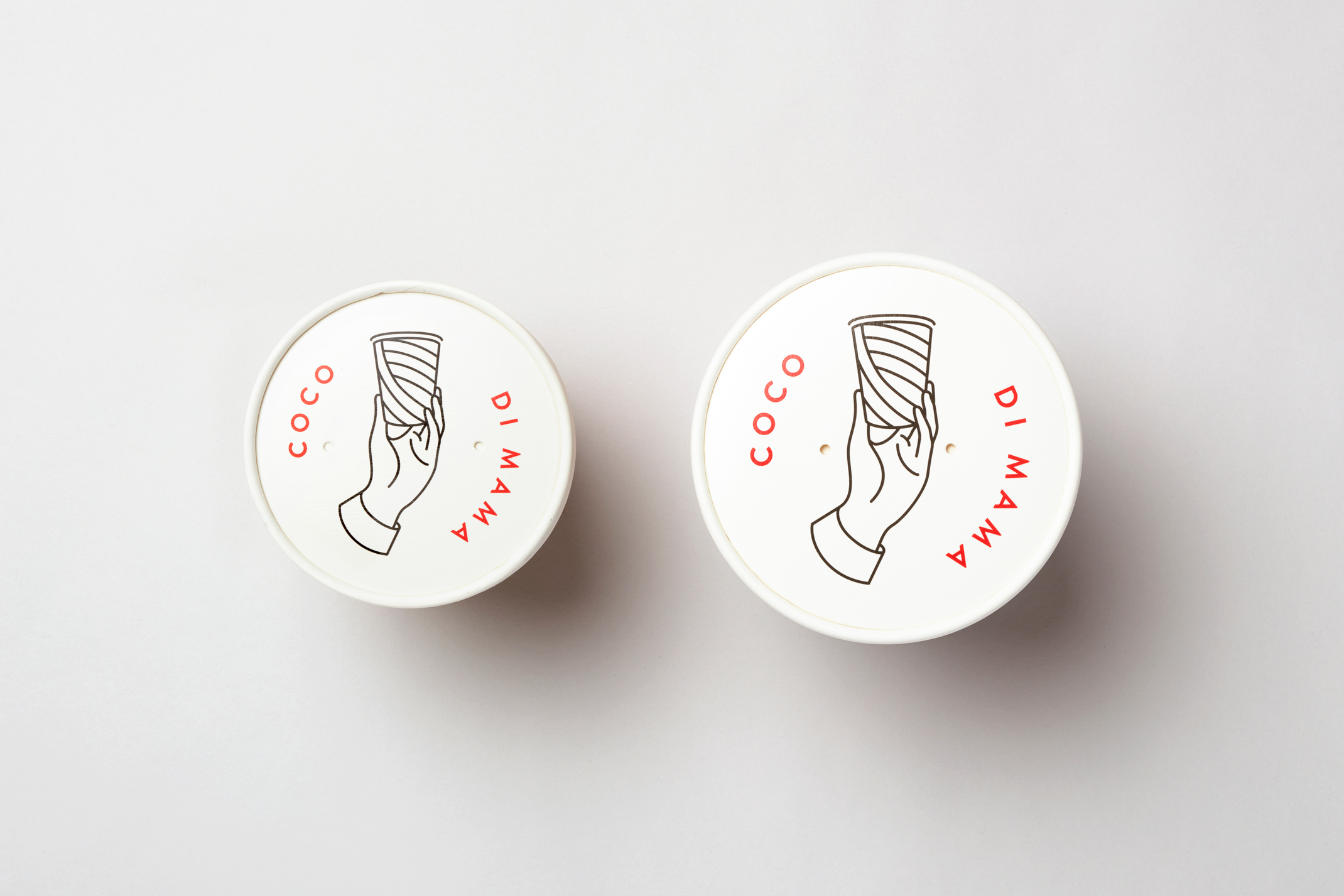
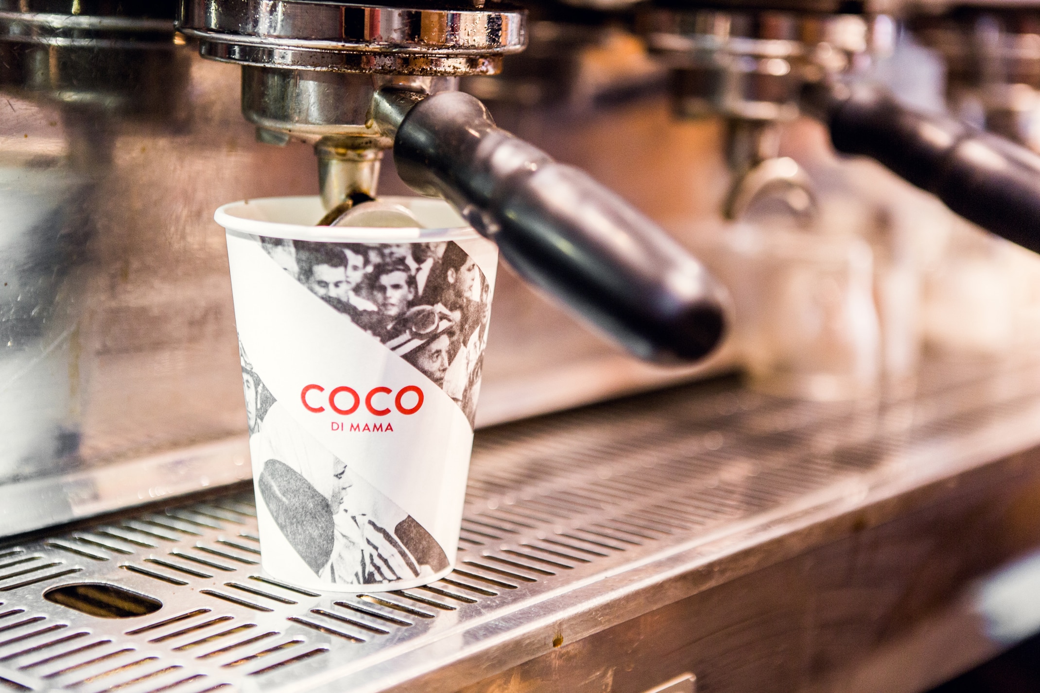
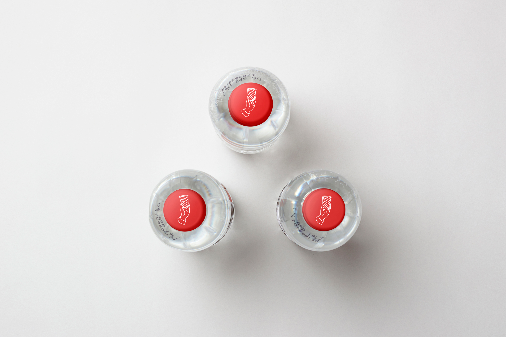
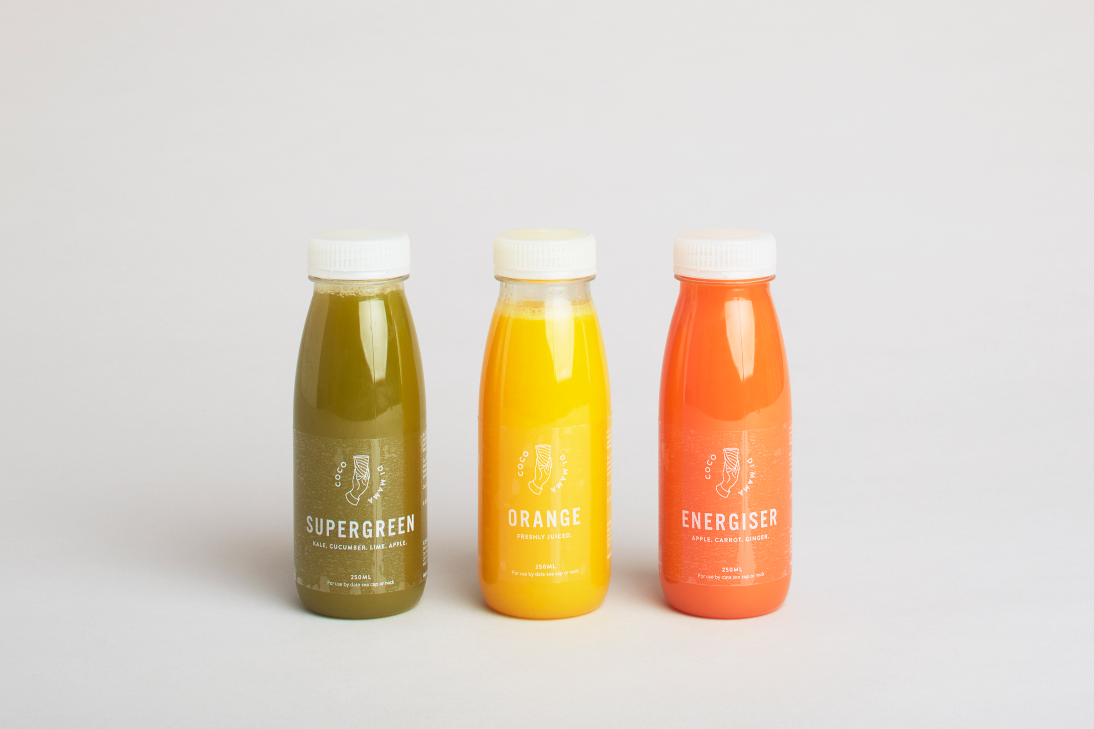
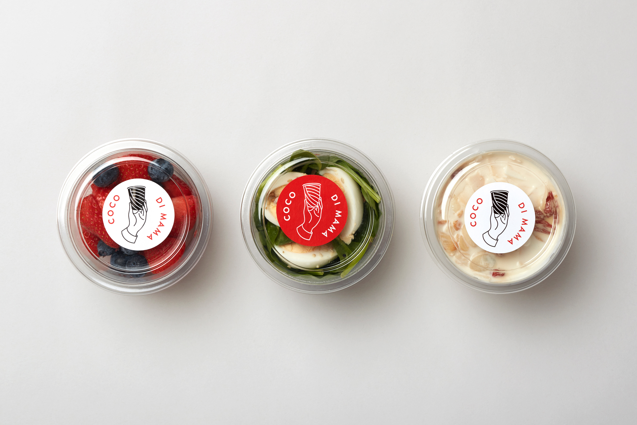
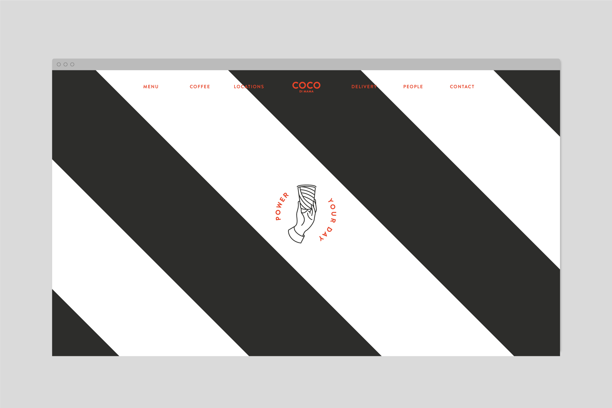
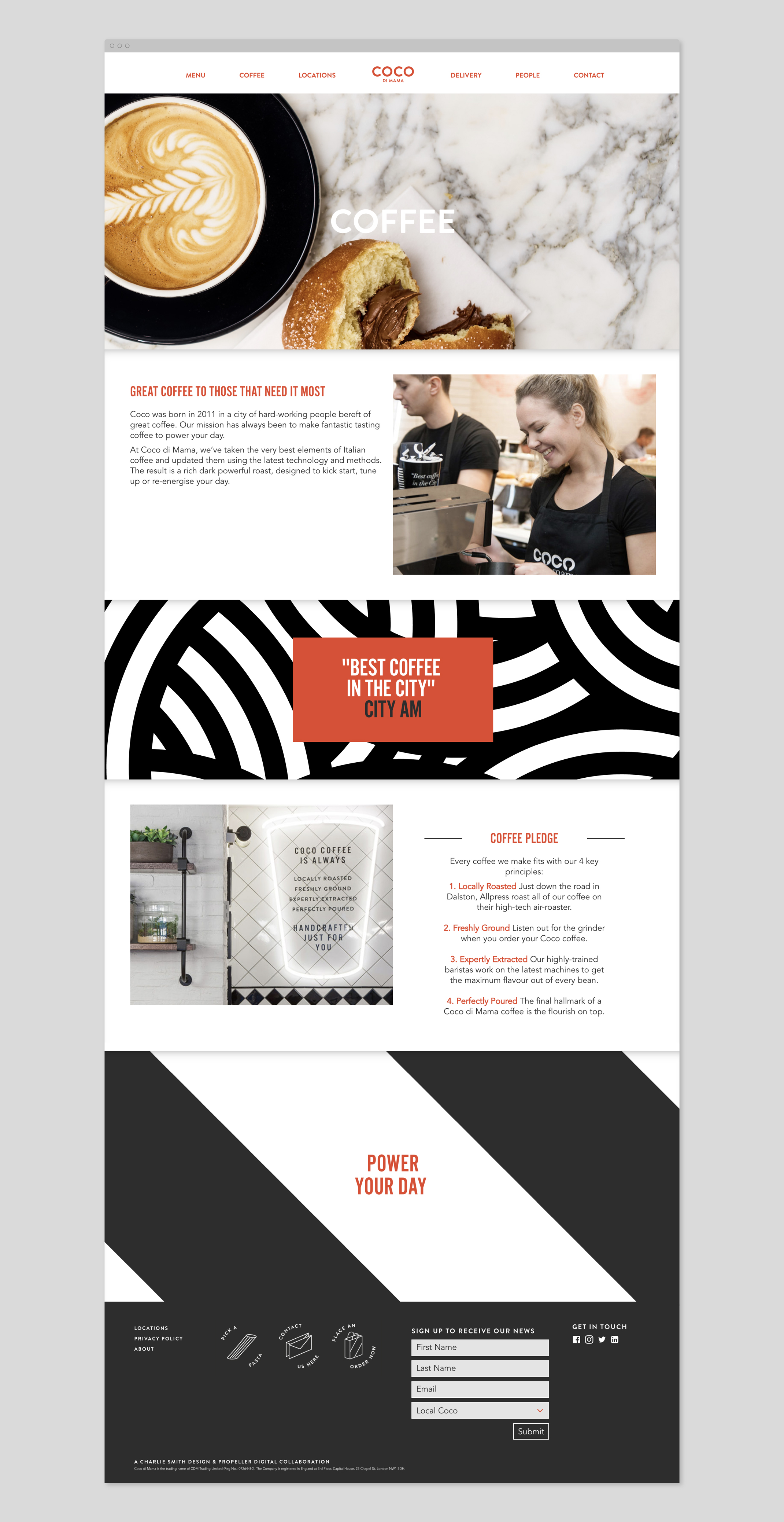
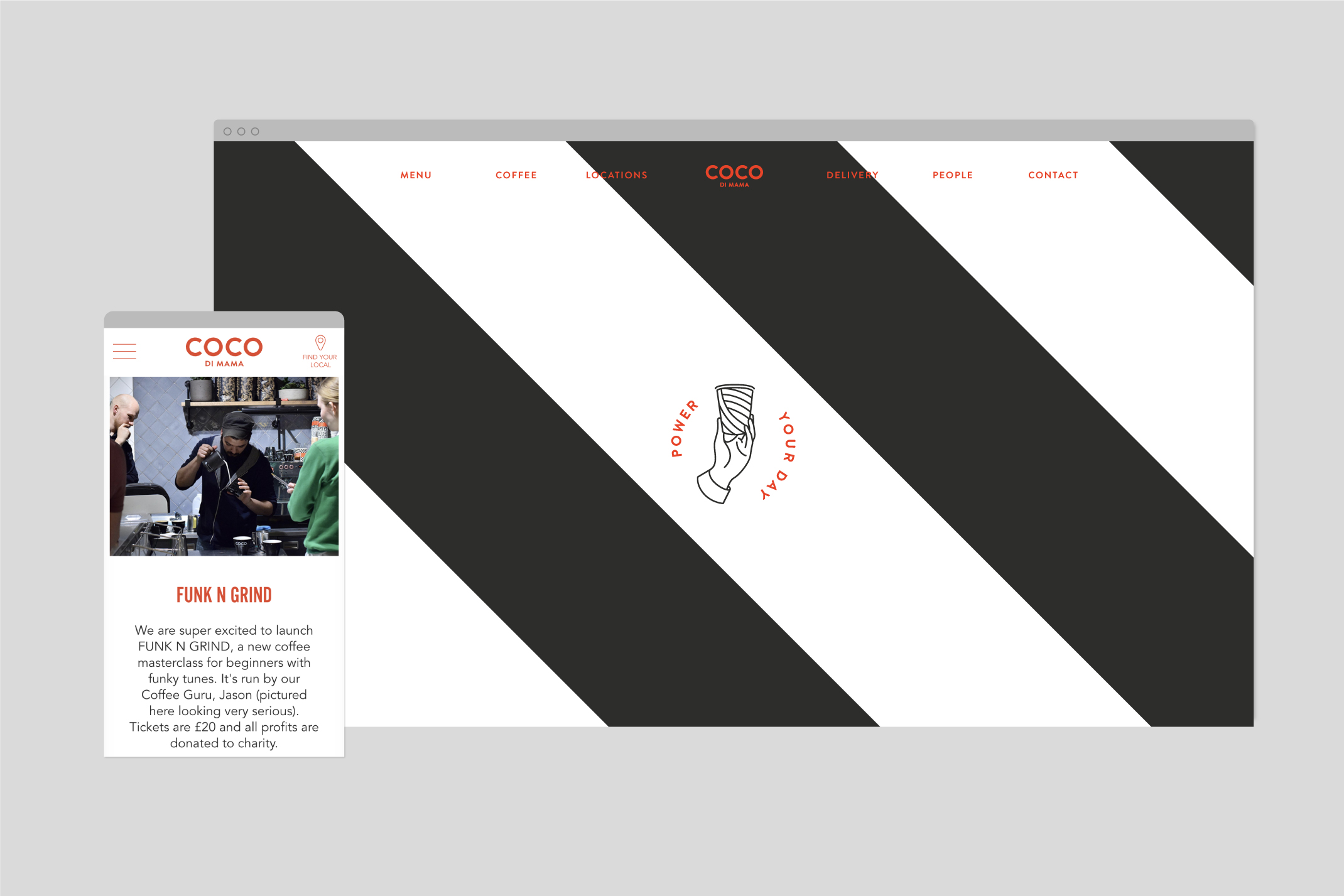
The logotype was updated to use a more contemporary typeface, we also created an accompanying icon that could be used either with or without the logotype. The icon needed to represent not only Coco’s commitment to a quality pasta offering, but also that they serve great coffee, which they are also known for. The hand holding a cup, represents both a cup of coffee, or pot of pasta.
We also developed a series of repeat patterns based on the different types of pasta. This pattern has been used at a variety of scales on applications across packing, printed collateral, signage and within the interiors of various stores. The graphic patterns were mixed with more traditional black and white photography of Italians going about their working day, these were made to feel more modern by being interrupted by stripes, again reflecting the patterns we have developed.
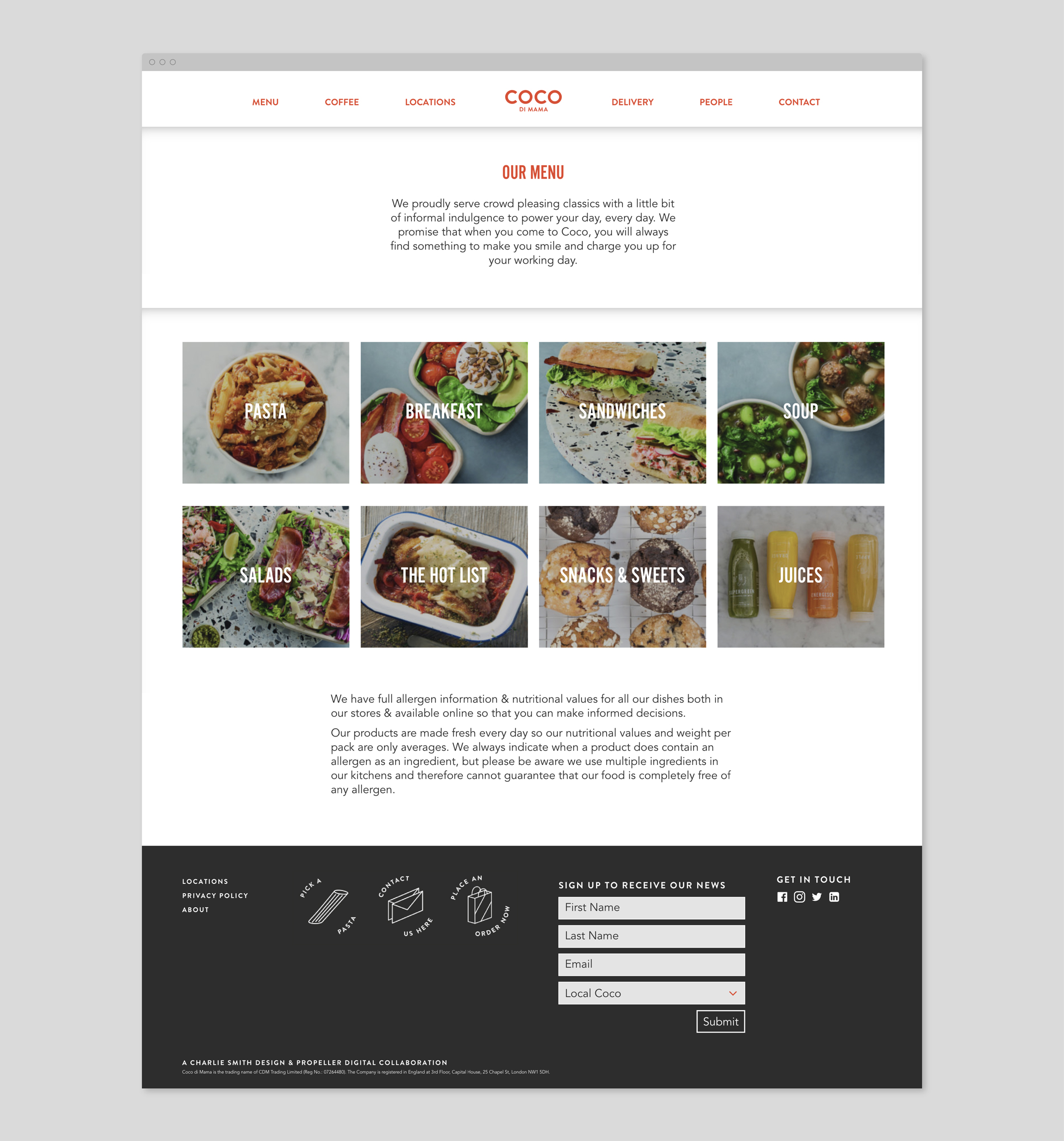
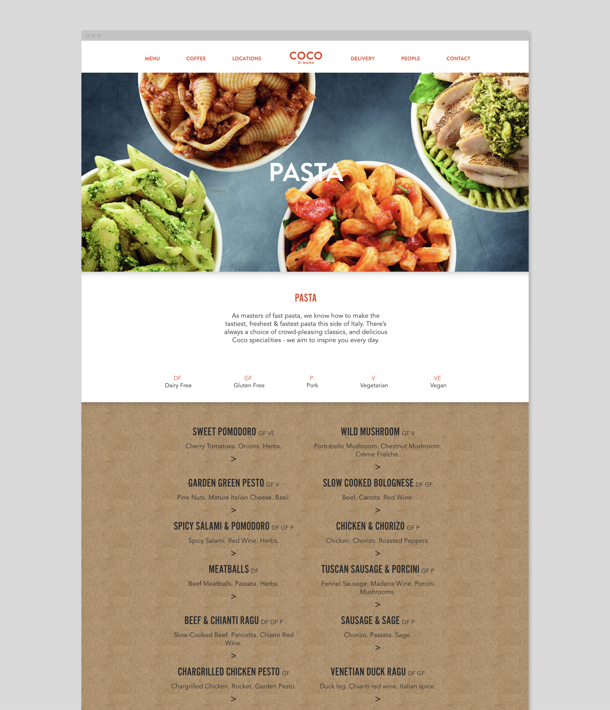
As part of the project we also created a series of icons of all the pasta shapes that could be used on their website and menu boards.
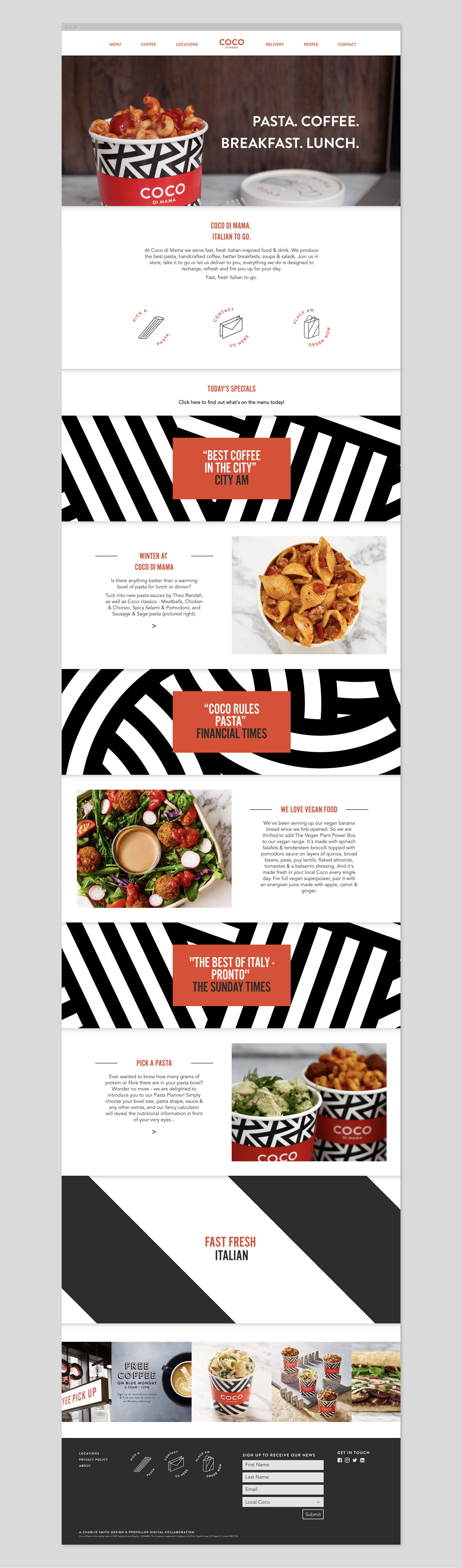
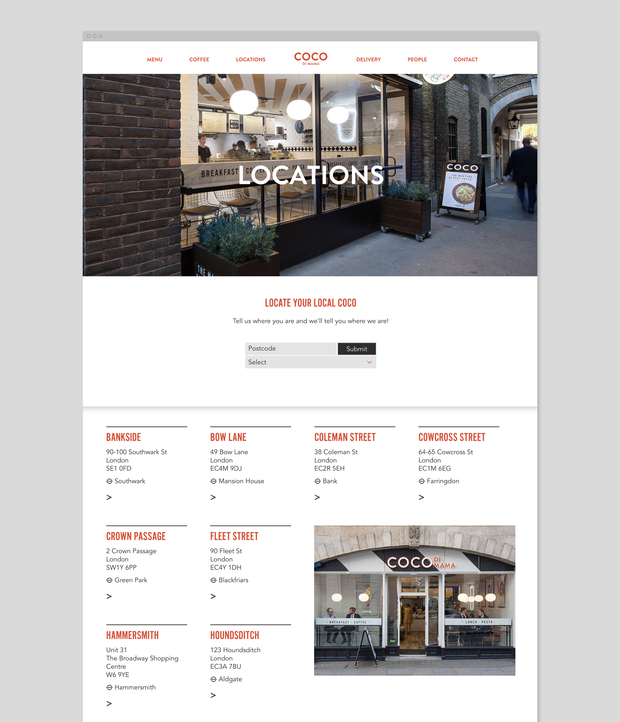
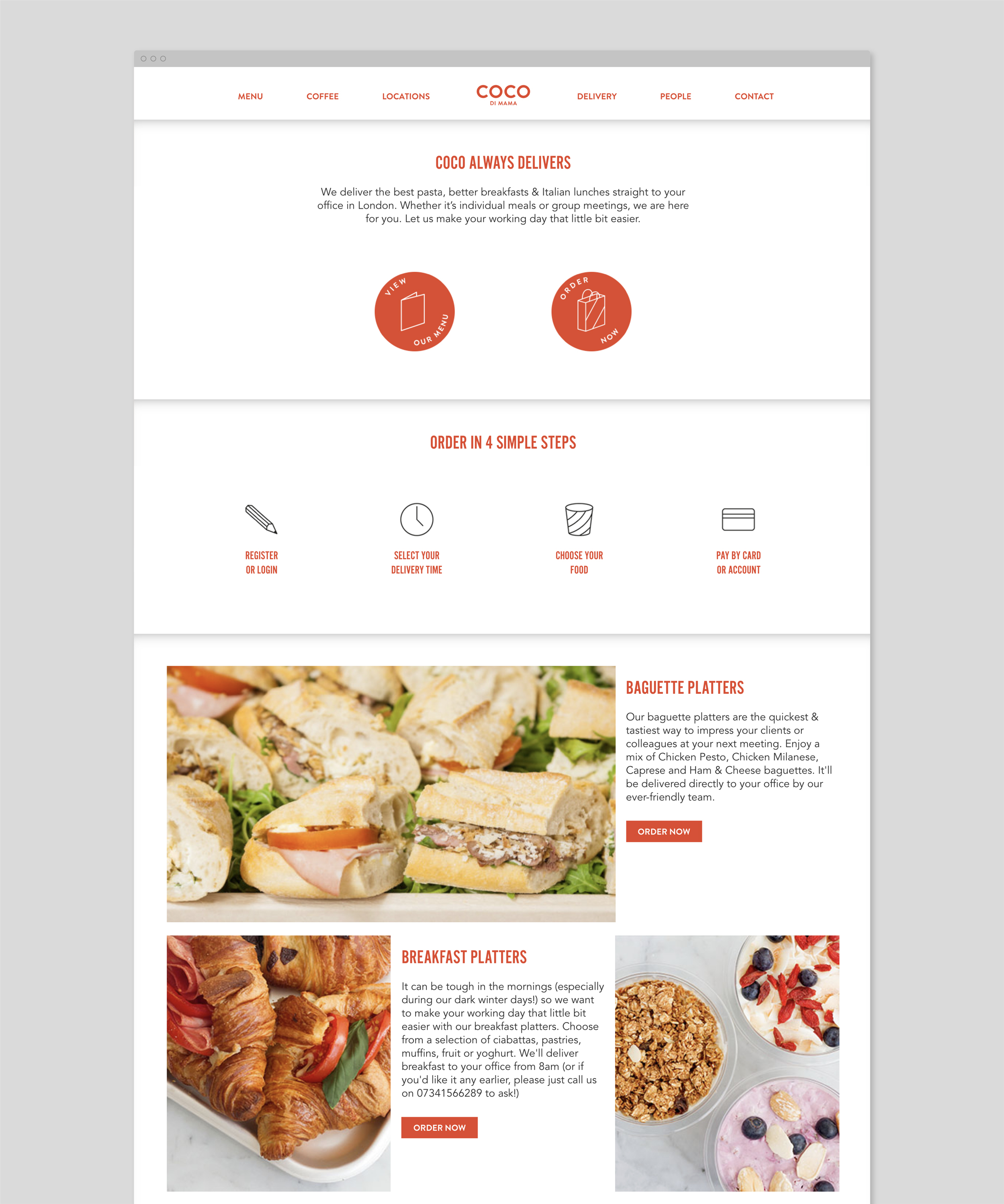
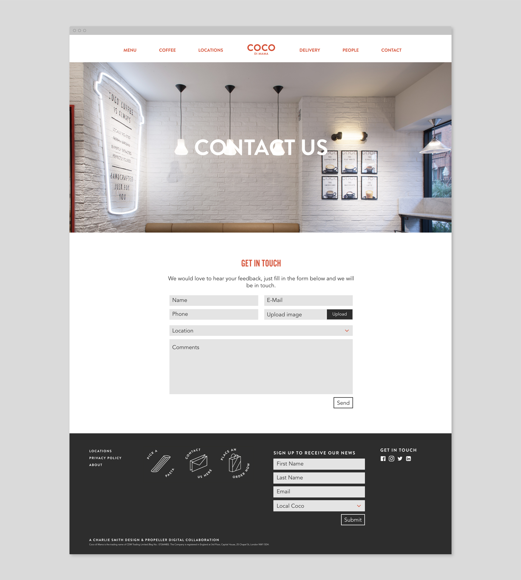
We worked on all aspects of the visual identity including internal and external signage, new packaging and much of the collateral. We designed their new website, collaborating with Propellor on the development.
Since the rebrand Coco has continued to grow rapidly across London to 21 stores.