Morrisons — Brand Stretch
Guidelines Identity Print
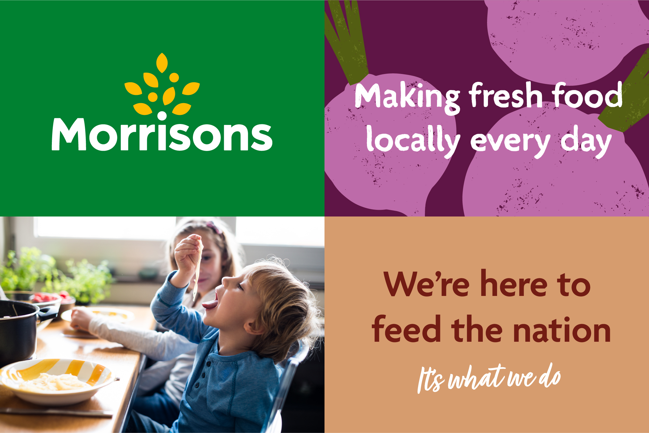
We worked in partnership with supermarket chain Morrisons to develop their current identity to make a more dynamic and uniform brand with added stretch.
The client
Morrisons are a large supermarket chain that sell food and drink as well as clothing, books, magazines, CDs, DVDs and home accessories. They currently have 491 stores across the UK.
The brief
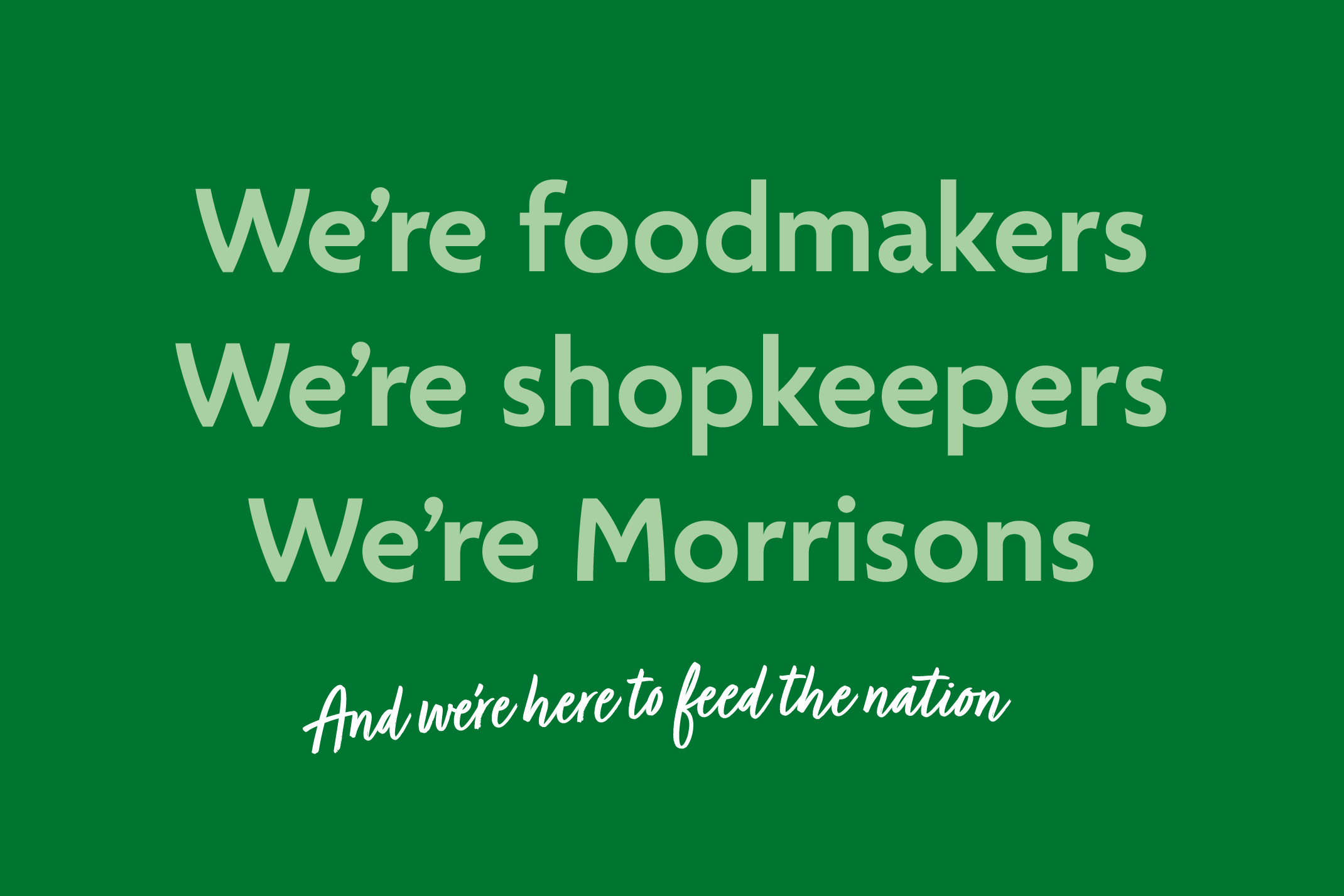
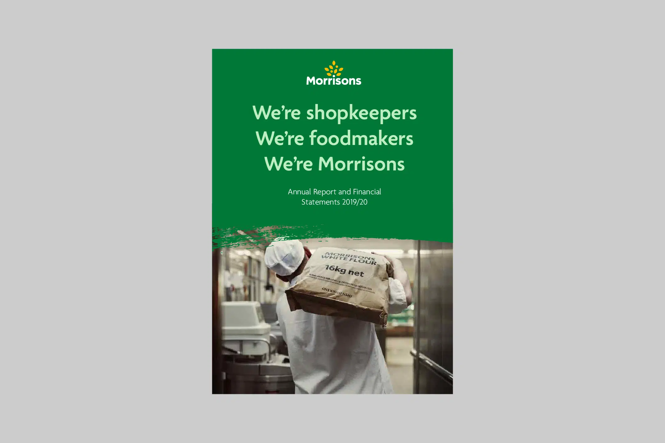
Morrisons wanted to build on and evolve their current core brand assets, with the goal of creating a more dynamic and uniform brand with more stretch. At the beginning of the project, the landscape changed dramatically due to the COVID-19 pandemic. During this time, Morrisons created a ‘Feeding the Nation’ identity, which they then wanted to incorporate into their new brand flex.
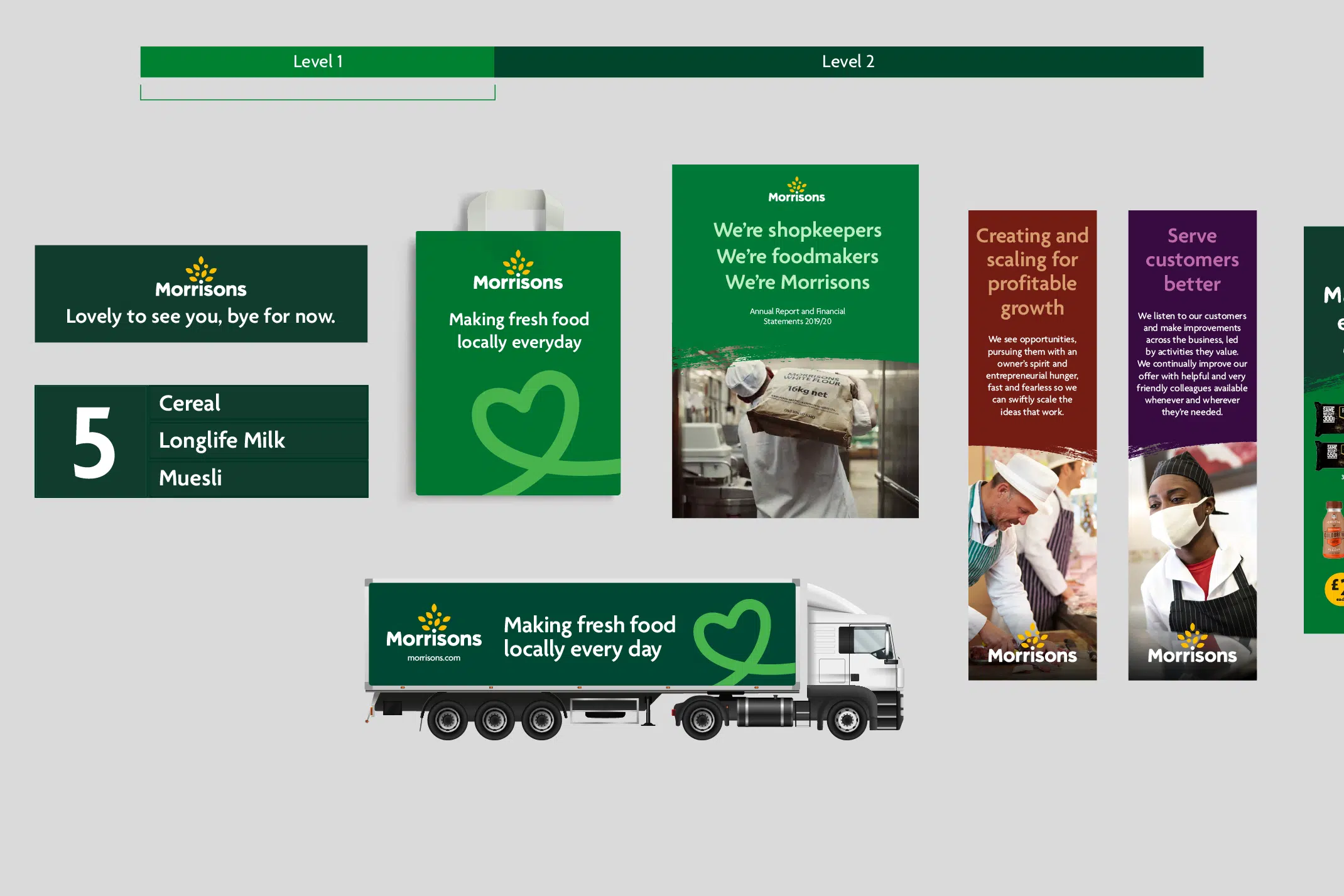
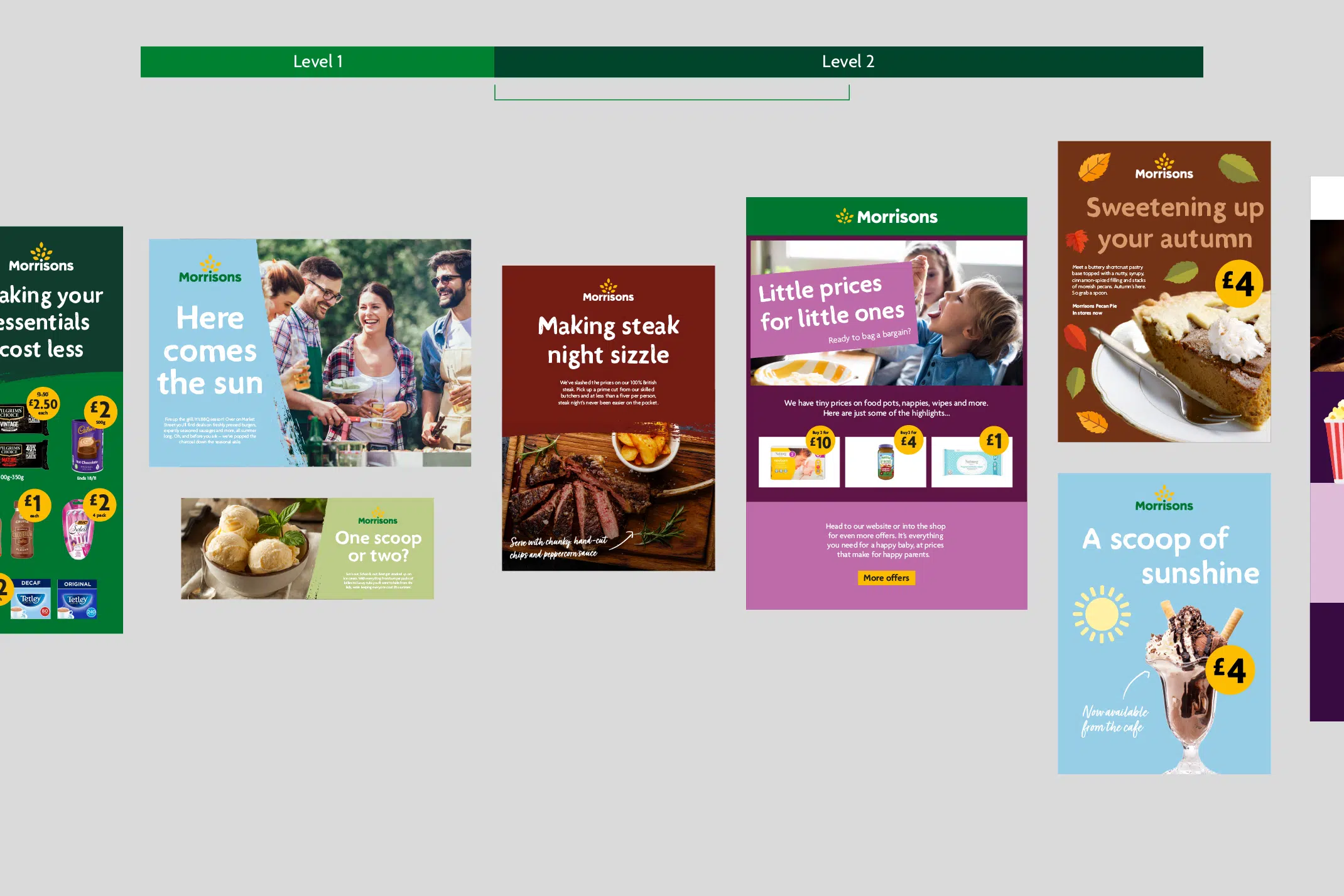
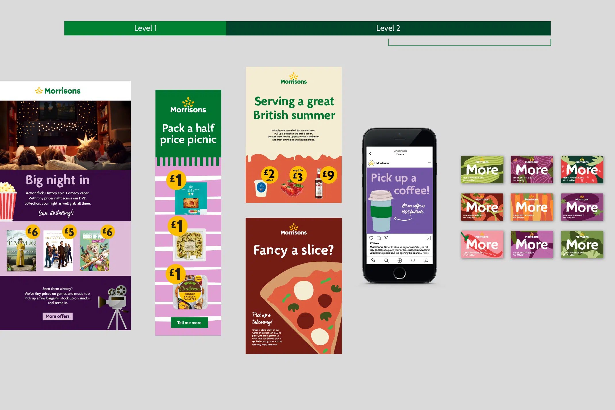
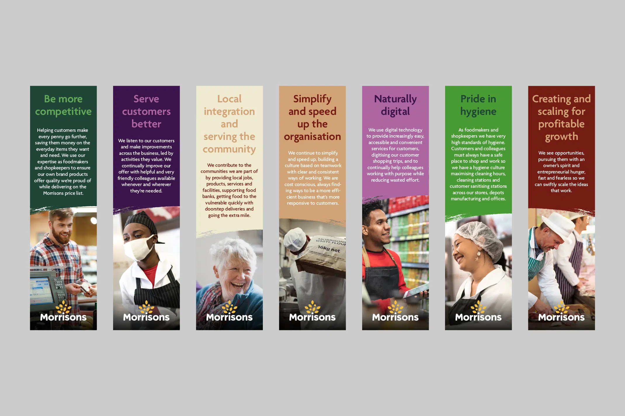
Creating a system
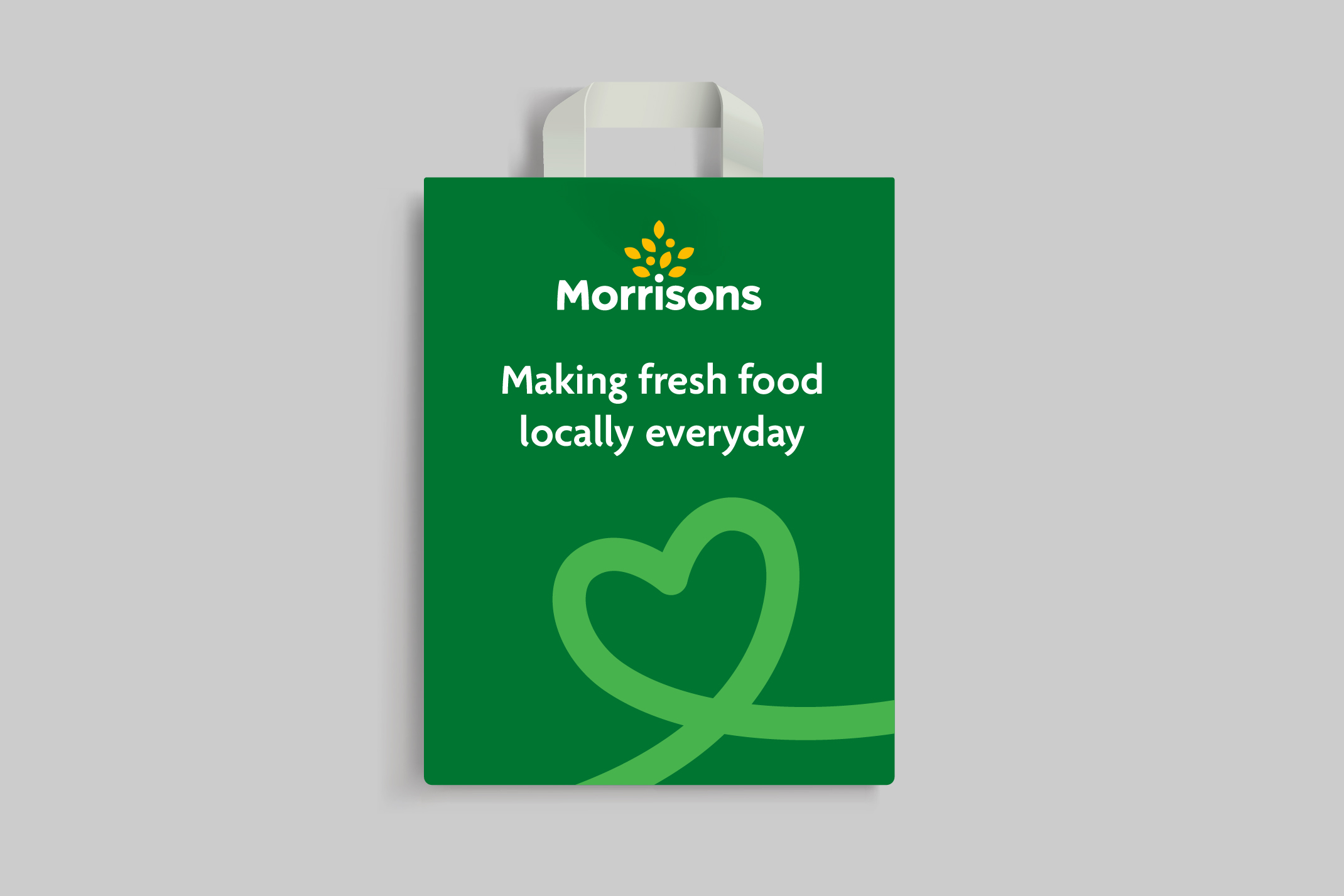
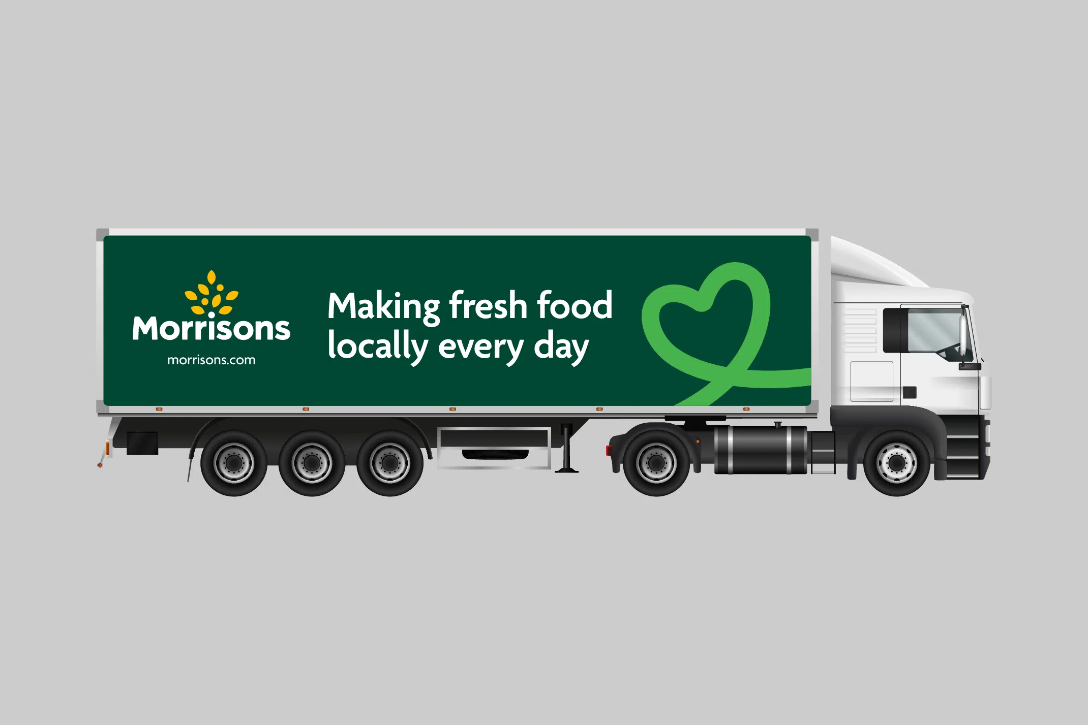
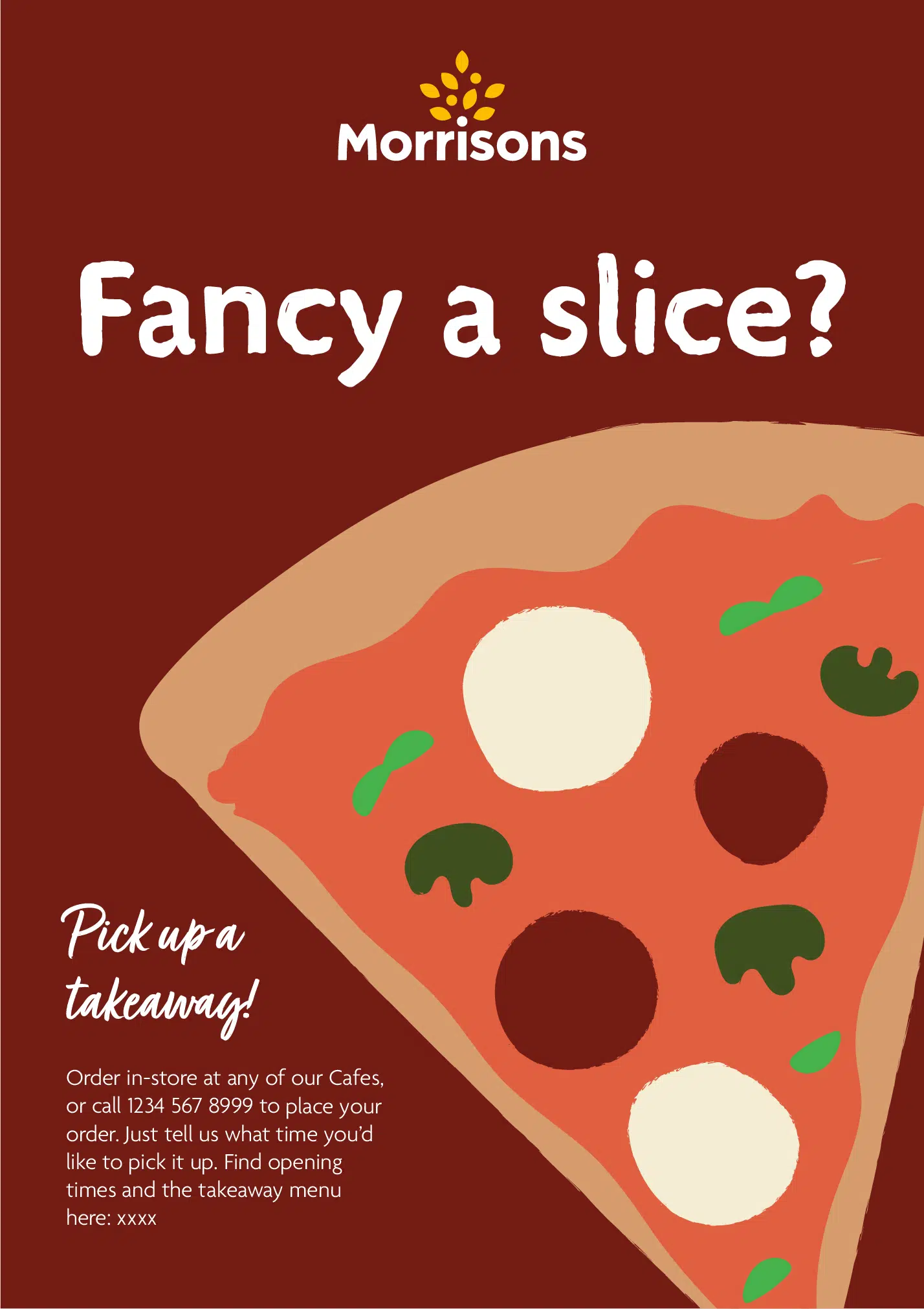
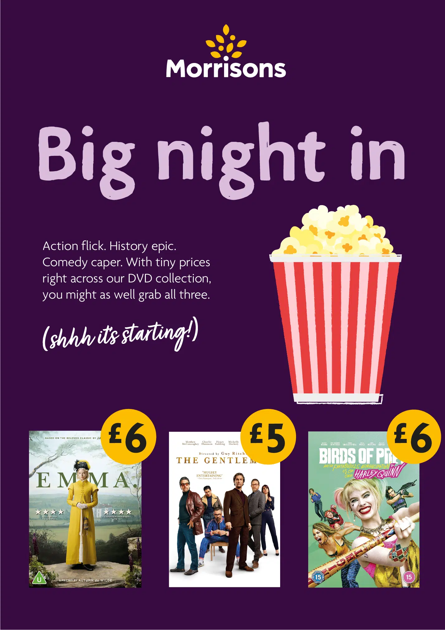
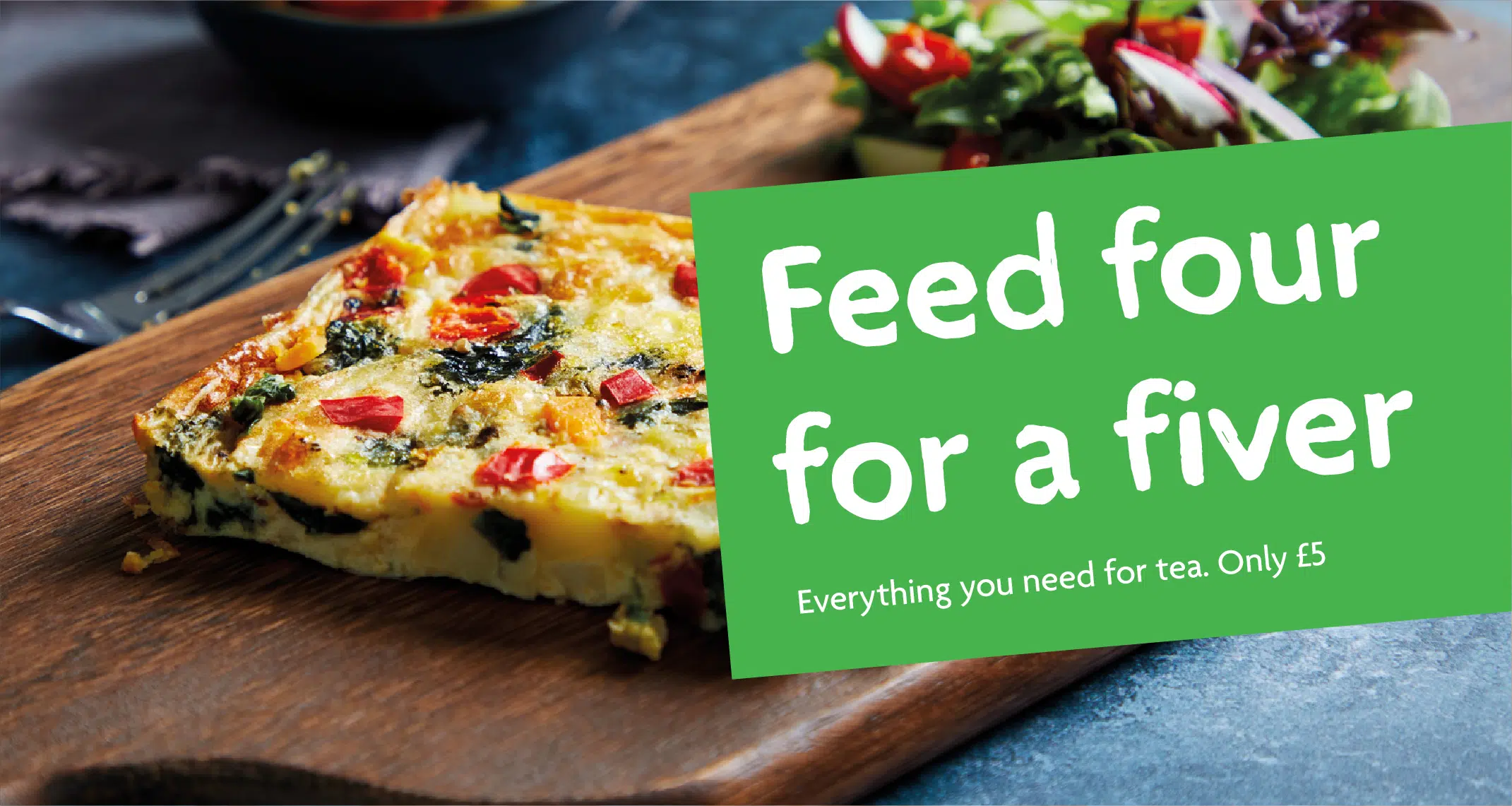
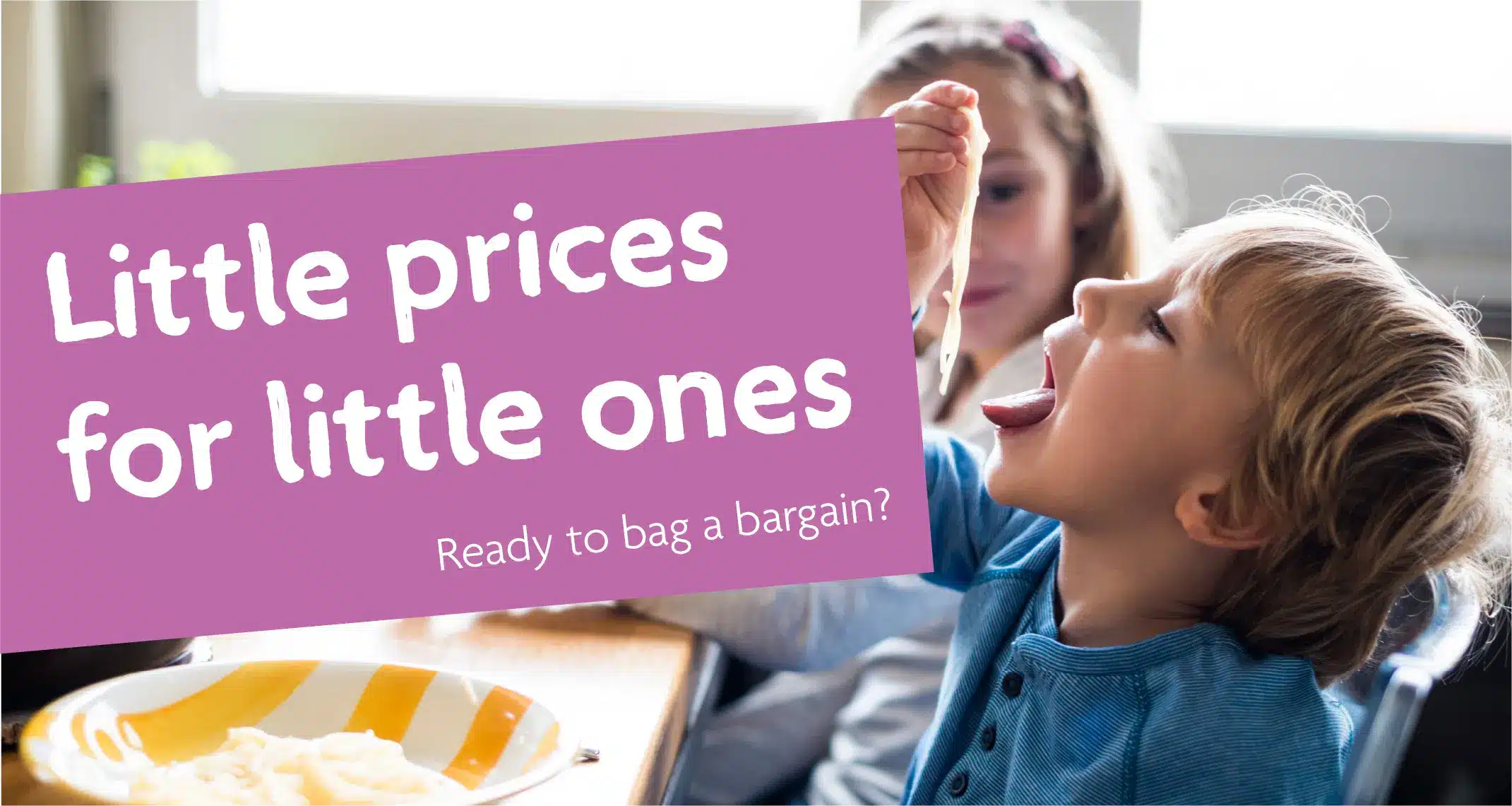
The identity needed enough flexibility to cover core collateral, such as bags and livery, as well as more playful communications like email newsletters and social media posts. We created a level system that featured two levels: Level 1 and Level 2. Each level is made up of different assets that come together to create something distinctively, recognisably Morrisons.
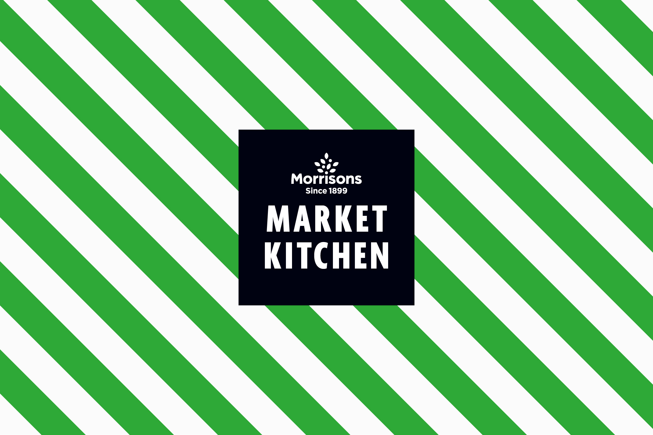
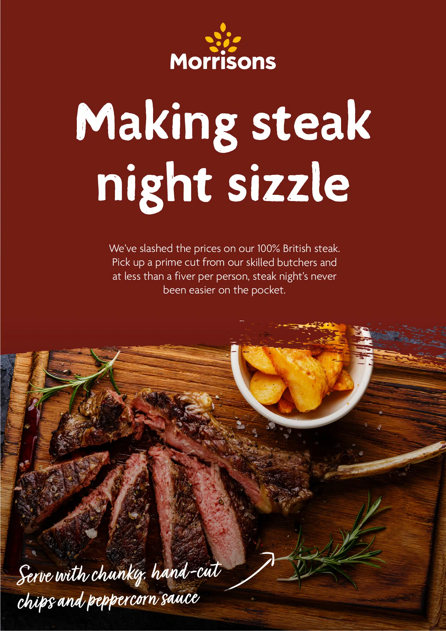
Level 1 builds upon their recent Feeding the Nation work and covers all the serious core-branded stuff. It retains their current logo, core font and line illustration style, and we introduced new assets such as a script font, new holding devices and an extended core colour palette.
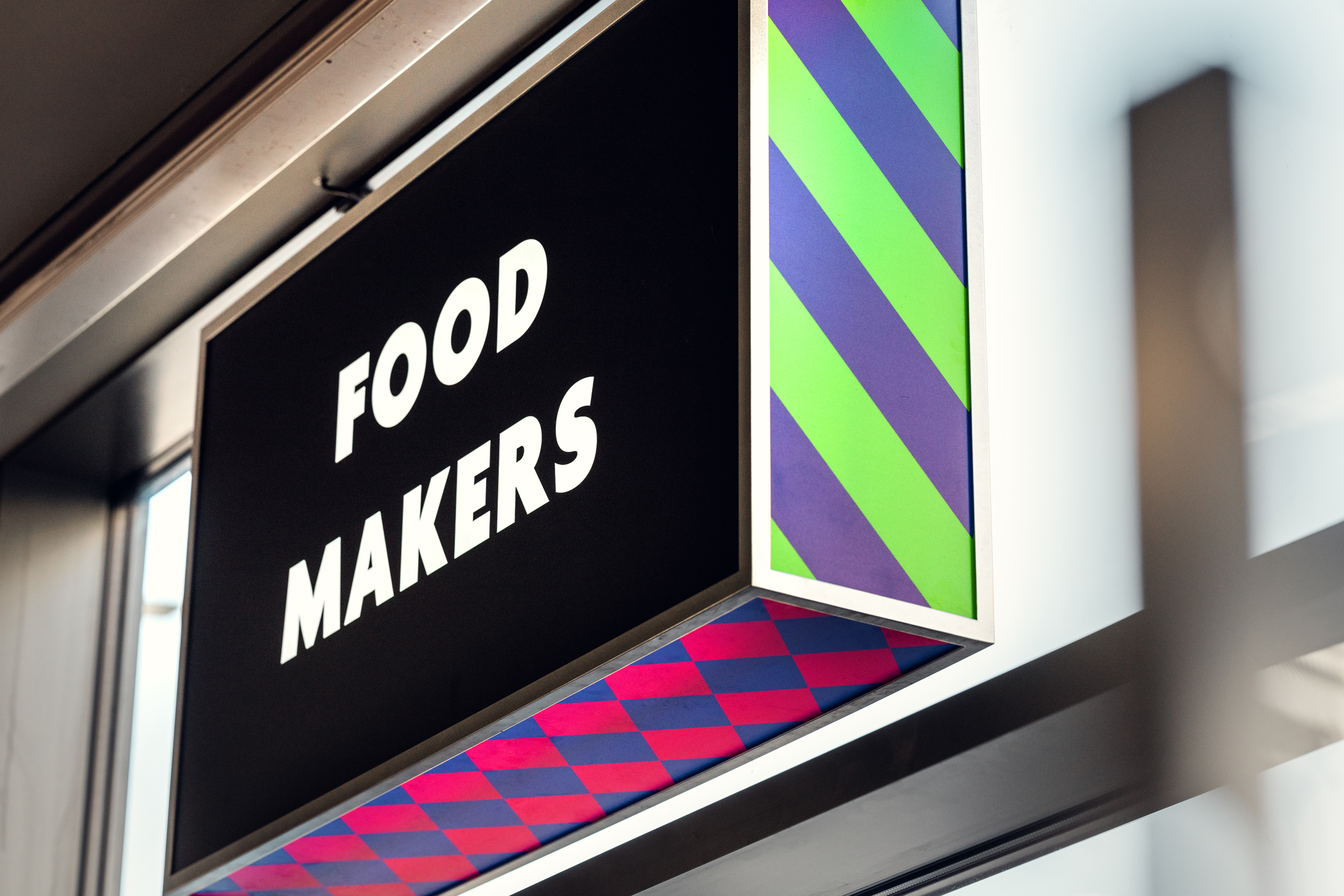
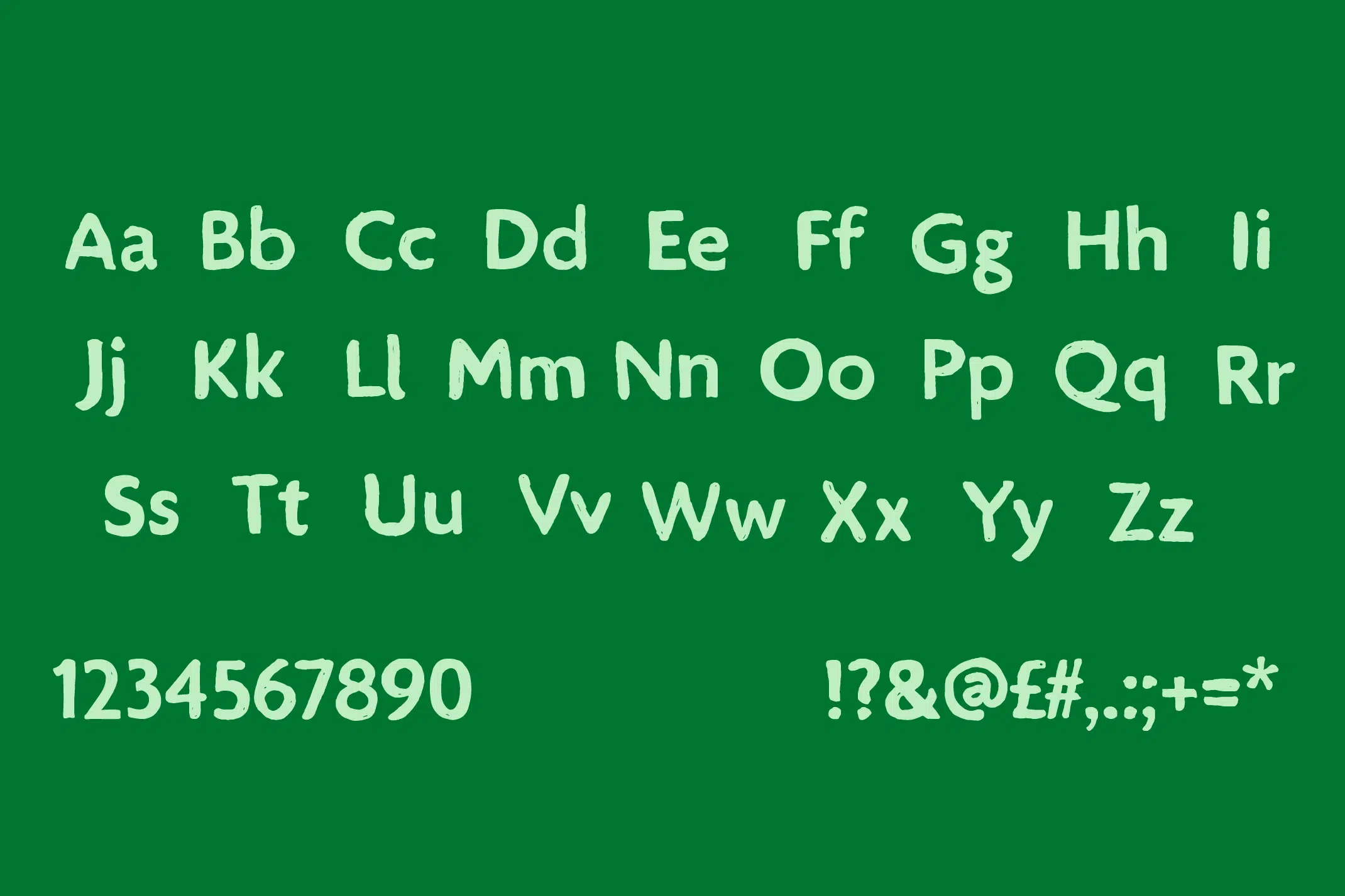
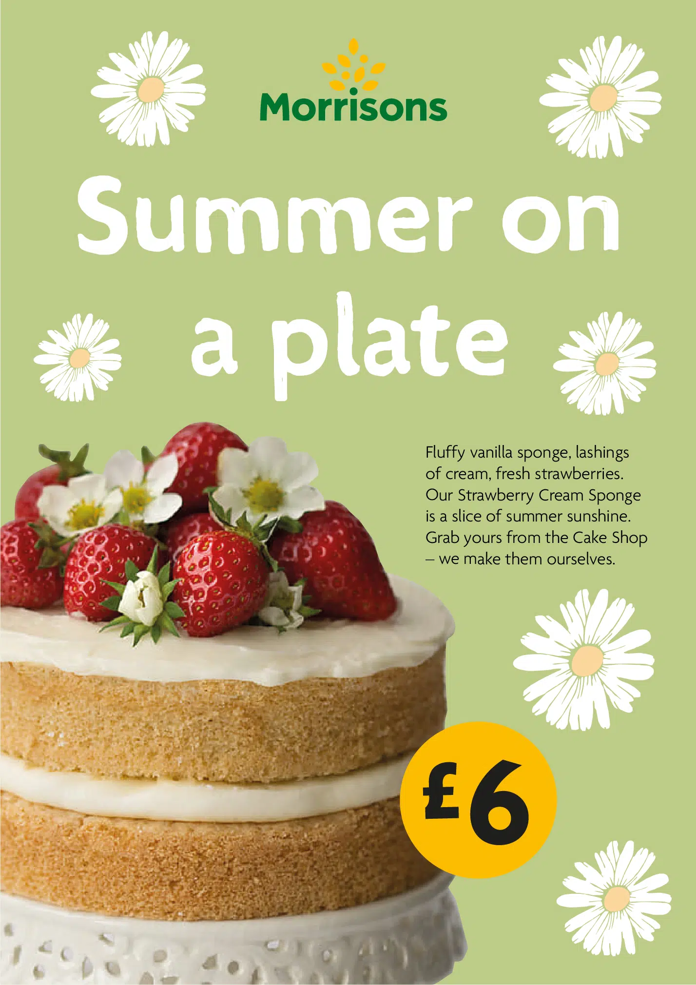
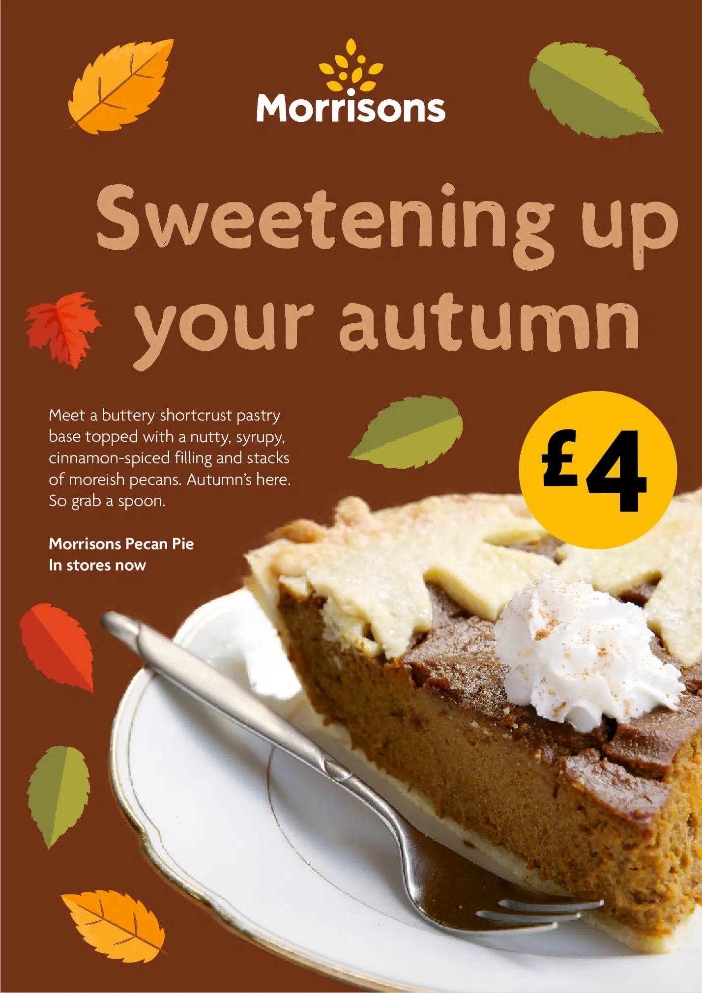
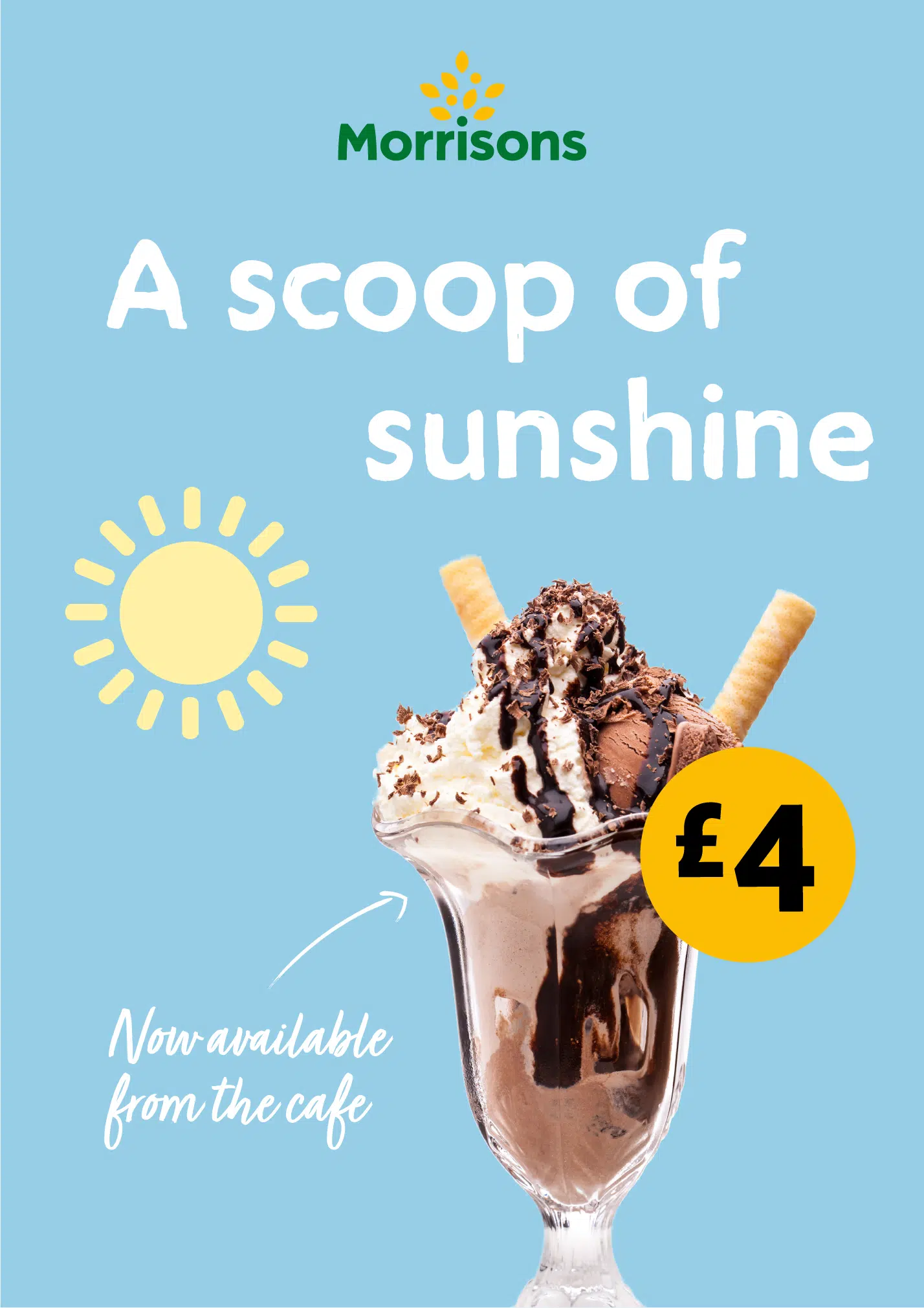
Level 2 introduces a new broad colour palette, a custom typeface based on their core typeface Morrisons Agenda and a new illustration style. This level is more fun and covers the soft, playful side of their identity.
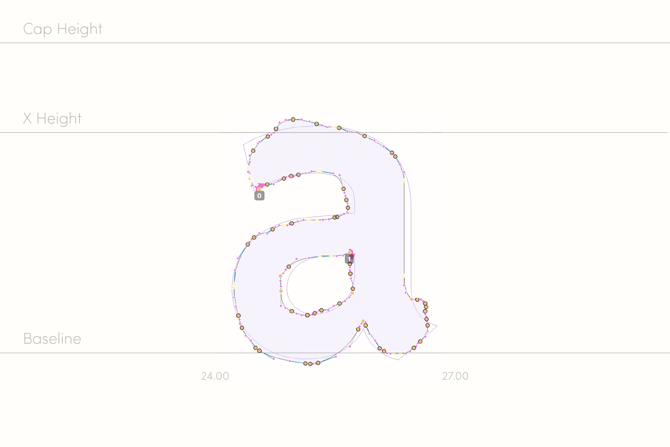
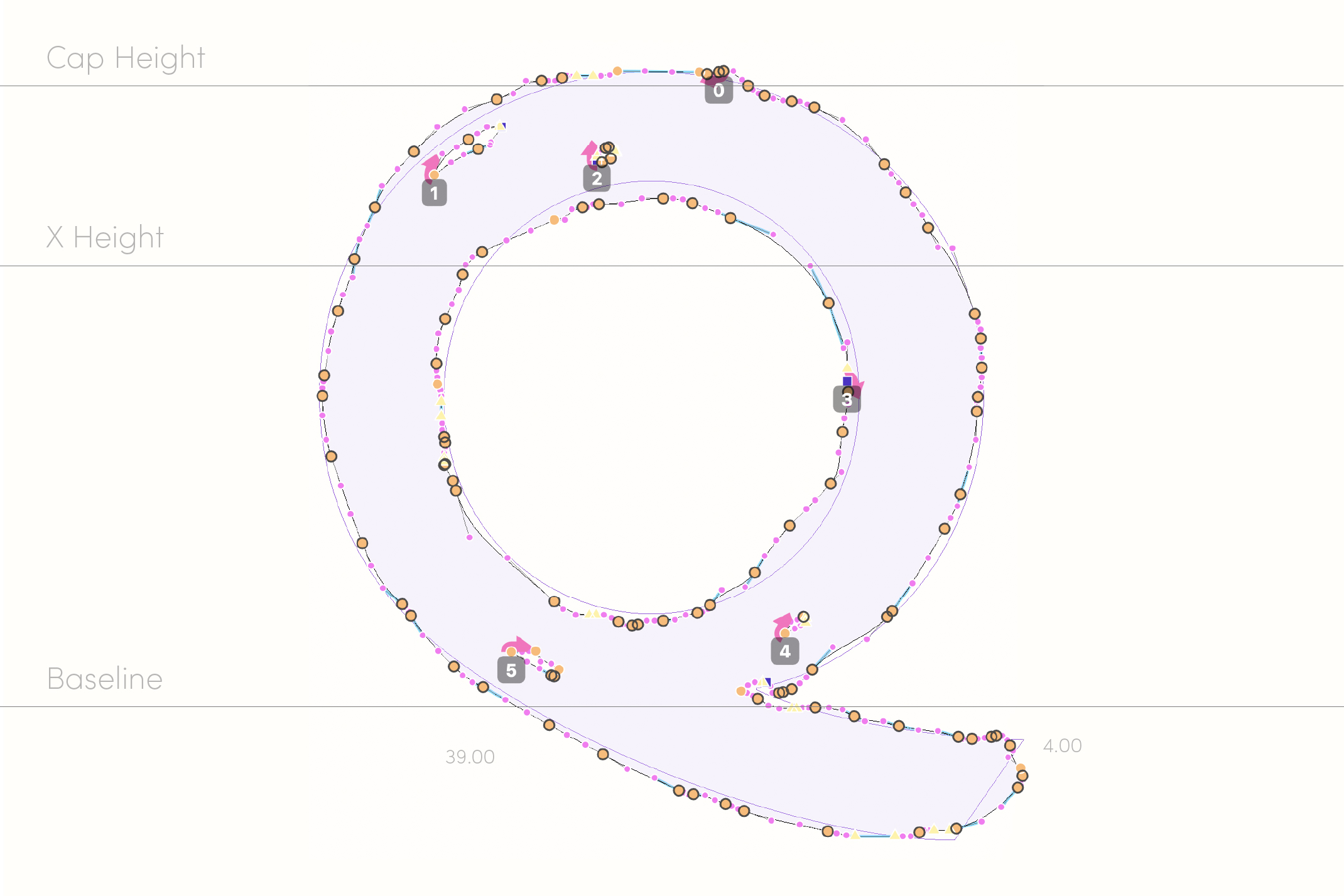
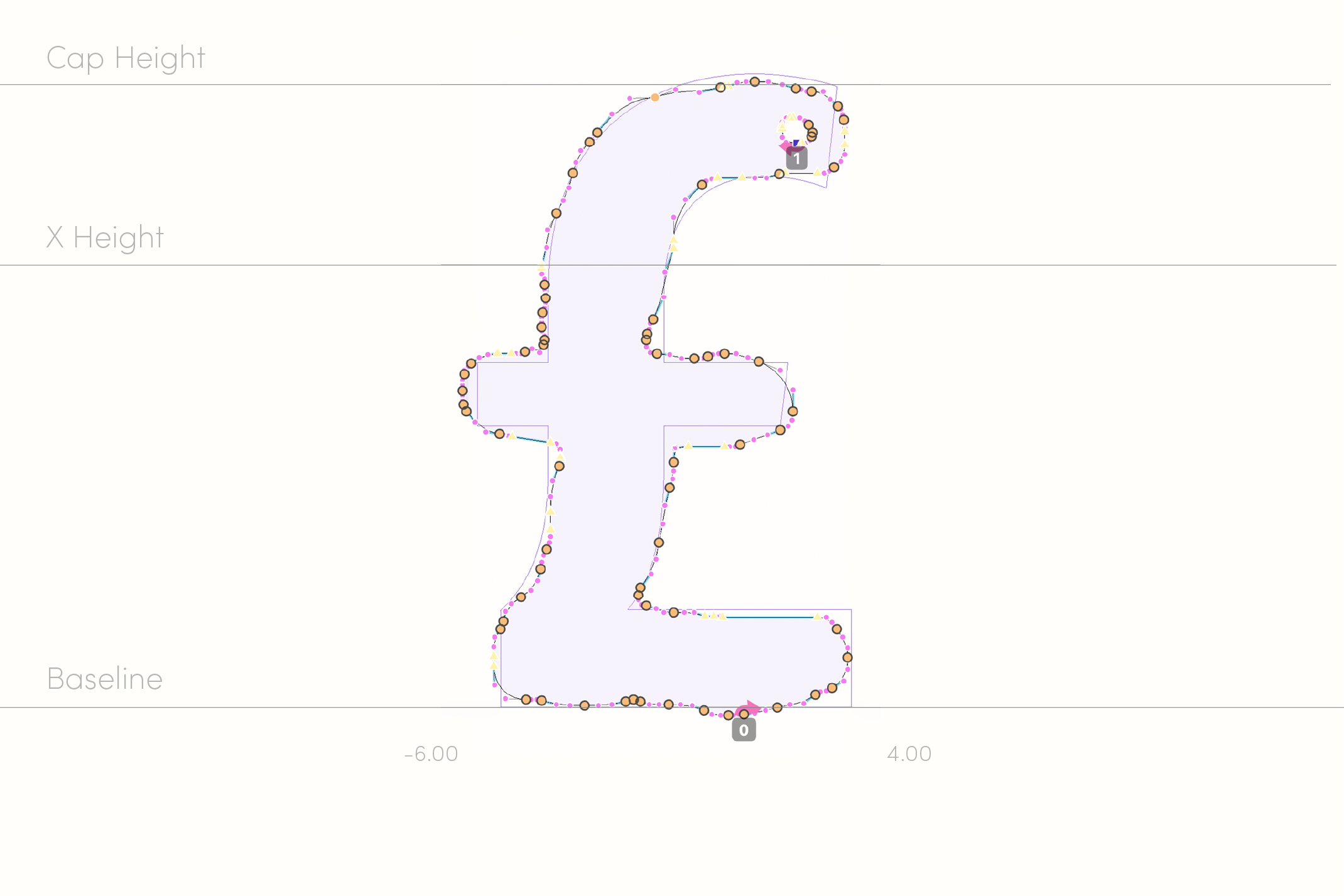
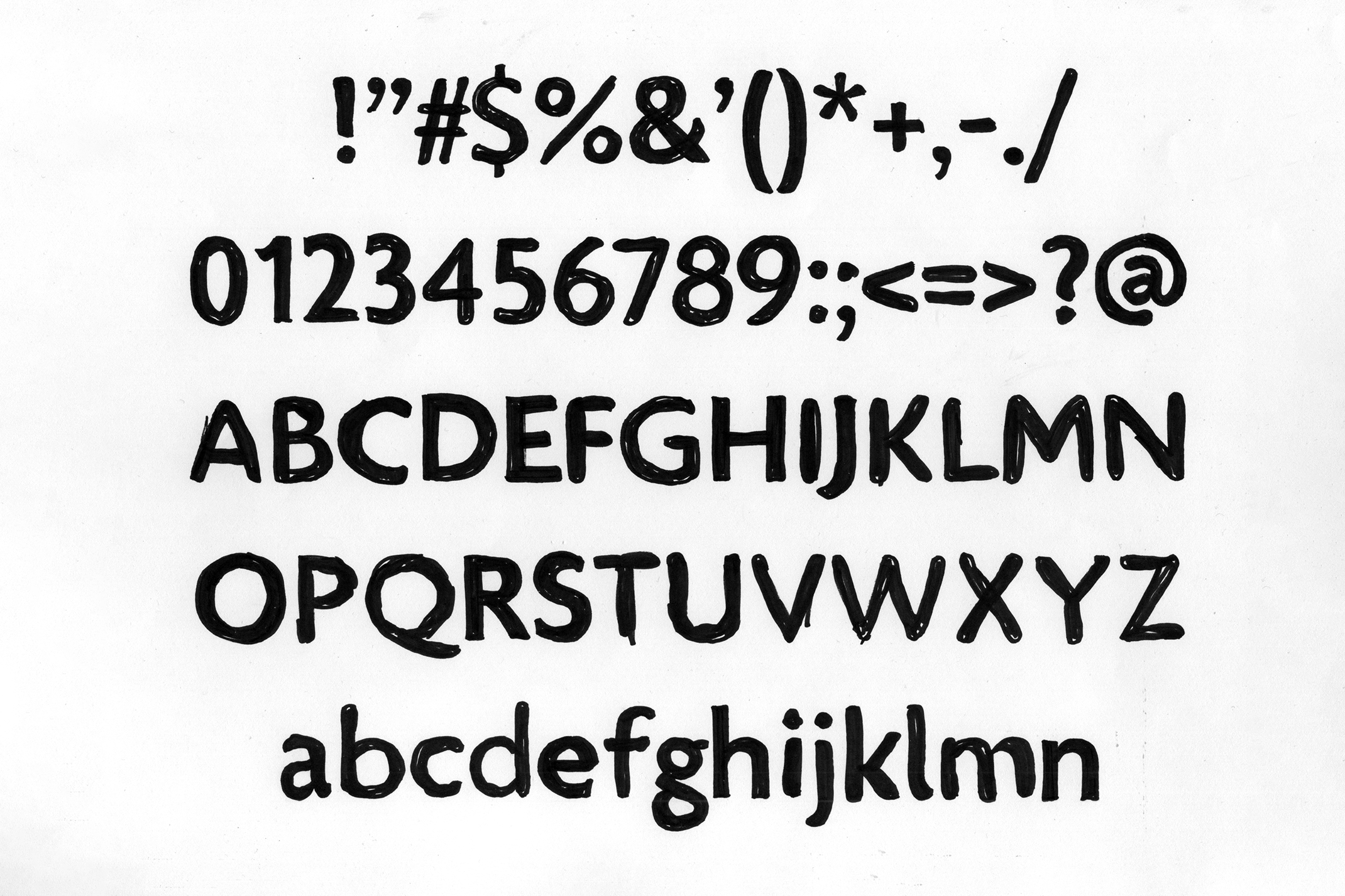
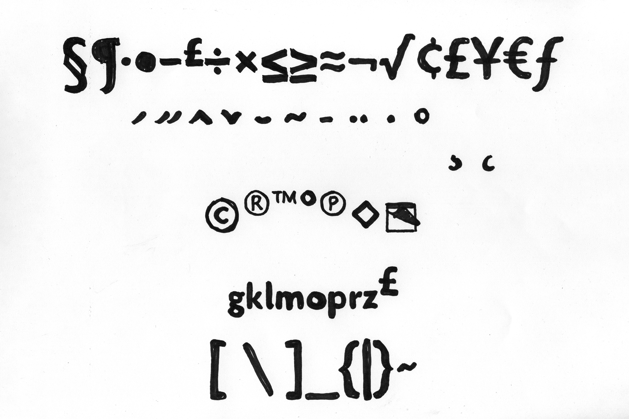
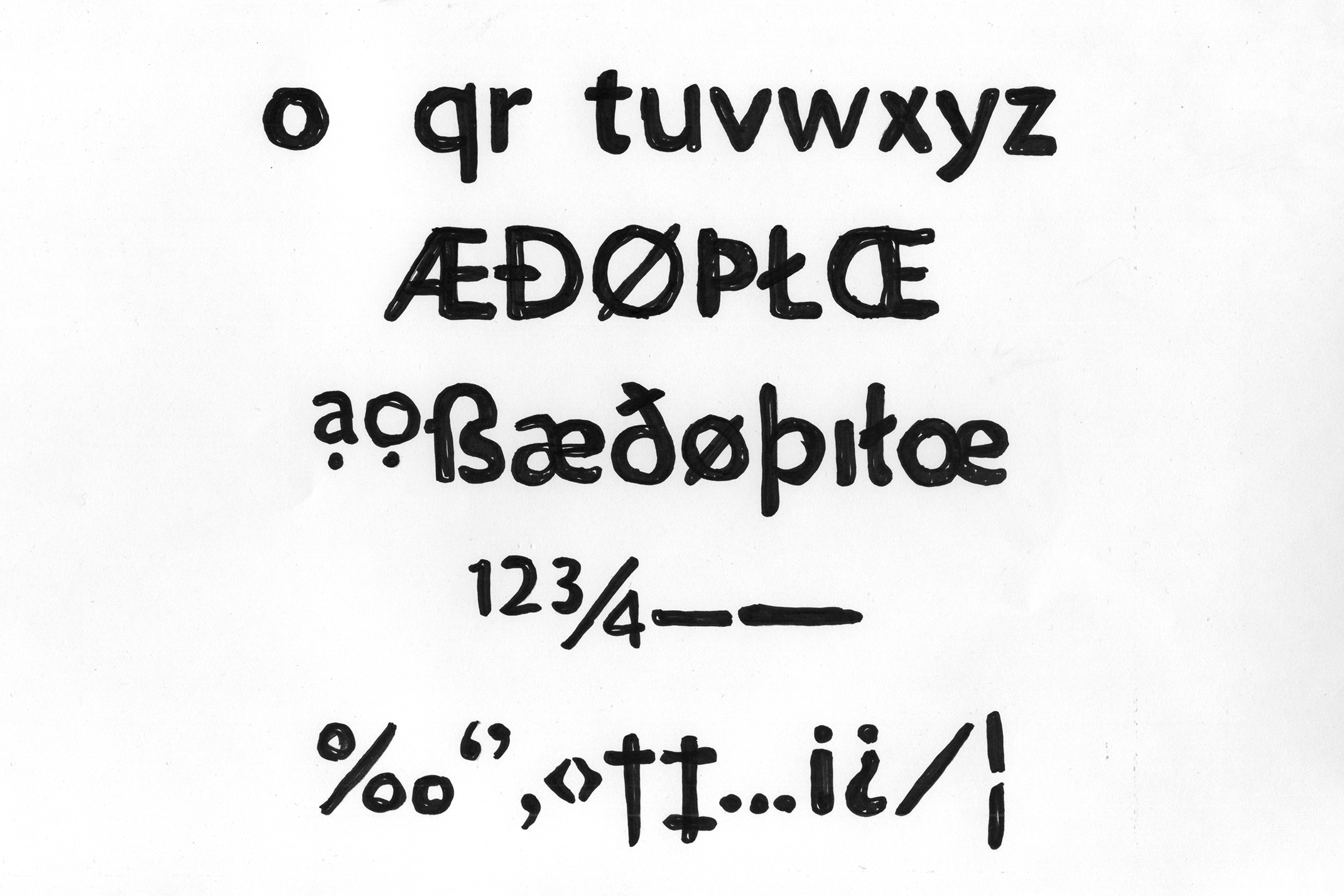

Custom typeface
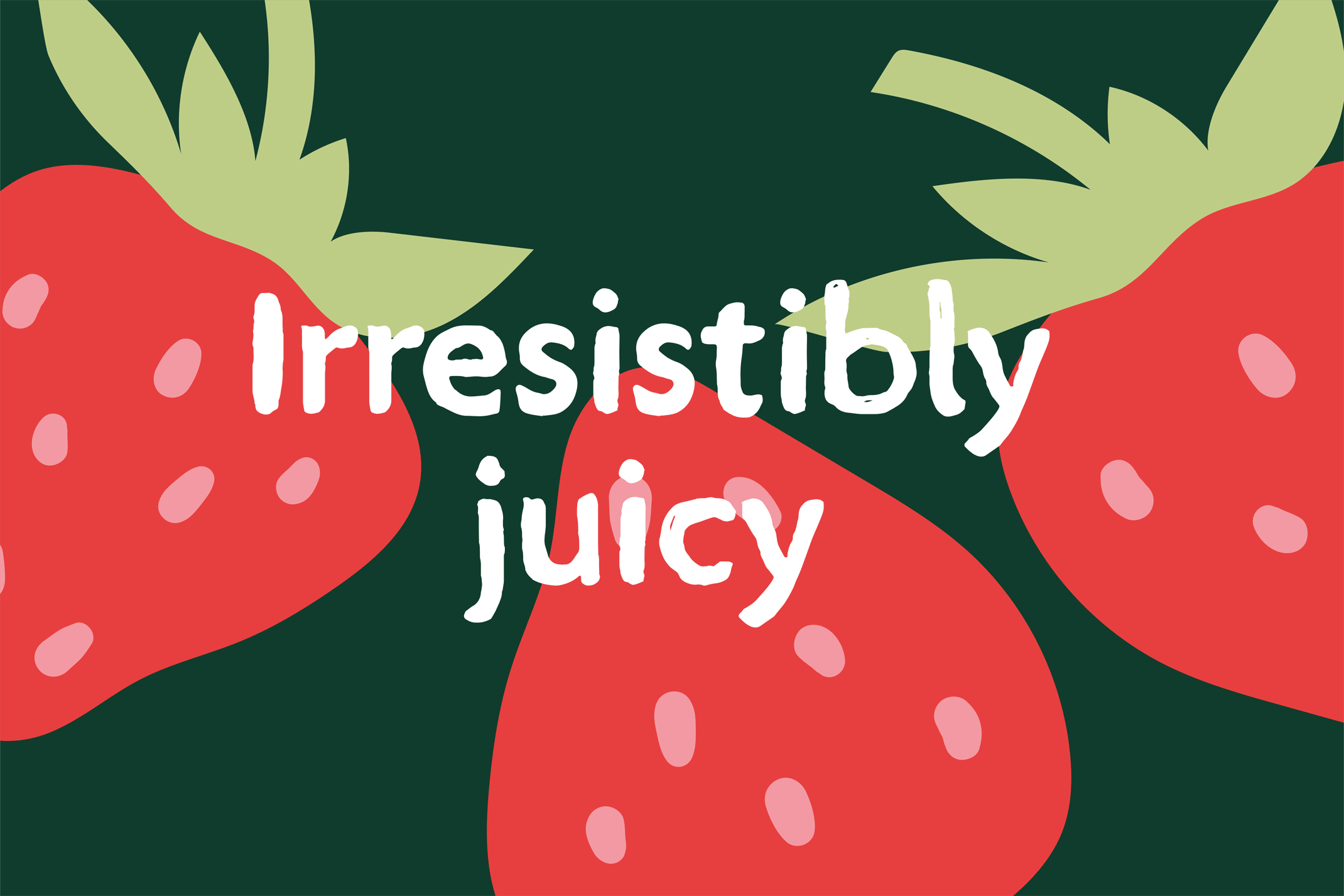
As part of the brand stretch, we commissioned Type Network to create a hand drawn version of Morrisons Agenda.
We created initial sketches based around the core typeface, and then worked alongside Type Network to digitise the font, making sure it still felt similar to Morrisons Agenda whilst having a warm, hand drawn feel.
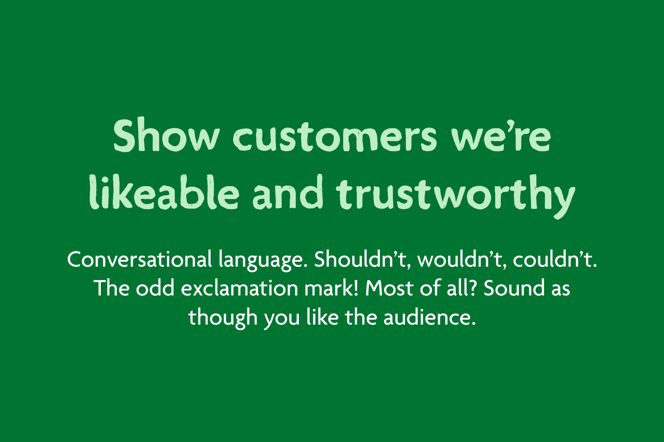
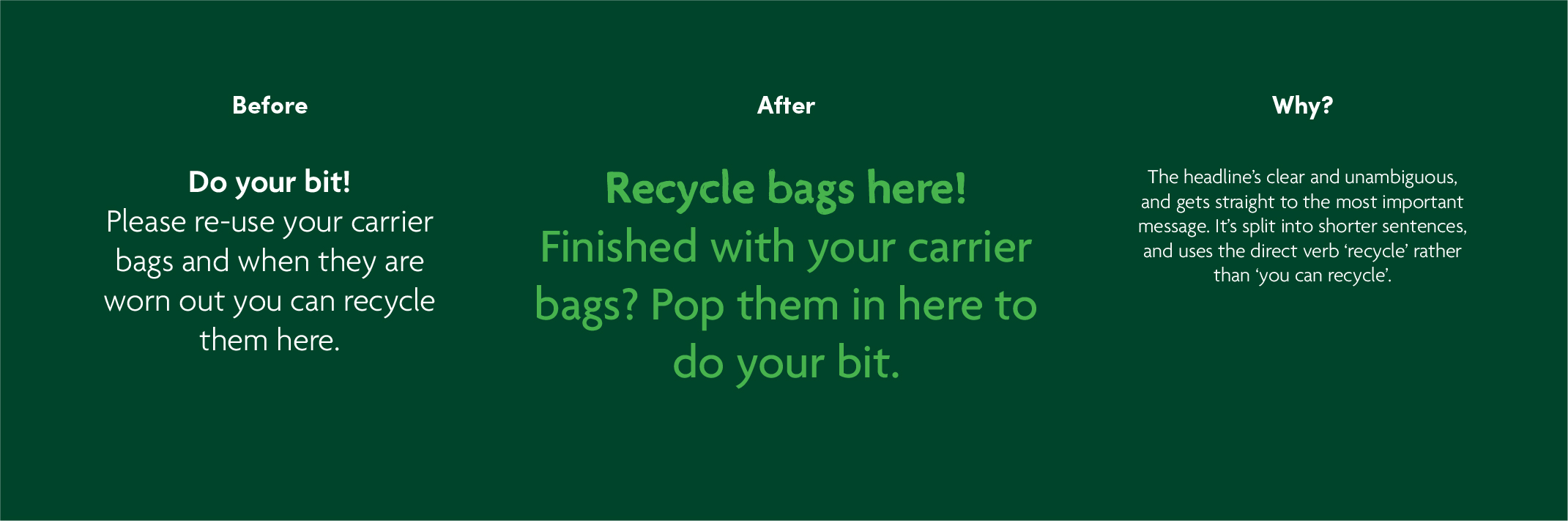
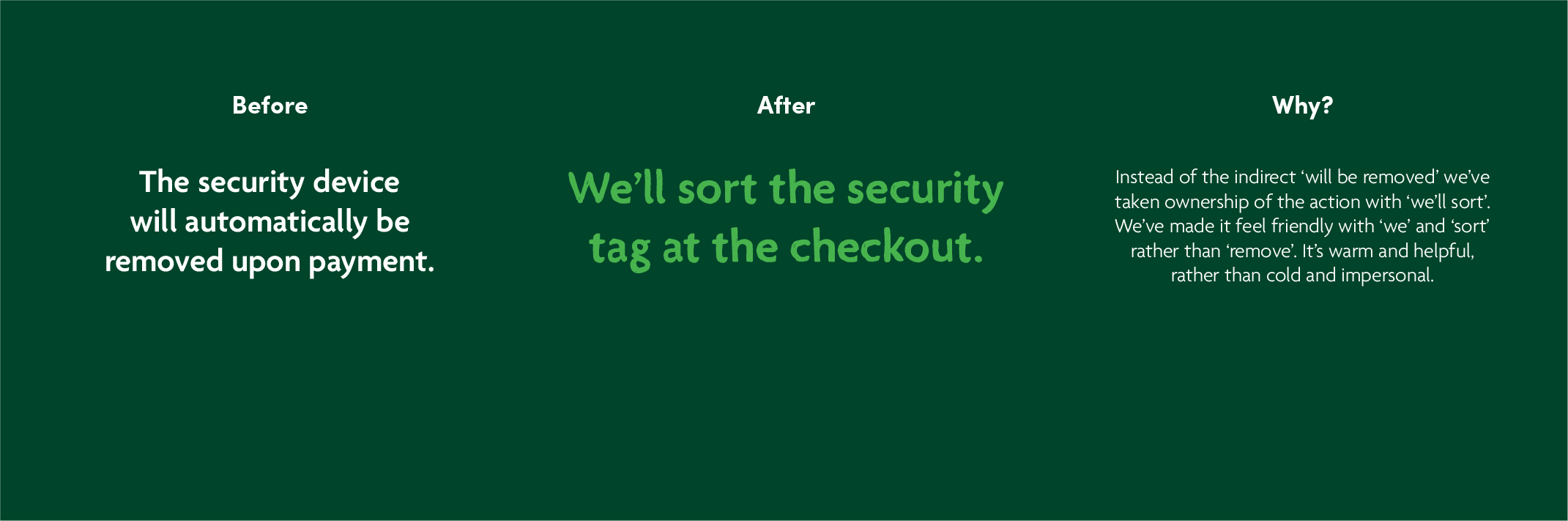
Tone of voice
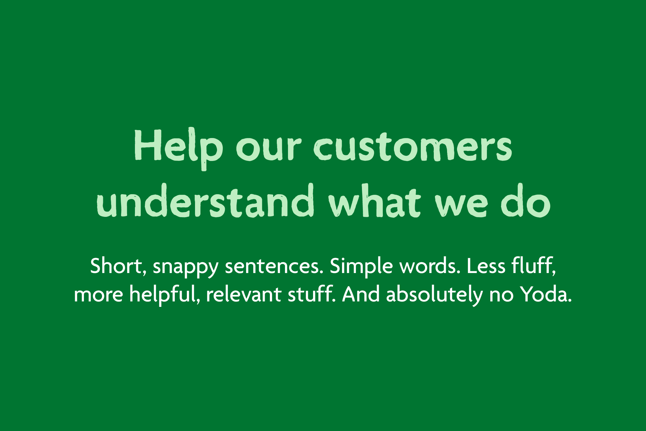
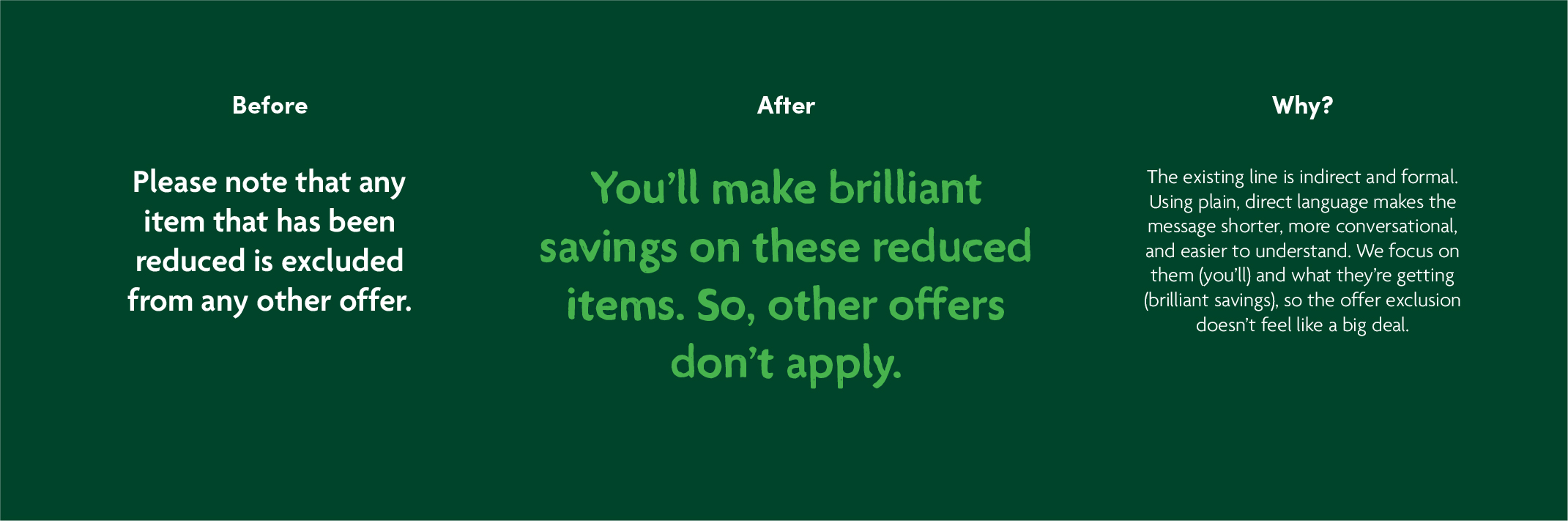
An important part of the project was establishing a new tone of voice that better reflected the brand. We worked with copywriter Sophie Allen, founder of Yarn Copy, to create an in-depth framework filled with examples to establish the new brand language.
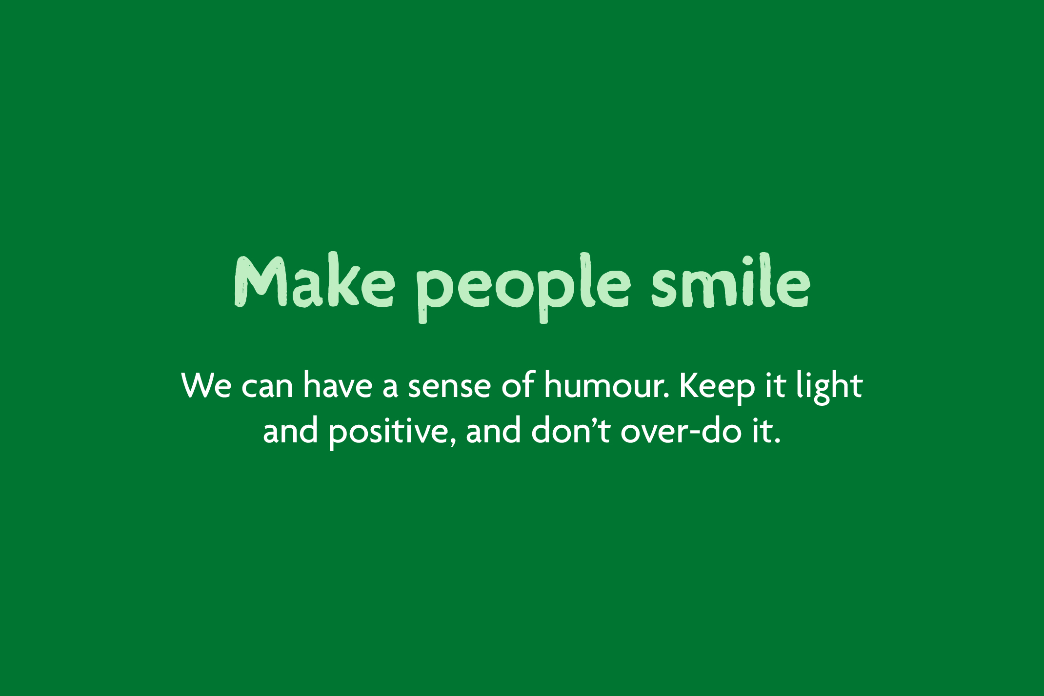
The new Morrisons tone is incredibly clear, punchy, and unapologetic, stripped back to sharp, energetic sentences and direct phrases. It has a warm, conversational feel, and instead of lapsing into robot-speak for more formal comms, it stays human.
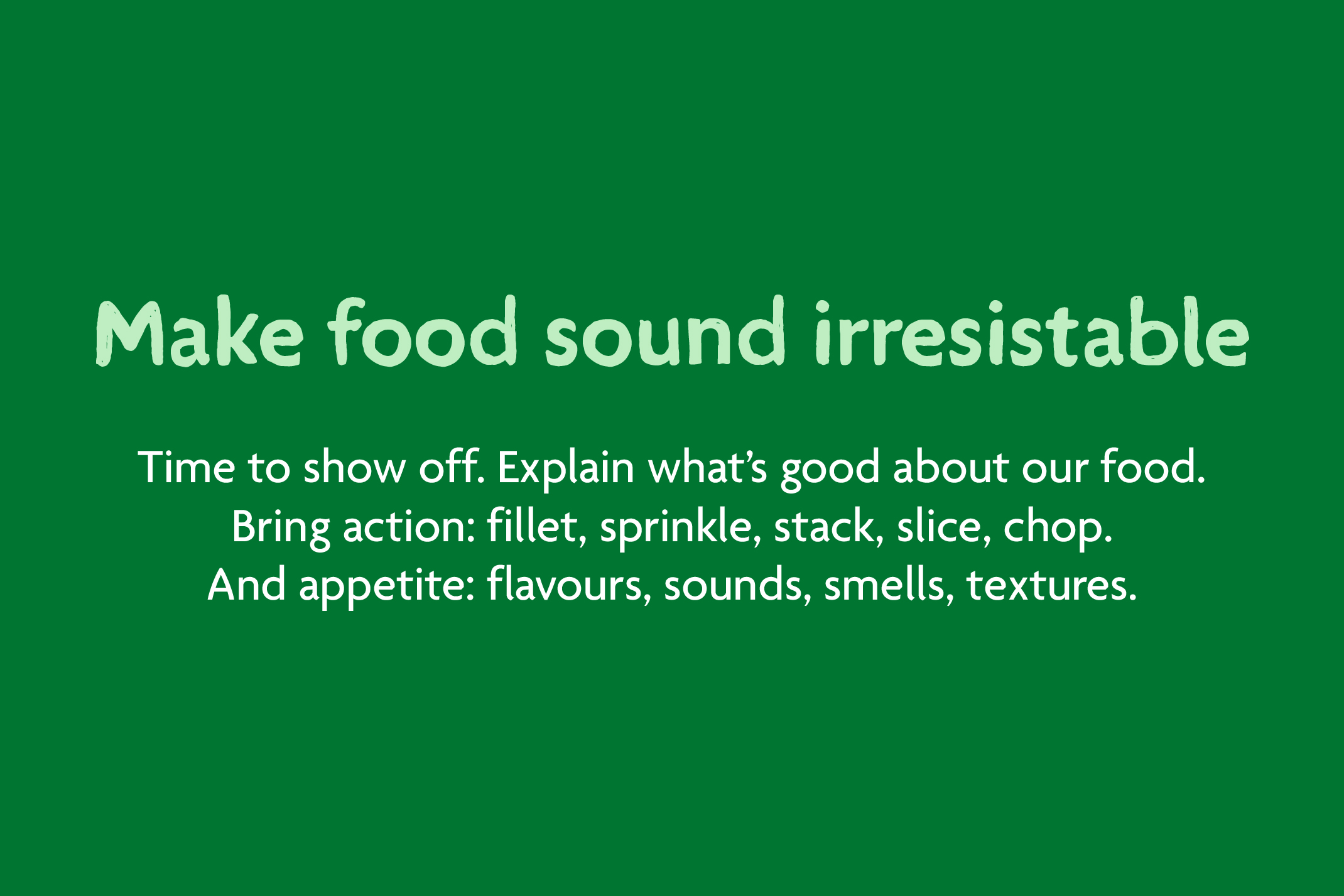
But when it comes to food, it’s enticing too. Morrisons are foodmakers – it’s who they are, and what they do – and their new tone shouts their love of food from the rooftops. It’s ‘fresh’, ‘irresistibly dippable’, ‘crispy’, ‘cheesy’, ‘juicy’, ‘sweet’. And now, we’re hungry.
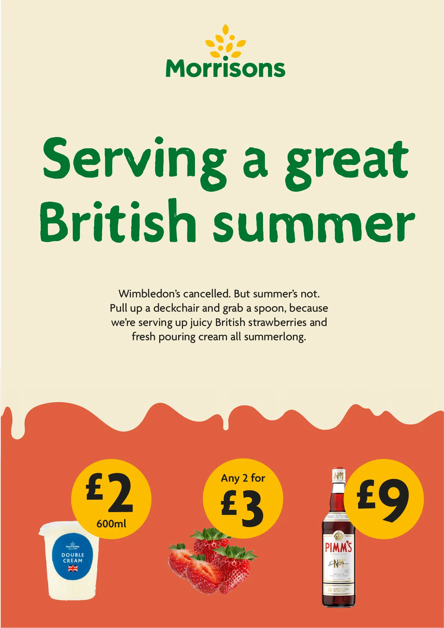
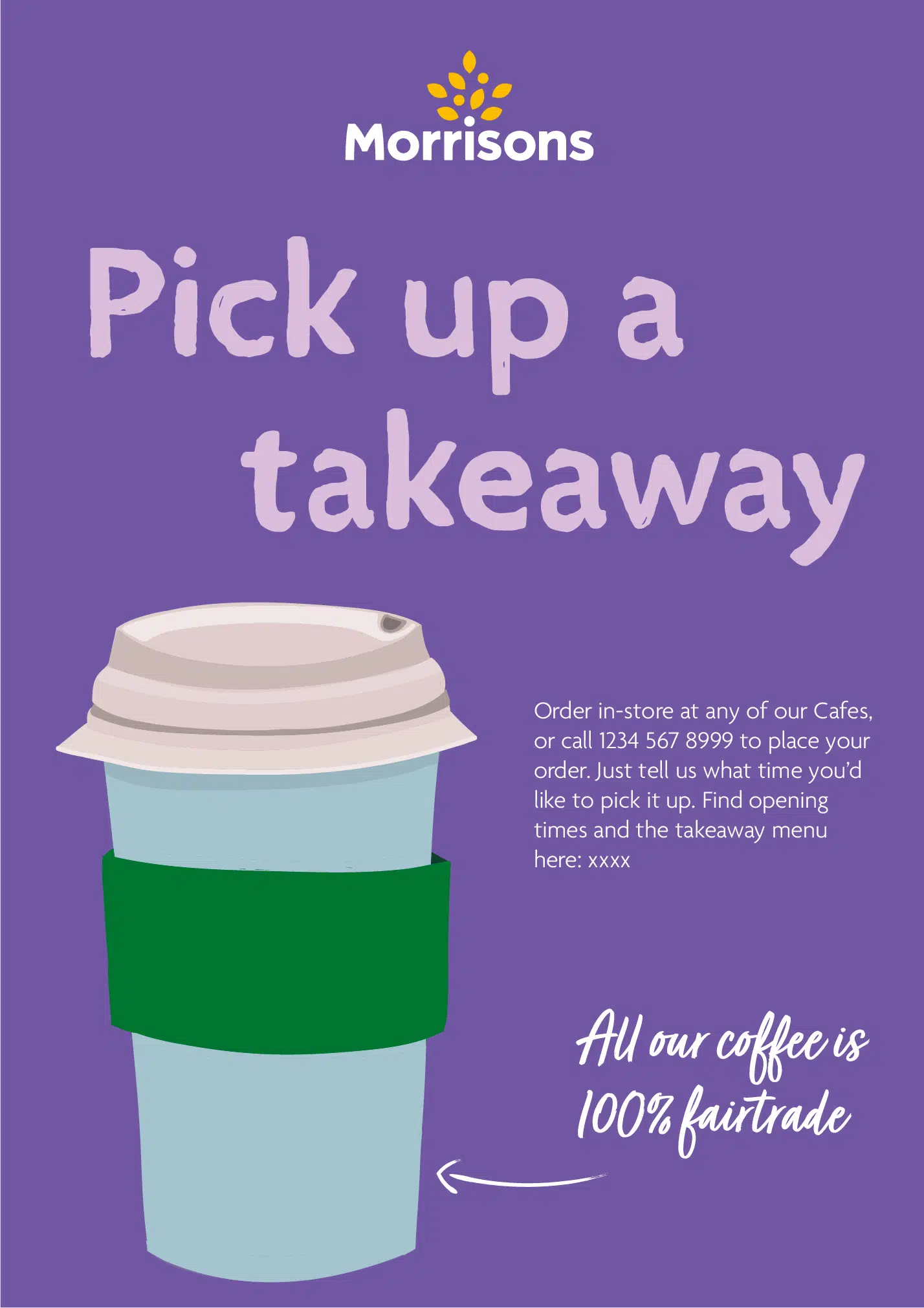
Guidelines and leading examples
Once the identity was finalised, we created a detailed Attitude and Approach document. A range of example designs were used to exemplify how the brand stretch elements are use to achieve the levels of stretch, from core to playful communications.