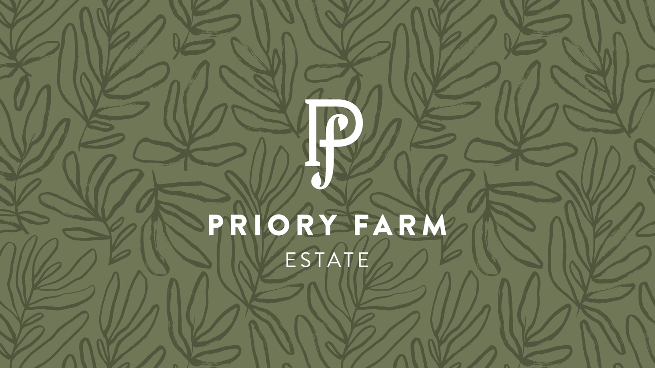
Priory Farm Estate — Brand Development
Identity Packaging
We recently worked with Priory Farm Estate to expand and update their brand identity.
The Client
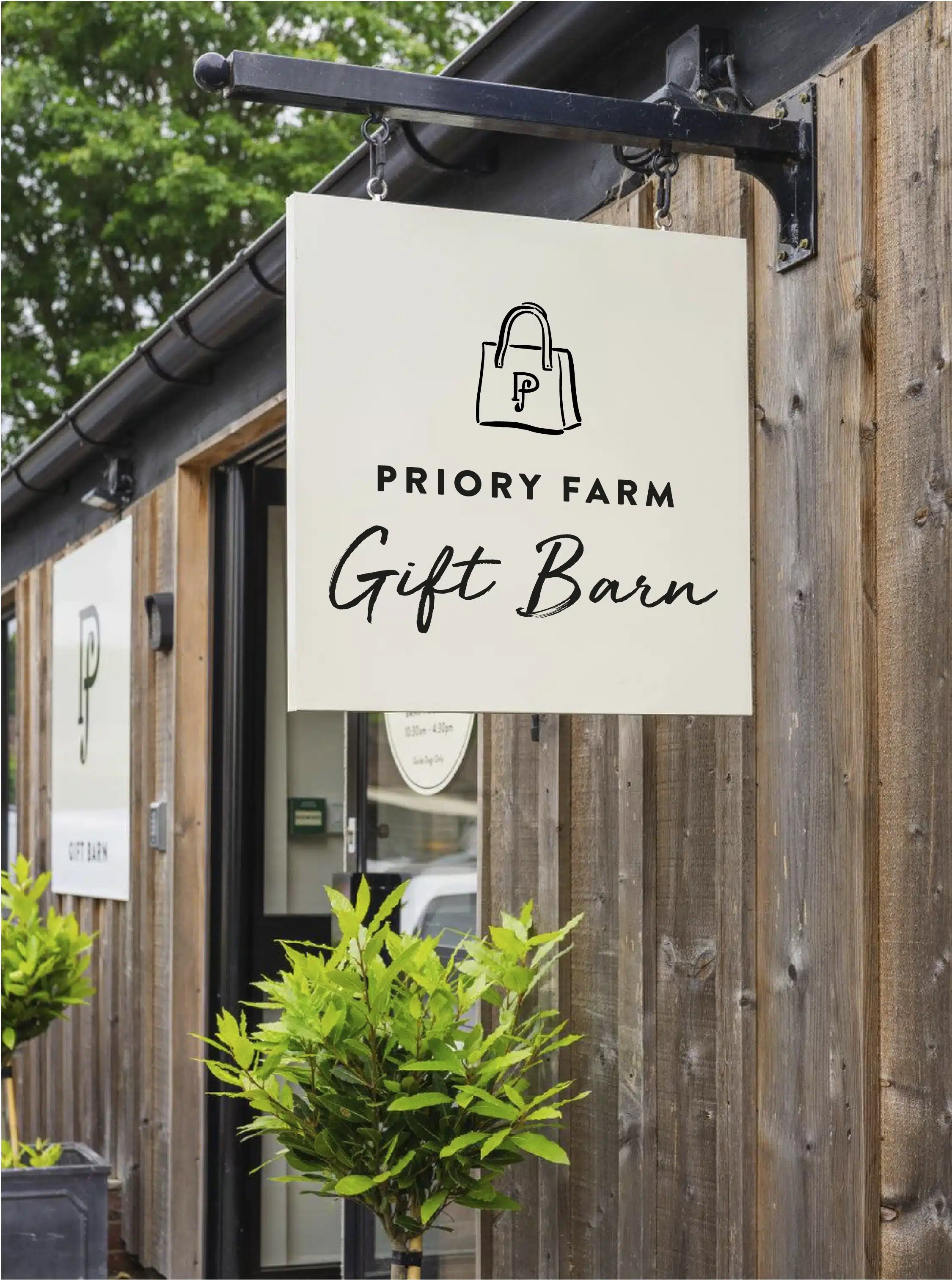
Priory Farm Estate is a family run business comprising of an award wining farm shop, garden centre, gift barn, family nature trail and much more.
The Brief
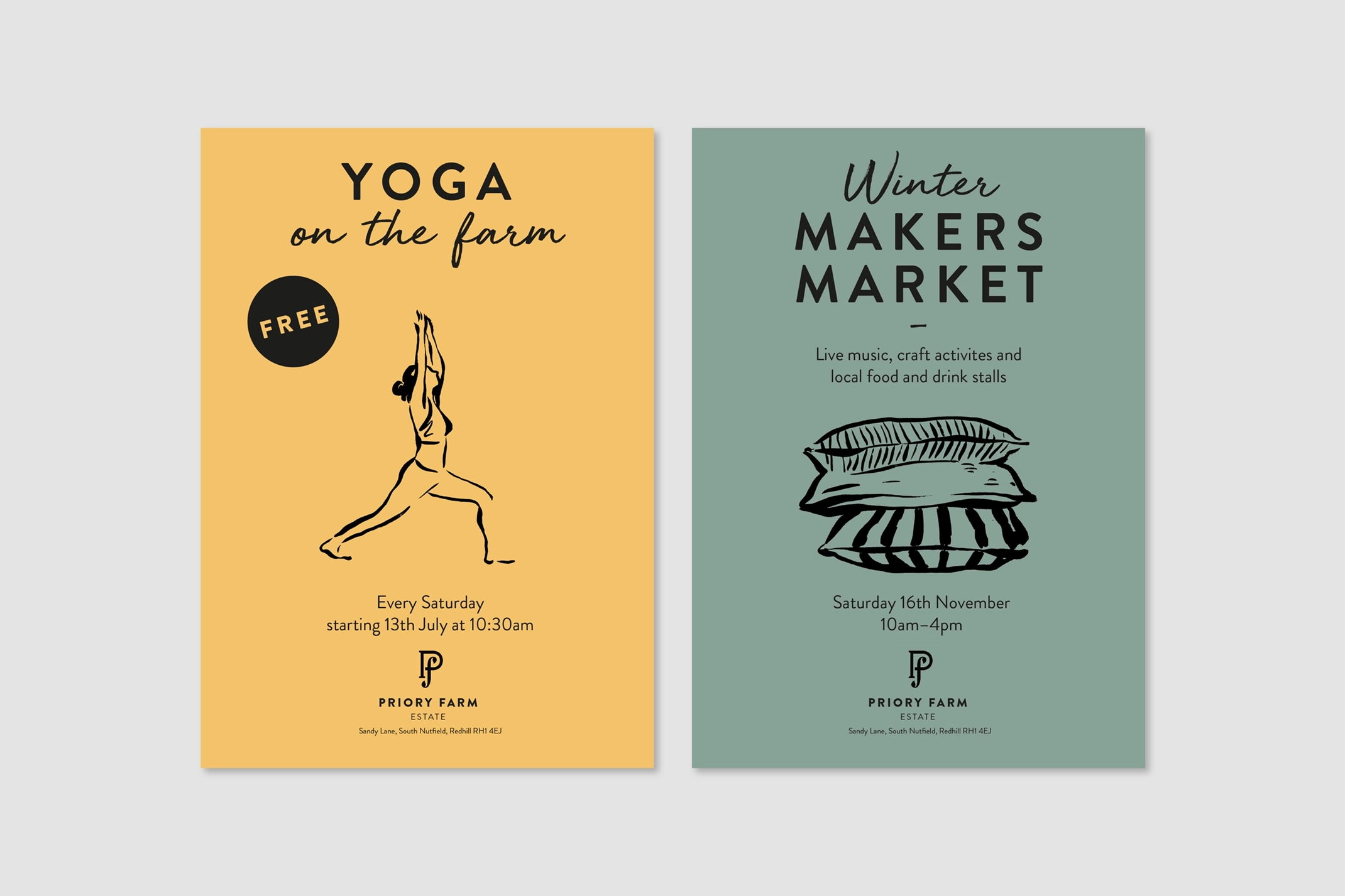
After rebranding three years ago, Priory Farm has a strong but simple identity. They were now looking to add additional stretch within the identity to provide flexibility and diversity across the business.
Our Approach
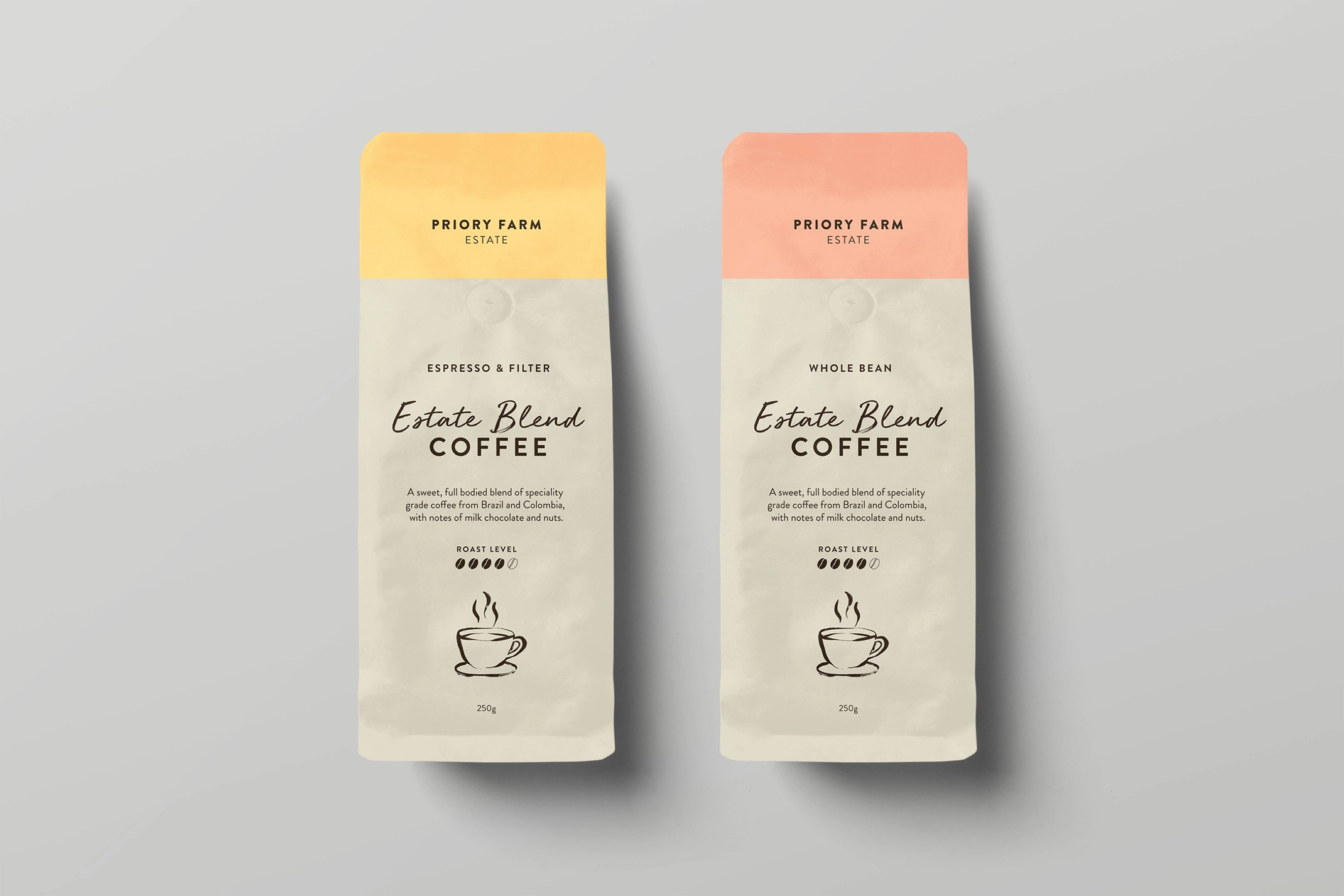
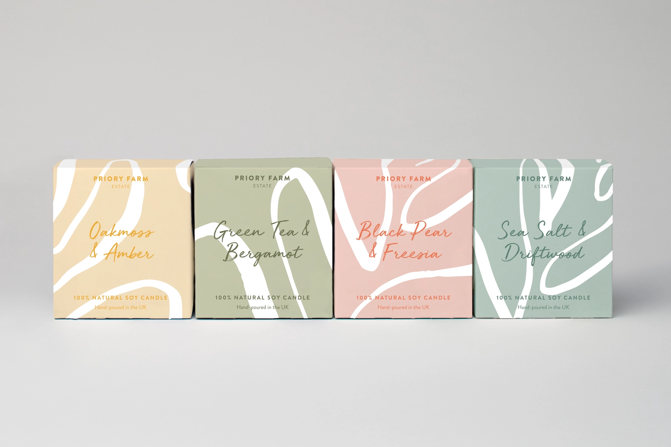
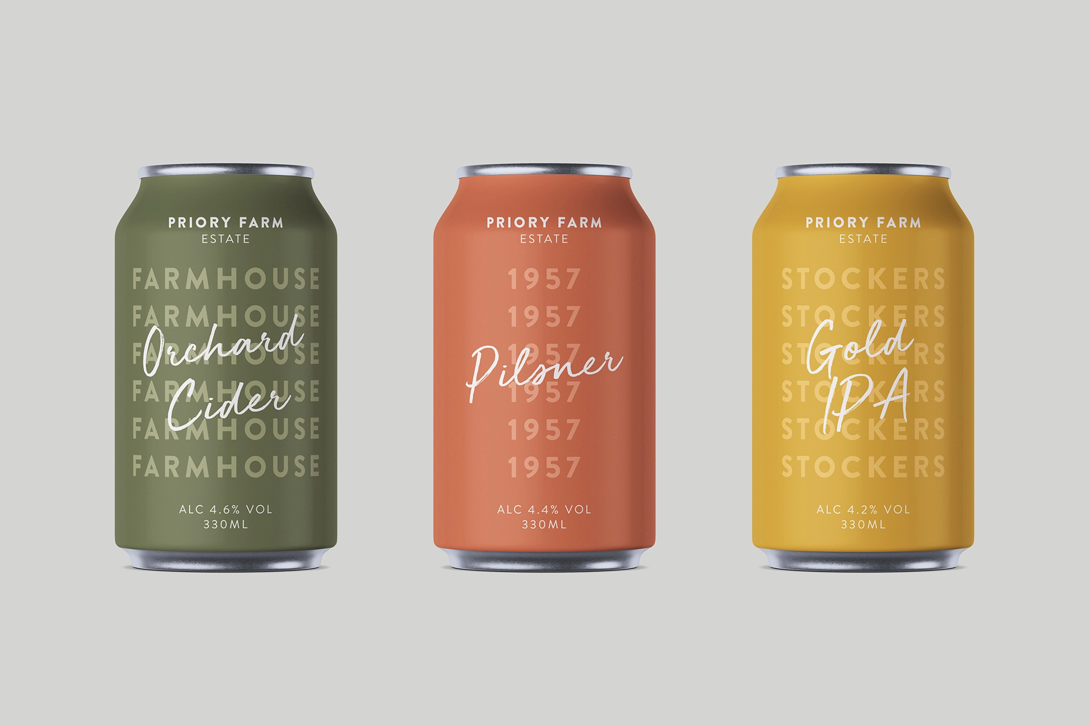
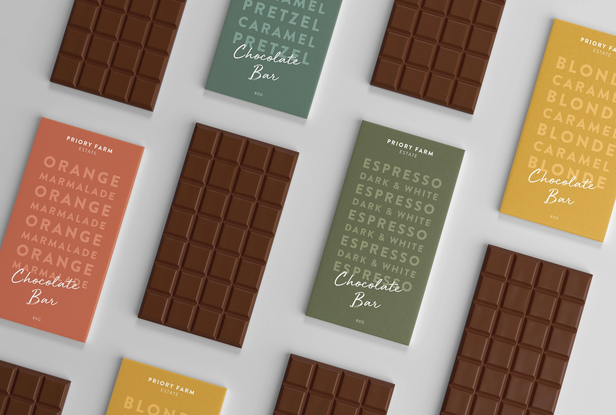
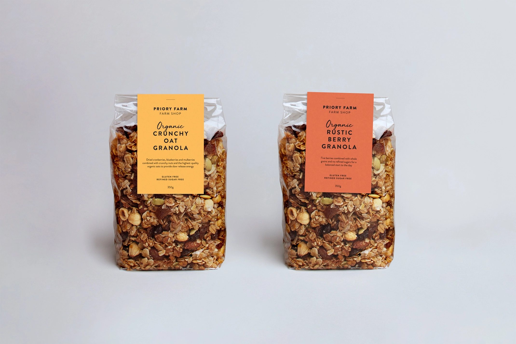
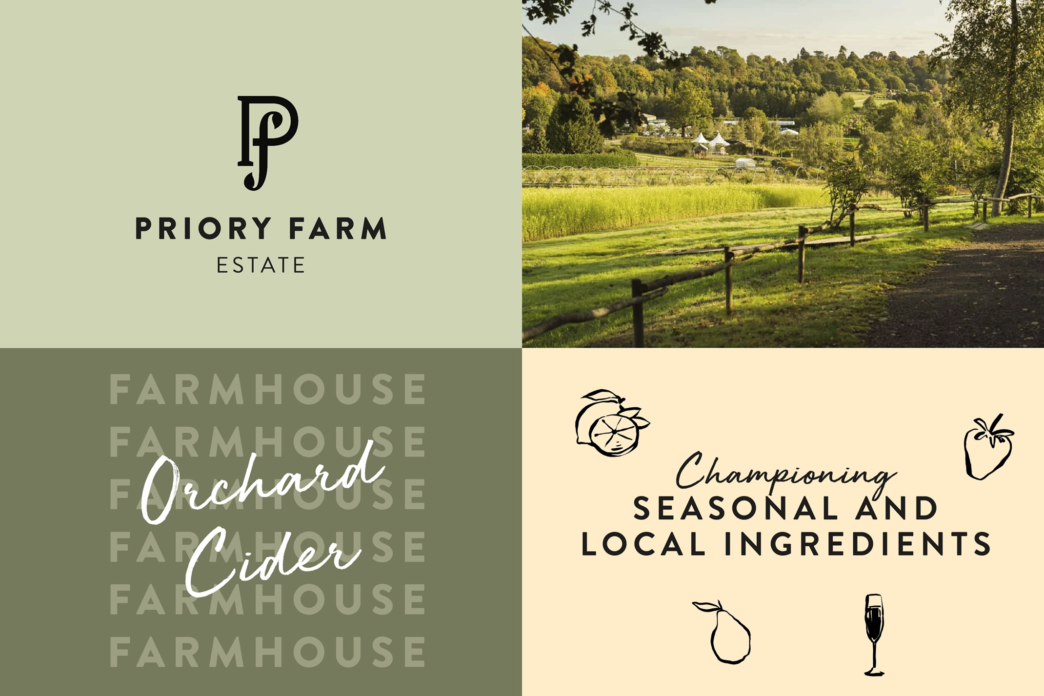
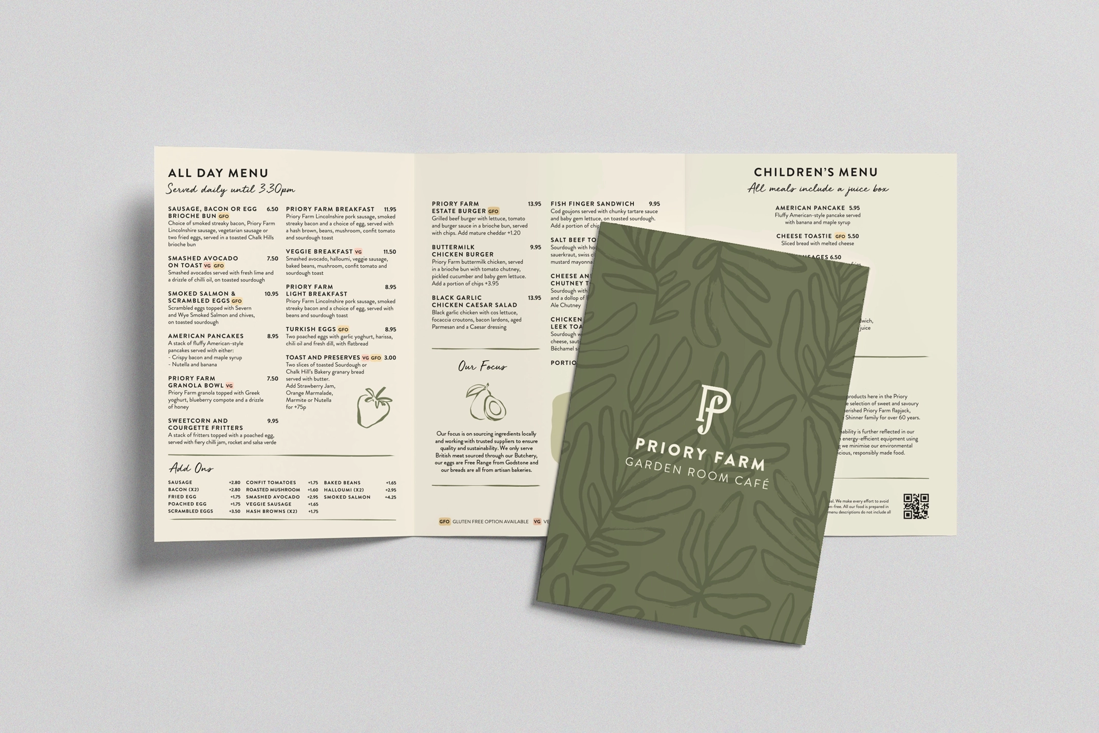
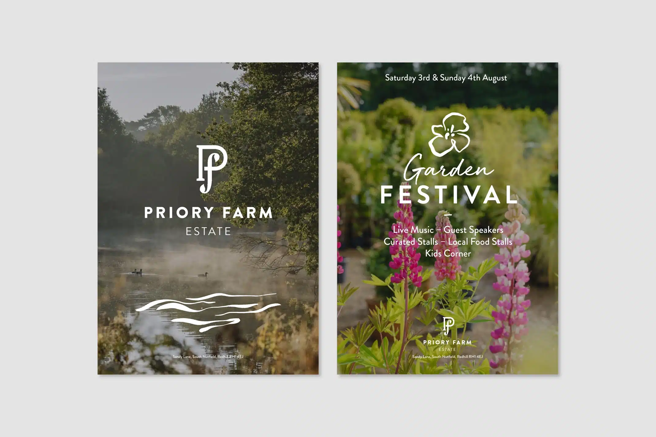
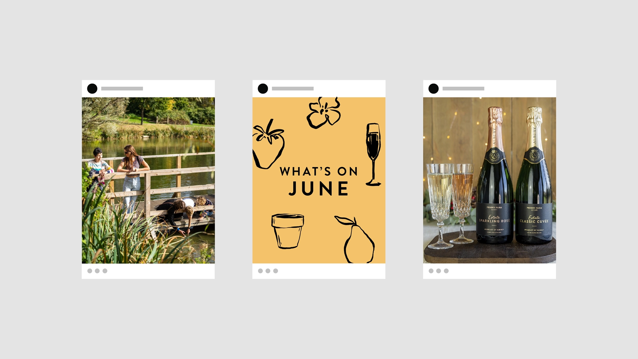
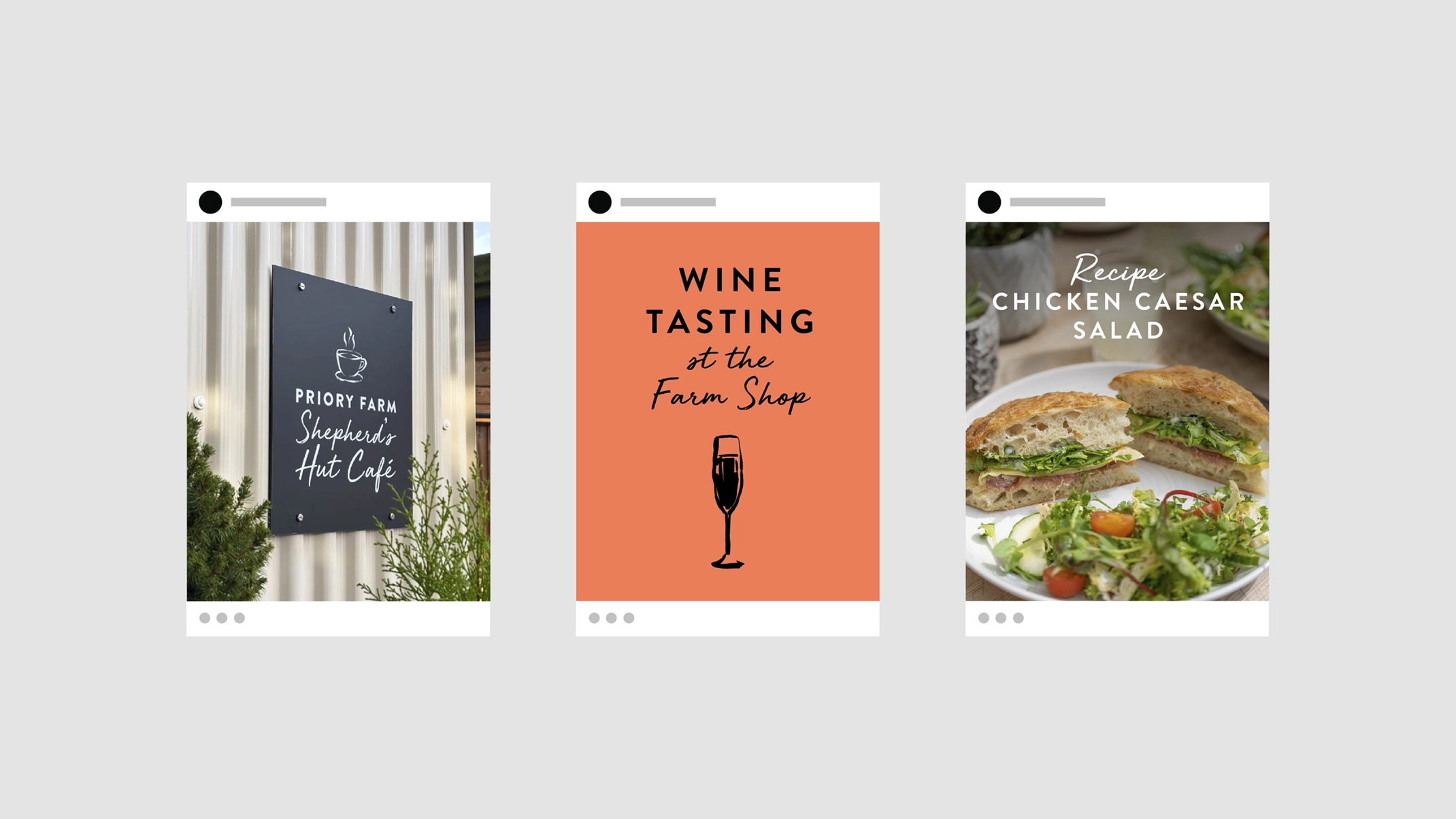
We began by auditing their existing brand assets and identifying different ways these could be used for the estate brand development. We introduced a script font and a wider colour palette that could be used along their core colours, providing more flexibility and personality.
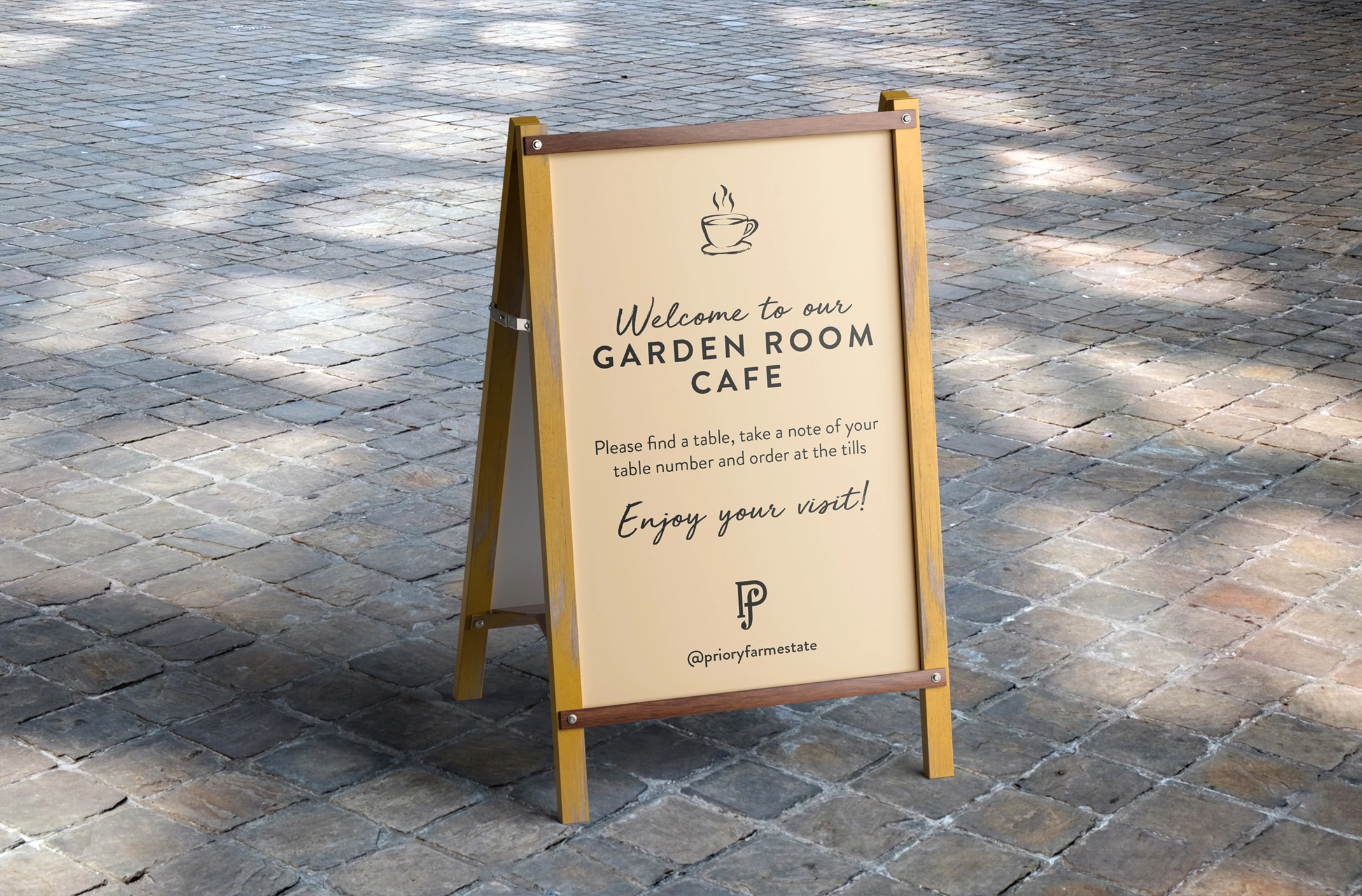
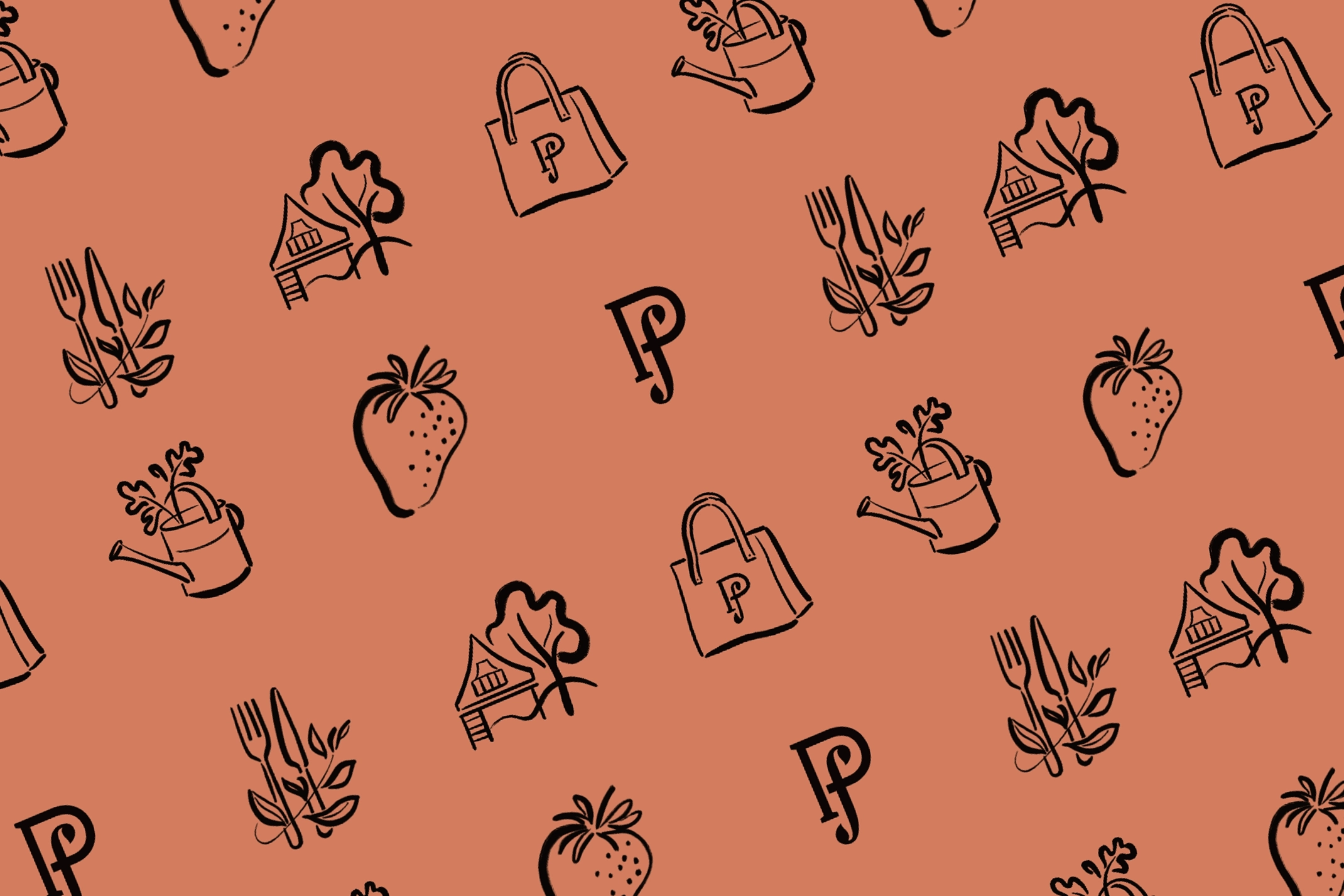
One of the areas we were asked to focus on was how to differentiate between all the areas on the estate. Working with illustrator Charlotte Trounce, we created a suite of icons that represented each location. Additional illustrations and patterns in the same style were used across collateral to bring the brand to life.
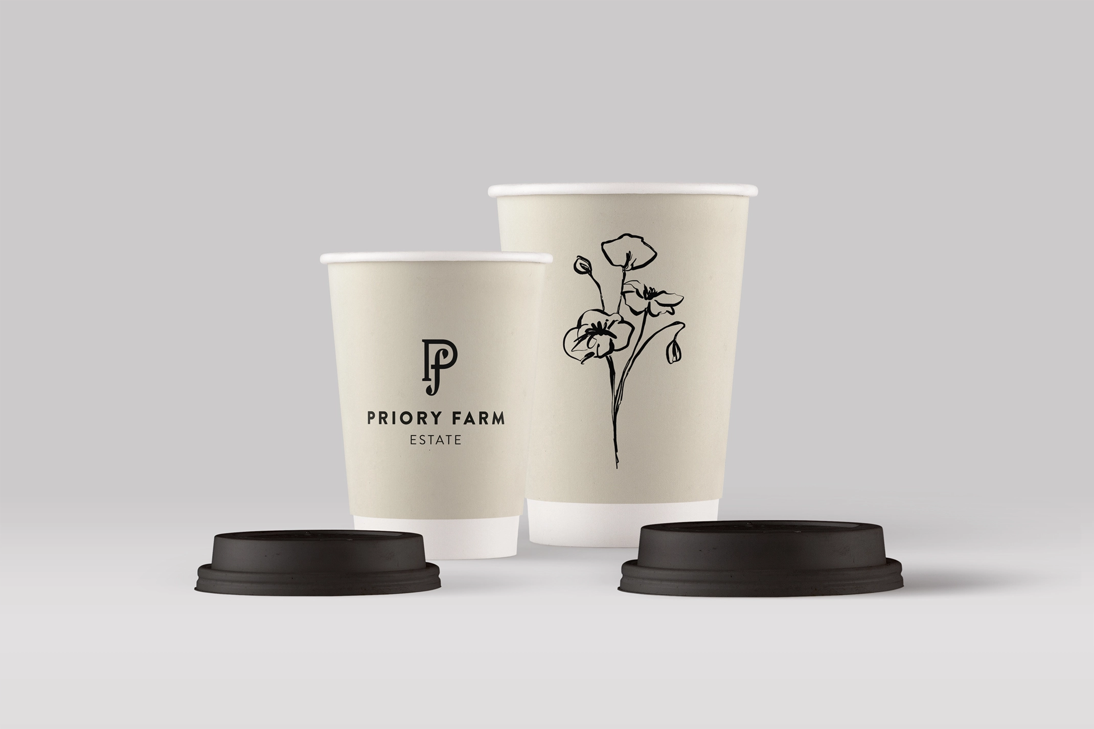

Packaging
Priory Farm were also developing some new products which required packaging. We used the new brand elements across a range of items including chocolate bars, coffee and candles.